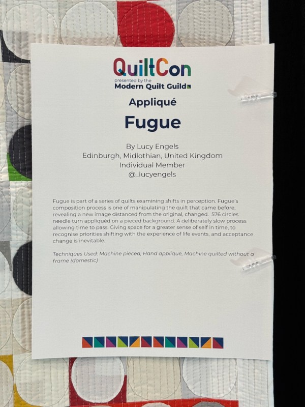
One of the challenges in our modern life is to deal with disruptions, distractions, and never letting us have a minute without someone telling us the five steps to a better life, to better breathing, to being a better whatever. Or as tech, culture and political writer Derek Thompson observed on his podcast Plain English, these voices tell you “everything is figureoutable. And if I just listen to these five steps, I can figure out all my life’s problems” (from here).
But for me, I escape to quilting to not figure everything out. I mean, yes, sometimes just cranking out on a pattern and whipping up a quilt is a good time and I like that as much as anyone. But hopefully, as Thompson noted, “you can have intimacy with a craft.” The challenge “is if we are constantly being distracted or interrupted, it’s hard to find that intimacy. It’s hard to get into the slipstream or the pocket of a creative project” (same source as above).
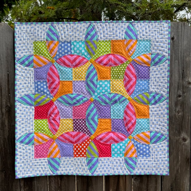
I like my pursuit of my craft. Of taking a well-known-to-me pattern like my Blossom, and seeing what I can do with it that sends me into discovery, of finding a new way to see what I’ve seen before. Because, really, haven’t we all seen it all before: make a cut, stitch a seam, sew it together, quilt it, and don’t forget the label?
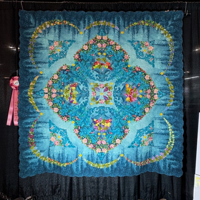
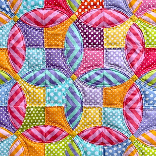
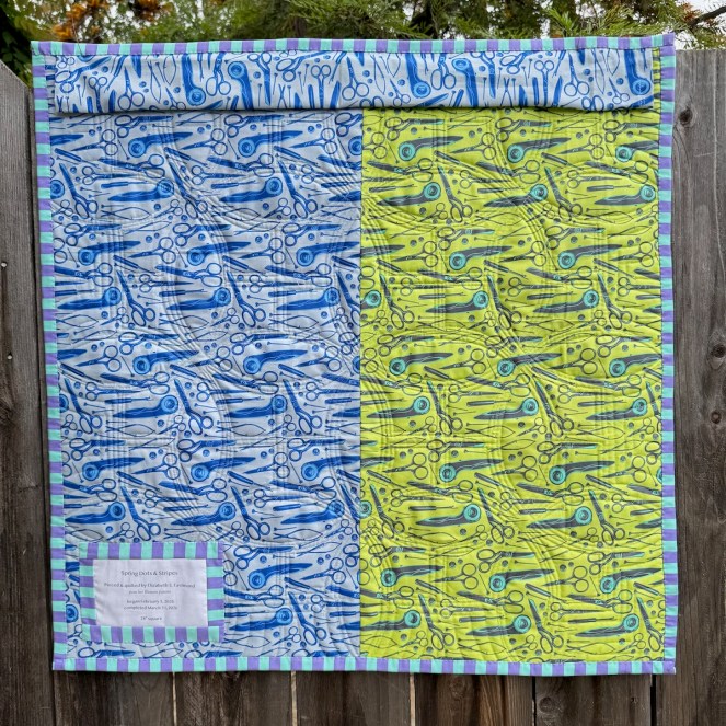
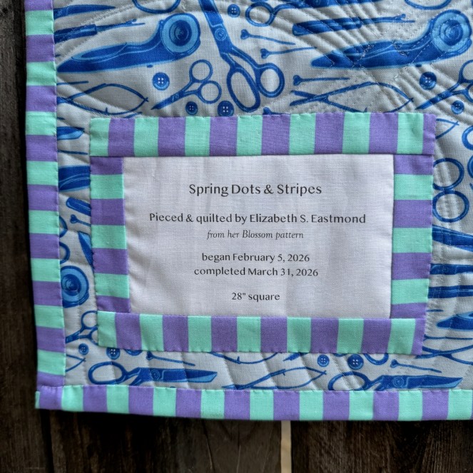
For this quilt (Spring Dots & Stripes), I chose to work with just two elements:
• dots and stripes (had to be white dots on bright colors),
• Tula’s Tent Stripes (in only four colorways).
It was this challenge that coaxed me into flow.
What is flow? The Czech psychologist Mihaly Csikszentmihalyi coined the word “flow” to refer to the psychological state of optimal performance.
“He recalled in an interview how he would watch painters in their studios and how he was fascinated by their ability to forget everything while working. He was also surprised by what happened when they were done: They’d finish a work of art, and instead of enjoying it…they would put it against the wall and start a new painting. They weren’t really interested in the finished painting. What these artists were after, Csikszentmihalyi realized, wasn’t the finished work itself but the experience of full immersion and absorption in the act of creation” (from here).
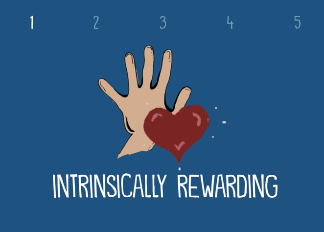
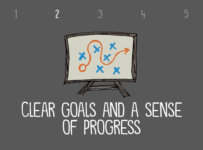
To understand it better, I watched several videos online, and liked the one from John Spencer, titled “What is Flow Theory?” He highlighted it like this (click arrows to advance):
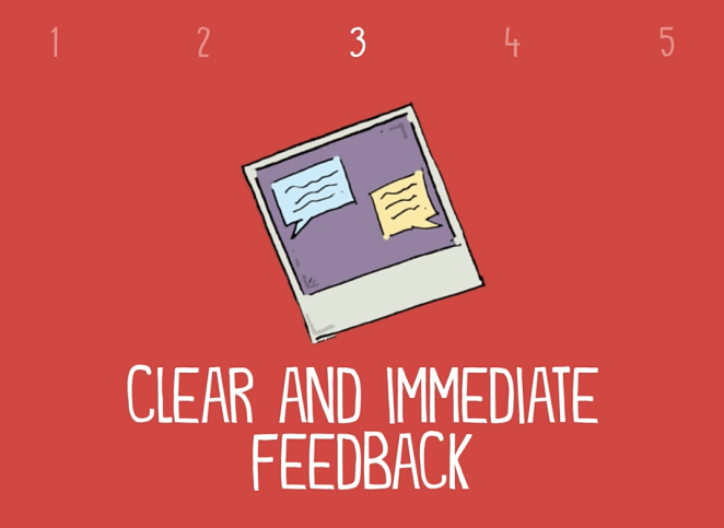
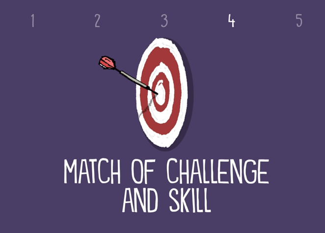
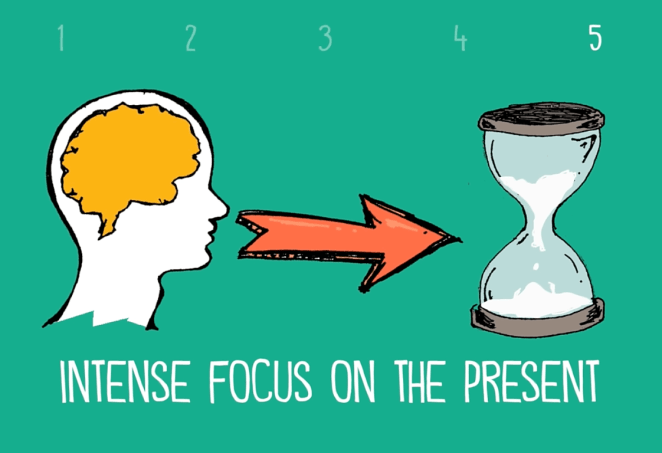
Since no matter what I tried, the slides kept getting out of order, the basics are:
- The task has to be intrinsically rewarding;
- The task has to have clear goals and a sense of progress;
- Clear and immediate feedback is critical;
- It’s a balance between the challenge of the task and the set of skills needed to complete it; and
- The person in the flow state has an intense focus on the present.
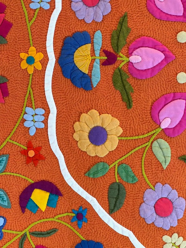
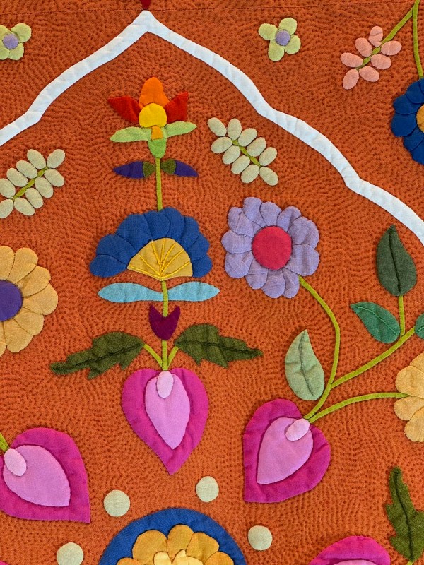
I cut out pieces in certain colors — the ones I thought I would want — and started putting them up on the design wall. And then in an a-ha! moment, I could see that I could group them differently to create a pattern of interest. Maybe that came from trial and error, maybe it came from being in the flow? I was able to discover a different way as I grouped the petals into colors, cutting and discarding and pinning up and sewing, as I ignored all that was going on around me.
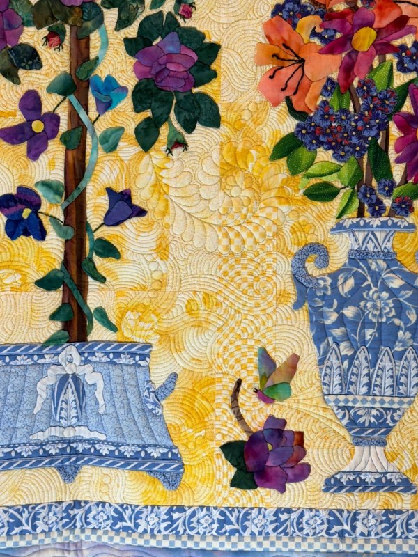
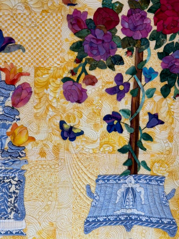
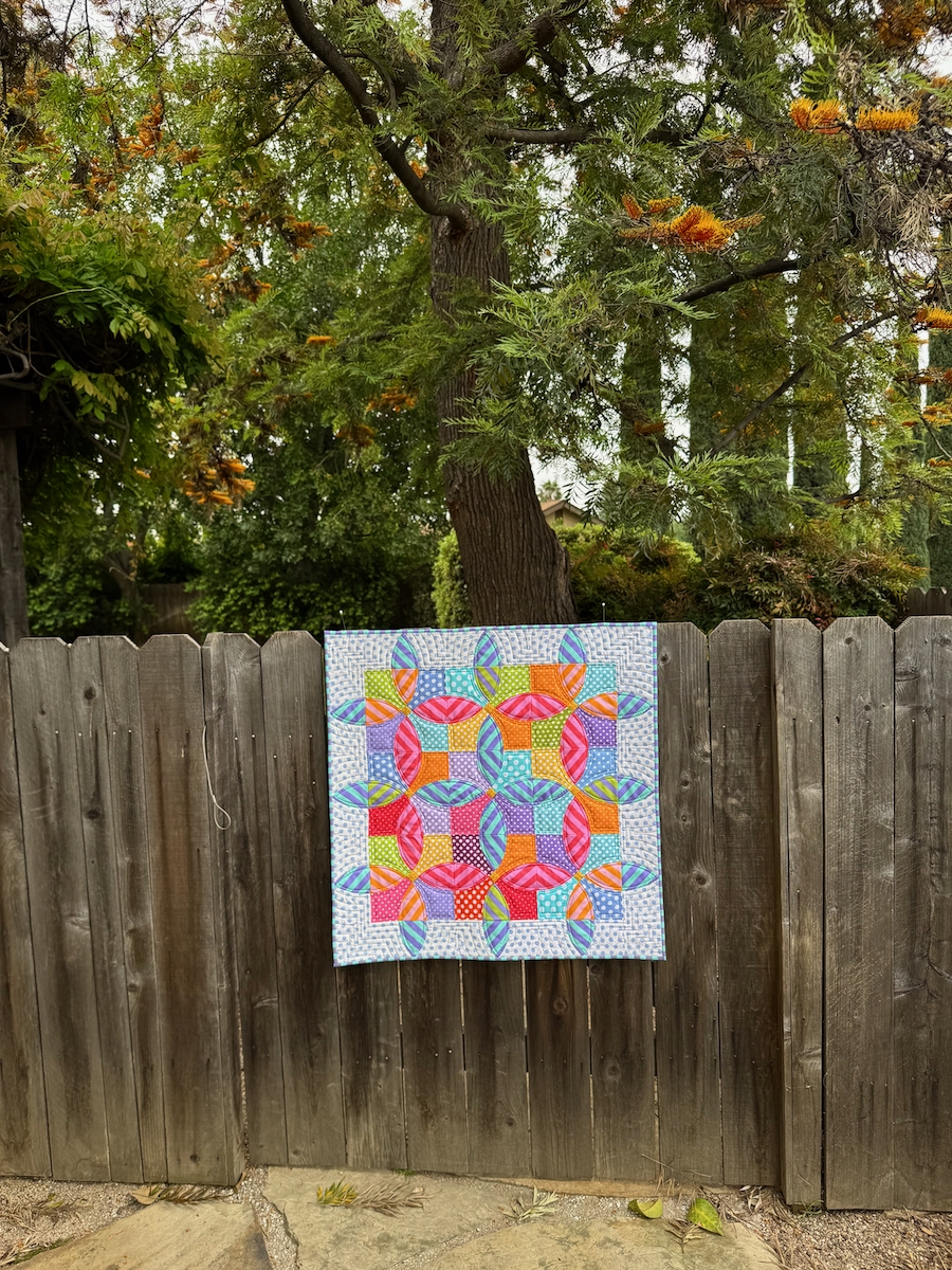
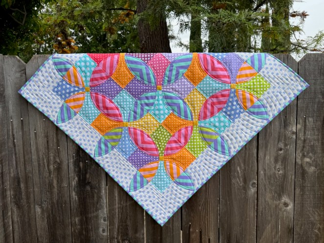
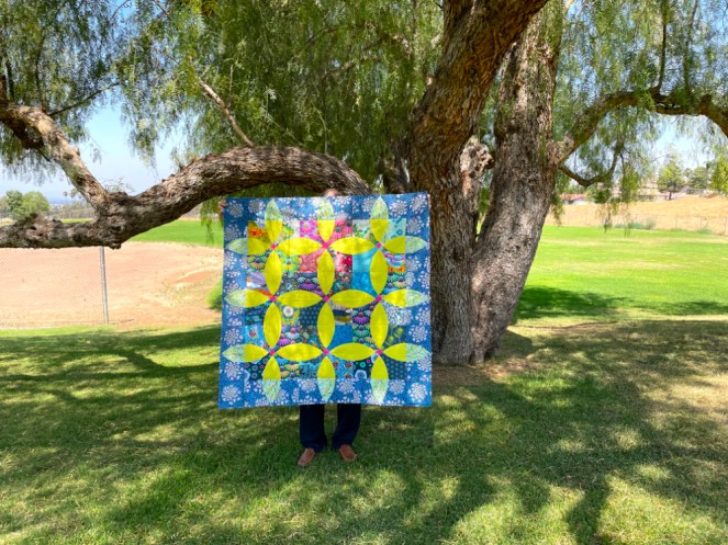
I took the finished quilt out into the garden for some photos this week.
Side Note: I’ve decided there are two categories of fabric design that I don’t like on the front of my quilts: the first is sharp things, like anything on this fabric. The second is insects, so these often end up on the back. (Cute small bee prints are the exception.)
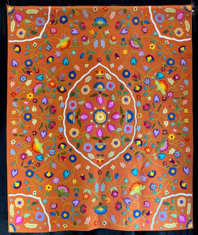
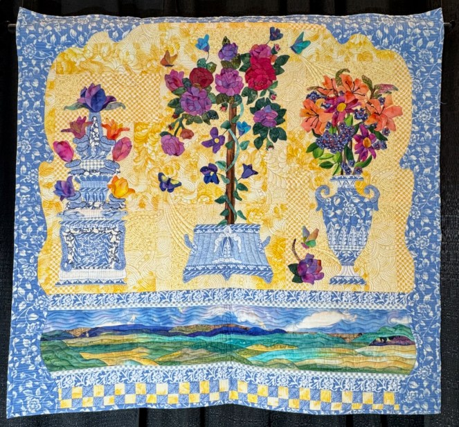
I needed a mini-quilt of just the right size to fit in a specific space (photo near the end), and it needed to be spring colors.
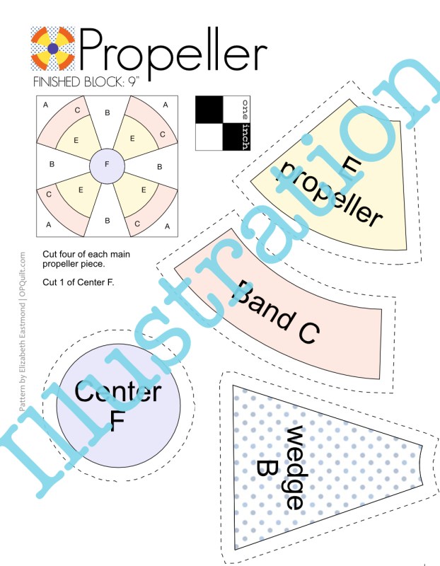
So when I turned to the Blossom pattern (which in turn has it beginnings in the traditional Flowering Snowball block), I didn’t have the right size. Because…

…last spring I discovered that over half of my computer files were corrupted. Not a virus. Just gone (it’s complicated). And 50 percent of those were my more recent pattern files. So many patterns that I’d written could never be updated. Unless…unless…I recreated all the missing, corrupted files to revise the pattern. Like this one:
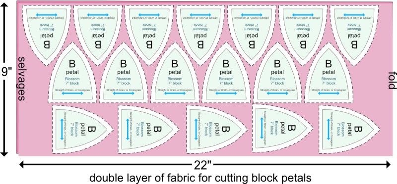
So I have been busy re-drawing the files I lost, and while I was at it, adding a new size (7″ block), and re-writing the pattern. If you’ve purchased Blossom from me before, you can go to the email you received with the pattern and re-download it. And for those who haven’t made one of my patterns, and want to try it, I put it on sale for a few days if you want to grab it now in my pattern shop.
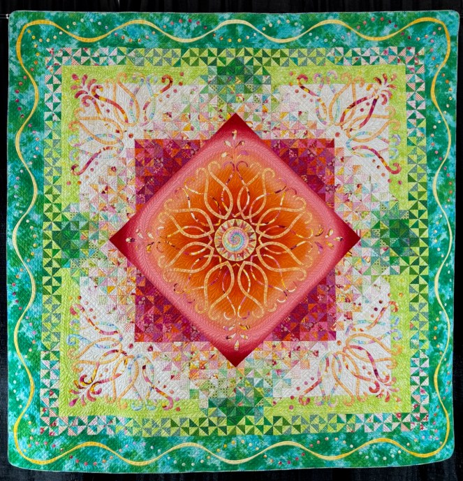
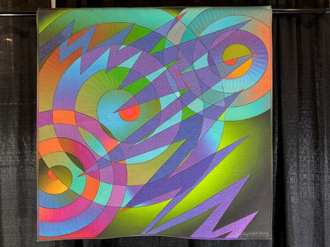
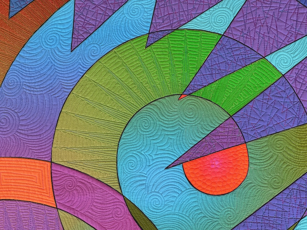
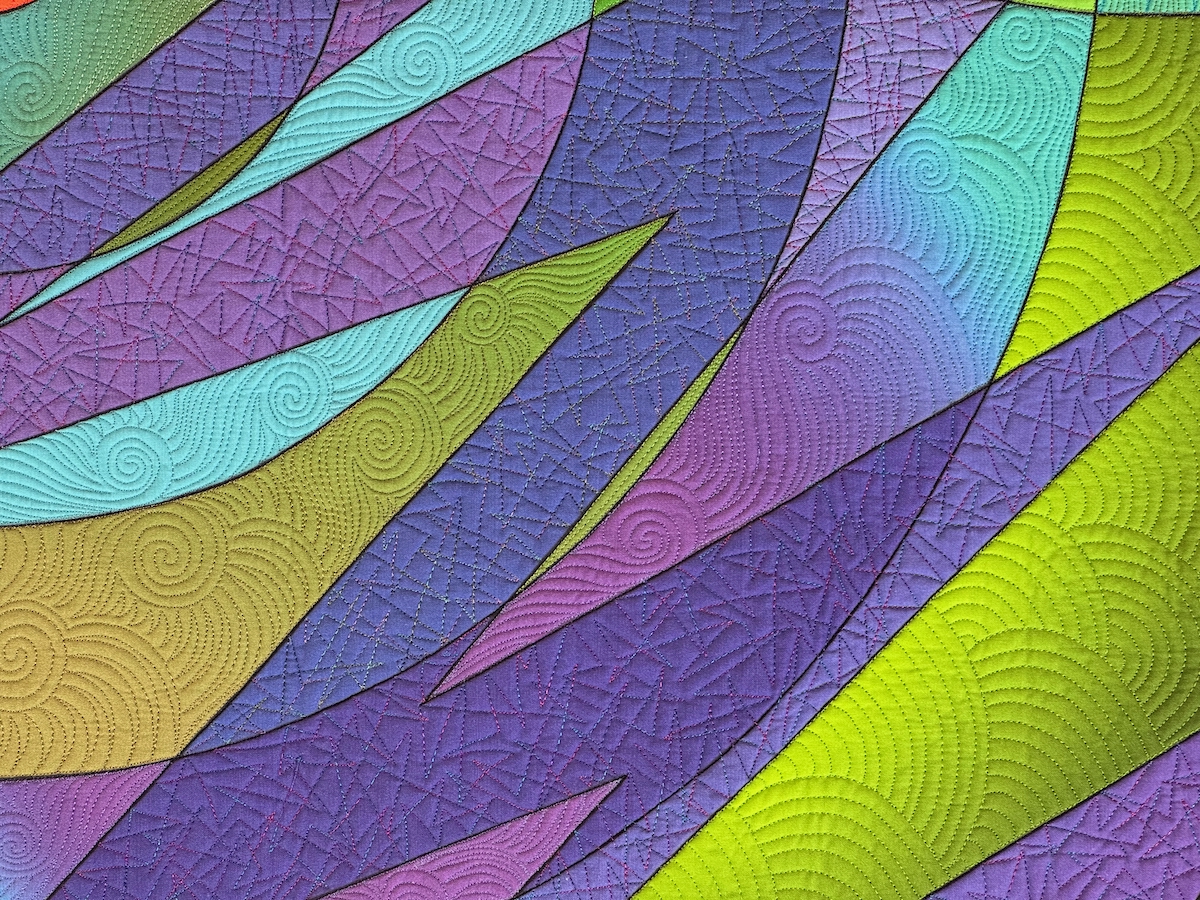
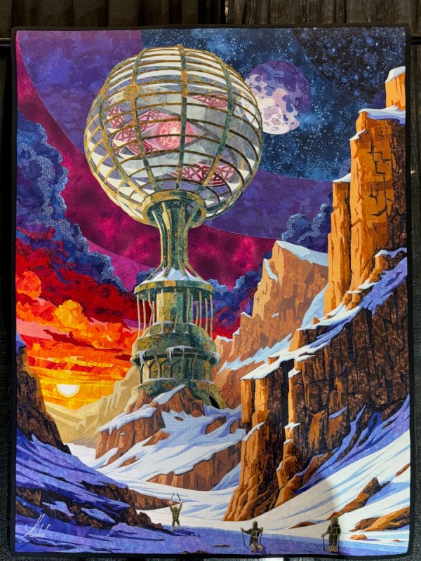
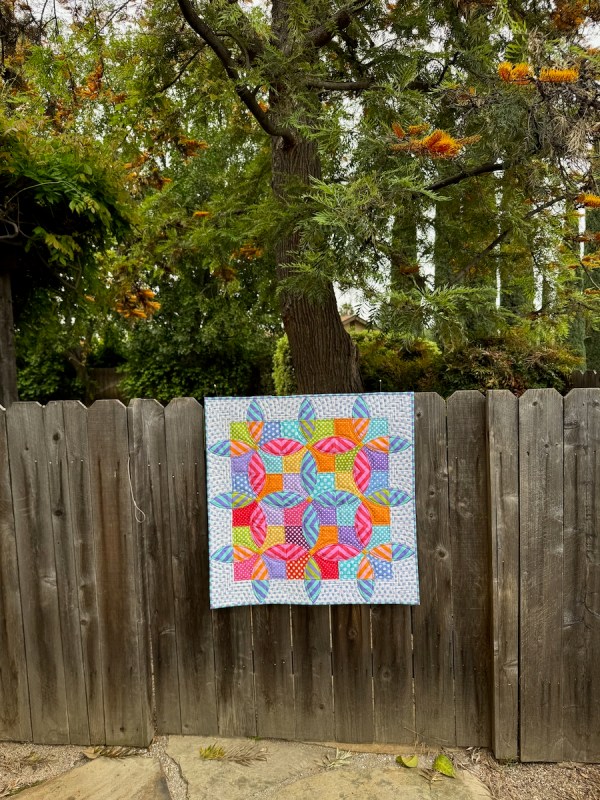
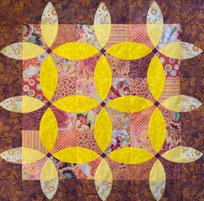
This a photo of another quilt, Aerial Beacon, that is stuck in re-write-land. I was about a month away from the release when I discovered the corrupt files. Talk about a way to stop the flow! I’ve slowly been re-creating this one, too. (Slowly is the operative word here, but it’s coming.)
Yes, I should have had it done by now, but this is what I call a “reverse flow” task. All those glowing ideals in the list in the beginning have their counterpart: discovering and ferreting out and crying inside over lost work and then redoing the lost work, I would say are just about the opposite of the bliss of being in the flow.
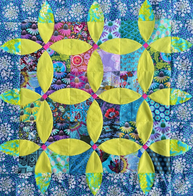
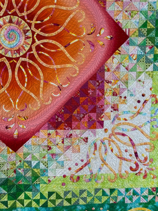
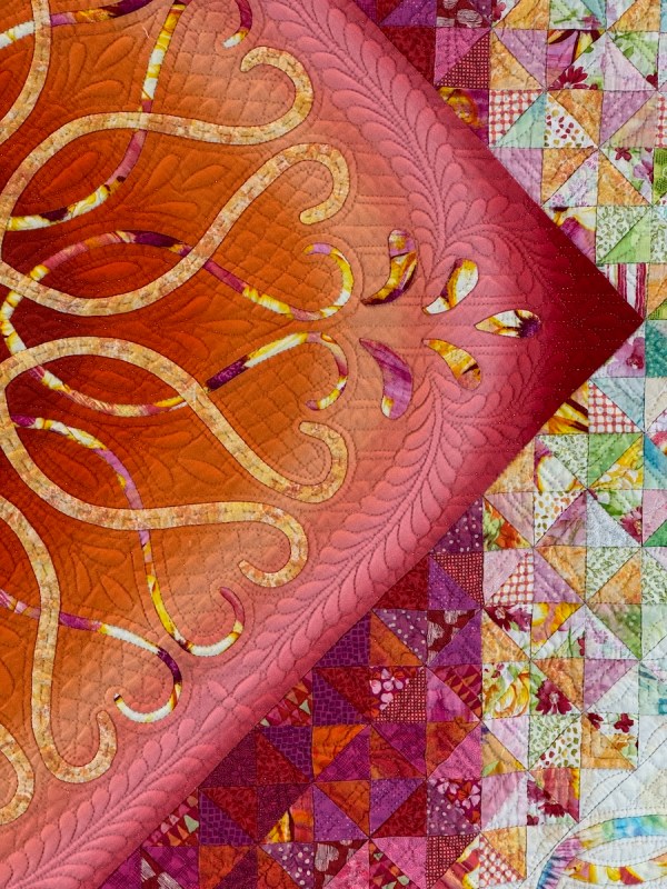
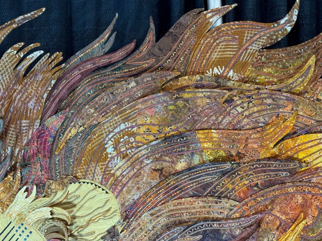
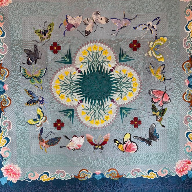
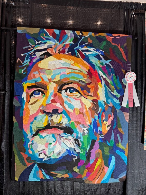
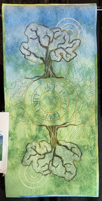
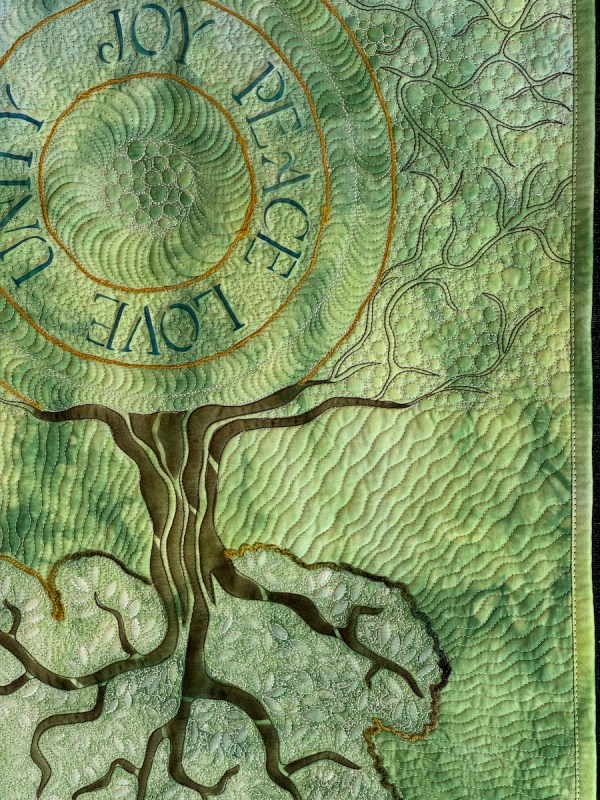
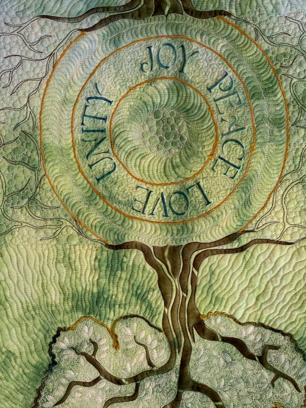
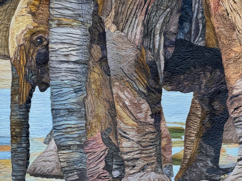
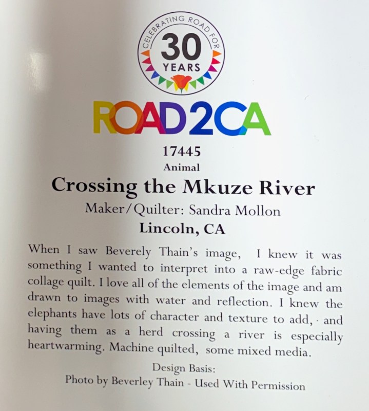
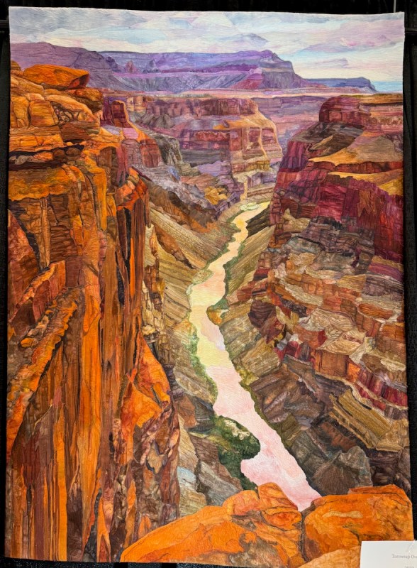
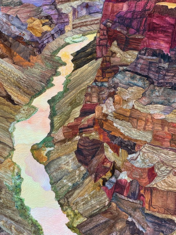
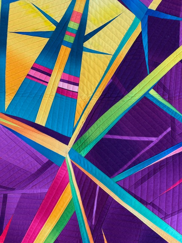
Since I was in the Blossom flow, I re-made the larger 12-inch block version as well, especially since I found that outer border fabric at Road to California this year. It’s in the needs-to-be-quilted stack.
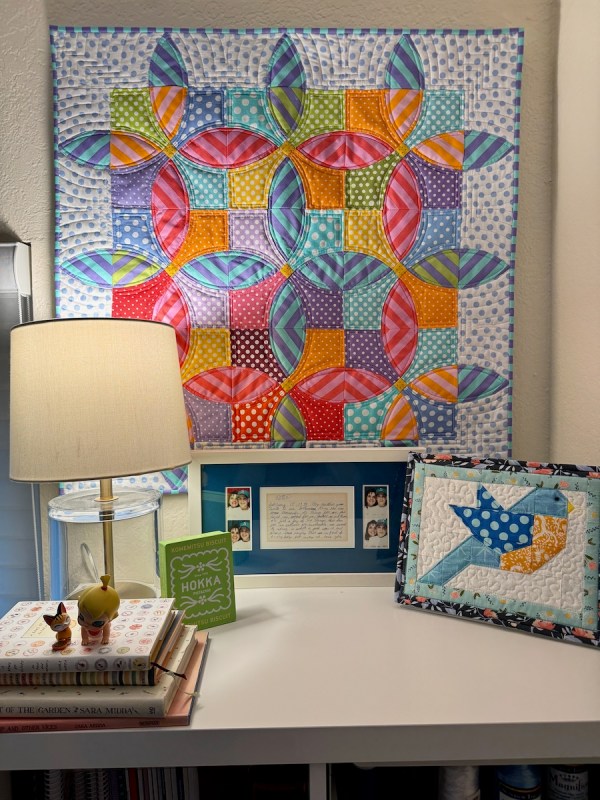
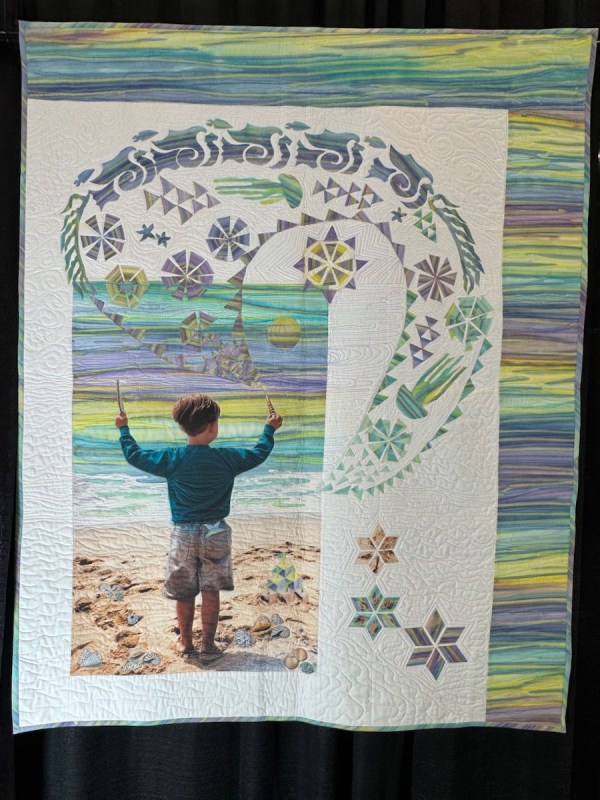
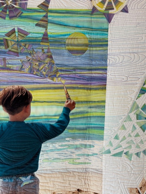
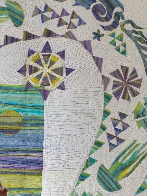
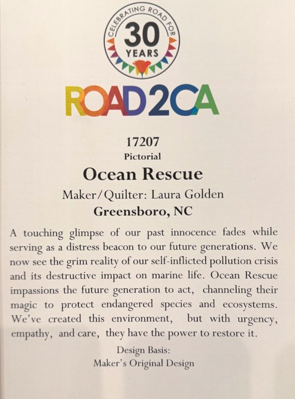
Quilt #316 • 28″ square, shown in that space where I needed a quilt
I’ll let this paragraph from Mihaly Csikszentmihalyi’s book, flow The Psychology of Optimal Experience, close up this post:
In the course of my studies I tried to understand as exactly as possible how people felt when they most enjoyed themselves, and why. My first studies involved a few hundred “experts”—artists, athletes, musicians, chess masters, and surgeons—in other words, people who seemed to spend their time in precisely those activities they preferred. From their accounts of what it felt like to do what they were doing, I developed a theory of optimal experience based on the concept of flow—the state in which people are so involved in an activity that nothing else seems to matter; the experience itself is so enjoyable that people will do it even at great cost, for the sheer sake of doing it. (from here)
I wish you all a week of flow, of enjoyable quilting, and a most happy Easter–

Other posts about Blossom, the pattern and quilts:
The newly updated Blossom Pattern (on sale), can be purchased in my pattern shop.
6″ block version: Hanagasaku, made in honor of the Olympics held in Japan
Hanagasaku: Flowering Rings • Quilt Finish

For a while I was a traveling quilter, teaching and visiting at Guilds in Southern California. During the covid shutdown, I taught several classes of this pattern, and the one above is Robin’s quilt — a study in the tones of autumn — a very successful one! You can read about her quilt here, and more, if interested.
Lastly, a post about how I moved from the simple traditional block to the larger quilt is found in this post.
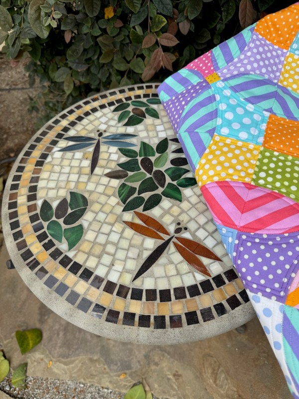
I think Easter is a good time to sit in the garden.