Something to Think About · Textiles & Fabric

Fat Quarter Shop Dreaming

FatQtrDreamingJune2013My fabulous sisters sent me a Fat Quarter Shop gift certificate for my recent birthday and I’ve had the most fun dreaming about what to buy.  I think I’ve clicked on every category in their online shop at one time or another, but after picking out my purchases (one was that Noteworthy charm pack in the lower right), I went onto their “What’s Coming” section to see what I can look forward to.  Here’s my list:

Ashbury Heights, by Dookikey Designs–I read her on Instagram and am happy to see that I like her upcoming line, with a modern twist, but different colors.  Like all of us, I trend towards medium brights in my purchasing, and I like that she has some lights and darks in her line.

Madhuri, by The Quilter Fish–These are many of my favorite colors.  Love the Far East references.

I need Christmas fabrics like I need a hole in the head, but that hasn’t ever stopped me before. I’m not really in the market for anything holiday, but I’m a total fan of Martha Negley, so just had to look at her Poinsettia and Holly line.

The Boo Crew–what can I say, but that’s it’s very cute.  And the fact that it has text (one of my “traps” in buying–but not just any text–I have to personally like it) and is by Sweetwater, also recommends it.  I know lots of lines have a fabric with words and writing on it, but like anything in life, there’a “bell curve” as to how useable it is.  And if I want to give up shelf space in my stash to house it.

2wenty Thr3e, byt Eric and Julie Comstock–Okay, all text fanatics, here’s a good set. Their traditional picture is below, but I can’t quite tell what the base color is: grey-ish beige (photo below)?, or a true cream (middle stack in above image)?

Screen Shot 2013-01-30 at 11.42.55 AM

Thesaurus, by Thomas Knauer–I saved part of my gift certificate to buy this when it lands this spring.  I loved Thomas Knauer’s first line of fabric, then was so-so about the next two.  This one looks like it will be another winner, if you ask me.  (And yes, the fact that it’s named Thesaurus doesn’t hurt.)

Last one is Return to Atlantis, by Jason Yenter.  I used his wintery line for a Christmas quilt I did a couple of years ago, and liked the quality of fabric.  While I said Madhuri has all my favorite colors, this does too–only it’s as if you added black to the Madhuri line, or lightened up the Atlantis line.

So strolling through all of this made me wonder: do we let the materials of the artist determine the picture?  Do paint artists see a certain blue in the paint store and run home to throw it all over their canvas?  I think not.  So do you think that quilters should let a certain line determine the quilt they are going to make?  I’ve done this–my Harvesting the Wind quilt came about because of a stack of their fabric and a desire to make a quilt after a tile from Portugal I’d seen on Flickr.

Many days the trend pulls quilters one way, as I saw with January’s Scrappy Trip-A-Long quilts. We love groups, quilt-a-longs, tutorials, Moda’s bake shop, and so on.  And I remember the brou-ha-ha over Emily Cier’s quilt out of Kate Spain fabrics (have we forgiven Ms. Spain yet?)–this came about because the quilt was exclusively made from Spain’s fabrics, and yet — -if you noticed the above post — I’m falling into the rut?  trap? groove? of shopping complete lines of one designer’s fabric, rather than considering the artistic impulse, figuring out what I want to do and pulling fabrics from my collection to suit the artistic vision I have. I’ve learned that while a designer’s fabric line may prompt me to plunge into a quilt, if I don’t begin with the block and my layout first, the fabric tends to sit on my shelf because I’m buying THEIR vision, not my own.

But it’s still fun to dream.

*******************************

TouristWarning

I went to Road to California — the quilt show — last weekend.  Photos coming soon.

Textiles & Fabric · WIP

WIP and Scenes from Italy

I think we are all breathing a sigh of relief that we can answer our phones again without being assaulted during dinner by robo-calls from a candidate.  Or go to our mailboxes without needing a forklift for the thousands of pounds of campaign fliers.  I live in California and thought I had it bad until we talked to our son who lives in Ohio.  My sympathies to all who live in swing states; thanks for participating in the process.

So it is so nice to return to a routine, and today is Works in Progress Wednesday, hosted by Lee over at Freshly Pieced. Actually today it is being guest-hosted by Svetlana, and she echoes my sentiment of enjoying the weekly accounting that we do every week to keep us on track.

Last night as I watched the election returns come in with my husband, sister and brother-in-law (who are visiting), I was able to finish up this seventh hexagon.  I just keep the basket of pieces downstairs by the television and work on it whenever I am parked in front of the tube.  This hexie I could christen the political hexie, for it seemed like that’s what I was watching most as I worked on it.  I don’t know what I’ll do with them all–Downton Abbey starts up in January so maybe I’ll have some more completed before I have to decide.

But I have just returned from a trip my husband and I took to Italy, where he participated in the Collegium Ramazzini, a scientific conference in Carpi (a little town northeast of Bologna).  Not only did we visit Carpi, but also Bologna, Padua (and the Scrovegni Chapel), Venice, and Burano–a colorful island near Venice of brightly painted houses.

This is a wall from the 11th century in a church in Bologna.  Love those patchwork designs.  Everything old is new again, isn’t it?

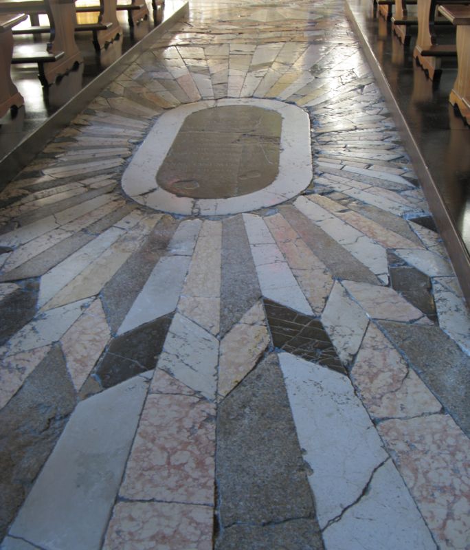
I can’t believe they let us walk on this ancient stone floor from the Peter/Paul Cathedral in Venice, but here it is.

My husband found this fabric shop for us to look at (Bologna), but I only bought fabric in a shop across from the two (slightly leaning) towers.  Below you can see the man cutting my wool challis.

I’m thinking a scarf or something.  Fabric was really expensive over there.

But they do wrap it up nicely to bring home.

I’ve been collecting tea towels for use on the back of quilts, and here’s the one from Padua.  We thought it interesting that the thing we went to see most — Scrovegni Chapel with Giotto’s frescoes — was not even listed on the back.

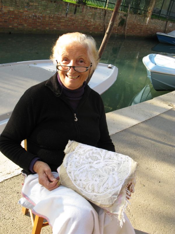
In sunny Burano, we saw a woman sitting out by the canal making lace.  By hand.  Burano is known for its lace and lacemakers, and apparently it’s a dying art because none of the young woman want to learn it.  We watched her for a while, as she used her needle and thread to create tiny stitches and knots over a paper pattern.

Here’s a close-up of her pattern.  She’s created the main flowers, then will come back in and create the webbing to hold it all together.

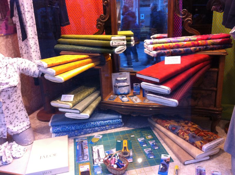
I found the quilt shop in Venice!  This is right as you come off the Ca’D’Oro vaparetto stop.

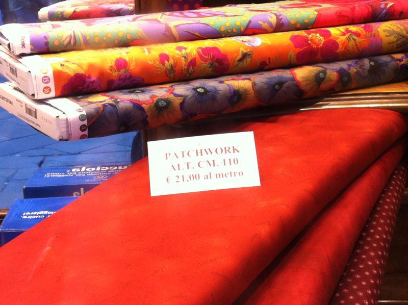
But the prices are enough to make you swoon.  Twenty-one euros a meter (39″) works out to about 25 bucks per yard.  I try to remind myself of the luxury of all the fabrics we have here in the States at about half the cost.  I’ve learned not to buy quilt fabrics imported from the United States when I’m traveling, but if I have time, I’ll duck into a shop for a pattern or an interesting notion.

I’ll leave you with three photos: the first two are from the island of Burano and the last is from our final, foggy, morning in Venice, before we headed home.

Creating · Quilts · Textiles & Fabric

Working in a Series

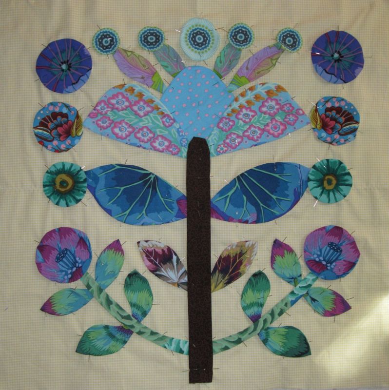
I think part of my discouragement this week was fatigue.  I’m working a stack of Kaffe Fassett fabrics.  There’s probably 40 to 50 different fabrics that I’ve collected over the years, and in this pattern it’s a challenge to get the fabrics to talk to each other within the block.

I can see, though, that working in a series has improved my ability to see what works, as I change out the leaves and some other smaller pieces, as well (above).  I found that I was less enamored of one of the earlier blocks, but it was already appliqued down and I would have been crazy to mess with it.

Here’s the final version of that block.

But I did mess with this one.  The brightly colored circles with red in them are a different line of fabric, Amy Butler, and they stand out among Kaffe’s florals. (Although I am using some Phillip Jacobs, and others from the Westminster line.)

I think the Anna Maria Horner fabric does harmonize well in terms of detail and color (the aqua circles at the top, and the second large circles down from the top, with feathers and berries).

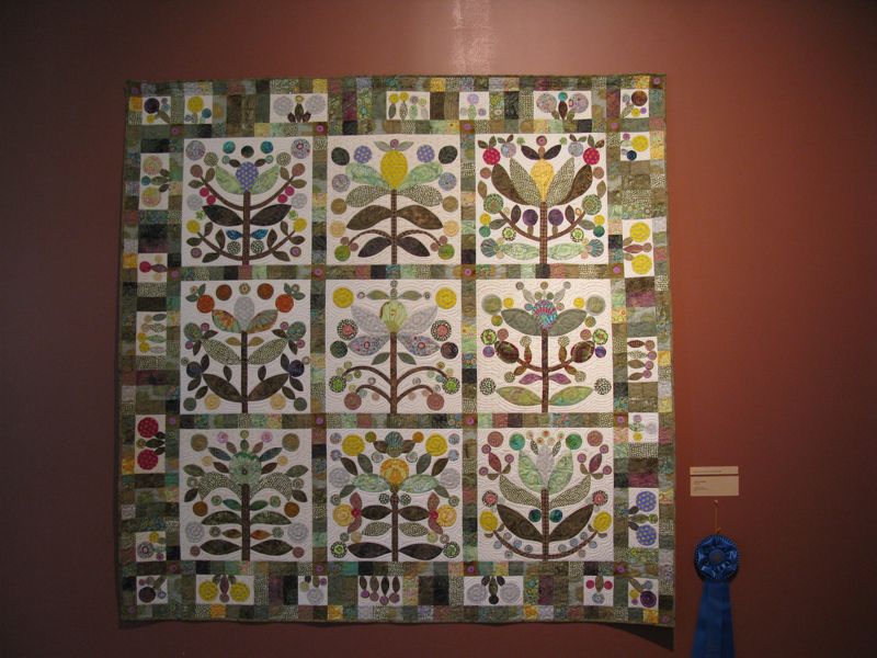
All in all, I am glad I pushed on.  I do love looking at them on the pin wall, although now I’ve turned my eye toward the borders — with more design decisions.  When I went to the Springville, Utah quilt show last summer, a version of this Kim McClellan pattern was done up in softer greens, a lovely quilt and a contrast to the bolder hues usually seen.  In this, you can see the border design.


It was certainly deserving of its blue ribbon.

And you are all blue ribbon readers–many thanks again for your encouragement!