Textiles & Fabric

Spoonflower’s Geeks

Last year Spoonflower had a contest titled Fabric 8, in which they selected 8 contestants to design a line of linked fabrics.  I loved following that group and reading about their choices.  This year’s theme is Geek Chic, and while the semifinal voting closed May 9th, I felt like an expert, since I am married to a very nice geek.  Most people think geeks are nerdy, but they are not the same thing.  And while Nerdy always includes tape-on-glasses and stacks of books with out-of-fashion clothing, Geek does not necessarily include those symbols.  And I was especially please to see some inclusion of science geeks strewn in among the computer geeks!

Here’s what I voted for:

Geek Chick 1

Geek Chic 2

But this one made me laugh out loud, but only after I looked at the title of the design: Old School.

Old School

It’s this artist’s illustration of “off” and “on,” in other words the string of 1s and 0s that run our computers today.  It’s the virtual hamsters on their wheels running like crazy in the background behind our graphics and colors and text and quilts and blog posts.

I’m really lucky to have two geeks in my life: my husband, a science guy, and my son Peter, who writes code for a living and is getting his grad degree in computer science.  If this one goes to the printing phase, I may have to get some to make him a cover for his recent tablet purchase (hint: NOT an Apple).  I hope he gets the joke!

Something to Think About · Textiles & Fabric

Fat Quarter Shop Dreaming

FatQtrDreamingJune2013
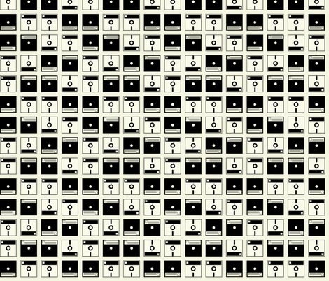
My fabulous sisters sent me a Fat Quarter Shop gift certificate for my recent birthday and I’ve had the most fun dreaming about what to buy.  I think I’ve clicked on every category in their online shop at one time or another, but after picking out my purchases (one was that Noteworthy charm pack in the lower right), I went onto their “What’s Coming” section to see what I can look forward to.  Here’s my list:

Ashbury Heights, by Dookikey Designs–I read her on Instagram and am happy to see that I like her upcoming line, with a modern twist, but different colors.  Like all of us, I trend towards medium brights in my purchasing, and I like that she has some lights and darks in her line.

Madhuri, by The Quilter Fish–These are many of my favorite colors.  Love the Far East references.

I need Christmas fabrics like I need a hole in the head, but that hasn’t ever stopped me before. I’m not really in the market for anything holiday, but I’m a total fan of Martha Negley, so just had to look at her Poinsettia and Holly line.

The Boo Crew–what can I say, but that’s it’s very cute.  And the fact that it has text (one of my “traps” in buying–but not just any text–I have to personally like it) and is by Sweetwater, also recommends it.  I know lots of lines have a fabric with words and writing on it, but like anything in life, there’a “bell curve” as to how useable it is.  And if I want to give up shelf space in my stash to house it.

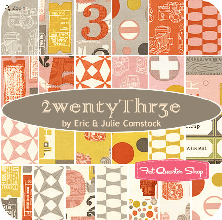
2wenty Thr3e, byt Eric and Julie Comstock–Okay, all text fanatics, here’s a good set. Their traditional picture is below, but I can’t quite tell what the base color is: grey-ish beige (photo below)?, or a true cream (middle stack in above image)?

Screen Shot 2013-01-30 at 11.42.55 AM

Thesaurus, by Thomas Knauer–I saved part of my gift certificate to buy this when it lands this spring.  I loved Thomas Knauer’s first line of fabric, then was so-so about the next two.  This one looks like it will be another winner, if you ask me.  (And yes, the fact that it’s named Thesaurus doesn’t hurt.)

Last one is Return to Atlantis, by Jason Yenter.  I used his wintery line for a Christmas quilt I did a couple of years ago, and liked the quality of fabric.  While I said Madhuri has all my favorite colors, this does too–only it’s as if you added black to the Madhuri line, or lightened up the Atlantis line.

So strolling through all of this made me wonder: do we let the materials of the artist determine the picture?  Do paint artists see a certain blue in the paint store and run home to throw it all over their canvas?  I think not.  So do you think that quilters should let a certain line determine the quilt they are going to make?  I’ve done this–my Harvesting the Wind quilt came about because of a stack of their fabric and a desire to make a quilt after a tile from Portugal I’d seen on Flickr.

Many days the trend pulls quilters one way, as I saw with January’s Scrappy Trip-A-Long quilts. We love groups, quilt-a-longs, tutorials, Moda’s bake shop, and so on.  And I remember the brou-ha-ha over Emily Cier’s quilt out of Kate Spain fabrics (have we forgiven Ms. Spain yet?)–this came about because the quilt was exclusively made from Spain’s fabrics, and yet — -if you noticed the above post — I’m falling into the rut?  trap? groove? of shopping complete lines of one designer’s fabric, rather than considering the artistic impulse, figuring out what I want to do and pulling fabrics from my collection to suit the artistic vision I have. I’ve learned that while a designer’s fabric line may prompt me to plunge into a quilt, if I don’t begin with the block and my layout first, the fabric tends to sit on my shelf because I’m buying THEIR vision, not my own.

But it’s still fun to dream.

*******************************

TouristWarning

I went to Road to California — the quilt show — last weekend.  Photos coming soon.

Creating · Quilts · Textiles & Fabric

Working in a Series

I think part of my discouragement this week was fatigue.  I’m working a stack of Kaffe Fassett fabrics.  There’s probably 40 to 50 different fabrics that I’ve collected over the years, and in this pattern it’s a challenge to get the fabrics to talk to each other within the block.

I can see, though, that working in a series has improved my ability to see what works, as I change out the leaves and some other smaller pieces, as well (above).  I found that I was less enamored of one of the earlier blocks, but it was already appliqued down and I would have been crazy to mess with it.

Here’s the final version of that block.

But I did mess with this one.  The brightly colored circles with red in them are a different line of fabric, Amy Butler, and they stand out among Kaffe’s florals. (Although I am using some Phillip Jacobs, and others from the Westminster line.)

I think the Anna Maria Horner fabric does harmonize well in terms of detail and color (the aqua circles at the top, and the second large circles down from the top, with feathers and berries).

All in all, I am glad I pushed on.  I do love looking at them on the pin wall, although now I’ve turned my eye toward the borders — with more design decisions.  When I went to the Springville, Utah quilt show last summer, a version of this Kim McClellan pattern was done up in softer greens, a lovely quilt and a contrast to the bolder hues usually seen.  In this, you can see the border design.


It was certainly deserving of its blue ribbon.

And you are all blue ribbon readers–many thanks again for your encouragement!

Something to Think About · Textiles & Fabric

(Presidents) Day in LA

My mother often says, “A change is as good as a rest,” meaning sometimes just getting out of the house and doing something different — a change — does a body good.  So we took off early to LA, and while I didn’t really expect to do anything “quilty” I did run into several design things that made me think about quilts.

These screens are from the Japanese Pavillion, the light coming through the windows in soft waves of grays and silver.  The whole pavillion is quiet and calm and filled with interesting angles and objects.

My husband and I also played hide and seek behind this giant stack of plates.  I was talking to a friend the other day and said about all they could write on my tombstone for accomplishments is washing 1.4 million dishes in my lifetime.  Some days don’t you feel invisible to the world?  I do.

Then we enetered the Pacific Standard Time exhibit, where they had this fabulous Airstream trailer.  Take It Easy, it says.  Yep.  I needed this day out.

Textiles were part of the modern design that was evolving mid-century.

Couldn’t you use this as a map for a quilt?  Half-square triangles, 30/60 triangles, curvilinear shapes balanced against grids.  Delicious.

This all-over textile is more interesting when you focus on the detail.

More half-square triangles.  And dots.

This bathing suit is called Swoon.  It was made during the war in 1942, as there was rationing on rubber.  Which means: no elastic.  So the designer used the laces to adjust the form to the wearer.

Here’s the exhibition tag.  Given that so many quilters are swooning over the recent Swoon quilt block design out on the market right now, I loved the parallel names, although they are very different.  Did you know that Catalina, another prominent swimsuit manufacturer was the original sponsor of the Miss America Pageant?  Maybe that’s why they always had swimsuit competitions.

More swimsuits.  Don’t you just love these?  (And guess what we had later for lunch?  Lobster rolls!!  They had a series of food trucks parked outside in affiliation with the exhibit, and we ate at the Lobsta Truck.)

That wooden bench in the background is so intriguing with all its cutout wood pieces all fit together like a . . . quilt.

Yep.  A hexagon barbeque pit.

Which leads me to this.  My husband drove out to LA (it’s about an hour from our house on a good day with no traffic) and I was able to stitch on my rose window block–hexagons!  Sometime I’ll have to get a good shot outside so you can see the colors.  I’ve only made one mistake in putting pieces together, which is okay with me.

So, I had a change.  Which is as good as a rest.  I’ve ignored the grading in the briefcase because it’s a holiday and I’ll have an extra day to get it done.  I’m off now to cut another rose window hexagon–I want to be sure and something to stitch on for Downton Abby tomorrow night!

Happy Presidents’ Day Weekend!