Clothing · Museums · Something to Think About · Textiles & Fabric

Power of Pattern: Central Asian Ikats

Ikat_1

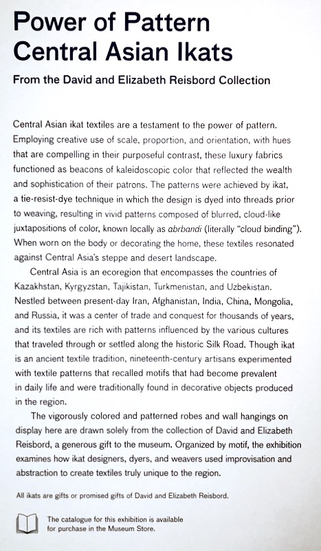
Among the most colorful clothing in the word, ikat robes — which hail primarily from the “the Stans,” or Central Asia — employ “creative use of scale, proportion, and orientation.” They are created by dying the warp (or vertical) threads of silk and cotton, sometimes multiple times.

Ikat_2Ikat_3

This past week, my husband and I had a chance to head into Los Angeles County Museum of Art (LACMA) to see this collection.  Here’s the notice in the gallery:

IkatTitle_1

Ikat_4

Ikat_4a
Note the embroidered cuff.

Ikat_5 Tajik Wedding Ritual

This photo of a Tajik Wedding ritual (1865-1872) shows the rich patterns of both men and women in their ikat robes.  I did a Google Image search, which has lots of results, but these older robes, as shown in LACMA, are rarer now.  In that Image search, I saw lots of machine-made ikats, which don’t have the subtlety of the hand-dyed.

Ikat_6

On the right is a series of threads which will form the warp threads in a loom, showing their various patterns from dying them using a resist process:

“Fabricating an ikat design demands vision as well as time. Before any actual weaving takes place, the lead craftsperson must picture a fully fleshed-out color pattern. Next, assistants soak the warp threads of the textile-to-be in a series of dye vats—up to eight in total—accumulating hues along the way. Prior to each dying phase, all stretches of warp are strategically bound with dye-resistant greasy thread, leaving exposed only those portions meant to be colored.

“By repositioning the dye-resistant thread before every immersion, textile makers gradually cover the entirety of the warp in an array of different tones. The most skilled designers will subject some sections of the material to multiple immersions, combining red and yellow dye to produce sunset orange, or red and blue dye to yield rich royal purple.

“Finally, when the Technicolor warp is ready, loom operators stretch it taut and gird it with a cotton or silk weft. The result is a long, narrow oblong textile bearing the designer’s repeating geometric pattern. This can be shaped into an eye-catching coat, or alternatively kept two-dimensional and made into a wall hanging” (from an article in the Smithsonian Institution Magazine, when they mounted their exhibit of ikat).

IkatTitle_3
LACMA’s didactic label in the exhibit
Ikat_7
I love the visual doubling and tripling of pattern and color in this robe.

Ikat_7bIkat_8

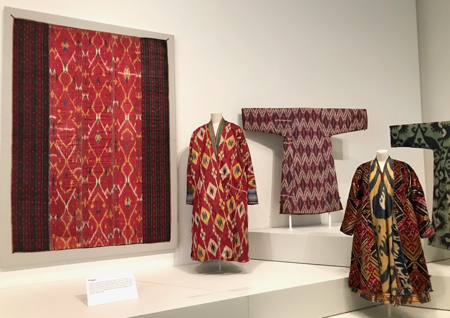
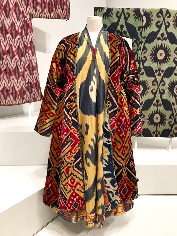
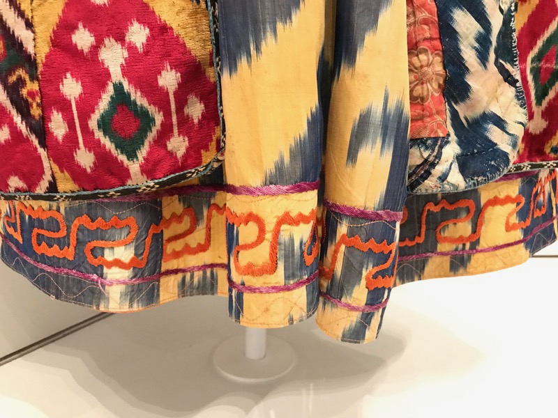
I think the guards thought I was crazy when I came to this robe.  I kept crouching down, zooming in, trying to capture the details of what I would call a type of kantha stitching, embroidery, hand overcasting.  It was a riot of color and texture and pattern:

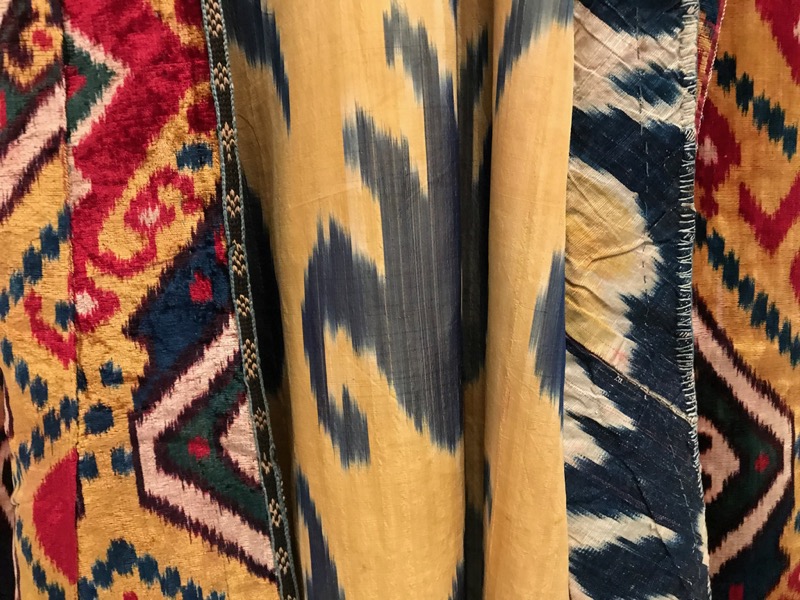
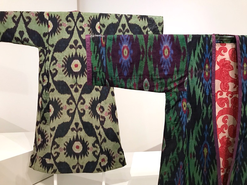
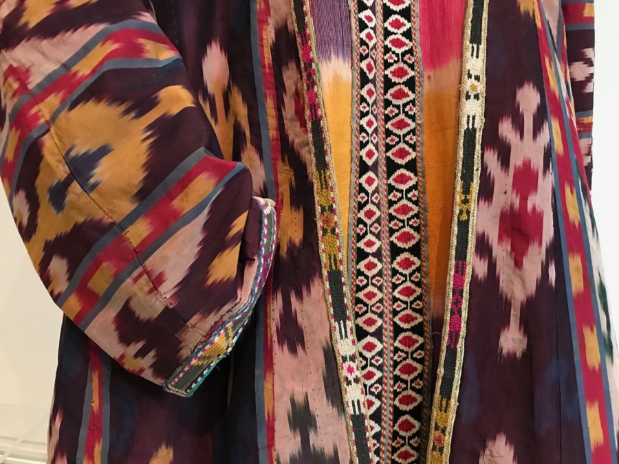
You can see the nature of the ikat weaving, which blurs the edges as the weft yarns are woven through those pre-dyed warp yarns.  To make velvet, two rows of weft yarns are needed, instead of just one, so velvet robes were considered top of the line.  In the outfit above, it is the outermost robe.

IkatTitle_2

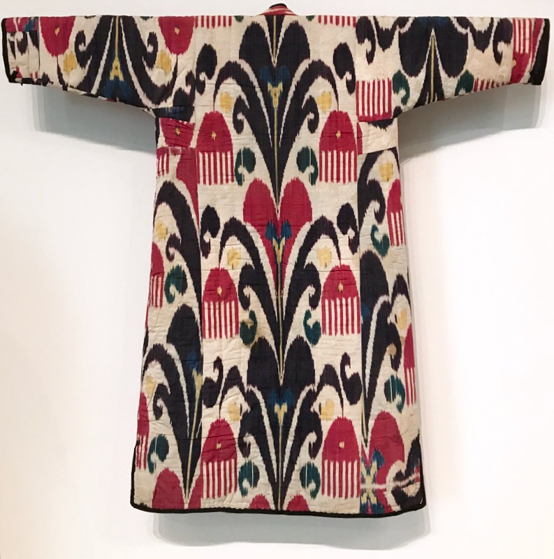
I took so many photos, that I’m not really sure which title goes with which picture, but I enjoyed reading the names of the clothing: a woman’s robe is a Munisak, a woman’s dress is a Kurta, and a man’s robe is a Chapan.

“Defined by an hourglass sihouette produced by the gathered fabric at each side of the waist, a munisak was used throughout a woman’s life for significant events, from her wedding to her funeral.  As such, it was an important part of her dowry” (LACMA text).

Ikat_9Ikat_10Ikat_10aIkat_11Ikat_12

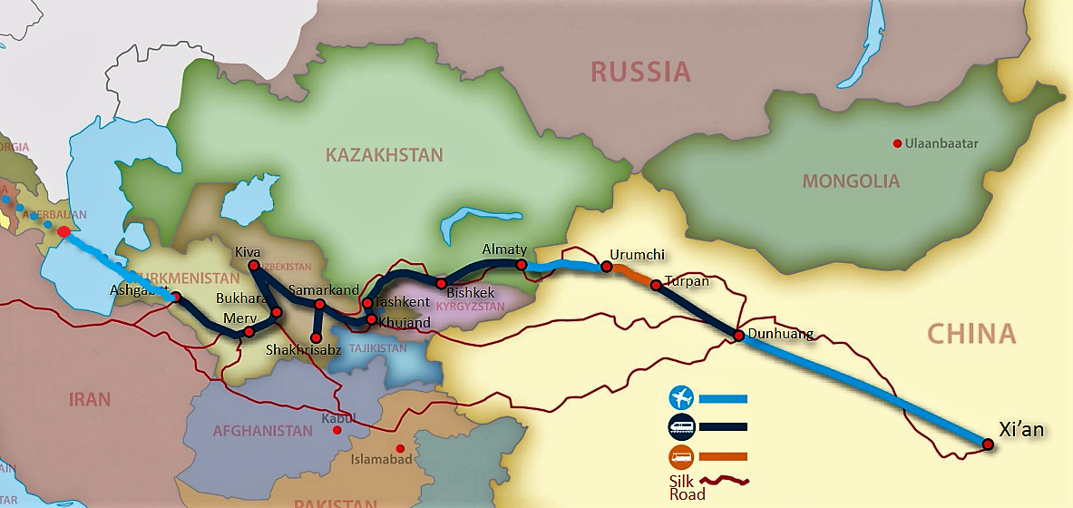
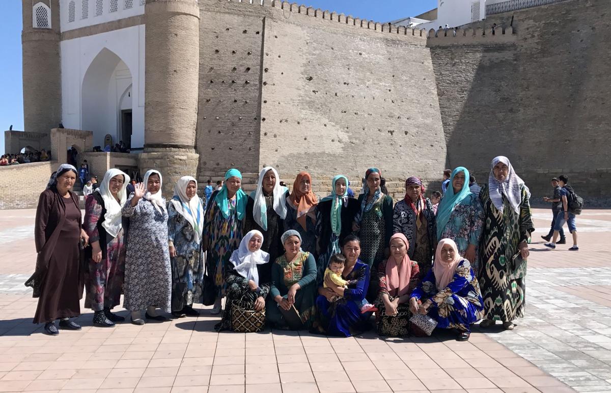
Recently, my friend Judy had traveled to this area with her husband, so I was familiar with the term “the Stans,” and what the area looked like.  Although some consider that term a snub (“stan” means land, as in Afghanistan is the land where Afghanis live), I think it works well for those of us not familiar with where these countries are:

Map of The Stans
Image sneaked off of her travel blog, *here*
Women and Ikat_2017
Women and their Ikat Robes (2017), from *here*
106-Turkish-Coat_Folkwear
Turkish Coat, pattern #106

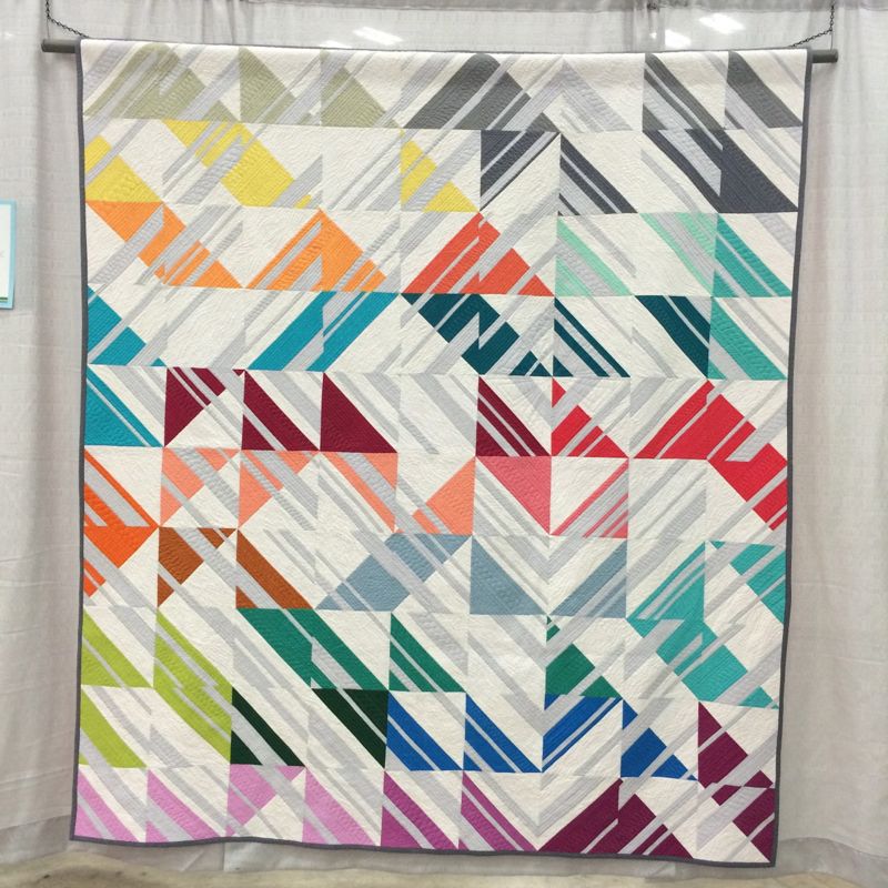
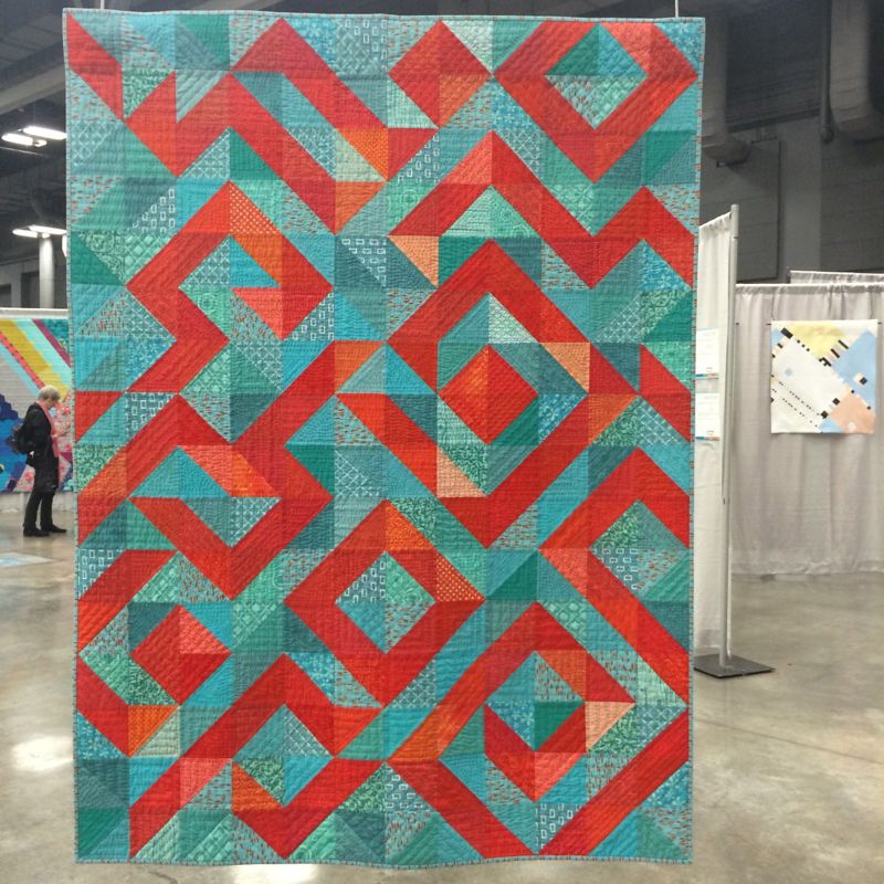
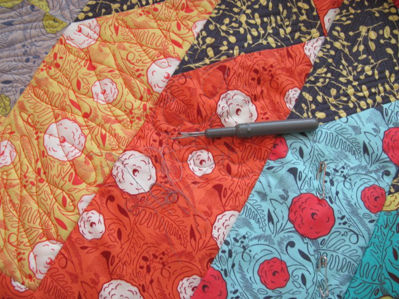
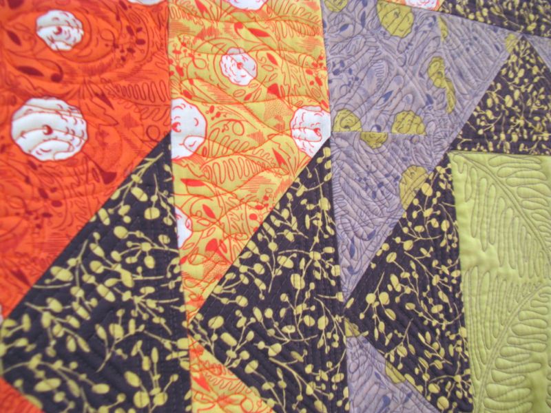
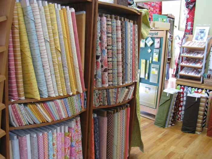
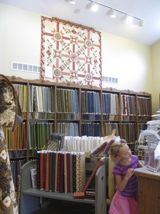
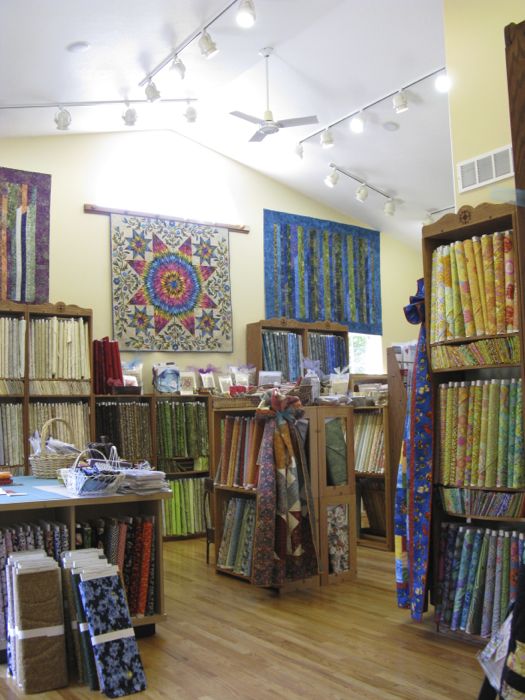
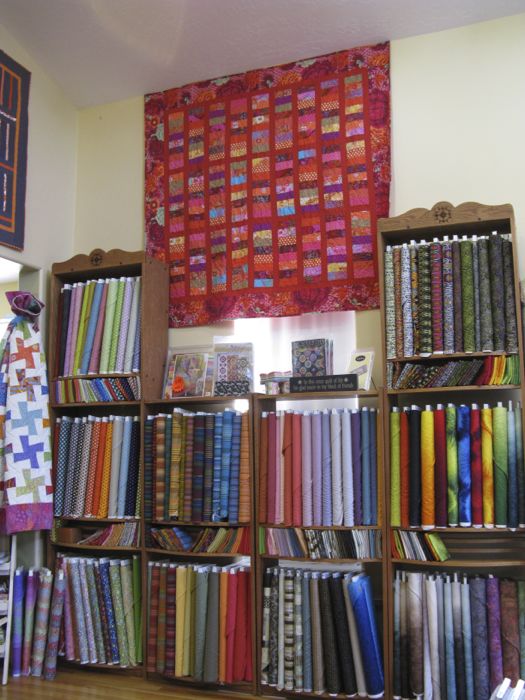
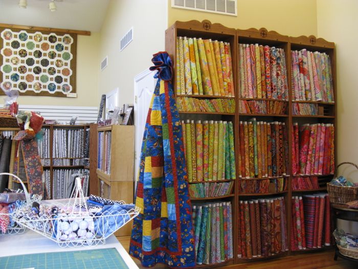
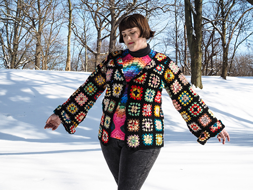
While we were in the LACMA exhibit, I told my husband that many quilters have used FolkWear patterns to make a similar robe, and added detailed surface decoration.  I first learned about ikat when I took a class in Houston several years ago from Roberta Horton, a reknowned quilter, who showed us ikats from her line of fabrics, made in India:

Ikat_14.jpg

Although I was a Clothing and Textile Major in college, I’d didn’t remember hearing about this fabric before; perhaps that why I wanted to blog about it today.  But in the quilting world, we also have variants of these colorfully patterned robes worn by these people from Central Asia.

Tabula Rasa Jacket_thequilttree.png

I’ve seen the Tabula Rasa jacket and all its variations, from a pattern by FitForArt.  Perhaps it’s the blurring of the lines between our patterned quilts and these beautiful ikat robes?  The more surface decoration the better?

crocheted jacket

Not always. I’ve also seen some not-so-great versions of handmade clothing that were patterned to within an inch of their lives, certainly showing their makers’ skill but not always on the level of what was in that exhibit.

The brilliant thing about these ikat robes is the sense of balance that is present.  Even in the layering of the different patterns, something pulls them together, links in either color or design.  A worthy goal for our own creating, wouldn’t you say? whether it be in quilts or robes or clothing.

Ikat_13

This was another experience that showed me that old truth: it’s always good to get out of my head, my studio, and the endless loop of social media, in order to gain inspiration from other places in the world.

Happy traveling, and Happy Father’s Day!

Wedding Day for Us
The day my husband became a father to four children.
Quilts

Prints Charming and QuiltCon

Michael Levine's stripes I admit it–I was in two fabric stores today: Michael Levine’s in Los Angeles (where they had 10% off all quilt fabric) and Sew Modern (always a treat to visit).  I went to Los Angeles as part of my week-long This-Will-Matter-Spring-Break experience, which also means I’m trying to avoid cleaning out the garage, or other household chores, but I did love Lily van der Stoker’s take on housework, seen at the Hammer Museum at UCLA: Lily van der Stoker Charles Gaines I’d gone to see Charles Gaines’ work, as he’s all about the grid, but the pieces I really wanted to see were in an area of the gallery that was roped off because of maintenance (which made me a bit crazy).  Above is a schematic of fallen leaves off a tree (you can see the branches in the background), but it’s something you just have to see–I can’t explain it.  And then I topped that all off with four hours of LA traffic (Motto: You Aren’t in a Hurry, Are You?) and a fun night at my local quilt guild. And all around was pattern.  The stack of fabrics I bought were prints.  The art I saw in the gallery was based on the grid and time and three-dimensions and it was all this idea of marks on paper, on photographs. . . no blank space unless it was part of the idea of his work.  But the filled–in little squares defined those blank spaces. QuiltCon Solids Now look at this.  This is predominantly what I saw at Quiltcon: solids.  Yes, chopped up, sliced, diced and pickled, but all solids (kidding about the pickled part).  Over and over.  And straight lines.  Over and over.  Don’t get me wrong–I really enjoyed the show, only tiring of the square-in-a-square or rectangle-in-a-rectangle when I saw it too often (time to move on now, peoples). Where were the prints?  There’s been a healthy discussion going on on Instagram (just click on the button on the right to be taken to my feed, where you’ll also find the names of the makers of the following quilts) about what happened to the prints? AlisonGlass_QuiltCon I was a total fan-girl for Alison Glass and her prints. AlisonGlass_QuiltCon2 Heather Ross Selfie And here is Heather Ross, she of print fabrics fame, agreeing to a selfie with me (yes, I’m a fangirl there, too).  But I did find some prints, and I thought I’d show you them.  Notice also how many straight lines there are.  Yes, there seems to be a bias against curved seams, with a few notable exceptions (Leanne Chahley’s fine work comes to mind), but here’s a few quilts that had print fabrics: QuiltCon_1 QuiltCon_2 This was a small quilt–maybe 24″? QuiltCon_3 QuiltCon_4 Lee Heinrich also does excellent work with prints, making them modern by her treatment of them through repetition and color-shifting. QuiltCon_5 When there were prints, they were more like this one, where the print “read” as a solid, disappearing. QuiltCon_6 Caught in the QuiltCon wild: a quilt with prints AND curves. QuiltCon_7 And another, with detail shown below. The prints aren’t try to disappear, they are there in all their patterned glory. QuiltCon_7a QuiltCon_8 Here’s another great use of prints, by the talented duo of Lora Douglas (piecing) and my friend Linda Hungerford (quilting).  Again, click on Instagram and scroll through the photos, then click to see the captions, where I identify all these quilts and their makers (offending several in my family with my quilt-heavy feed–cue eyeroll). QuiltCon_9 Final print-prominent quilt of QuiltCon for this grouping.  Like I said, the majority of quilts were solids, pieced and quilted in straight lines.  Glorious, but there is obviously a bias.  Now take a look at what WE, the QuiltCon attendees were wearing: Brightly Colored Tote A mix of solids and prints. CharlieHarper backpack Charlie Harper on a backpack. Show Attendees Her scarf? Print.  His body?  Print. Storybook GirlI wish I’d had the guts to ask Storybook Lass for a photo showing the front of this dress.   And here was a quilt by Windham Fabrics, a manufacturer: WindhamFabrics Chairs Stitching Jessica And the lovely young woman who sat manning the Sit and Sew Booth, with a lot of fun PRINT fabrics (her creation after sitting there for four days). Malka Dubrawsky Malka Dubrawsky, who has wonderful bold prints (yes, I was shameless in asking for selfless), as well as Vanessa Christensen (below) of V and Co. with lots of fabulous prints in her line of fabrics (although she is showing a solids quilt example for our class). Vanessa Christensen In talking with the saleslady at Sew Modern today, she saw some of the same thing (as she cut my yardage of. . . what else. . . prints), but here’s hoping that the Modern Quilt movement will start to branch out as the skill level grows of these quilters, finding ways to incorporate print into their modern version.  Next show is in a year, in Pasadena.  Stay tuned. Giveaway BannerI was totally impressed with all the things you readers have been doing, from cleaning out cupboards, to fixing computers to making blankets and quilts. Since today is March 17th, St. Patrick’s Day, I chose the 17th commenter for one prize, then did a double-algorhymic interpolation to pick the second winner.  Just kidding, I picked the first person who wrote, because Vanessa Christensen was the giving away tons of cool stuff in her class, but I was number 1 and NEVER got picked.  Ever.  So I thought that our Number One should win something.  Congratulations–I’ll send you an email to get your mailing addresses.

Winner #1Winner #2

Quilts

Quilting. . . and a Sticky Question

Facets Quilting_1

It begins here.  I printed off a picture of my quilt, then took a fine-point sharpie to “quilt” in the designs I thought I would do.

Facets Quilting_2

Then this happens.  Over and over, on each row.  For every hour quilting, I spent half an hour unpicking.  Wrong color thread.  Wrong pattern.  Wrong shape.  Wrong style.

Facets Quilting_4

Finally, things start working.

Facets Quilting_3

Facets Quilting_5

I admit it.  The last row got stippled, as I was pretty tired and my shoulders hurt from quilting.

Facets Quilted_1

I put it up on the pin wall, but something’s not working.

Three Tries for Facet

I pin up different centers–hard to see on this small picture, but I know it’s the center.  I call in my resident quilt expert.  “Looks nice,” he says, in the same tone of voice as when he answers the question “Does this make me look fat?”  I know now what is wrong, but I am loathe to admit it.  I turn out the light and go to bed.

Facets unpicking_1

In the morning, I pick up my seam ripper.  Unpicking dense quilting gives you a chance to think.  A lot.  Here comes the sticky question, but first the set-up.  I own a good-quality Viking/Husqvarna sewing machine, but it was purchased before we all started quilting so much on our quilts, even though it is called the Quilt Designer.  After three tries, I finally found the foot that works for me, the tension, the everything to allow me to quilt on my machine.  But my quilting doesn’t look like Judi Madsen’s on The Green Fairy, or on other blogs that I haunt.  And I know why: my domestic sewing machine, without a stitch regulator, cannot compare to what a long-arm can do.  Or even a baby long-arm.  It’s just me and the thread, me and the pedal, my hands moving supposedly in sync with the speed of the machine.

But it’s not enough anymore, is it?

Facets unpicking_2

What was wrong with the middle was my quilting.  The shape of the fern, the stitches that hover near even, but occasionally veer into very small or a bit-too-big, the whatever–it was just wrong.  Free-Motion Quilting — the REAL free-motion quilting, has its warts, showing the artisan behind the tool.  But that’s not what we are after anymore, is it?  We want perfection: no bobbles, no wobbles.

So after three hours of unpicking, I am back here.  And the reality of where our industry is heading today is that if I want a quilt that I feel I can enter in a show, or display wherever, I’ll have to step up on the quilting front, because no matter how you look at it, the ones with the bigger, more extensive machines with stitch regulators will always have it over me on my little domestic machine. Because of the limitations of my tools, I don’t know if I can make it right.

But I’ll try.

˚˚˚˚˚˚˚˚˚˚˚˚˚˚˚˚˚˚˚˚˚˚˚˚˚˚˚˚˚˚˚˚˚˚˚˚˚˚˚˚˚˚˚˚˚˚˚˚˚˚˚˚˚˚˚˚˚˚˚˚˚˚˚˚˚

Note: You may occasionally see ads here placed by my blogging software.  They place ads so I can blog for free.  It’s an okay trade-off.

Quilt Shops

Elaine’s Quilt Block–Salt Lake City, Utah

Elaine's_1

Whenever we go to Utah to visit relatives, I try to find a quilt shop to visit.  Elaine’s Quilt Block quilt shop is very close to my sister-in-law’s house, which could be verrrry dangerous, as you’ll see once we step inside.  Featured in the Quilt Sampler edition of Fall/Winter 2011, the building was built to be a quilt shop, and it is a delightful place to visit.  The address is  6970 South 3000 East, Salt Lake City, Utah 84121, and their website is *here.*  Their phone number is 801-947-9100.  They are located inthe Cottonwood Heights section of the city, up on the southeast bench of the mountains, if you know your way around, and are just off the 215 belt route freeway.

Elaine's_2

Elaine's_3

This is the view as you step inside the front door–bolts and bolts of fabrics, notions, light and bright, tall ceilings, a welcoming staff and so much to see!

Elaine's_4

Elaine’s has three levels and this is the stairs headed up to the upper level, which I’ll show you in a minute.  The lower level is classrooms and I didn’t visit there, but wanted to post this photo so you can see the cute displays they have tucked around the shop.  There are many project and quilt samples and they are all such good ideas–I want to make so many of them.

Elaine's_6

Elaine's_7

I’m still standing in the doorway, looking to my right. . .

Elaine's_8

. . . and a little further inside.

Elaine's_9

At the back of this main room/entryway, they have all their magazines, some more displays and samples.  The main room is flanked by two other large rooms with dramatic high ceilings–the better to show off quilts!

Elaine's_10

Entryway into the left room, which trends to Thimbleberries, Civil War and reproduction-style fabrics.  They have a huge selection.

Elaine's_11

Elaine's_12

Elaine's_13

The room to the right is where my heart resides: Kaffe Fassett fabrics, Australian imports, brights, batiks.

Elaine's_14

Elaine's_15

There are tables everywhere so you can lay out the fabrics for selecting colors for a quilt.  I loved the small decorative motif at the top of the shelving units.

Elaine's_16

The black and white section.

Elaine's_17

Rows of batiks.

Elaine's_18

And underneath the lines of fabrics are folded fat quarters.  I had a fun time with those, as I had a limited time and had to pick quickly (note to self: leave more time for Elaine’s in the future).

Elaine's_19

Upstairs are children’s and sale fabrics and Christmas and I believe, solids.

Elaine's_20

No, I didn’t have to carry my bolts downstairs to be cut–there is a large cutting table right in the middle of this room, and they cut it for me there.

Elaine's_21

At the main register, where I checked out, was this board of Block of the Month quilts they are running through the store.  I snatched one more pattern to add to my selection of fabrics, because of course, I need another project like I need a hole in the head, but it was the Thimble Creek Christmas quilt Santa’s Village pattern and it was charming (see below).

SantasVillage Thimblecreek

And that to me is one of the values and advantages of shopping at a local quilt shop like Elaine’s.  When you physically step inside, you are energized by all the creativity and samples and ideas that the shop owner has brought to their store.  I do both LQS and online shopping, but I feel more inspired by visiting a shop and seeing the fabrics, touching the samples and projects, turning them over in my hand and in my mind.  I hope you feel the same!

Textiles & Fabric

Spoonflower’s Geeks

Last year Spoonflower had a contest titled Fabric 8, in which they selected 8 contestants to design a line of linked fabrics.  I loved following that group and reading about their choices.  This year’s theme is Geek Chic, and while the semifinal voting closed May 9th, I felt like an expert, since I am married to a very nice geek.  Most people think geeks are nerdy, but they are not the same thing.  And while Nerdy always includes tape-on-glasses and stacks of books with out-of-fashion clothing, Geek does not necessarily include those symbols.  And I was especially please to see some inclusion of science geeks strewn in among the computer geeks!

Here’s what I voted for:

Geek Chick 1

Geek Chic 2

But this one made me laugh out loud, but only after I looked at the title of the design: Old School.

Old School

It’s this artist’s illustration of “off” and “on,” in other words the string of 1s and 0s that run our computers today.  It’s the virtual hamsters on their wheels running like crazy in the background behind our graphics and colors and text and quilts and blog posts.

I’m really lucky to have two geeks in my life: my husband, a science guy, and my son Peter, who writes code for a living and is getting his grad degree in computer science.  If this one goes to the printing phase, I may have to get some to make him a cover for his recent tablet purchase (hint: NOT an Apple).  I hope he gets the joke!

Something to Think About · Textiles & Fabric

Fat Quarter Shop Dreaming

FatQtrDreamingJune2013My fabulous sisters sent me a Fat Quarter Shop gift certificate for my recent birthday and I’ve had the most fun dreaming about what to buy.  I think I’ve clicked on every category in their online shop at one time or another, but after picking out my purchases (one was that Noteworthy charm pack in the lower right), I went onto their “What’s Coming” section to see what I can look forward to.  Here’s my list:

Ashbury Heights, by Dookikey Designs–I read her on Instagram and am happy to see that I like her upcoming line, with a modern twist, but different colors.  Like all of us, I trend towards medium brights in my purchasing, and I like that she has some lights and darks in her line.

Madhuri, by The Quilter Fish–These are many of my favorite colors.  Love the Far East references.

I need Christmas fabrics like I need a hole in the head, but that hasn’t ever stopped me before. I’m not really in the market for anything holiday, but I’m a total fan of Martha Negley, so just had to look at her Poinsettia and Holly line.

The Boo Crew–what can I say, but that’s it’s very cute.  And the fact that it has text (one of my “traps” in buying–but not just any text–I have to personally like it) and is by Sweetwater, also recommends it.  I know lots of lines have a fabric with words and writing on it, but like anything in life, there’a “bell curve” as to how useable it is.  And if I want to give up shelf space in my stash to house it.

2wenty Thr3e, byt Eric and Julie Comstock–Okay, all text fanatics, here’s a good set. Their traditional picture is below, but I can’t quite tell what the base color is: grey-ish beige (photo below)?, or a true cream (middle stack in above image)?

Screen Shot 2013-01-30 at 11.42.55 AM

Thesaurus, by Thomas Knauer–I saved part of my gift certificate to buy this when it lands this spring.  I loved Thomas Knauer’s first line of fabric, then was so-so about the next two.  This one looks like it will be another winner, if you ask me.  (And yes, the fact that it’s named Thesaurus doesn’t hurt.)

Last one is Return to Atlantis, by Jason Yenter.  I used his wintery line for a Christmas quilt I did a couple of years ago, and liked the quality of fabric.  While I said Madhuri has all my favorite colors, this does too–only it’s as if you added black to the Madhuri line, or lightened up the Atlantis line.

So strolling through all of this made me wonder: do we let the materials of the artist determine the picture?  Do paint artists see a certain blue in the paint store and run home to throw it all over their canvas?  I think not.  So do you think that quilters should let a certain line determine the quilt they are going to make?  I’ve done this–my Harvesting the Wind quilt came about because of a stack of their fabric and a desire to make a quilt after a tile from Portugal I’d seen on Flickr.

Many days the trend pulls quilters one way, as I saw with January’s Scrappy Trip-A-Long quilts. We love groups, quilt-a-longs, tutorials, Moda’s bake shop, and so on.  And I remember the brou-ha-ha over Emily Cier’s quilt out of Kate Spain fabrics (have we forgiven Ms. Spain yet?)–this came about because the quilt was exclusively made from Spain’s fabrics, and yet — -if you noticed the above post — I’m falling into the rut?  trap? groove? of shopping complete lines of one designer’s fabric, rather than considering the artistic impulse, figuring out what I want to do and pulling fabrics from my collection to suit the artistic vision I have. I’ve learned that while a designer’s fabric line may prompt me to plunge into a quilt, if I don’t begin with the block and my layout first, the fabric tends to sit on my shelf because I’m buying THEIR vision, not my own.

But it’s still fun to dream.

*******************************

TouristWarning

I went to Road to California — the quilt show — last weekend.  Photos coming soon.