Betty Crocker Takes Up Quilting, quilt #199
36″ square
It all begins with digging deep in the stash closet for fun, familiar fabrics…
..with some quilting to show off the two different sections…
…to make up another sample for a class I’m teaching in August, for the South Bay Quilters in Torrance, California. I’m really excited to head out there to the coast in the middle of August, and to spend some time with their guild. The smaller version is 27.5″ and the larger is 36″ square.
We’d switched up our classes to this one, which is a Two-for-One class: a quilting/making component in the morning, and a free-motion primer in the afternoon.
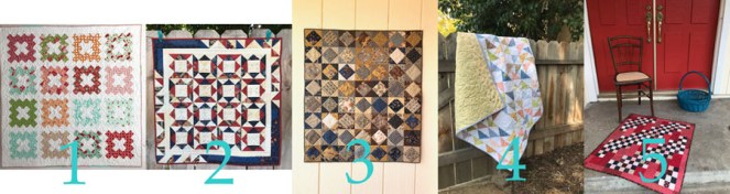
I will also be teaching at Valley Modern Quilt Guild this fall, with the trunk show/lecture on Monday, October 29th, with a workshop on that Saturday, November 3rd. I’m excited to teach there, although they haven’t told me which workshop yet. We have all summer to decide that, but here’s a quilt they may want to consider:
Improv Appliqué, taught in a demo at QuiltCon 2018. Or…
Criss-Cross, which if done in these colors, is right in time for Christmas. Or…
Sky Rocket, using just eight colors to make up into a bold, punchy mini-quilt.
I love meeting new quilters, having a chance to talk to people, and later on, sitting in a room full of quilters intent on their projects, their sewing machines humming along. Can’t wait!
It’s the first of June, so you know what that means.
Cuteness, so cute, darling, adorbs, charming, majorly adorable.
Yep, that’s why I bought these things. So by now you have figured out it’s time to sew up another Frivols, and now we are on Frivols Tin 6, which you can find on the Moda blog. Here is the errata for this box:
Note: After learning that a handful of customers had received rolls of pre-cut squares that were a bit scant, we decided to re-work the cutting to make the pieces a bit smaller and allow a little leeway. The artwork and text for the tin had already been sent for manufacturing so it could not be changed. However, the pattern has the correct sizes and instructions, and we apologize for the discrepancy. It just needed to be done.
After opening, I’m thinking: Still pretty cute, yes yes yes.
I unrolled and pressed the squares. Um.
(silence) Oh, please. (rolls eyes)
Not another one of these pastel boxes! she moans to no one in particular. Even my husband said “Another one?”
Here’s my Happy Barometer in working with my Frivols Tins so far:
Frivols #1 <happy> for it was a gift for a friend’s baby.
Frivols #2 <happy>
Frivols #3 <happy>
Frivols #4 <meh> It was a test of will, but I’m keeping it around for gifiting to future babies.
Frivols #5 <not bad> once I got going
Frivols #6. <——-extreme dismay——> I know all the Bonnie and Camille fans out there are like, “Send it to me!!” but really, a deal with myself is a deal. But that doesn’t mean I can’t change it up some.
The finished quilt measures 45″ x 54″ supposedly, but I don’t know if that is the before measurement, or the one they took after their changes. I also took a look at the outside of the tin requirements, which is code for BUY MORE FABRIC, but since that fabric — Strawberry Fields Revisited — is long gone, given the current habit of our manufacturers of deluging us with fabric lines until we are overwhelmed, then taking them off the shelves forever. (A personal pet peeve of mine.)
And given the fact that one of my 7″ by 7″ squares was cut off at the knees, and another one skewed and shredded by the cutter, it’s time to hit my own stash and pull out some colors/shapes/fabrics that will coordinate.
That piece in the upper left by 3 Sisters ought to be just fine with this group of toned florals and geometrics. And given that I’m already flummoxed by the cutting instructions, we are definitely changing up this puppy. And because I needed a project to do after Annularity’s completion, I charged on ahead (still moaning about these mushy-valued pastels).
Each Frivol has 7″ squares. Even though they warned me not to trim off any bumps, after doing one as a trial, I found I could trim off the sides without any great disaster, then proceed to cut them as they asked.
And by that night, I had One Grecian Urn. Kidding. I had one churn dash (you have to have seen the movie The Music Man to know the inside joke about Grecian Urns).
A Word About Value in Quilts.
We need some.
Value is how light something is or how dark something is. Quilts without value shifts tend to be mushy-looking, and sort of blah. It’s the mushy ones we walk right by at quilt shows. I see a lot of these, and have even made some myself (see Frivols #1 and #4). But it is value that moves your eye around a quilt, makes it interesting to look at, gives it depth. When I worked in the photo lab at University of California, the photography professor preached the same gospel: you need black as midnight and white as snow in the black and white photographs. OF COURSE there are exceptions, but we are not always making exception-quilts.
Note the two flowers above. Which one is more interesting? Which one grabs your eye, pulls it around, as you notice things? Of course you said the one of the right, a calla lilly by Robert Maplethorpe (the other one I greyed out to have only medium tones).
Same with our quilts. So what can I do with a box full of medium to medium-light fabrics? Smash them up against each other:
Now that medium brown in the upper right corner can function effectively as a “dark.” It’s still not wonderful, but I do think it’s better than the one they wanted me to do:
Kidding. Here’s theirs:
I could tell from their description I was in trouble: Sun-washed. It is a lovely little quilt, perfect for babies, and other people who don’t like contrast in their quilts, I guess. But this is my blog and you are subjected to my bias, and I trend towards quilts with good light-to-dark values.
I also believe if you are going to sell me a tin of fabrics, I should be able to make a quilt with what’s in the tin. (Right.)
It needs some kind of borders, so I was going for the look of Frivol #2, but this is a Major Fail. It has that baked potato problem. So I ripped off the borders and pulled out nearly every fabric I had in my stash to find one that I though perked up this baby.
A lovely tomatoey color of red with white dots will do nicely. I’m happy with it. Now I’ll get it quilted and bound and will show you the end product, at some later date.
What I learned from this tin of Frivols:
Don’t let your quilts be mushy.
Move beyond one manufacturer’s grouping of fabrics to avoid having your quilt be only a medium value quilt.
And some advice as well from my photography professor, given to us on the last day of class: keep your camera dry.
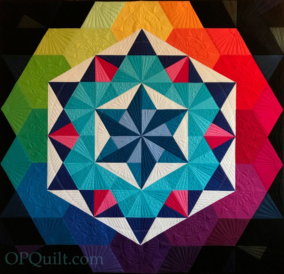
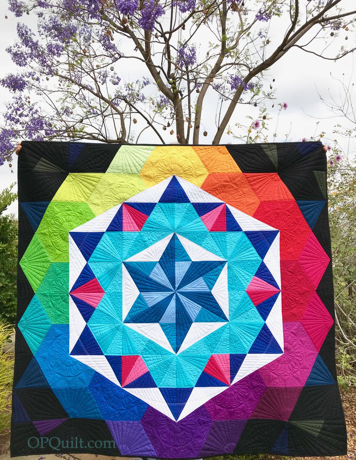
Annularity Quilt #203 Began October 2017 • Completed May 2018
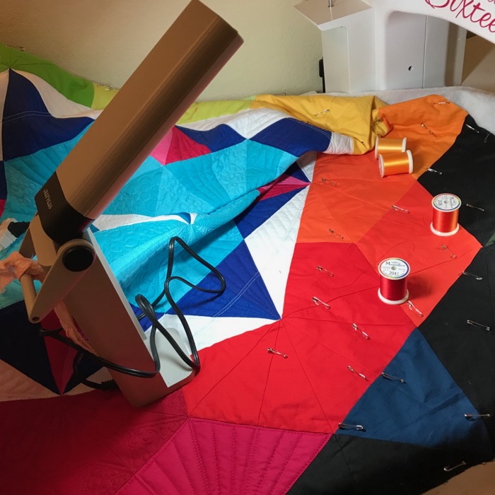
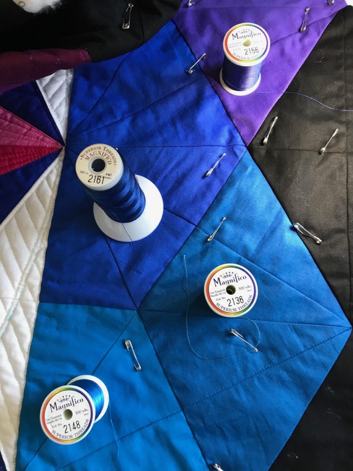
I use Magnifico thread as it has a nice sheen without being shiny, and it lays down a lovely line of stitching. In the bobbin is So Fine thread (both by Superior Threads).
I made a duplicate of Annularity II — which was a quilt I designed and made for Paintbrush Studios (which hung at QuiltCon, and most recently, Quilt Market) — because I thought the first version had been lost in the mail en route to the quilter. It hadn’t, and now I had my own top.
Then I decided to quilt my own, trying out different ideas as explained in an earlier post. But thanks to my quilt holder Dave, I can now reveal the fully quilted version to the world, as well as deliver some great news about this quilt.
Recently I’d been talking with Rick and Dot Kimmelman of Pineapple Fabrics about this quilt, hoping they’d want to use it for their booth, as they carry the full line of Painter’s Palette Fabrics. In between Point A and Point B of our discussions, they purchased Keepsake Quilting, which made many of us in the QuiltWorld very happy. And so, beginning this summer, Keepsake Quilting and Pineapple Fabrics will be the exclusive sellers of my Annularity pattern. Both Keepsake and Pineapple will also have kits available that include all the fabrics for the top and binding. (You can check Pineapple Fabrics.com to purchase within the next month, and see Keepsake Quilting’s Fall catalogue, due out the second week of August. You can bet I’ll put something up on here when I first lay eyes on my quilt in their catalogue!)
The wild and crazy back. It’s “prairie house” from the De Leon Design Group, for Alexander Henry Fabrics. I thought it might disguise any oopsies, but I was happy to note that I actually had very few. I guess maybe after ten years I’m getting better at the quilting? Much credit belongs to the Sweet Sixteen machine I use, and the threads, which always seem to balance so well.
After one quilting session, when I turned it over to check the back, I noticed I had quilted in this wedge-shaped scrap onto the back. I started to try and cut it out, then decided I kind of liked this nod to the process, so left it in. Really, you can’t see it, when looking at the overall back. (Well, NOW you do, but you didn’t at first, right?)
So, thanks for being my cheering squad, motivating me to finish up my quilt. And I hope you enjoy making yours!
My version of Annularity sat rolled up on my guest bed for ages, until I realized it wasn’t going to get quilted that way. There are no Quilting Fairies, not that I know of. (Shucks.)
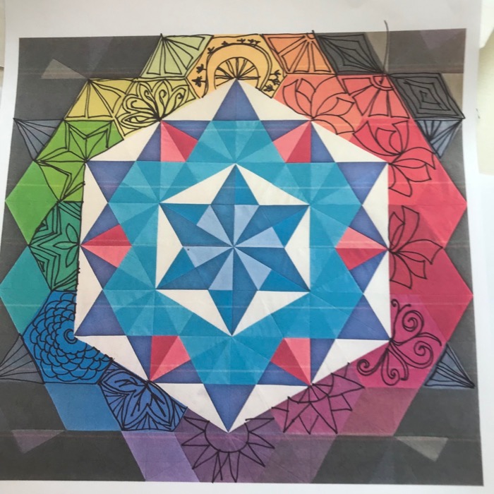
Where does quilting begin? It begins in the tortured anguished cry of “How am I going to quilt this thing?” an endeavor I described in this blog post titled Don’t Let the Process Overtake the Purpose— a terrifying something about careening off a mountain cliff sort of feeling. Yep. That’s how it starts…or doesn’t. But finally, using some advice I’d been given at QuiltCon, I started drawing and drawing (above). It got me through the center.
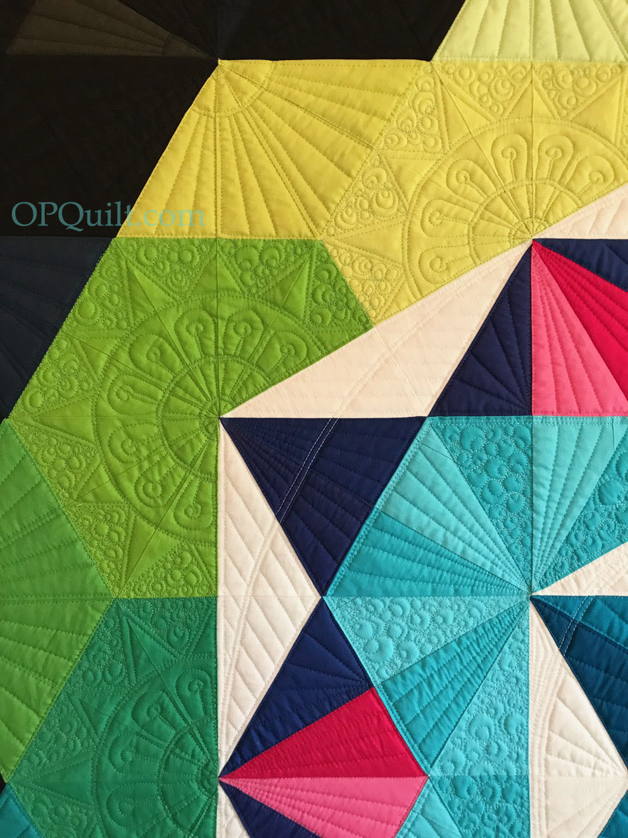
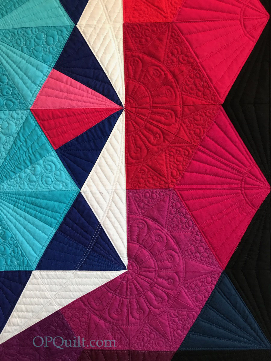
Then the outer ring of colors. I opened any random artsy book in my house, pulling up the one from an exhibit of Japanese screens from the Smithsonian, which prompted those bold ribbon designs in the upper right, which looked to me like the ribbons at the end of a piñata.
No.
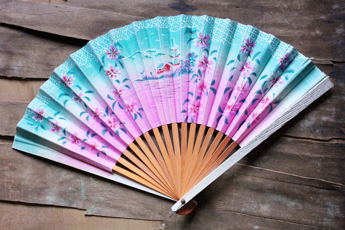
But that same book gave me the idea to think of those shapes as fans, and to fill in the design as if someone had opened one of those and was showing me the designs.
It became easier to visualize the design that way.
Am I 100% thrilled with this? No, but I am 100% happy that I’ve figured it out enough to get the quilt quilted, knowing — again — the truth in that old slogan I repeat to myself more than once a day: The Perfect is the Enemy of the Good. (or Done.)
I had purchased a number of spools of Superior Thread’s Magnifico, which is my go-to thread for quilting. It lays down a lovely, slightly thicker, line of thread, but it doesn’t sit on top of the quilt like some thicker threads. I’m always trying to match the thread well, taking photos of the colors to keep myself on target.
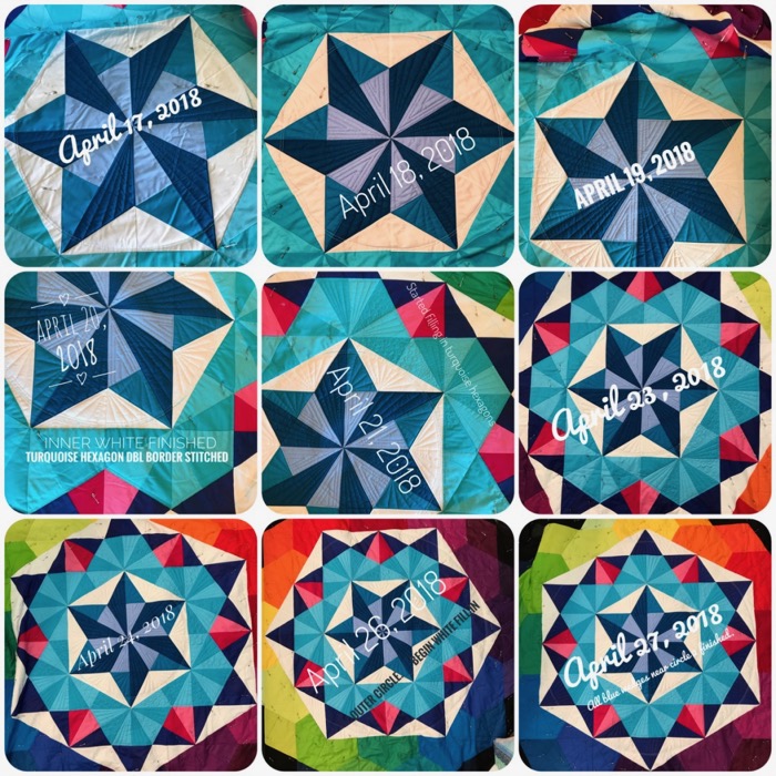
So I wouldn’t get discouraged over taking this in small bites, I took a photo at the end of each quilting session, threw it into my Snapseed app on my phone and labeled the date and the progress. Above is the first grouping.
It was celebration once I quilted out of the reds into the yellow, which you can see happened last week.
Here’s where I am now. I’ve got to take a break for a while (some traveling and family stuff), but look forward to getting back at it. The dark outer quadrants have already been planned, mostly quilted in black thread, letting them recede away from the rainbow of colors.


 Here’s my Happy Barometer in working with my Frivols Tins so far:


 Annularity
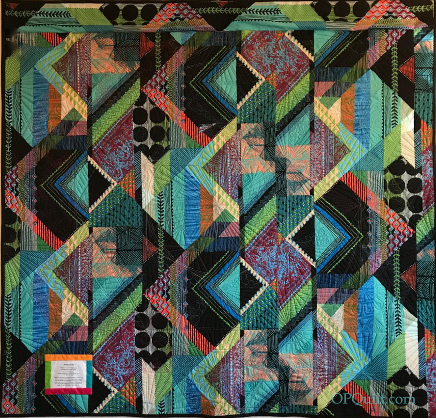 The wild and crazy back. It’s “prairie house” from the De Leon Design Group, for Alexander Henry Fabrics. I thought it might disguise any oopsies, but I was happy to note that I actually had very few. I guess maybe after ten years I’m getting better at the quilting? Much credit belongs to the Sweet Sixteen machine I use, and the threads, which always seem to balance so well.