
Cuteness, so cute, darling, adorbs, charming, majorly adorable.
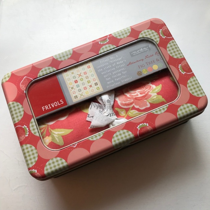
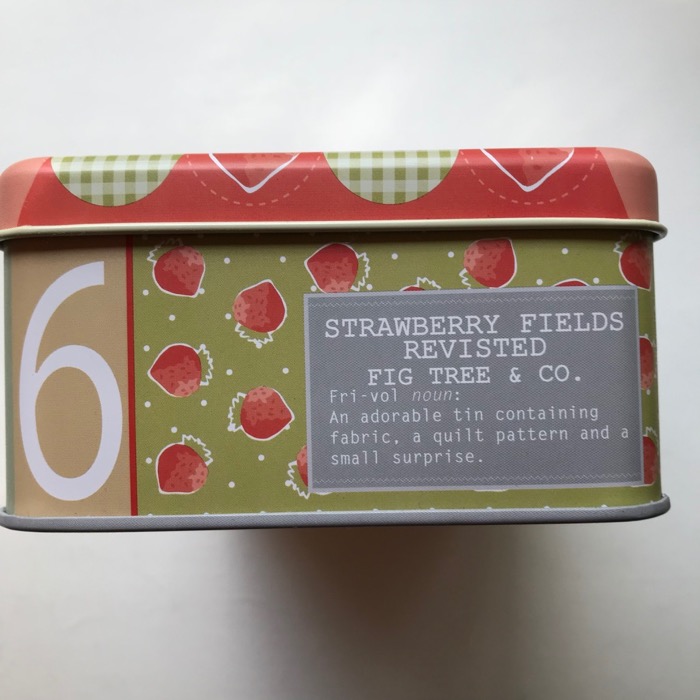
Yep, that’s why I bought these things. So by now you have figured out it’s time to sew up another Frivols, and now we are on Frivols Tin 6, which you can find on the Moda blog. Here is the errata for this box:
Note: After learning that a handful of customers had received rolls of pre-cut squares that were a bit scant, we decided to re-work the cutting to make the pieces a bit smaller and allow a little leeway. The artwork and text for the tin had already been sent for manufacturing so it could not be changed. However, the pattern has the correct sizes and instructions, and we apologize for the discrepancy. It just needed to be done.
After opening, I’m thinking: Still pretty cute, yes yes yes.
I unrolled and pressed the squares. Um.
(silence) Oh, please. (rolls eyes)
Not another one of these pastel boxes! she moans to no one in particular. Even my husband said “Another one?”
 Here’s my Happy Barometer in working with my Frivols Tins so far:
Frivols #1 <happy> for it was a gift for a friend’s baby.
Frivols #2 <happy>
Frivols #3 <happy>
Frivols #4 <meh> It was a test of will, but I’m keeping it around for gifiting to future babies.
Frivols #5 <not bad> once I got going
Frivols #6. <——-extreme dismay——> I know all the Bonnie and Camille fans out there are like, “Send it to me!!” but really, a deal with myself is a deal. But that doesn’t mean I can’t change it up some.
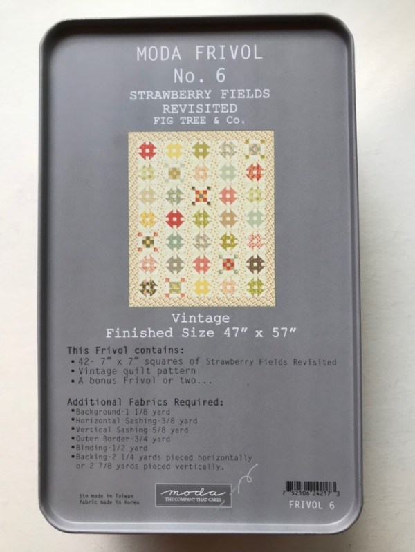
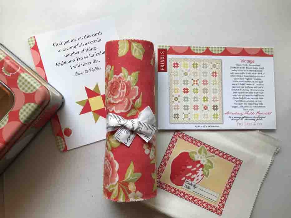
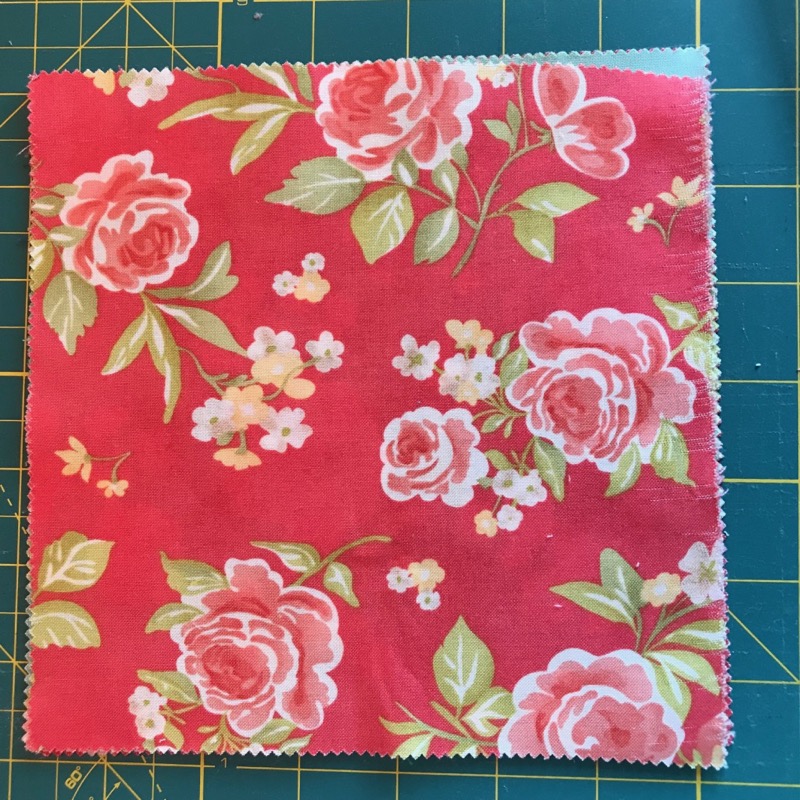
The finished quilt measures 45″ x 54″ supposedly, but I don’t know if that is the before measurement, or the one they took after their changes. I also took a look at the outside of the tin requirements, which is code for BUY MORE FABRIC, but since that fabric — Strawberry Fields Revisited — is long gone, given the current habit of our manufacturers of deluging us with fabric lines until we are overwhelmed, then taking them off the shelves forever. (A personal pet peeve of mine.)
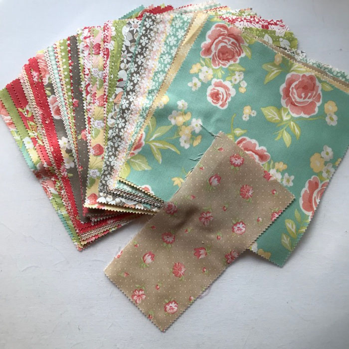
And given the fact that one of my 7″ by 7″ squares was cut off at the knees, and another one skewed and shredded by the cutter, it’s time to hit my own stash and pull out some colors/shapes/fabrics that will coordinate.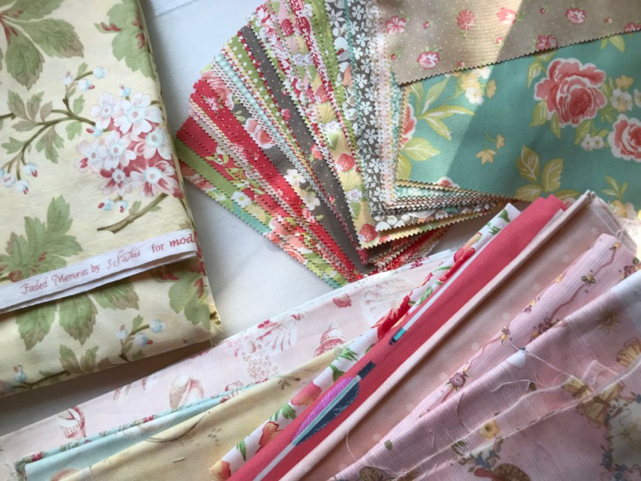
That piece in the upper left by 3 Sisters ought to be just fine with this group of toned florals and geometrics. And given that I’m already flummoxed by the cutting instructions, we are definitely changing up this puppy. And because I needed a project to do after Annularity’s completion, I charged on ahead (still moaning about these mushy-valued pastels).
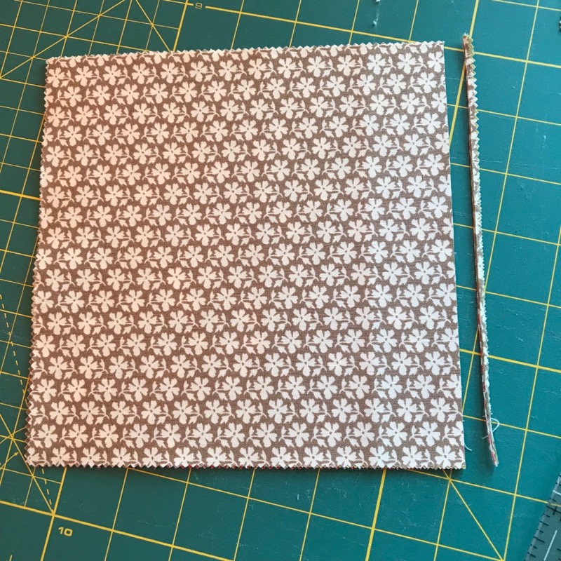
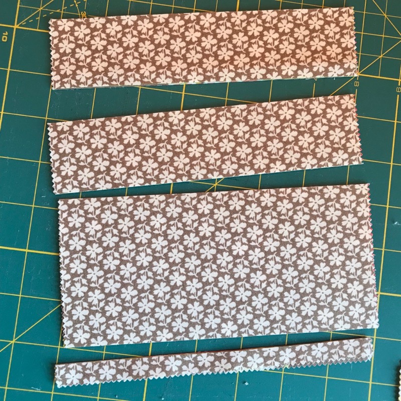
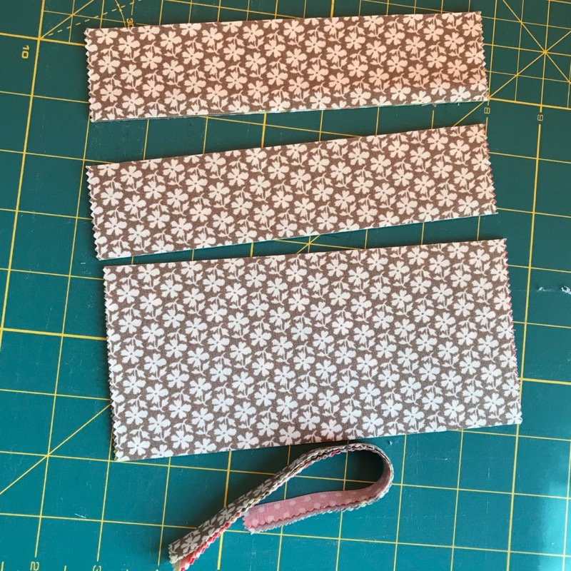
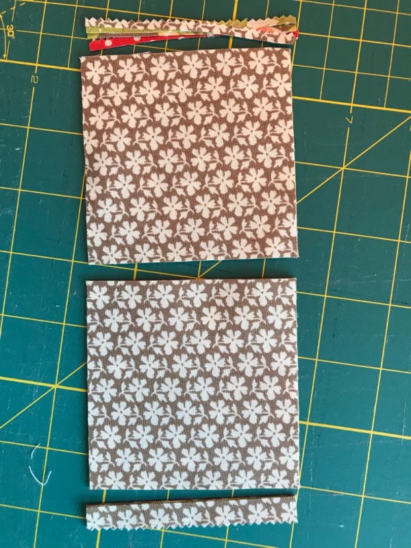
Each Frivol has 7″ squares. Even though they warned me not to trim off any bumps, after doing one as a trial, I found I could trim off the sides without any great disaster, then proceed to cut them as they asked.
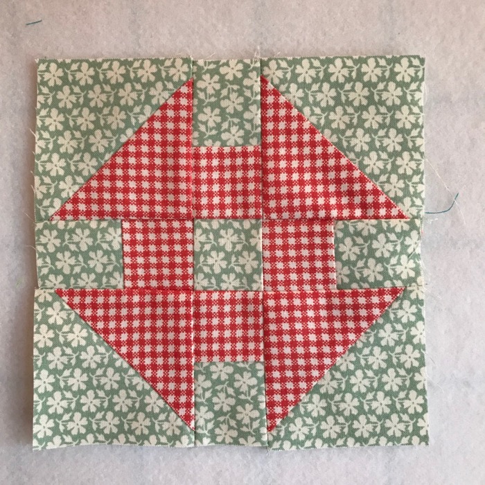
And by that night, I had One Grecian Urn. Kidding. I had one churn dash (you have to have seen the movie The Music Man to know the inside joke about Grecian Urns).
A Word About Value in Quilts.

We need some.
Value is how light something is or how dark something is. Quilts without value shifts tend to be mushy-looking, and sort of blah. It’s the mushy ones we walk right by at quilt shows. I see a lot of these, and have even made some myself (see Frivols #1 and #4). But it is value that moves your eye around a quilt, makes it interesting to look at, gives it depth. When I worked in the photo lab at University of California, the photography professor preached the same gospel: you need black as midnight and white as snow in the black and white photographs. OF COURSE there are exceptions, but we are not always making exception-quilts.
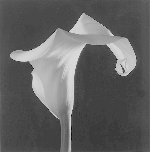
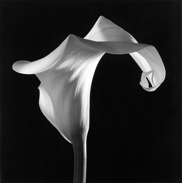
Note the two flowers above. Which one is more interesting? Which one grabs your eye, pulls it around, as you notice things? Of course you said the one of the right, a calla lilly by Robert Maplethorpe (the other one I greyed out to have only medium tones).
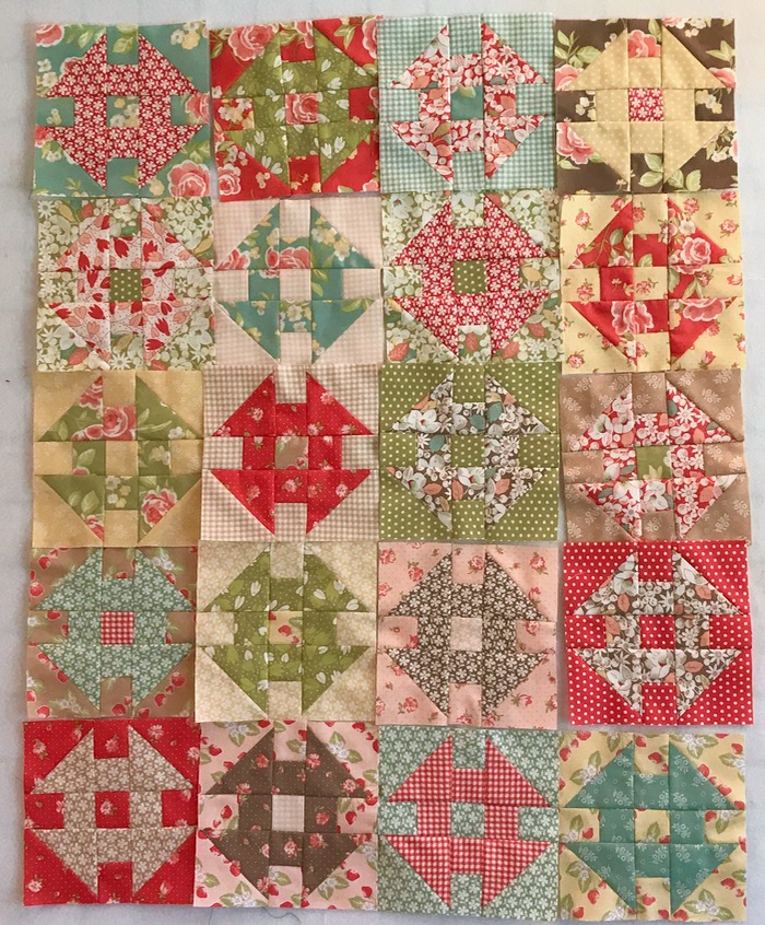
Same with our quilts. So what can I do with a box full of medium to medium-light fabrics? Smash them up against each other:
Now that medium brown in the upper right corner can function effectively as a “dark.” It’s still not wonderful, but I do think it’s better than the one they wanted me to do:
Kidding. Here’s theirs:
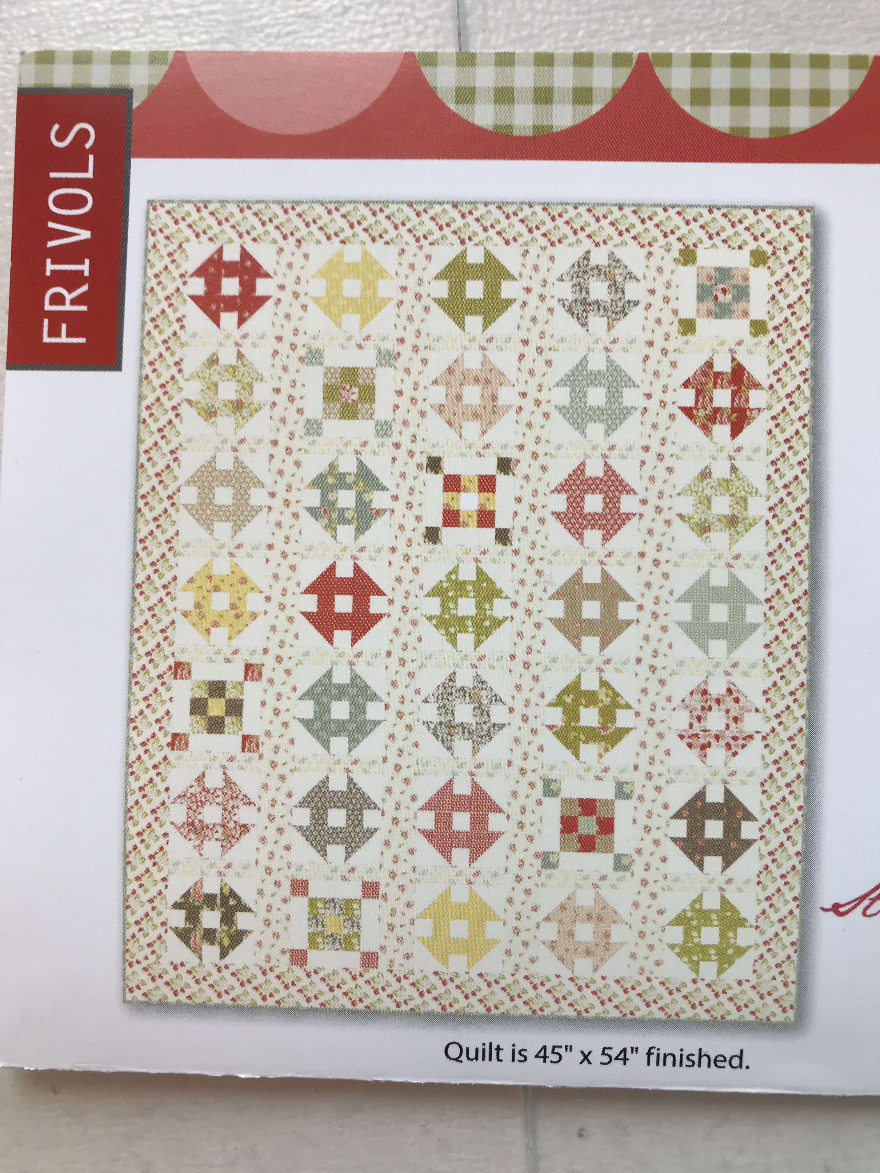
I could tell from their description I was in trouble: Sun-washed. It is a lovely little quilt, perfect for babies, and other people who don’t like contrast in their quilts, I guess. But this is my blog and you are subjected to my bias, and I trend towards quilts with good light-to-dark values.
I also believe if you are going to sell me a tin of fabrics, I should be able to make a quilt with what’s in the tin. (Right.)
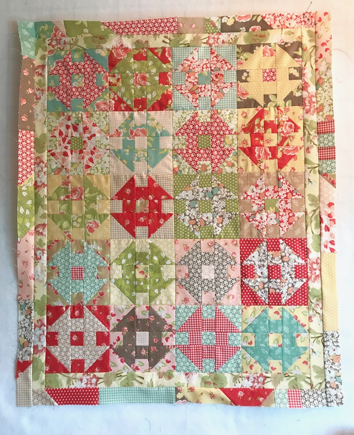
It needs some kind of borders, so I was going for the look of Frivol #2, but this is a Major Fail. It has that baked potato problem. So I ripped off the borders and pulled out nearly every fabric I had in my stash to find one that I though perked up this baby.
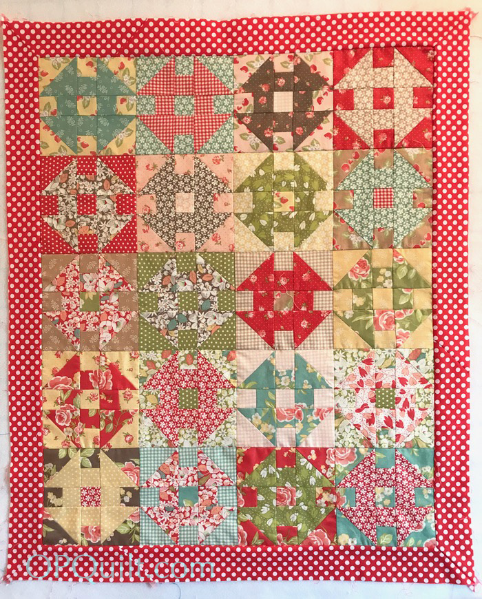
A lovely tomatoey color of red with white dots will do nicely. I’m happy with it. Now I’ll get it quilted and bound and will show you the end product, at some later date.
What I learned from this tin of Frivols:
- Don’t let your quilts be mushy.
- Move beyond one manufacturer’s grouping of fabrics to avoid having your quilt be only a medium value quilt.
- And some advice as well from my photography professor, given to us on the last day of class: keep your camera dry.
Discover more from OccasionalPiece--Quilt!
Subscribe to get the latest posts sent to your email.

Mushy pastels!!! I never knew what to call them !
Good save!!! Confirms my go-to saying of late: “the pattern is only a suggestion” (or the tin, in this case). Or as my favorite auctioneer says “put something else with it”!
That red and white spot certainly lifts your little quilt to a whole new level! I’m guessing though that you’re going to think my next baby quilt is way too ‘sun washed’!!!😆
Oh. The voice of honesty is SO refreshing! I’m accustomed to keeping my opinions to myself, but I can pick out and dislike a mushy quilt from a mile away! It’s the over-coordinated fabrics that get me every time. How can other quilters not see the same thing? Thank you for showing and explaining it perfectly. Just as you should. It’s your blog post. (rah, rah). You’ve affirmed why it’s just way more fun to mix fabrics and values on your own, rather than let a fabric manufacturer pick them out for you – according to the fabrics they need to sell! And I admire you for plucking on through the making of this one. I would have opened that tin, looked at those fabrics, and immediately put it on the freebie table. Yes, this is MY comment. 🙂
I have to say that one of the things I like most about my delve into transparency quilts and design is that it forced me to think about value and appreciate a spread in value in all quilts and have a sharper eye for fabric selection. It’s not that all quilts need to be made with the same requirements (I’ll still do whatever novelty print a friend wants for her baby quilt), but by golly it has helped me to go back and look at some of my earlier quilts and have aha moment about why they didn’t work as well. I am glad you were able to steer this quilt closer to something you will enjoy and thanks for the honesty and sharing how these are working (or not) as you progress through the year.
It reminds me of a quilt book from years ago called Blended Quilts. The effect was amazing, but you really had to use the right fabrics for the effect. Great job of forging ahead on the project. It would not be my favorite either, but it will be a nice cuddle quilt.
I admire your determination to work your way through those tins and be honest about how you feel about them too. I’ve made plenty of mushy quilts in my day. Some of them were intentional back when I made ‘blended quilts’. Value is so important and still something I don’t do very well. I tend to rely on color more than value. The flower photo is such a good example of value. Thanks for sharing your thoughts.
Just one comment, in case there is any confusion: these are Fig Tree fabrics, not Bonnie and Camille. And if you believe I’m going to stop at one, I’ve got a resort on an exquisite Caribbean island to sell you (it would be sun washed, but not sun bleached!! Ha. That value lesson is key. It’s not really color that makes the difference in a quilt nearly so much as value.
With the move toward scrappy (or back to or just saying we’re moving around it), I think this lesson really comes home. There are great scrappy quilts (with lots of value shifts) and lots of mushy ones (I have a crazy pieced quilt made of lots of my scraps (not yet finished) that suffers dreadfully from the mushy malady. It will just have to be one of those “all cats are the same color in the dark” quilts.
I succumbed to the Frivols movement as well (guess I was afraid I might miss out on something really great) and have yet to make one. Not because I’m saving them to sell for a fortune when I retire (while I have a couple of Beanie Babies, I don’t have a collection of those, either). I have yet to subscribe to any of the monthly mystery boxes or bags or whatever — maybe I’m getting smarter.
And one parting comment — seeing the Mapplethorpe calla lily reminded me of how the curator at the Sheldon Museum at UN-L described one. “Just see how juicy it is. So so juicy!” We want our quilts to provoke reactions like that. Maybe not seen as “juicy,” but the same kind nontheless!
Hurray for the red!
Your feeling about having to add fabric echoes my feeling about challenges where one can add fabrics, but they have to be from the same company (maybe even line) as the initial challenge pieces. Great marketing device, but not necessarily a great design plan. I have quit playing those games. I love how the red border works with the blocks.
I heard someone once say, “Value does the work and color gets the credit.” I think you’ve demonstrated that well. I also applaud your changes in the pattern. It took me forever to have the courage to do this. Just like I thought I wasn’t allowed to make changes in recipes. Life is more fun now. 🙂
That red and white dot made the mushy quilt sing – not quite Broadway or even off Broadway but at least qualify for the choir.
You made a good save with the border fabric. Thanks for the lessons.
I also strongly prefer strong contrast, in general! I used to tell my investment management clients that having a portfolio that wasn’t balanced like the market (by industry/sector allocation) could be okay, but if you do, it should be because you WANT it that way, not just by accident. If you WANT a low-contrast quilt, that’s okay, but it should be on purpose, not by accident.
If you don’t have clear contrast of value, it helps to have clear contrast of color. With these mid-sized prints that are all quite similar, you don’t even get that.
Oh dear. You are clearly glad to have this one behind you. You sound like I would if I had to sew with batiks, and I do not like precuts because of the bumps. I would be very grumpy too.
I love your addition of the red spots. They really do lift the muted colours.
I totally agree with you on the fabrics being sold out too soon. I still haven’t sewn any Frivols, but have cut out two of them. I keep sewing large wedding quilts and quilts for grandchildren. I now wish I had never bought any of the Frivol boxes at all. I have too large an appetite for quilting goodness. I am so glad you used that bright red border because someday when I sew mine I can do the same!
A little late to the party here but just a comment anyway: you are so right about how frustratingly fast fabric lines disappear and how some projects are promoted by tempting you with a “starter set” that requires a lot beyond it to make the featured project. Regarding the contrast issue: being that these are Fig Tree fabrics, you would have been safe looking for contrasting fabrics (probably any of the white or cream based ones) from ANY other Fig Tree line. The designer (Joanna Figueroa) works in the same basic color palette (tomato red, chartreuse green, tan, medium brown, yellow, apricot, aqua, plum, black, cream, white and sometimes lilac and navy) for all of her fabric lines so they coordinate pretty much interchangeably.
We all have our color and saturation biases — mine is shaded fabrics — but I admit I have also long loved the consistently muted and toned palette of the FT lines too. So much so that I’ve been working on a sampler of hers that she did in one of her Christmas fabric lines (so all various red, green and white prints) but I’m doing in a scrappy mix of her basic colors using fabrics from any of her older lines that I can find (and which I am behind on working on this month!). It was still thrilling to watch you once again “Make It Work” for yourself to get it to a finish!
This. So much this. There are several very popular fabric designers whose fabric lines always leave me sort of meh. I couldn’t figure out why, but you helped me realize it’s the lack of contrast in values in their fabric lines – everything they produce is either a light medium or a medium medium. This post just gives me more impetus to trust my own fabric choices. After all, no one else REALLY cares about my quilts anyway. 😆
Is it obvious to everyone but me that extra fabric is necessary to complete the quilt? Why are the directions so vague?
I am grateful for this blog where I discovered Elizabeth’s comments and efforts to complete the kit. I realize most of the problem I have resides in myself– A fear of being wrong. Twenty-four years ago I wrote this on my dining room wall, “To live a creative life we must lose the fear of being wrong”. Retirement is here and I am finally going to learn how to lose the fear.
Thank you to Elizabeth for her detailed blog and to everyone else for your comments to help me implement my mantra in my creative endeavors.