Creating · This-and-That

Color, Venice and Valentino • This and That July 2021

“Fashion is not ‘art’, because the latter is sufficient in itself while the former always has a purpose, a function, a use. Recognizing the differences is the first step to instructing mutual listening, made up of curiosity, enthusiasm, and respect. This listening needs time, just like Haute Couture and ultimately also like art. In fact, the maturation of the project was slow, a rhythm perhaps unusual for our world but just and intimate for the world that I would like to.” -Pierpaolo Piccioli (from here)
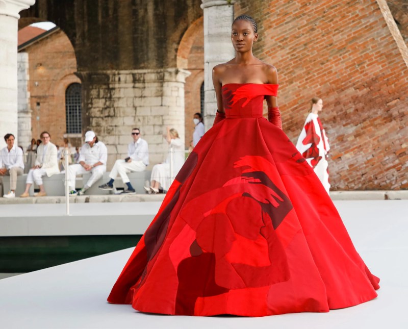
And if you understood that, then you are more experienced than I in the language of haute couture–the clothing, the dresses, the fashion that is more concept than something you would hang in your closet. But just like the movie The Devil Wore Prada in that withering scene where Meryl Streep’s character critiques Ann Hamilton’s sweater, the fashion houses often tilt us to what’s coming in shape, in color and in what we’ll be wearing post-pandemic when we finally decide to crawl into stores and buy ourselves some clothes.

It’s also very likely that we’ll be seeing some influences on the colors we use in our quilts, or maybe even the shapes we’ll experiment with (if you are a half-way, non-traditional quilter). Or not.

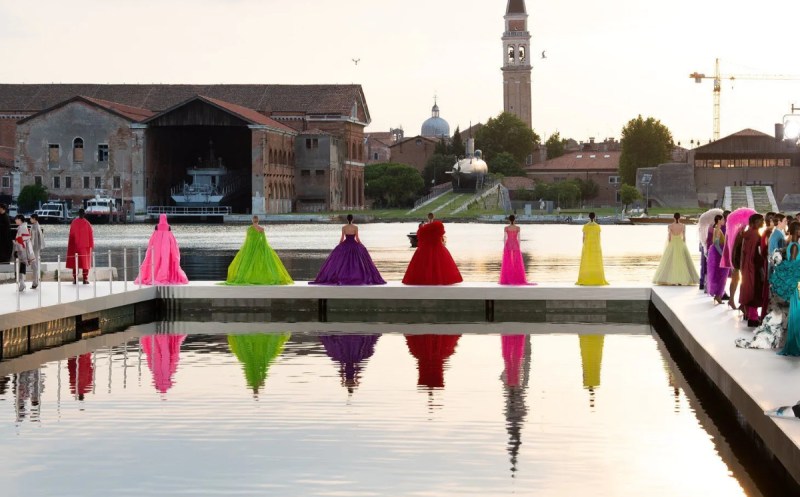
So I was pretty amazed by the colors put together by the designer for Valentino, Pierpaolo Piccioli, and while I can’t pretend to really absorb what he said (above), I do speak the language of color, and thought you might like to see some of his designs, shown recently in the magical city of Venice, Italy. The contrast between that very old city with its own recent struggles with over-tourism, pollution and dwindling residents is a perfect contrast and foil to the glamorous, hand-sewn clothing made with extraordinary precision with pricey fabrics.

As Vanessa Friedman of the New York Times wrote: “[The designer Piccioli] has been conversing with contemporary artists — about their work, sure, but mostly about life in general, process, emotion, what turns them on — thinking about how to integrate their points of commonality in cloth…The result — shown at sunset beneath the brick arches of the former shipbuilding yard of Venice, with water lapping at the edges of the runway…was as powerful an argument for the interconnectedness of time, human connection and creativity as anything fashion has produced. The lushness of Mr. Piccioli’s palette — as a designer, he is the best colorist since Yves Saint Laurent — was on full display; so was his throwaway elegance, and his generosity. Not just to his atelier (his show notes name-checked the individuals who sewed each garment [italics are mine]) but to the bodies that will wear the clothes.”
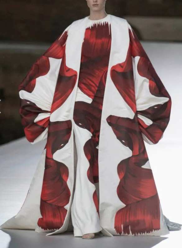
from here

So, what do I see?

In the above image, I see scale: large shapes on a larger garment, then those same large shapes on a more narrow profile of a dress. The designer plays with scale in many of his other pieces, using different shapes to emphasize different parts of the body, and different lines (like those flowing hats!).

I also see a lot of color blocking: large swaths of color against slivers of color (a bit of scale, again), causing each to accent the other. This collection is not about fussy little prints. Mostly I see lush, elegant and rich, deep colors:

palette generator from here

This palette is missing the mint of the shirt. Sure, it’s a metallic shimmer of color and hard to catch, but that really makes this grouping, in my mind.

In this one, the palette generator is capturing a lot of the background, but it’s that’s slice of bubble-gum pink against those deep coral trousers which really caught my eye. The grey isn’t those flat greys we are used to seeing in our quilting fabrics, but a soft mellow gray, warmed up slightly, but not heading towards taupe or green-gray — maybe a deep off-white?

Orchid appears to be heading our way, but a vivid hue of that color, especially when paired with bright jungle green.

While the palette generator captured a lot of the background (I don’t see that pinky brown anywhere on the model), this palette is a “be-still-my-heart” series of shades for me as I love aqua blue. But it’s a new take on that–a refreshing deeper shade.

Now to shift gears from haute couture to the nuts and bolts of my life lately:
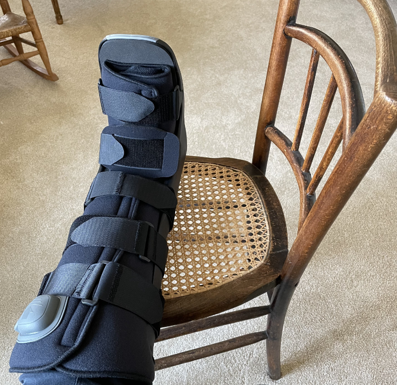
How about some velcro bolts? This is the boot they gave me to wear while my ankle heals. I hate it for a variety of good and not-so-good reasons (would it kill them to add some color?). The doctor okayed my getting around the house without it, so I’ve just decided to ace-bandage-wrap my ankle for protection, stay off it, and stay home. What’s four more weeks of pandemic quarantine?
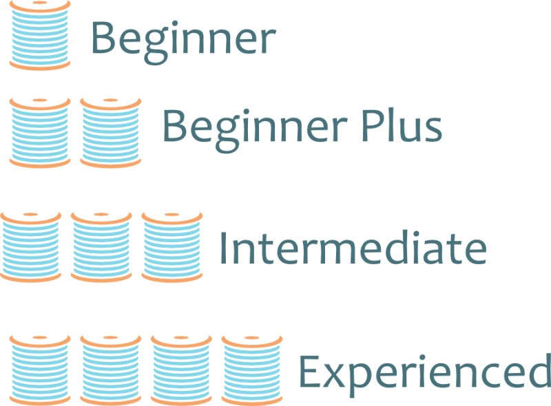
Very proud of this: I drew the spools up by hand. Well, digital hand. Yes, it’s in my favorite color (aqua blue). I have found lately that getting the hang of a few tools in my Affinity Designer has opened up new worlds for me in terms of satisfaction with my work; it was a bit of a struggle at first, but a bit smoother sailing now. And why did I make these?

Pattern Shop Refresh!

I didn’t like the nuts-and-boltsy (notice how I’m stretching the metaphor) look of BEFORE as it was too chunky and disparate. I also wanted something as well that would indicate degree of difficulty at a glance. So, I made spools. And I like how the shop looks now.

This is the new display pattern front. I still have a few things left to do, but have finished most. PayHip upgraded some of their marketplace tools, so I thought it was a good time for me to fuss around a bit, too.
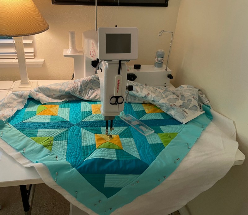
Quilting SeaDepths (a variation of Azulejos) in spurts, while listening to this:
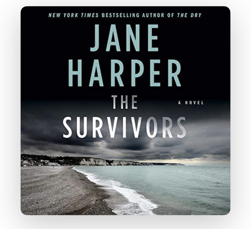
I like how the themes overlap: the ocean in Harper’s book with the theme of SeaDepths on my newest quilt. I can hardly wait to go upstairs and quilt. I’ve listened to two of her others: The Dry and The Lost Man and loved both of those. I will reserve my review on this until I finish it (5 more hours). While I listen, I think of Susan of PatchNPlay, and her trip to Tasmania. I can’t wait to show off the backing I chose for this quilt.
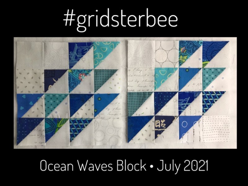
Lastly, there seems to something in the zeitgeist here, but truth! Patti chose this without knowing all the other watery connections I’ve just mentioned. If you jump on this link, you can see a lot of the blocks she’s received, all laid out together. I love how nice they all play together.

And that’s it for today. Happy July, Happy Not Wearing My Boot, and Happy Quilting!

Digital/Virtual World · Shine: The Circles Quilt · This-and-That

Abecedary • Late June 2021

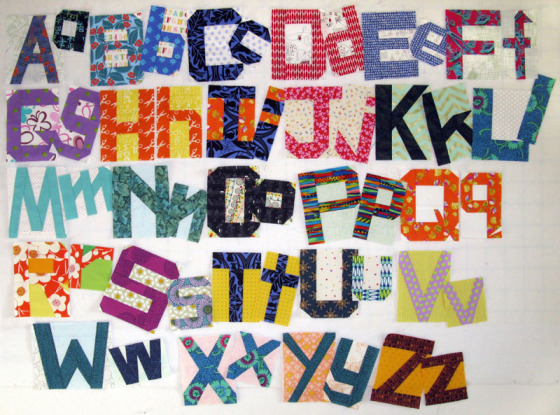
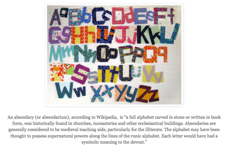
A is for Abecedary, or a way of organizing this post.

It’s also the name of my Lecture I present to Guilds, and I’m coming up on my last Abecedary of Quilts lecture next month (a milestone). And by the way, today I might skip a few letters. Subtitle: This and That • June 2021.

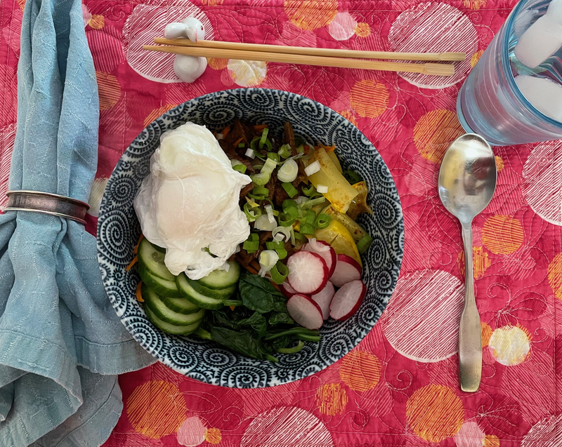
B is for bibimbap

which is a favorite summer dish, shown here on my placemat made out of Simone’s fabric, back when we supported her in her fabric launch. In the Before Times.

B is for Bunny ears.

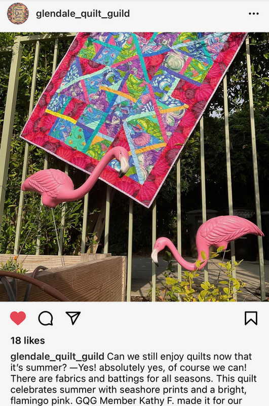
C is for Criss-Cross. Fun to see Kathy’s finished quilt on the Glendale Quilt guild’s IG account.

E is for exclamation points, for which I often use too many and always have to edit them out.

F is for feet on Instagram, specifically feet on quilts. Seems there are strong feelings about this.

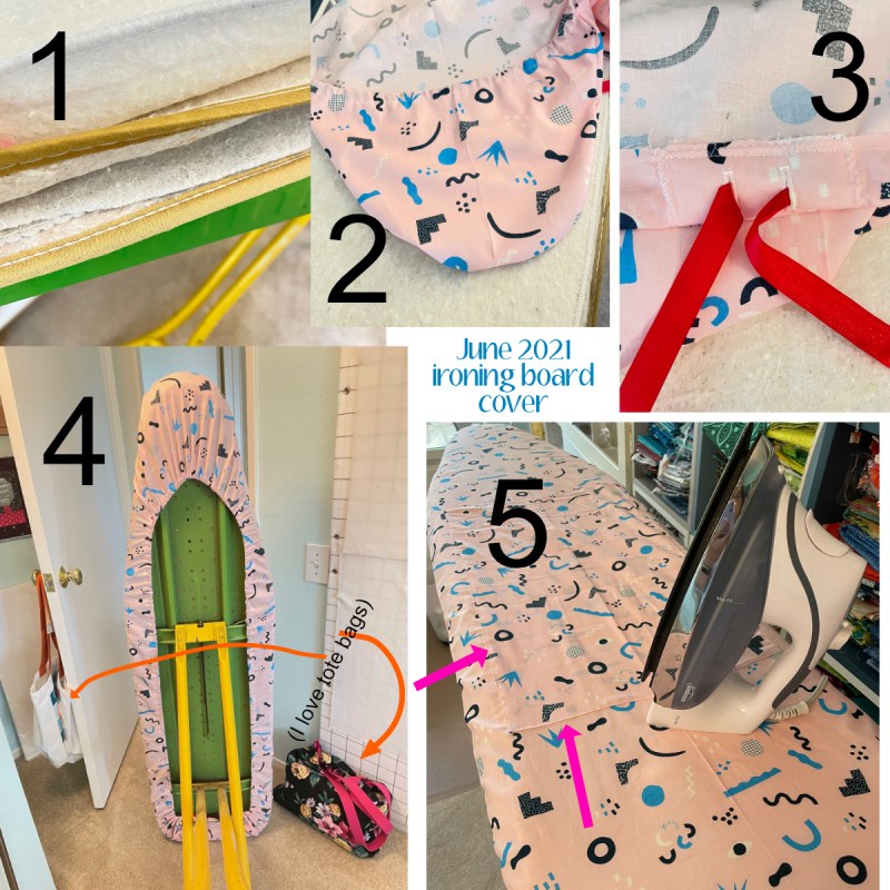
I is for new ironing board cover.

1. I always leave lots of padding, but maybe shuffle them around. This is multiple year stack-up of padding.
2. My pattern has me lay the ironing board down on some fabric then draw an outline about 3″ away from the edge. No precision needed. I then make a separate “hood” for the top, by duplicating the upper portion. No reason. It’s just the way my most favorite commercial ironing board cover was made, way back in the day, and I’ve just continued it. I sew it on the top part, RST, then flip it. It’s tricky to get the casing around those edges, and I always find myself unpicking bits here and there to get the drawstring through. Don’t judge me by my underneath-the-ironing-board-cover business.
3. I slap an interfaced square on the lower edge and put in two buttonholes (for drawstrings), making sure they are closer to the raw edge. Make a hem of about an inch of fabric all the way around and stitch it down, doing your best. No, I don’t finish the raw edge. Why should I? After that, slide through some sort of long string-y thing (not yarn or string). The best one I’ve found is to use two packages of seam tape, seamed together and overstitched. I’ve re-used it over and over.
4. The underneath, after I’ve pulled it all up into place, and tucked in the strings.
5. My newest gig is to sew on a giant rectangle, right in the middle (pink arrows). I just tuck the edges under after pinning, and topstitch it down. Yes, I fit the board with this after laying the cover on, but before drawing up the string. Why this? When it gets grunge-y after constant use, I unpick the stitches and yippee! Fresh and clean ironing board surface.

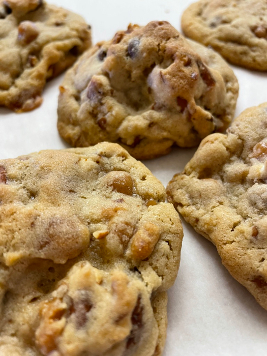
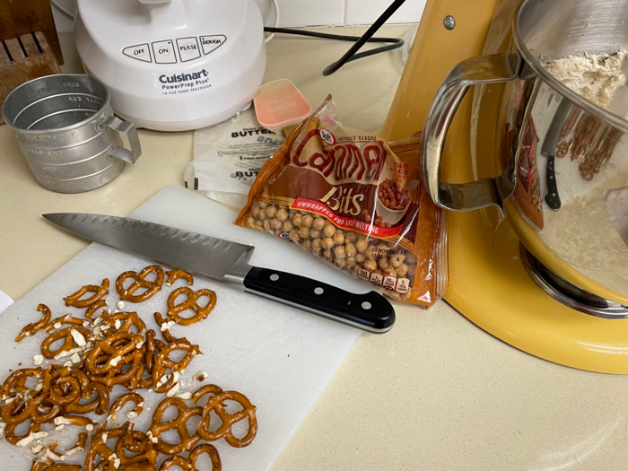
K is for Kitchen Sink Cookies.

You can find this recipe on my daughter’s new website, Sweet Mac Shop, made and launched this last month for her macaron-baking efforts.

L is for Leisa.

She’s coming up on the one year anniversary of her stem cell transplant and we are celebrating by taping up a quilt (left side of the photo) for her niece. She had this little quilt of mine out on her antique sewing machine, so I took some time to re-acquainted with an artifact from an early day.

This was one of my earlier attempts at Home, Sweet Home, using a Lemoyne Star in the center, which is a juggling act all the way around (my pattern has an easier method).

It’s like old home week, visiting these fabrics once again.

L is also for Link Tree.

This is what people see when you set up a space to list a series of links off of Instagram. Typically you put it where your ONE available link address is, thereby giving you way more links. Michelle, a brand stategist, often has little tips in her stories about how to make our online life easier, and more clever. One day she had a tip about creating a Link Tree in Canva, a website that will assist you in design tasks.

But then I got to thinking: can’t I do this on my own, using a page from my own website? Since I know her IRL, I asked her and she said “Yep, you can.”

I use WordPress for my blogging software, and they use Blocks for text, images and anything on the page, I colored my Blocks in different colors, wrote my text, and since I didn’t give the page a title, it has a naturally short web address.

Voilá! My very own Link Tree that I can change at a moment’s notice.

N is for Northern Star Quilters’ Guild.

I just finished teaching Criss-Cross and presenting my Abecedary of Quilts lecture to a wonderful group of quilters all the way across the country in New York state. What wonders of our era, to be in California and NY at the same time.

O is for Obama.

I’m almost done listening to the first part of his memoirs, and boy, have I learned a lot about government. A brilliant writer, with an easy-going style. His strong character traits, as well as some of his flaws, do come out in this book, but what I’ve appreciated learning is the bits of history he builds in to each international incident: it gives me a fuller appreciation for the difficulties of managing the expectations of the presidency in both foreign affairs and domestic. Love him or hate him, a lot can be learned by listening to, or reading this book. You’ll learn more about how bills are passed — and blocked — by taking the time to hear from a former president.

P is for pre-wash your red fabrics.

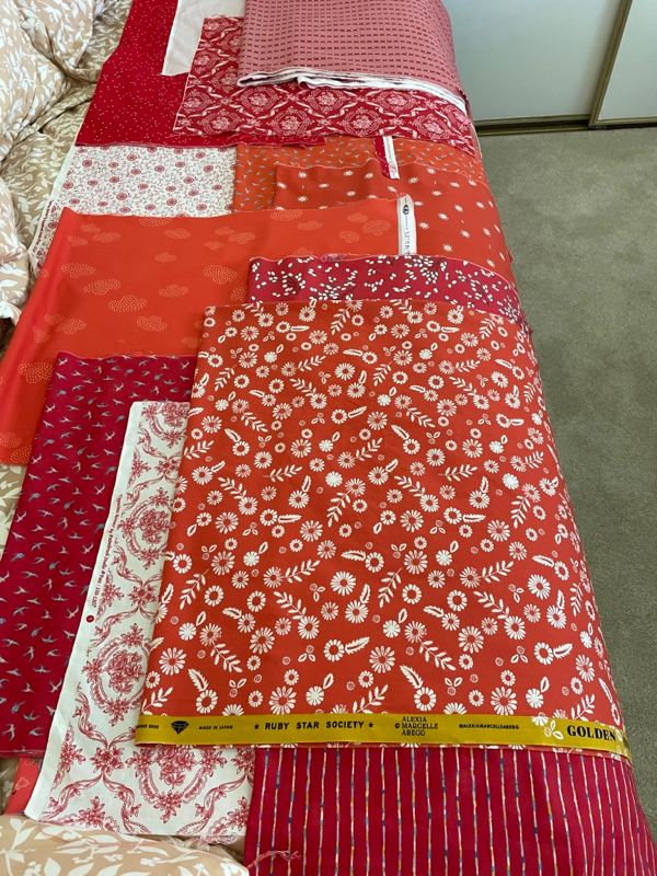
After they come out damp from the dryer, I press them and let them dry on the guestroom bed. This was in preparation for my Summer Snowcone Quilt. I don’t always pre-wash all my fabrics, but I ALWAYS pre-wash the reds.

S is for Shine, the red, white and blue version.

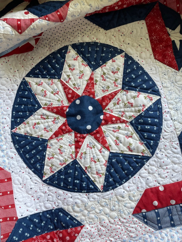
My goal is to get this done by the end of next week, in preparation for the Fourth of July. I have now finished most of the white thread, most of the red thread, most of the blue thread. Next up is light-blue thread, and then going back for borders and finishing touches.

W is for Writing Patterns.

Next up is Azulejos, a pattern to be made from a quilt finished in the Before Times. This pattern is almost done. I use Affinity Software (Affinity Designer, Affinity Photo and Affinity Publisher) and for the last while they’ve been offering a smoking hot deal at 50% off. (Hooray! No more chained-to-Adobe-subscription prices, although they do have excellent software.)

Well, that is ending soon, on the 30th of June. If you have a hankering to design, or to tweak your photos, or other creative uses, head to Affinity by Serif and pick up your copies before it goes off sale. I’ve written about this before and I will again. It’s a great set of software apps for creatives Creative Peoples Creative People and Quilters. It will take you some time to get to know it, I won’t lie, especially if you have no Adobe experience. I had never used Illustrator by Adobe, but I purchased Affinity’s Designer. I had to do a bit of research here and there, but they have a great series of tutorials (I went through them all and Took Notes), a hefty online design community, a comprehensive online manual and even a hardcover book, that walks you through lessons on how to use it. I was up and running fairly quickly, and continue to learn new things.

Speaking of sales, get this, too. QuiltFolk. Ending Soon, and all that stuff.

V is for a sad move for Viking Sewing Machines.

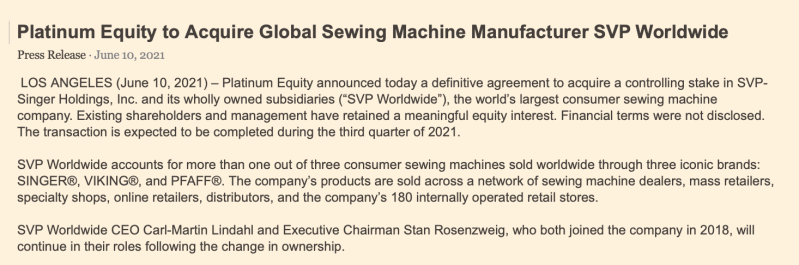
Somehow I never think it is a good sign when equity firms own our sewing machines. We recently lost one good tool when QuiltPro, a favorite design software (it used vectors, not lines) was purchased by a corporation, and let it slide into nothingness. Admittedly, it is still around and functioning for Windows machines, just not on Macs. Superior Threads was also sold, and I miss talking to my favorite help person on the line, although the threads themselves are still the high quality threads I know and love. And now these three sewing firms. I’m somewhat encouraged by the last line of the announcement, but not much.

Z is for Zee End.
Happy Beginning of Summer!

Free Quilt Pattern · Gridsters · Something to Think About · This-and-That

This and That • May 2021

This has been a busy week, with zooming and teaching at the Orange Grove Quilters Guild, but I’ve managed a few things around the edges.

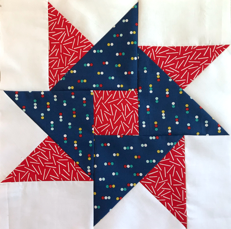
This was April’s Gridster block, requested by Nancy. She sent out the blue fabric, and we chose the other, with her guidance.

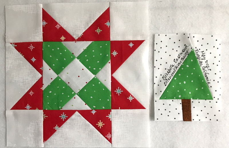
This was May’s Gridsterbee block, chosen from my Sawtoothmania pattern by Allison. She also sent out fabric, but we provided the center color patches.

She had us do a wonky Christmas Tree. Allison asked for the one from another quilter, but I also have a free tutorial sheet on making little Christmas trees, too. Such a clever idea!

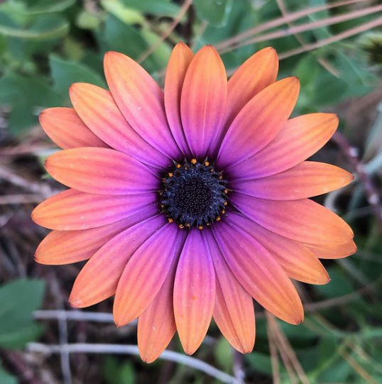
My husband brings me flowers every day…well, photos of flowers. This one measures about 1 inch across in real life.

I finished Vesper Flights, and went on to this one: The Midnight Library. I listen to them at the same time my mother does, but this is one I wish I had in print, so I could underline things that caught my heart and imagination. Now I’m deep into Obama’s A Promised Land. It’s moved much faster now he’s been elected, and hearing about the 2008 economic meltdown, as well as the hog-trading of politics has been interesting. I am SURE I never want to be a politician. I’m sticking with quilting.

This is a close-up of one of the panels I used on my Wealth of Days quilt backing. I was stoked that it had our city on it. I tell most people, “we are between Palm Springs and LA,” but here we are!

Fabric receipts? Now the fabric just shows up in my mailbox, like magic, or something.

Occasionally, when writing this blog, or trying to color in a design, I can’t quite make the program give me the color I want (like this background). That’s when I turn to this no-frills site which shows a ton of colors with all their hexadecimal codes. I always start with the Blues page, which is what I’ve linked you to. I just copy the #code, pop it into my software or blogware, and I’m good to go.

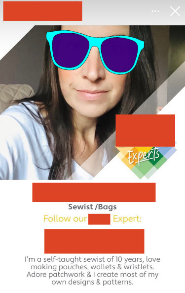
I love following people who know what they are doing. I love reading their blog posts, their Instagram posts, and while I’m not a total fangirl of them all, I have several favorites (there are too many to list here; see my list at the bottom of my blog). I appreciate their sharing what they’ve discovered and learned. However, recently a famous maker of absolutely necessary quilting supplies popped the above Instagram ad up on my feed. (I’ve blocked out all the identifying marks to protect the marketing department.) She may be qualified, but is she an expert?

Shouldn’t she be referred to instead, more appropriately, as an Influencer?? I like Aurifil’s word for their influencers: “Ambassadors,” which my macaron-making daughter let me know, is also used in her industry. Rather than the previous ad campaigns of simple extolling of excellence of product, we now use people for that. (In my English classes of yore, this was a type of logical fallacy, using celebrities to sell products; however, we’ve morphed from random celebrities to using established personalities in the field to sell products.) Carolyn, a sewist/sewer who I’ve read for years, knows her stuff and has an excellent post on the rise of Influencers. I love this part of the post:

My criteria is based upon:
– Can they actually sew?
– Are they learning to better their craft?
– Do their garments fit well or are they just photographed well?
– Do they have any actual fabric knowledge or are they just taking stuff because it’s free?
– Do they understand why notions are important and why they’re needed to perform a task?
– Is all of their knowledge YouTube/Internet based or have they actually read a sewing book?  Not all YouTube videos show you the correct techniques.
– Is this just a way to make them Social Media Famous?

A reminder for us creatives from Grant Snider

And lest you think I just sit around, I am working on a scrappy blues quilt, but it’s pretty shy right now and I just can’t coax it out from underneath the bed. I’ve even tried leaving spools of thread and colorful scraps to lure it into the daylight. Maybe later I can get a photo of it.

This is a quilt for a college-girl’s bed. My granddaughter shyly asked me last time I was at her house, “Grandma, will you make me a quilt for college?”

Me, inside:

Me, outside:
“Absolutely!”

We traded designs and pictures back and forth, but I quickly discovered that she is a minimalist, and likes gray. She knows I hate am not a fan of gray (generally), but she told her mother she thought I would come around after working on her quilt.

The red line in the drawing above is to approximate her queen-sized bed. I ordered yards of Painters Palette solids from Pineapple Threads, and they arrived last week. Between the shy scrappy blue quilt hiding out of sight, and this one, I’ll be keeping busy.

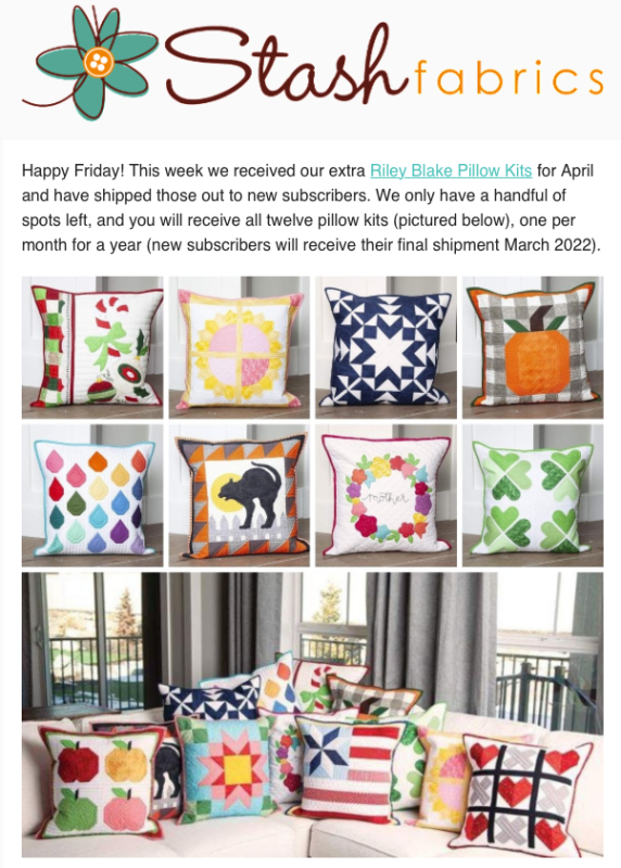
I can’t believe I signed up for this, but I swear it was because they come in cute little boxes. I do have some undressed pillow forms around her that need some clothes, and these seemed to call out to me (although if you know me, it won’t surprise you that I’ll be changing up some of the designs…looking at you Miss Christmas). But I’m excited to get a little fun package every month in the mail. (Guess this means I’m in covid-recovery–that I’m actually planning into the future.)

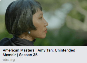
Lastly, I listened to/watched this show about the writer Amy Tan, called “Unintended Memoir.” It gave me so much to think about as I worked on the shy scrappy quilt, and now I want to go back and read her books again from her first, Joy Luck Club. She speaks movingly about her mother, and Tan chronicles their relationship as well as the writing of her novels. It lasts about 90 minutes; I recommend it.

Happy Quilting!
Gridsters · This-and-That

Rounding the Corner into Spring: This and That for March 2021

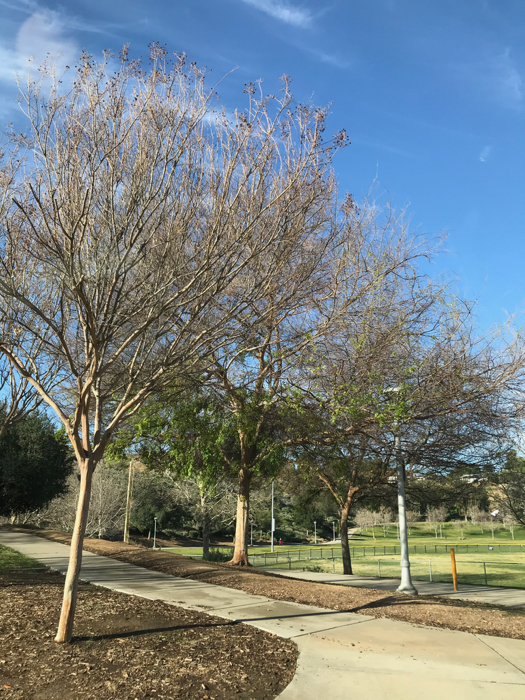
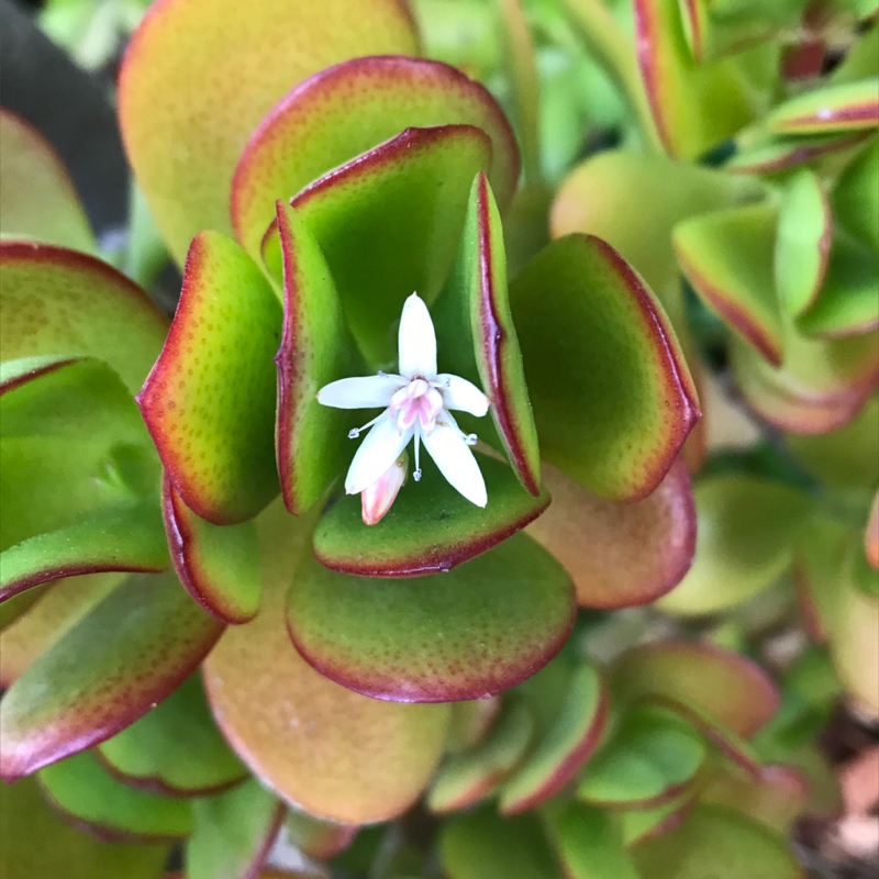
I’m leading with this photo, the green leaves just beginning to bud out on the airy branches at the park where I walk most days. It’s three laps, 2.2 miles, almost 4 km, then a stretch of the legs and I drive back home.

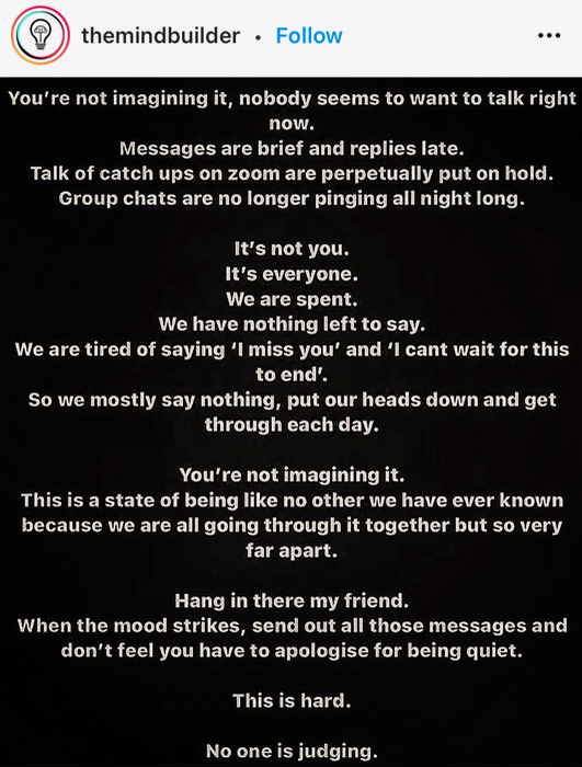
Sometimes I walk around the neighborhood, like my husband, who loves to photograph flowers (above). But this Spring, so many are tired:

So I am happy to bring you this one, that I found on an walk.

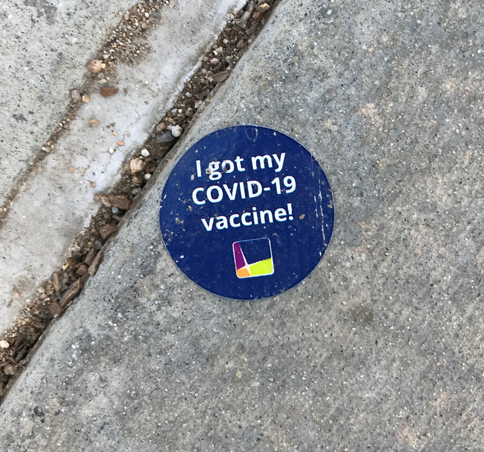
I also saw this sticker on the ground. I didn’t get a sticker. Did you get a sticker?

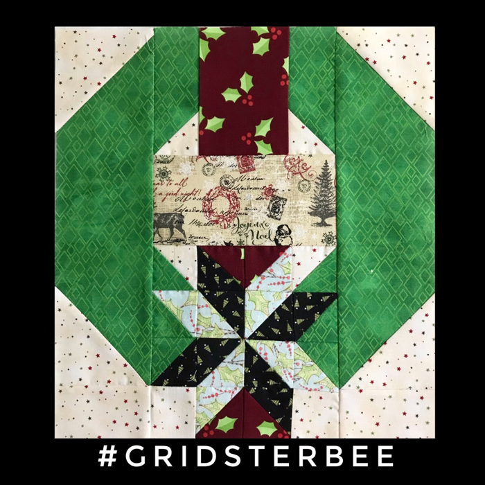
To thoroughly give you seasonal whiplash, this month Marsha had us rummaging around our Christmas stash to make her block. She found the free pattern online from a fabric manufacturer, but I morphed it into a handout for a single block. You can download a free PDF of the directions ifi you want to make a wreath block:

She determined the overall tonality of the fabrics we would use, as she sent us the fabric for the banner across the wreath, the ribbon and the background. Then we could choose what we wanted to for the rest, staying within traditional colors.

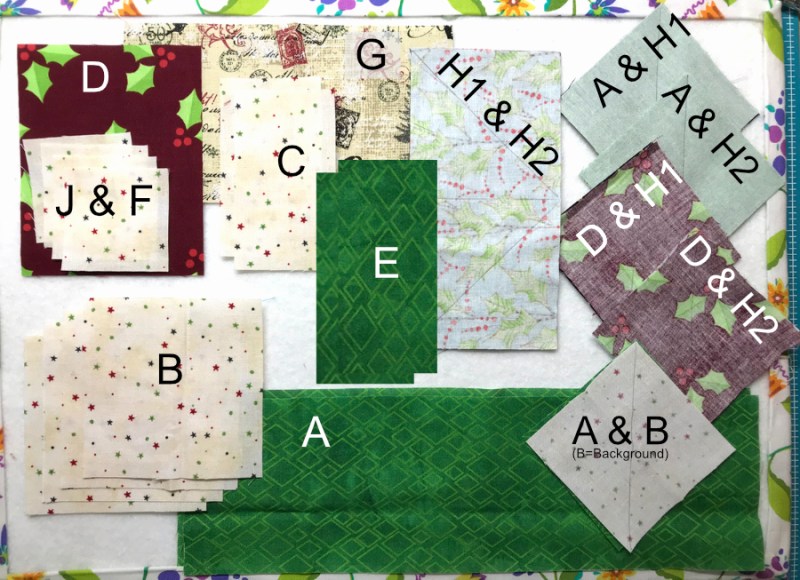
I became confused when figuring out what to cut, as there are a lot of moving parts, so I wangled up this schematic to help me keep track.

It really didn’t take that long. I read about one of the quilters in the BeeSewcial group this month who spent twelve hours on her block for their group (it’s stunning–I always love her blocks). In our GridsterBee, we kindly request to keep it under a few hours. I’ve done a block once that took me 12 hours in a bee, and I swore never again.

Three more SHINE blocks have come back home. They are free EPP downloads, if you are interested. Start HERE.

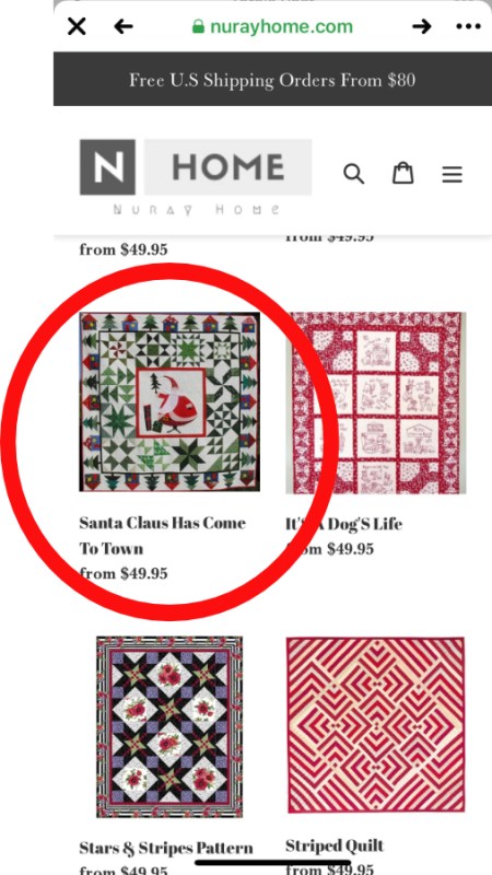
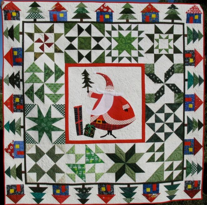
My friend Cindy, of LiveAColorfulLife who found this photo, says “You have arrived. You have been ripped off.” Oh, boy. Here’s the original quilt:

I laughed because it looks like they used this EXACT PICTURE on their website. Not only are they thieving the quilt design, they are thieving the picture, too.

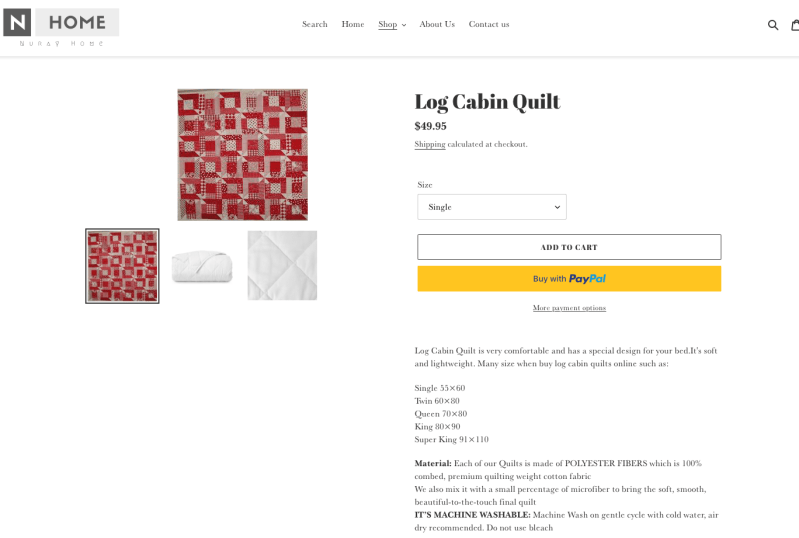
UPDATE: The website actually has two of my quilts. Go and see if any of yours are there, and then write them a letter telling them off, or something. So what do you think? I imagine that they just print the picture on a square of polyester, then quilt it. Interestingly in this second one, they rotated the photo and didn’t make it very large, so it’s a bit hard to see. The original is here.

Almost done clearing out the This and That box. Two things left — hang on for the finish.

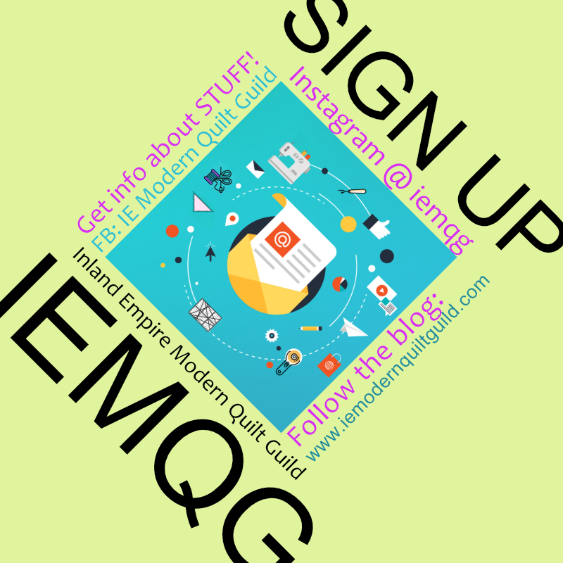
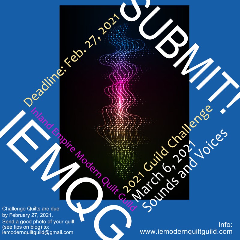
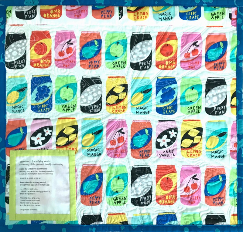
I’ve been asked to keep making the graphics for the Inland Empire Modern Quilt Guild. The top one is the general info graphic about how to follow us and get the news. The lower one is the announcement for our Guild Challenge: Sounds and Voices. My entry is all done and submitted, so I’m looking forward to our meeting on Saturday to see the other entries. Here’s a teaser:

I had gifted one of my other small quilts that had the pop cans on the back, so when I put this one together, I used some more of the pop can fabric. It’s a favorite. I’ll show that in the next post.

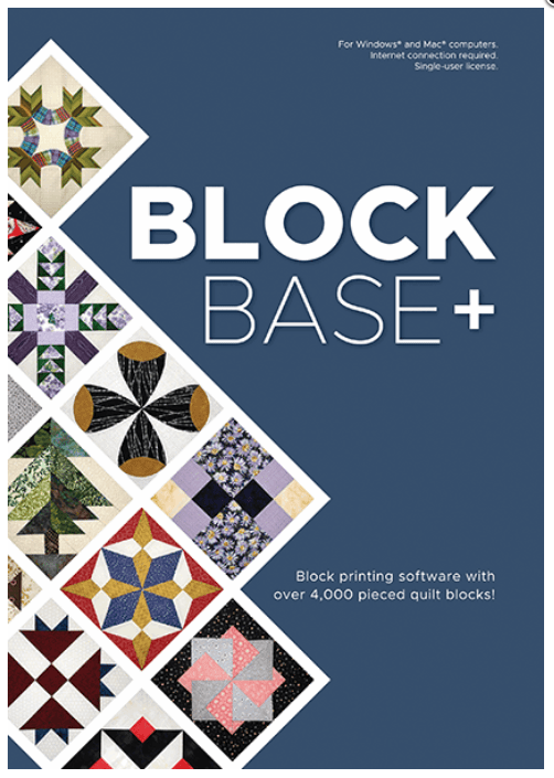
Okay, I promise that this is the last thing. The fine people over at Electric Quilt have been revamping and changing and making a whalloping good piece of software to go along with the Encyclopedia of Pieced Quilt Patterns by Barbara Brackman. I was able to be a beta tester, and will be doing a giveway of the software (both Mac and PC) the week of April 18th, as well as a couple of my observations (and a handout for a pattern) about the software (I love it) and how it can be used. Just wanted to give you a heads up.

And that’s it! Thanks for staying for the This and That Show, and thank you all very much for your comments on my last post. I loved reading about what you think about Craft (both noun and verb), and the assurances that you will keep riding your craft horse into the sunset.
Looking forward to this tomorrow!
And yes, I need to get this quilted.
Also: notice the watermark, bolder than I usually plant on my photos, thanks to the theives, above.