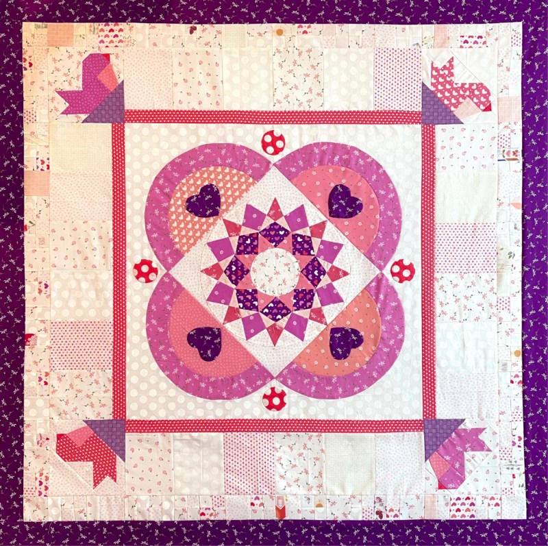
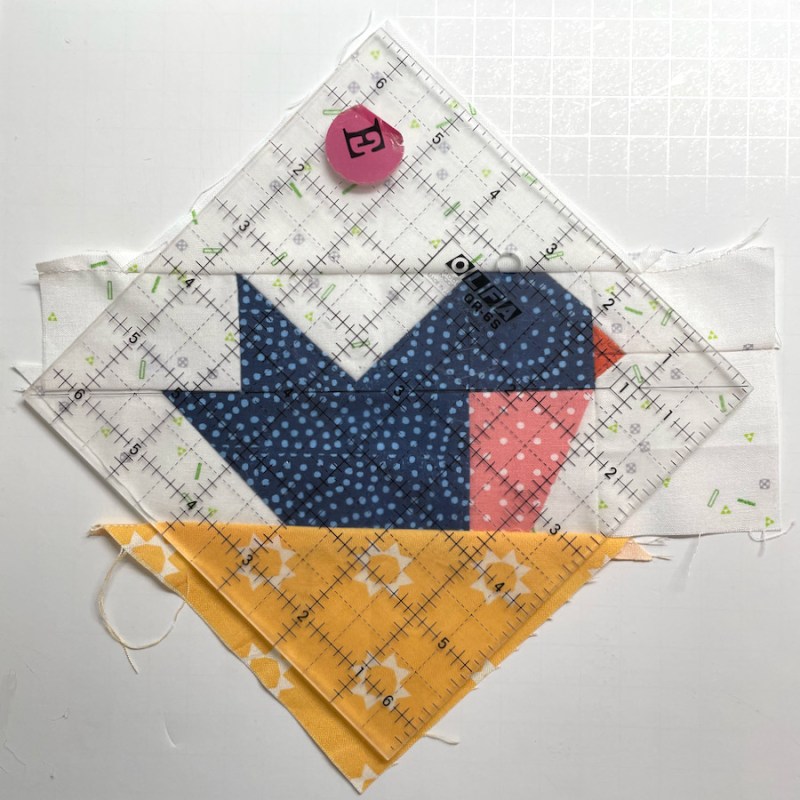
This month is what I call a supporting month in the Heart’s Garden Mystery QAL. Of course you can figure out that flowers will be planted here next go-round, and so you’ll keep that in mind as you create your garden beds for them to grow in. There are three borders: the first inner one with large blocks and corner birds; a second one of interesting bits; and finally, a third one for stability and delineation for what’s coming next. All things rest on your creation this month, but first! some eye candy from Part 2 from Joan, Lisa and Susan:
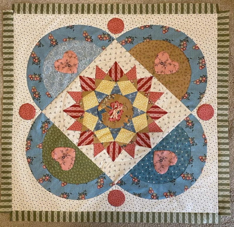
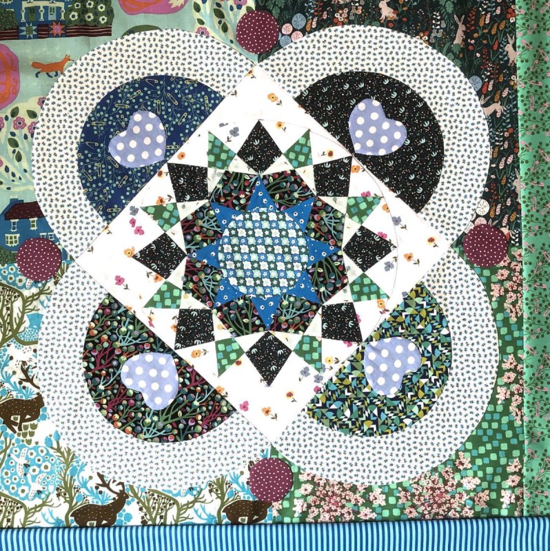
Joan has put a butterfly in the center. Lisa (middle) also fussy cut her center and the striped border is really perfect. Susan decided to create a four-patch in the background of her Part 2 as she didn’t have any one piece of fabric that she liked. I’m really enjoying the creativity of these quilters!
This month includes making four sparrows in the garden.
I made more samples out of scraps to refine the pattern, but most of the fabrics I’m working with are Sherri and Chelsi’s line of Sincerely Yours, with a lot of warm pinks, reds and fun neutrals. After seeing the quilters above, I now want to remake it in something different.
Then the rest is cutting small bits, creating a background for what comes in Part 4–easy, peasy, right? I know it’s hard to create without knowing the future of a design, and my hat is off to Joan, Lisa and Susan for giving this mystery a go. As I mentioned in the last post, it was a bit of a mystery to me, too, after I scrapped the design of what I’d been headed toward and reworked it into a medallion quilt, but now I’m full steam ahead.
Here’s the front of this month’s installment. Parts 1 and 2 have come down, but all parts will be available in a stand-alone pattern, for sale in mid-summer. Our Instagram hashtag:
[UPDATE: The pattern is for sale in my online pattern shop.] Hope you enjoy making this third part. If you can post them on Instagram they will be fun to see! P.S. If you can’t manage another project, feel free to download for another time.
Happy Quilting!
P.S. This is how I feel about Daylight Savings Time.
All the smartie pants people who Know Stuff say we’ll be shuffling through covid for quite some time, and that we just need to practice keeping going. So my usual at this time of year is a round-up of quilts, a way to say, well I wasn’t quite a total slouch in 2021. Evidence follows.
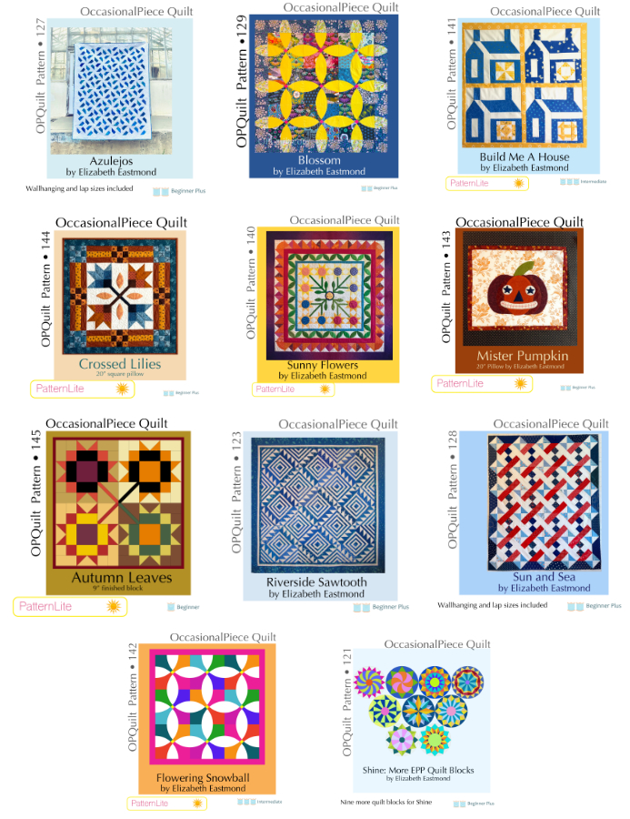
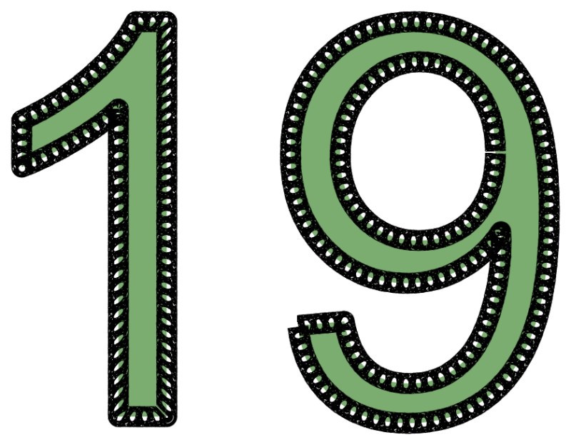
I made nineteen quilts:
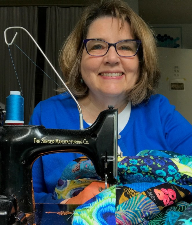
Here’s the listing in my Quilt Index–300 Quilts. I thought the photo above of me at our Guild Meeting, wearing a mask and holding the 19th finish (A Tiny Spritz of Elements) was appropriate. We’re back to virtual meetings for the next three months with the Omicron Covid-19 outbreak.
I spent a lot of the time at the computer, writing up eleven new patterns. Sometimes I’d write a Pattern Lite pattern, then keep adding things until it became a full pattern. That happened with Flowering Snowball growing up into Blossom. Others were old patterns, previously released, that needed extensive revision and clarification.
I took only TWO loads to the thrift store, and then they wouldn’t accept a couple of pieces of small furniture. I cooked so much the first year of the pandemic, that I was more hit-and-miss this year, but still averaging 3-4 home-cooked meals a week. We are partial to Vietnamese, Korean, Japanese and whatever can be found in the open-this-bag-and-cook-it aisle of the grocery store.
If I take into account all the “ifs” (Covid-19 rates, masking, health, how the world is turning), I’ll be at Road to take a class and see my quilts in January. Ditto for February’s QuiltCon in Phoenix. Beyond that, you’ll find me in my sewing room, stitching away, writing some more patterns, keeping a difficult balance.
If you are new to this blog, you can find out more about me by reading another Happy Old Year Ending post.
A favorite poem from grad school, it is thumbtacked over my washer. My wash doesn’t hang out on the lines between buildings, nor does it ever look like angels, but I think we all are trying to keep a difficult balance.
The eyes open to a cry of pulleys, And spirited from sleep, the astounded soul Hangs for a moment bodiless and simple As false dawn. Outside the open window The morning air is all awash with angels.
Some are in bed-sheets, some are in blouses, Some are in smocks: but truly there they are. Now they are rising together in calm swells Of halcyon feeling, filling whatever they wear With the deep joy of their impersonal breathing;
Now they are flying in place, conveying The terrible speed of their omnipresence, moving And staying like white water; and now of a sudden They swoon down into so rapt a quiet That nobody seems to be there. The soul shrinks
From all that it is about to remember, From the punctual rape of every blessèd day, And cries, “Oh, let there be nothing on earth but laundry, Nothing but rosy hands in the rising steam And clear dances done in the sight of heaven.”
Yet, as the sun acknowledges With a warm look the world’s hunks and colors, The soul descends once more in bitter love To accept the waking body, saying now In a changed voice as the man yawns and rises, “Bring them down from their ruddy gallows; Let there be clean linen for the backs of thieves; Let lovers go fresh and sweet to be undone, And the heaviest nuns walk in a pure floating Of dark habits, keeping their difficult balance.”
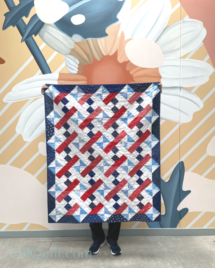
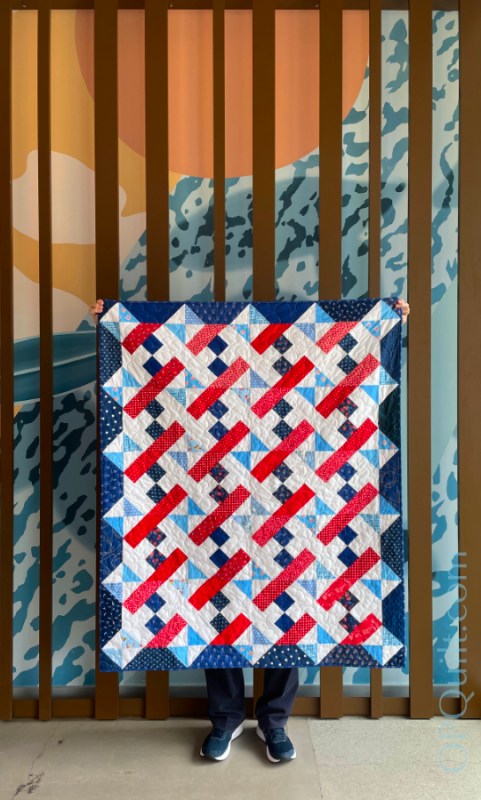
Summer Snowcone, variation of Sun and Sea Pattern Quilt #251 48″ wide x 56″ high
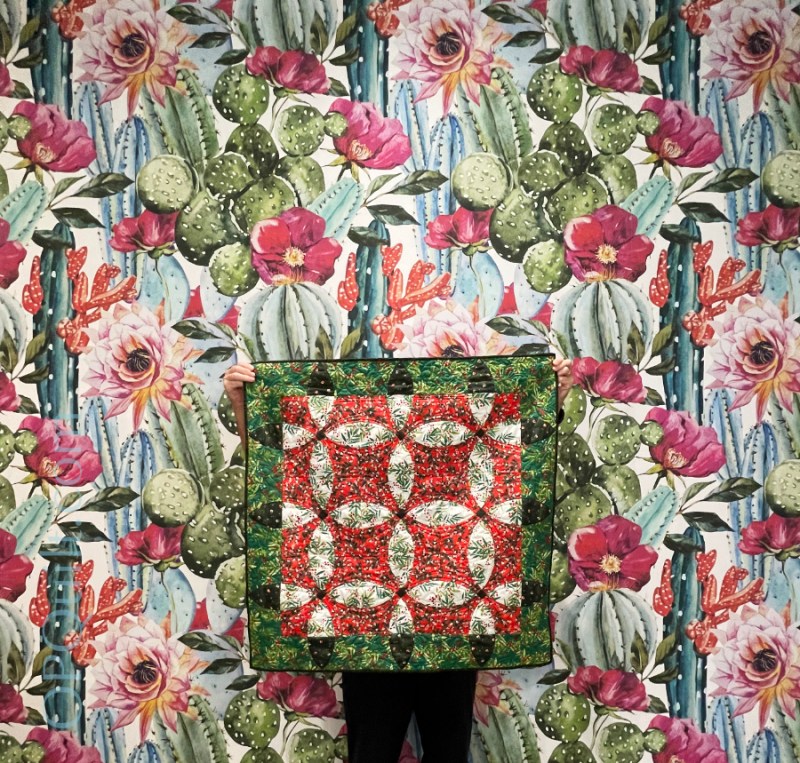
Advent, previously shown but what a cool backdrop of flowers. It was in the women’s bathroom, but I couldn’t resist. (I propped open the door and we were in and out in under 60 seconds, and no one was there.) And yes, I have the best quilt-holding husband on the planet.
The drive to meet our son for lunch was about 90 minutes, and I wanted to finish sewing down the hanging sleeve on Advent and the binding on Summer Snowcone, so we had them along. When I saw that painted hallway, I grabbed the quilts out of the car for photographs.
Photographed in the hallway at City Tacos, Sorrento Valley near San Diego. Since my son’s a working man, we drive to see him and his girlfriend. A good day out.
Website of Interest: A project to make a kimono representing every nation was recently completed. The website groups the kimono by continent, and then you can navigate to the country you want to see. Of course I went to see America, then copied and pasted the text into Google Translate.
Their caption, translated:
The image of a country consisting of 50 states called "United States" is expressed by "state flowers". Designed with the national symbol "President" as "American Eagle". Baseball, American football, Hollywood movies, and the goddess of freedom, which Americans love, are studded in the state flowers, and the great presidents Lincoln and Kennedy are represented by statues and Apollo programs.
I love that Abraham Lincoln is right up there with the “goddess of freedom (which Americans love) as well as baseball and Hollywood. When they say “goddess of freedom” I think they mean the Statue of Liberty. But so cool that they included all the state flowers.
I’m now going to go waste a lot of time thinking about how I should get more stuff done. But hey! it’s Labor Day Weekend and we honor the concept of Labor by relaxing, barbecuing and not doing anything.
“Fashion is not ‘art’, because the latter is sufficient in itself while the former always has a purpose, a function, a use. Recognizing the differences is the first step to instructing mutual listening, made up of curiosity, enthusiasm, and respect. This listening needs time, just like Haute Couture and ultimately also like art. In fact, the maturation of the project was slow, a rhythm perhaps unusual for our world but just and intimate for the world that I would like to.” -Pierpaolo Piccioli (from here)
And if you understood that, then you are more experienced than I in the language of haute couture–the clothing, the dresses, the fashion that is more concept than something you would hang in your closet. But just like the movie The Devil Wore Prada in that withering scene where Meryl Streep’s character critiques Ann Hamilton’s sweater, the fashion houses often tilt us to what’s coming in shape, in color and in what we’ll be wearing post-pandemic when we finally decide to crawl into stores and buy ourselves some clothes.
It’s also very likely that we’ll be seeing some influences on the colors we use in our quilts, or maybe even the shapes we’ll experiment with (if you are a half-way, non-traditional quilter). Or not.
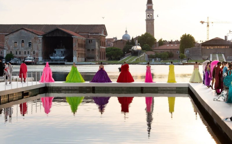
So I was pretty amazed by the colors put together by the designer for Valentino, Pierpaolo Piccioli, and while I can’t pretend to really absorb what he said (above), I do speak the language of color, and thought you might like to see some of his designs, shown recently in the magical city of Venice, Italy. The contrast between that very old city with its own recent struggles with over-tourism, pollution and dwindling residents is a perfect contrast and foil to the glamorous, hand-sewn clothing made with extraordinary precision with pricey fabrics.
As Vanessa Friedman of the New York Times wrote: “[The designer Piccioli] has been conversing with contemporary artists — about their work, sure, but mostly about life in general, process, emotion, what turns them on — thinking about how to integrate their points of commonality in cloth…The result — shown at sunset beneath the brick arches of the former shipbuilding yard of Venice, with water lapping at the edges of the runway…was as powerful an argument for the interconnectedness of time, human connection and creativity as anything fashion has produced. The lushness of Mr. Piccioli’s palette — as a designer, he is the best colorist since Yves Saint Laurent — was on full display; so was his throwaway elegance, and his generosity. Not just to his atelier (his show notes name-checked the individuals who sewed each garment [italics are mine]) but to the bodies that will wear the clothes.”
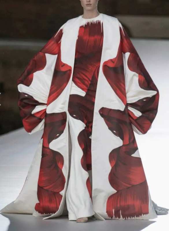
In the above image, I see scale: large shapes on a larger garment, then those same large shapes on a more narrow profile of a dress. The designer plays with scale in many of his other pieces, using different shapes to emphasize different parts of the body, and different lines (like those flowing hats!).
I also see a lot of color blocking: large swaths of color against slivers of color (a bit of scale, again), causing each to accent the other. This collection is not about fussy little prints. Mostly I see lush, elegant and rich, deep colors:
This palette is missing the mint of the shirt. Sure, it’s a metallic shimmer of color and hard to catch, but that really makes this grouping, in my mind.
In this one, the palette generator is capturing a lot of the background, but it’s that’s slice of bubble-gum pink against those deep coral trousers which really caught my eye. The grey isn’t those flat greys we are used to seeing in our quilting fabrics, but a soft mellow gray, warmed up slightly, but not heading towards taupe or green-gray — maybe a deep off-white?
Orchid appears to be heading our way, but a vivid hue of that color, especially when paired with bright jungle green.
While the palette generator captured a lot of the background (I don’t see that pinky brown anywhere on the model), this palette is a “be-still-my-heart” series of shades for me as I love aqua blue. But it’s a new take on that–a refreshing deeper shade.
Now to shift gears from haute couture to the nuts and bolts of my life lately:
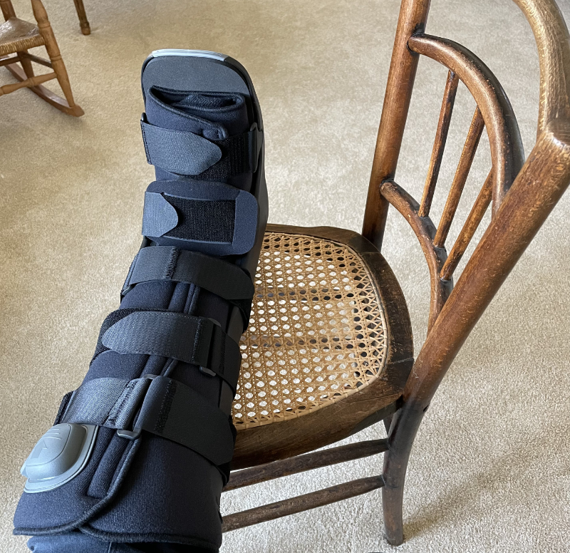
How about some velcro bolts? This is the boot they gave me to wear while my ankle heals. I hate it for a variety of good and not-so-good reasons (would it kill them to add some color?). The doctor okayed my getting around the house without it, so I’ve just decided to ace-bandage-wrap my ankle for protection, stay off it, and stay home. What’s four more weeks of pandemic quarantine?
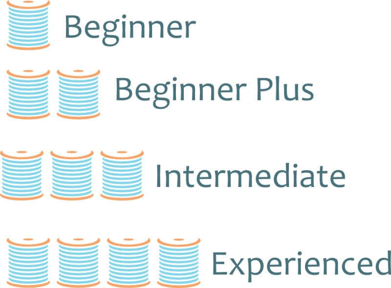
Very proud of this: I drew the spools up by hand. Well, digital hand. Yes, it’s in my favorite color (aqua blue). I have found lately that getting the hang of a few tools in my Affinity Designer has opened up new worlds for me in terms of satisfaction with my work; it was a bit of a struggle at first, but a bit smoother sailing now. And why did I make these?
I didn’t like the nuts-and-boltsy (notice how I’m stretching the metaphor) look of BEFORE as it was too chunky and disparate. I also wanted something as well that would indicate degree of difficulty at a glance. So, I made spools. And I like how the shop looks now.
This is the new display pattern front. I still have a few things left to do, but have finished most. PayHip upgraded some of their marketplace tools, so I thought it was a good time for me to fuss around a bit, too.
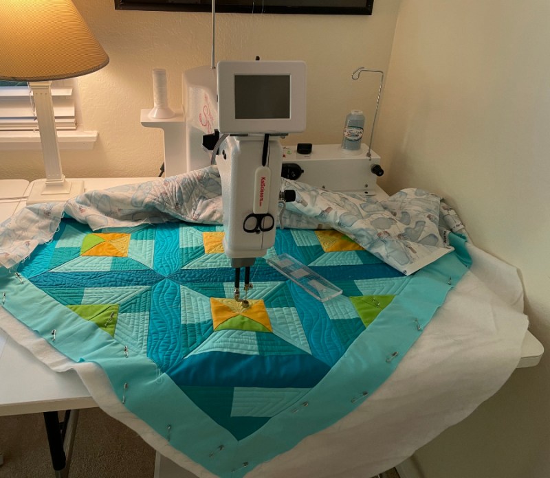
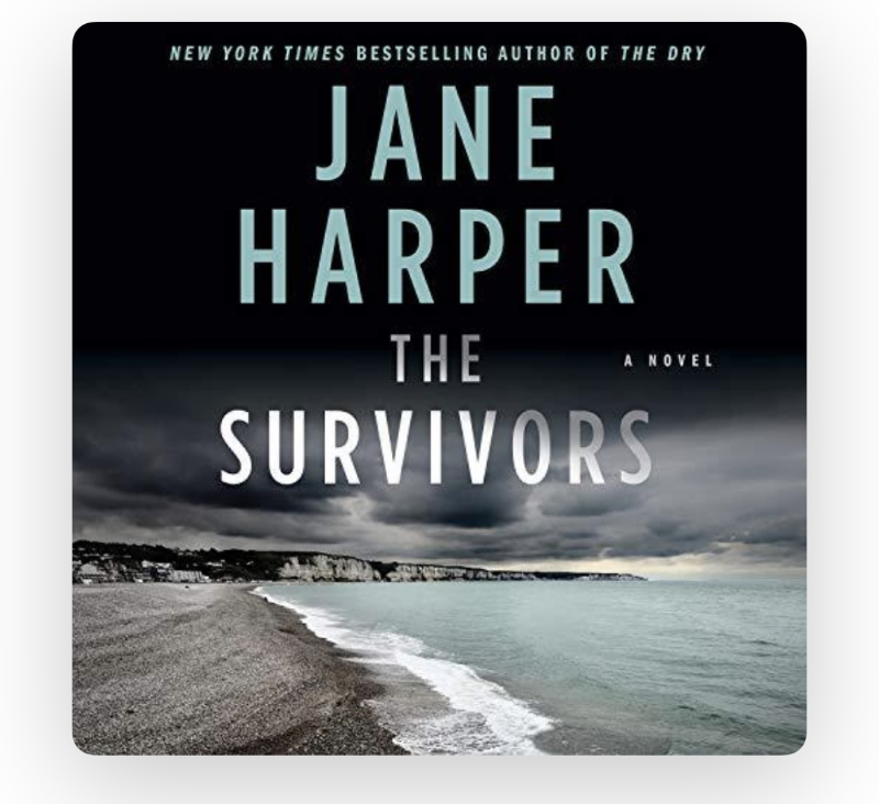
Quilting SeaDepths (a variation of Azulejos) in spurts, while listening to this:
I like how the themes overlap: the ocean in Harper’s book with the theme of SeaDepths on my newest quilt. I can hardly wait to go upstairs and quilt. I’ve listened to two of her others: The Dry and The Lost Man and loved both of those. I will reserve my review on this until I finish it (5 more hours). While I listen, I think of Susan of PatchNPlay, and her trip to Tasmania. I can’t wait to show off the backing I chose for this quilt.
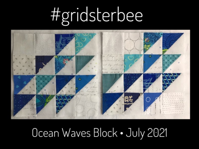
Lastly, there seems to something in the zeitgeist here, but truth! Patti chose this without knowing all the other watery connections I’ve just mentioned. If you jump on this link, you can see a lot of the blocks she’s received, all laid out together. I love how nice they all play together.
And that’s it for today. Happy July, Happy Not Wearing My Boot, and Happy Quilting!