 I admit it–I was in two fabric stores today: Michael Levine’s in Los Angeles (where they had 10% off all quilt fabric) and Sew Modern (always a treat to visit). I went to Los Angeles as part of my week-long This-Will-Matter-Spring-Break experience, which also means I’m trying to avoid cleaning out the garage, or other household chores, but I did love Lily van der Stoker’s take on housework, seen at the Hammer Museum at UCLA:
 I’d gone to see Charles Gaines’ work, as he’s all about the grid, but the pieces I really wanted to see were in an area of the gallery that was roped off because of maintenance (which made me a bit crazy). Above is a schematic of fallen leaves off a tree (you can see the branches in the background), but it’s something you just have to see–I can’t explain it. And then I topped that all off with four hours of LA traffic (Motto: You Aren’t in a Hurry, Are You?) and a fun night at my local quilt guild. And all around was pattern. The stack of fabrics I bought were prints. The art I saw in the gallery was based on the grid and time and three-dimensions and it was all this idea of marks on paper, on photographs. . . no blank space unless it was part of the idea of his work. But the filled–in little squares defined those blank spaces.
 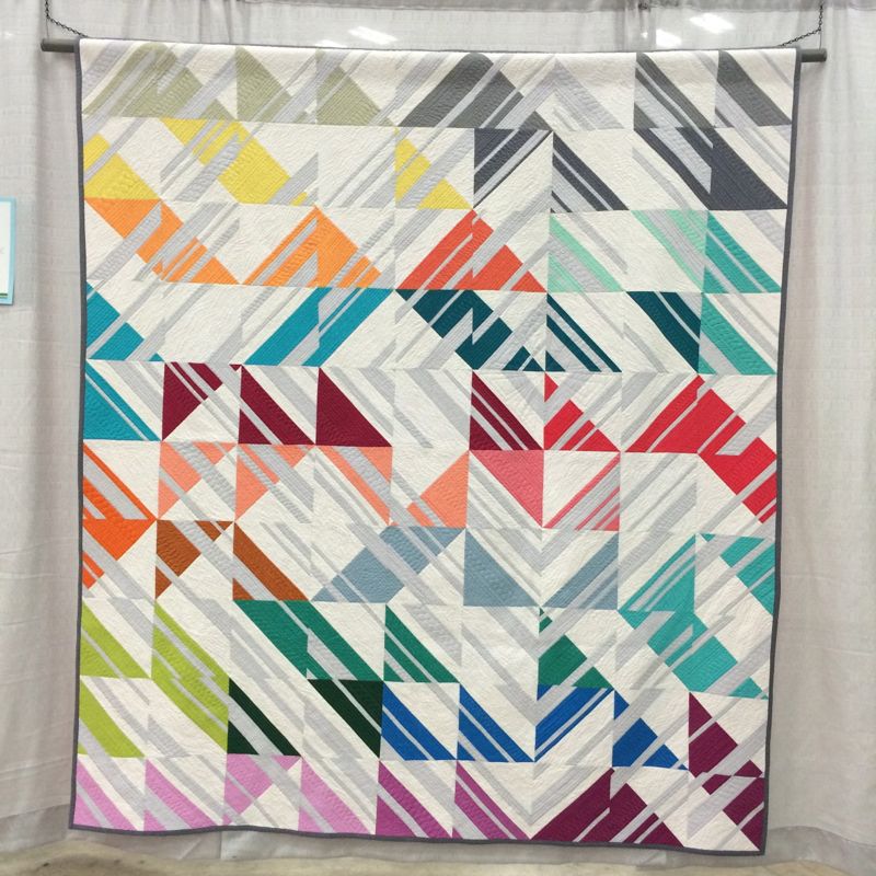 Now look at this. This is predominantly what I saw at Quiltcon: solids. Yes, chopped up, sliced, diced and pickled, but all solids (kidding about the pickled part). Over and over. And straight lines. Over and over. Don’t get me wrong–I really enjoyed the show, only tiring of the square-in-a-square or rectangle-in-a-rectangle when I saw it too often (time to move on now, peoples). Where were the prints? There’s been a healthy discussion going on on Instagram (just click on the button on the right to be taken to my feed, where you’ll also find the names of the makers of the following quilts) about what happened to the prints?
  I was a total fan-girl for Alison Glass and her prints.
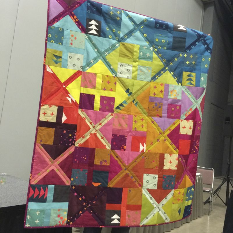
 And here is Heather Ross, she of print fabrics fame, agreeing to a selfie with me (yes, I’m a fangirl there, too). But I did find some prints, and I thought I’d show you them. Notice also how many straight lines there are. Yes, there seems to be a bias against curved seams, with a few notable exceptions (Leanne Chahley’s fine work comes to mind), but here’s a few quilts that had print fabrics:
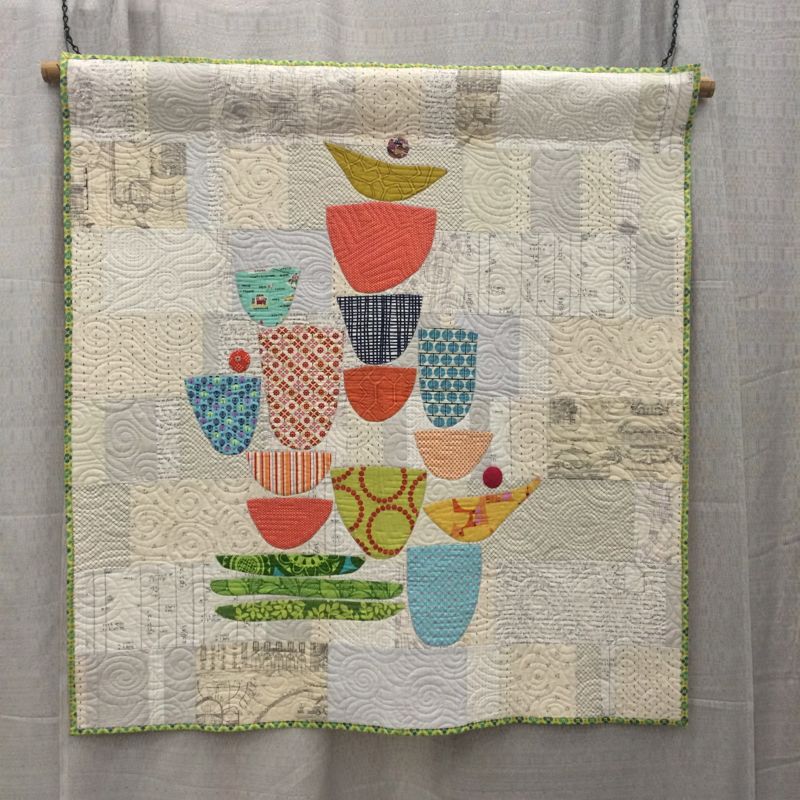 This was a small quilt–maybe 24″?
 Lee Heinrich also does excellent work with prints, making them modern by her treatment of them through repetition and color-shifting.
 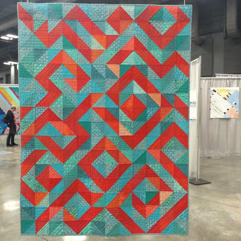 When there were prints, they were more like this one, where the print “read” as a solid, disappearing.
 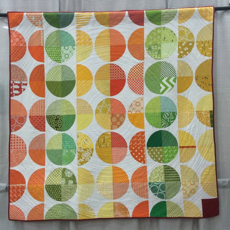 Caught in the QuiltCon wild: a quilt with prints AND curves.
  And another, with detail shown below. The prints aren’t try to disappear, they are there in all their patterned glory.
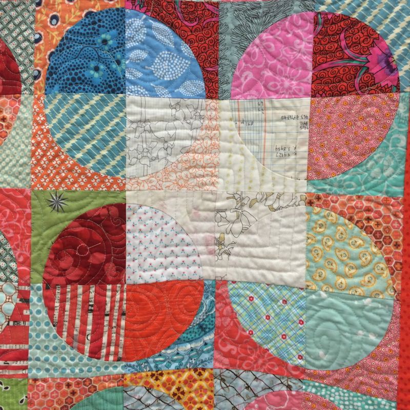
 Here’s another great use of prints, by the talented duo of Lora Douglas (piecing) and my friend Linda Hungerford (quilting). Again, click on Instagram and scroll through the photos, then click to see the captions, where I identify all these quilts and their makers (offending several in my family with my quilt-heavy feed–cue eyeroll).
 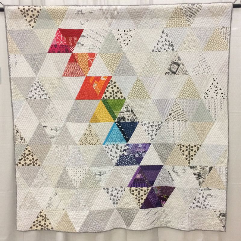 Final print-prominent quilt of QuiltCon for this grouping. Like I said, the majority of quilts were solids, pieced and quilted in straight lines. Glorious, but there is obviously a bias. Now take a look at what WE, the QuiltCon attendees were wearing:
 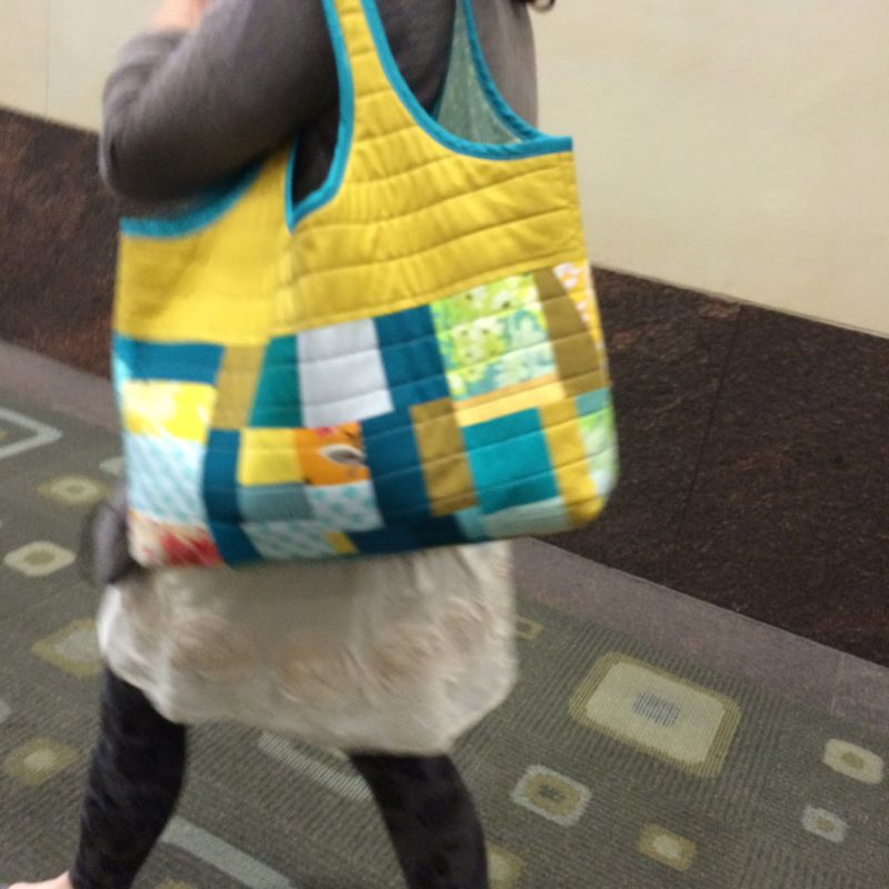 A mix of solids and prints.
  Charlie Harper on a backpack.
 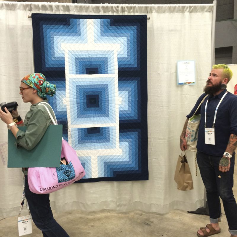 Her scarf? Print. His body? Print.
  I wish I’d had the guts to ask Storybook Lass for a photo showing the front of this dress. And here was a quilt by Windham Fabrics, a manufacturer:
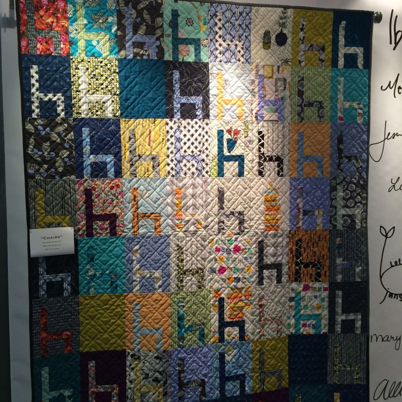
 And the lovely young woman who sat manning the Sit and Sew Booth, with a lot of fun PRINT fabrics (her creation after sitting there for four days).
 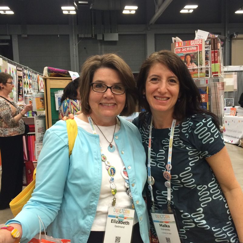 Malka Dubrawsky, who has wonderful bold prints (yes, I was shameless in asking for selfless), as well as Vanessa Christensen (below) of V and Co. with lots of fabulous prints in her line of fabrics (although she is showing a solids quilt example for our class).
 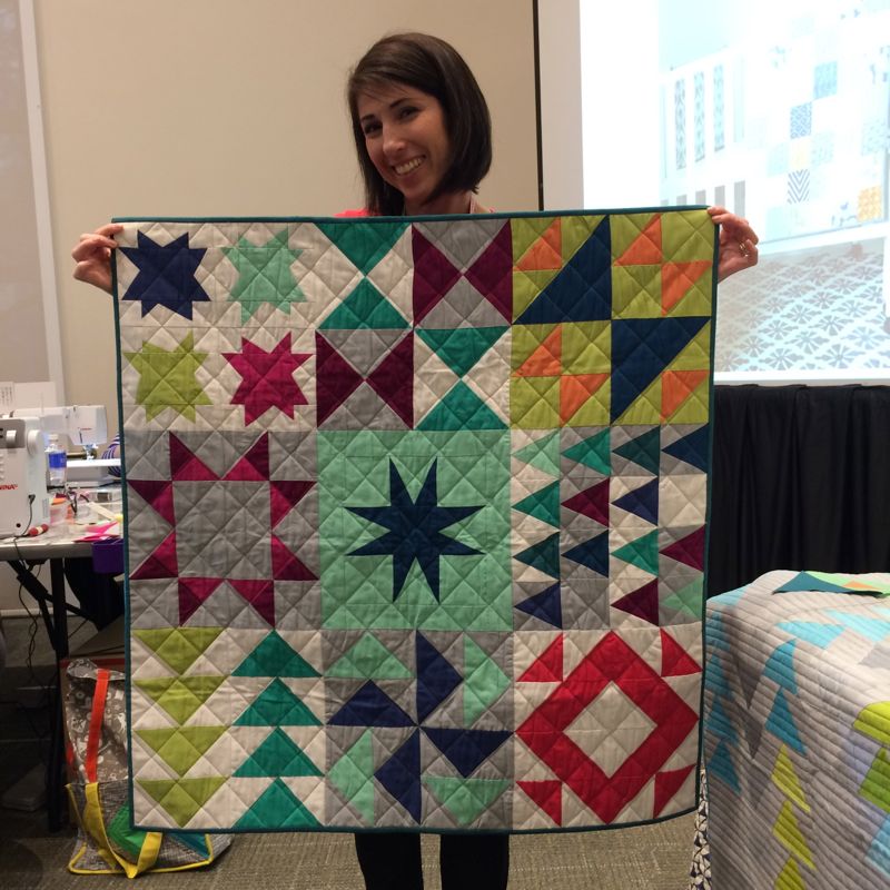 In talking with the saleslady at Sew Modern today, she saw some of the same thing (as she cut my yardage of. . . what else. . . prints), but here’s hoping that the Modern Quilt movement will start to branch out as the skill level grows of these quilters, finding ways to incorporate print into their modern version. Next show is in a year, in Pasadena. Stay tuned.
  I was totally impressed with all the things you readers have been doing, from cleaning out cupboards, to fixing computers to making blankets and quilts. Since today is March 17th, St. Patrick’s Day, I chose the 17th commenter for one prize, then did a double-algorhymic interpolation to pick the second winner. Just kidding, I picked the first person who wrote, because Vanessa Christensen was the giving away tons of cool stuff in her class, but I was number 1 and NEVER got picked. Ever. So I thought that our Number One should win something. Congratulations–I’ll send you an email to get your mailing addresses.


Discover more from OccasionalPiece--Quilt!
Subscribe to get the latest posts sent to your email.

Oh yeah I love prints too, I’m so glad you picked Jo Avery’s quilt as an example, it is one of my favourites and she is lovely too.
All these prints remind me I need to finish my article on postmodern quilting….
When the article is finished I want to know where to find it
So… solids, straight lines. One thing I notice, too, is, at least in the pix you show above, there isn’t much variation in use of color. Seems like the same color set over and over. Is that due to what’s available for fabric, or trendiness, or … what? I’d be interested in your thoughts.
Thanks for the fun report.
Hi Elizabeth – I am a new fan of your blog !! its wonderful and gets me sooo excited to retire soon so i can have more to share – the quilts from Quiltcon also intriguing to try and expand myself into new ways – I know i will learn a lot from you! thanks – J Evans (ucr quilter)
Loved this post about all the solids at Quilt Con and then was surprised with my name at the end! Thanks Elizabeth!
Thanks for sharing the Quilt-Con photo’s. I guess I am not the only one who notices the preference for solids in the modern world. I am drawn to prints. Guess I am a traditional person.
I am definitely more of the prints type person too. The solids look nice, but are pretty boring to me. I can’t wait to see what you do with all of your newly acquired prints. Shopping at Michael Levine’s is always a delight a bit overwhelming too!
Thanks for sharing all of the great quilts!
I think that it might be that you are reacting to the acceptance of solids in the show. If you look at the winning quilts, for example, 19 of 42 have prints in them, including all of the best in show and all the other top prizes (but one of the judge’s choices). This show was, in my view, much more remarkable in its acceptance and inclusion of flat printed fabrics (as opposed to textured solids, batiks, painted solids, etc.) and so they stand out in comparison to other shows. I don’t actually think that there were more quilts with solids than prints, I think that they were about evenly matched. And I expect that is was the same with the lines, again the acceptance of them just stands out compared to the swirling quilting and piecing of a traditional show.
I think it will be interesting to see what is favored for the next show 🙂
Ready for a book? Hah, I’ll try to keep it short. First, I think that since many modern quilters come from a graphic design background or at least that influence (we are the digital generation) you are going to get solids. After all, in advertising and computer design, prints are distracting and tend to be avoided. Second, I think prints are actually harder to work with. I took a class a few years ago with Vicki Pignatelli (who uses everything!) and she pointed out that from a distance, most prints tend to read “medium”. Third, with a busier print, the quilting itself is much less noticeable. Isn’t that why we put prints on the back of our quilts, to hide the stitches? If you have too many prints the standard modern “straight line quilting” is lost.
Well Elizabeth it sure looks like fun! That little 24″ quilt made my heart go putter patter. Very cool. Enjoy your day. One year I hope to get to Quilt Con : )
But I really, really like solids. And match stick quilting. And then I ponder the construction of taste. Sigh. Probably more from frequent input than anything internal. In my taste’s defense, I have not acquired a liking of mixed clashing prints just because I’ve seen them often. I remember the Amish solids phase. I remember moving from one print,two coordinating solids and white (70s) to carefully mixed prints in log-cabin blocks (80s). I do love the challenge of mixing prints and making it work, though I would define “working” more conservatively than many of my modern quilter friends.As to QuiltCon, I will continue to watch it but do my own thing.
I had to click over and read the comments because I thought there might be some interesting ones. I started quilting about 3 years ago. I have a full-time job so it is solely a hobby for me. I discovered quilting blogs about 6 months after I started quilting. The use of white and solids amazed me (as did some poor workmanship from popular bloggers). I speculated by what some wrote that solids were cheaper and therefore they used them more. I am a print girl and joke I’m allergic to solids. Over the last six months I’ve started incorporating some solids into my projects but prints are just so pretty. Thanks for blogging and entertaining me while I eat lunch!
It’s so interesting how a “label” becomes fixed and the parameters seem concreted! “Mod” quilting/piecing = solids, geometrics, grays, straight lines, etc. I thought it would be more like today’s ‘take’ on the art of quilting/piecing……whatever or wherever that takes the artist but that may be a bit naive of me to have that idea since I do know of those who have their quilts rejected from such “Mod” events as not fitting the “definition” of what they wanted (although a clear definition could not be found anywhere!!!!!).
“His body? Prints.” Best line of the day.
I agree with your observations, Elizabeth. A majority of the quilts used solids, and a majority of the quilts were straight line quilted. Too simplistic, in my opinion. Not sure where that leaves us print-lovers and elaborate quilting-lovers when it comes time for Pasadena, but I’m pretty sure I’m not even going to try and find out. Not entering and not going. I’ll be watching interestedly from the sidelines. Thanks for calling out “Ad Libbing.” Those improv blocks were nothing but prints, but the solid white negative space outweighed the prints.
Another great quilt show sampling, Elizabeth. My favorites were the little 24″ quilt and the Windham Fabrics one.
I’ve not been following the solids vs prints debate on Instagram so can’t speak to that. What I have come to realize is that I like, and make two different styles of quilts. Some are driven more by a strong graphic design element and those are often much better suited to all solids. They are about the graphic elements, composition and edges that solids provide. The other type of quilt I make is driven more by fabrics and color and the desire to play one print off another. This is where my heart usually soars. Strong graphics still play a part but solids aren’t needed to pul it off. I can make an all solid quilt and be satisfied with the strong graphic statement it makes but once it’s done I can actually be a bit bored with viewing the end result. It’s all there to be taken in at a glance. The chaos of print and color on the other hand draws me back again and again as my eye wants to wander around and see new things. So I will continue to use both solids and prints as the inspiration strikes. I do hope that the modern movement will embrace prints, especially large scale prints in the future.