Quilts

Windowpane: Frivols 2 – Finished

FrivolsButton

Frivols_2_13a
Better get going…

Frivols_2_front

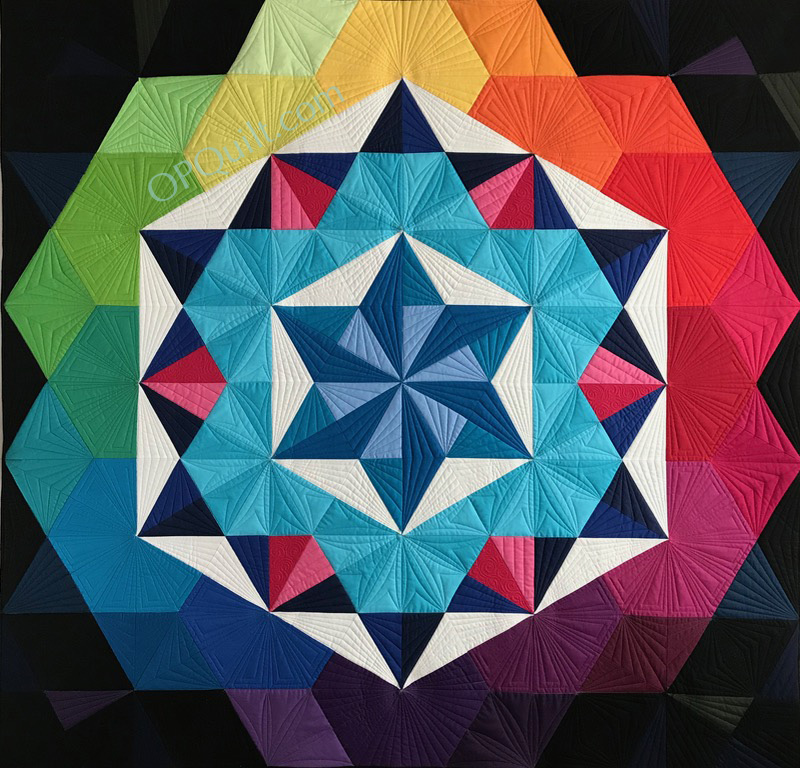
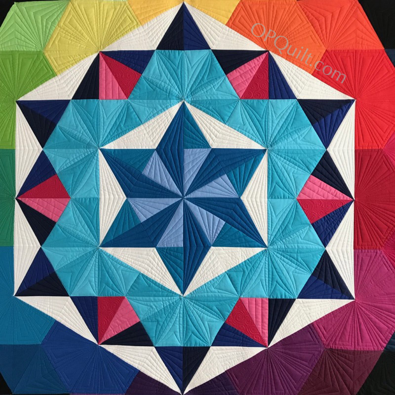
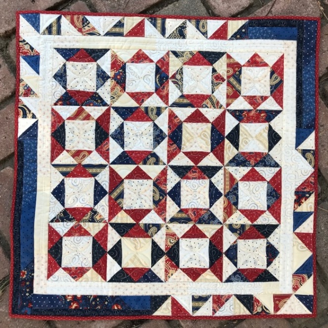
Windowpane, Quilt #196
26″ square • February 2018

I have finished Frivols #2, and maybe it was just because I was listening to another Maisie Hobbs mystery, but I had things go awry in a couple of places.  Because of this I thought I’d lead off with where I went wrong.

Frivols_2_13b

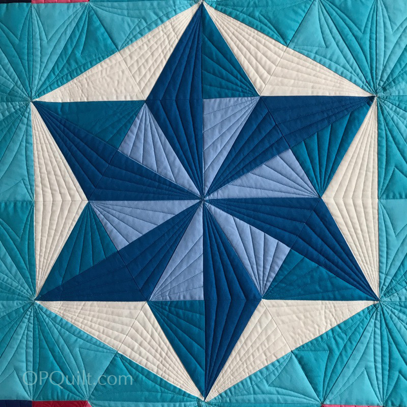
So, this went right.  I stitched together the four smaller HST to yield this little cornered square.

Frivols_2_14

But now…those corner blocks!  Was I supposed to do all navy blue in making these?  Some red?  All the red?  The pattern doesn’t give you specific directions on this one.  I had cut all the quarter-square triangles from the 4″ squares–cutting up blue, red and cream, sewed them together as they showed, and was now left with this quandary.

Frivols_2_15

So I had my pile of trued-up HST made from the smaller squares, and now a pile of cut quarter square triangles.  I didn’t catch this little bit: “make matched sets.”  That means the same blue and the same cream will create a “set.” The same red and the same cream.  I didn’t do that, so my corners are a lot more red and the quilt is a bit more scrappy.Frivols_2_16

I did the best I could.  I chose to get the “set” with the lighter fabrics, and yet you can see there is that one wild-card darker fabric, lower left.  It’s supposed to match the one on the other side.

The real quilt shown on the front of the card is slightly different than the drawing of the quilt, and that’s where I became stumped.  My advice is to use a large table, or your ironing board, or something and lay out all the squares and their split corners.

Because I used more red in the making of the centers, I had less of that for the outer split (quarter-triangle) corners, as well as for the outer border.  Oh well.  Back to the philosophical part of the brain, realizing that I’ve had these Frivols tins for over a year and it won’t matter to anyone how they get sewn up.

Frivols_2_16a

Pressing on.  First two split-corners are sewn on, and I’m now doing the other two, and trimming dog-ears.

Frivols_2_17

When squaring up your blocks, pay attention to: 1) the diagonals, 2) where those little triangles on the sides and top point to.  You want it to be visually fluid.

Frivols_2_18

After 55 permutations on the design wall, I’m good to go.  And that’s the end of the nighttime photo shots.

Frivols_2_19

Border #1 attached.

Frivols_2_19a

Border #2, after figuring out all the version of the triangles and where they go (I wish I’d had a few more reds…).  Yes, the border’s a bit long, and not perfect.  (A truth: rotary cutters erase mistakes and never gossip.)

Frivols_2_19bFrivols_2_19cFrivols_2_20

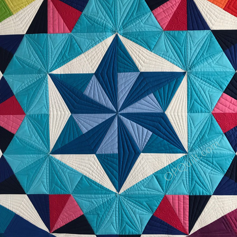
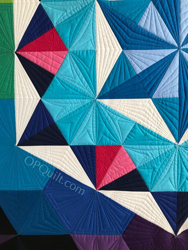
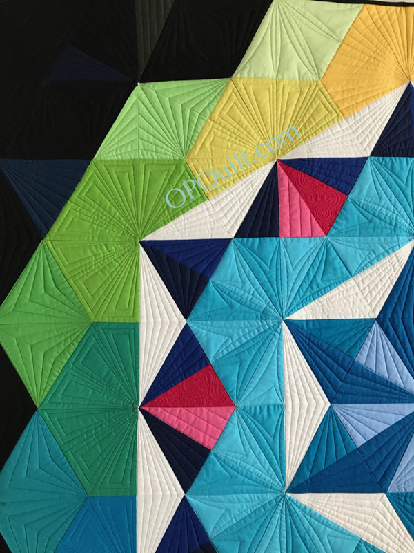
I found a backing I liked that was busy enough, layered it into a quilt sandwich and began my FMQ the way I always do: trying to figure out what to do.  I didn’t want to do a million little stitch-in-the-ditch lines.  So I went to my IG hashtag #fmq and found this idea: a ribbony frame for the center, and I added the small four-petal flower.Frivols_2_23aFrivols_2_23bFrivols_2_front detailFrivols_2_origin1

So I’m always trying to connect the dots between today’s patchwork and our fine history, and think this could be a connection: if you erase the middle of that block, and put in that square-in-a-square, you’ve got it.  Nancy Cabot (from the 1930s) called that block a Cock’s Comb, but certainly it’s not the same.

Frivols 2 windowpane.jpg

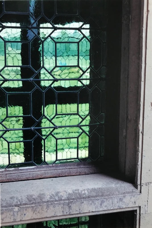
But for my title of Windowpane, the repeated themes of squares and angles reminded me of a window I saw once in a Loire Valley chateau.


200 Quilts · Quilt Shows

Rainbow Gardens and Quilt Mascot?

RainbowGardens2017_front

My Rainbow Gardens has made its way out into the world.  I was contacted by the Victoria Quilter’s Guild in Victoria, B.C. (Canada) to ask if it was all right if they used my quilt for their poster.  The theme of the quilt show and sale is the City of Gardens, which is one of Victoria’s names, according to the website for the city: “Victoria – otherwise known as the “City of Gardens” – is home to a number of spectacular gardens that range from formal to heritage, exotic to west coast, and multi-themed to mostly rhododendron.”

So, a quiet and reserved “YESSSSS!” was my response.  I soon will have the poster in my possession, which I plan to tape up on the door to my sewing room studio.

Rainbow Gardens Poster

While the real life poster should arrive here soon, I was sent this image of the poster by a an observant reader of mine, who saw the poster and sent me a photo of it.  If you are up in that area, put it on  your calendar — I would love to go to a quilt show that has live music.

Japan Tokyo 2020 Logo

Since we’ve all just finished watching the Olympics in Korea, I thought I would get you prepped up for the Tokyo 2020 Summer Olympics, by showing you their patchwork-like logos.  Can we make quilts like this?  They are auditioning their mascots now, because no matter where you are in or what you are doing in Japan, there is a mascot for it.

I think we need a quilt mascot.

Lady Liberty in Quilts

I made this image in my very first Digital Art Class; the other students thought I was pretty much a nut-case, but I still like Lady Liberty draped in a quilt.  But now as we are more international, we need a cute little quilty creature (I vote patchwork with some appliqué) to carry forward our message.

Go to it, you creatives!

200 Quilts · Creating · Quilt Patterns · quiltcon · Quilts

Annularity II

Annularity1PBStudios

This is the story of the design of my quilt Annularity.  It is also the story of Annularity II, which will hang at QuiltCon in Paintbrush Studios Booth.


Annularity II
Quilt Number 194
Designed and Pieced by Elizabeth Eastmond
Quilted by Natalia Bonner
59″ square

The story of this begins when I was contacted by the fine people at Paintbrush Studios, who make the ever-lovely Painter’s Palette Solids.  I submitted one design for review, time passed, things changed; I thought the process was dead in the water.

AnnularityDesign_1fabrics

But I had all these lovely fabrics, so we started the process again.

Annularity Fail

I played around in QuiltPro, my favorite quilt design program and came up with the above design messes.

annularityfailalmost

I showed them to Simone, seeking advice, and she said, “Don’t forget the white.”  Negative space is critical, but sometimes you get in the weeds of a thing and you can’t see your way clear.

Given that the Great American Eclipse was on my mind, I started calling my quilt Annularity:

Screen Shot 2018-01-05 at 11.11.41 AM.png

I began building the quilt top, remembering the white.  But when I got to the outer edges, something still wasn’t right.  A designer can do all the designing they want to, but then the fabric takes over and slowly, the outer edges morphed from the planned design to what you see at the very top.  Then there was the problem of the center.

AnnularityOPQuilt Centers

I tried lots of combinations: yellow, aqua, violet, maroon but finally finished with periwinkle, one of my favorite colors in the Painter’s Palette Solids line-up.  I finished it and when Paintbrush Studios told me that Natalia Bonner was going to quilt it, I was over the moon, because I quite admire her work.  I bundled up the quilt, sent it off, and then waited.  And waited.  And waited.  And I began to wonder, even though I’d tracked it to her address, if it had gotten lost.  I worried, then did the next best thing:

My Annularity

I made another.

In the rush, I didn’t have all the correct fabrics, so some are pieced.  But then I heard from Natalia that she had the quilt.  Whew!  Since it’s going to be hanging in the booth at QuiltCon 2018 in Pasadena, I gave the first one a new name, since now there were two in the world: Annularity II.

Pineapple Fabrics has the complete line of colors needed to make this design, and you can soon buy the quilt pattern from them.  Come and see Annularity II in the Paintbrush Studios booth, #905.

But I’ll be quilting mine, Annularity, bit by bit, sharing that experience as I proceed.  In the meantime, enjoy the photos of Natalia’s fine work:

SaveSave

Quilts

We Need to Fix This

Screen Shot 2018-02-15 at 2.09.46 PM
Jaime Guttenberg

For those of you who live in the United States, you may have seen this picture of this Florida high schooler, standing in front of a wall that reminds me of a log cabin quilt, and who died in our recent shooting in Florida on Valentine’s Day.  For those of you who live outside the United States, you may wonder what is wrong with our country.  I have no answers for that.

But I do hope to honor this young woman’s memory — and the memory of others who have died in yet another American mass shooting — by writing letters and calling my Congressman and my Senators, telling them how I feel about this.

I recognize it is a puny gesture, and I may yet find other ways to add my voice to join that of David Hogg, one young man who was caught in the middle of this, when he implored us to take action when he said: “We’re children.  You guys are the adults.”

We owe it to America’s children to clean up this mess.

Elizabeth
February 15, 2018