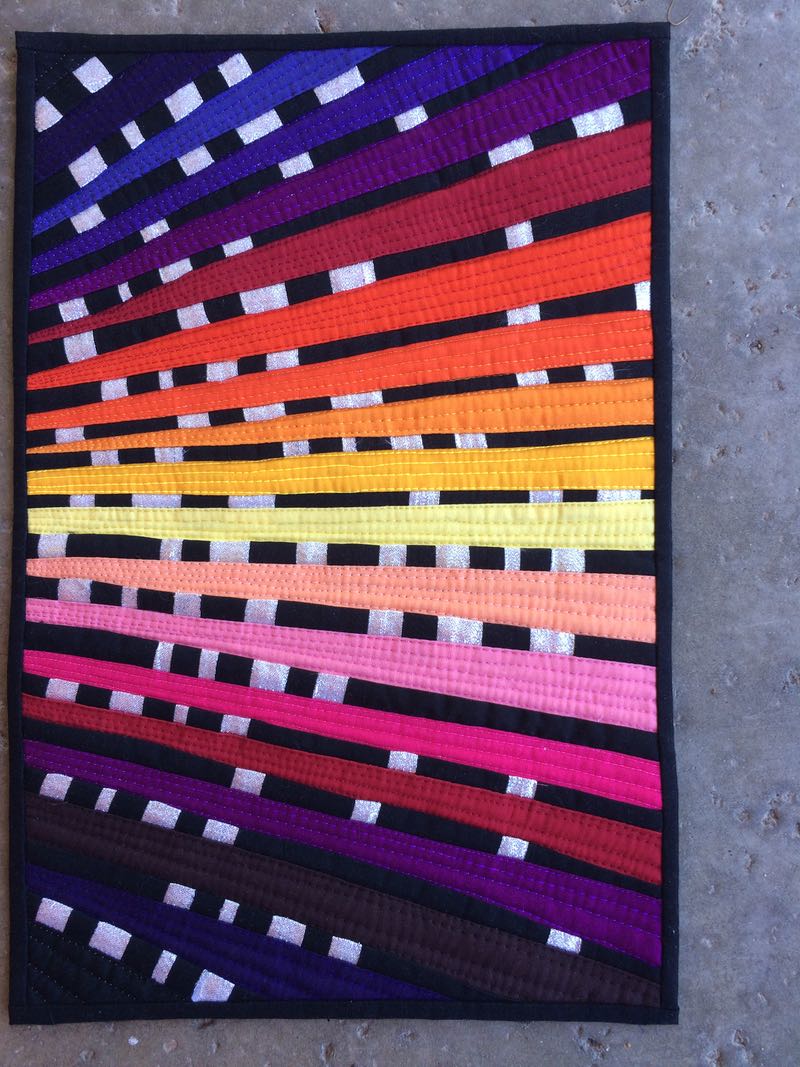
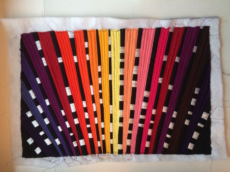
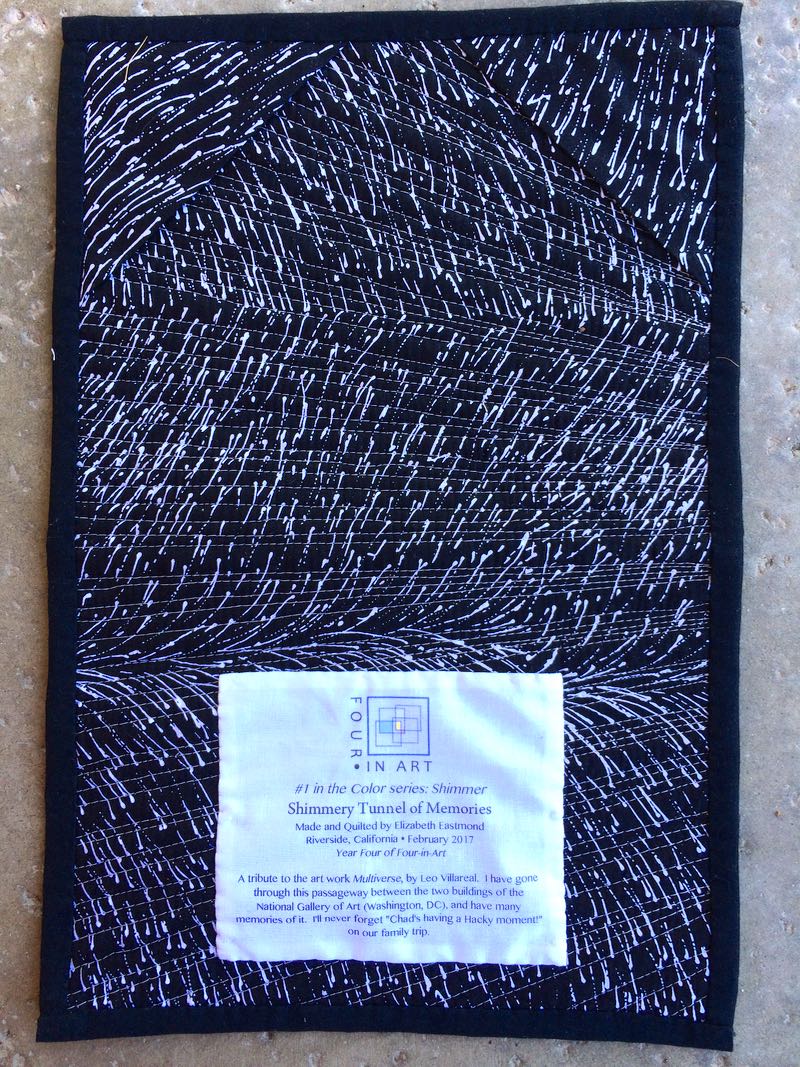
Halfway There
Quilt # 180
13-1/2″ wide by 20″ tall
That night, I was alone in bed in the guest room, five pillows behind me and one to each side, propping me up in a sitting position. I couldn’t lay down to sleep as it was too painful, so I semi-sat there, my head leaning back on the pillows, staring up at the ceiling.
My husband Dave had tucked me in that night, as he had done every night since the rotator cuff surgery three weeks earlier, helping me find the right position for the pillows, touching my cheek, making sure I knew he loved me, then turned out the light and walked down the hallway to our bedroom that now seemed oh, so far far away. I felt adrift on a sea of pillows.
 I tried to shift slightly, trying to move to a more comfortable position: there wasn’t one. The pain pills they gave me from surgery had been effective, but unfortunately their side effect was ever-present weeping, so I’d ditched them a couple of weeks earlier, relying instead on acetaminophen, which barely tamped down the pain and discomfort. I was pretty much a mess.
 I gazed at the ceiling, waiting for that sleep that wouldn’t come — hadn’t come, since I’d moved from the uncomfortable recliner chair two days post-surgery and had come off the prescribed drugs. The light from the white Christmas lights we’d left in the laurel bush outside the window shone up through the slatted blinds, casting a linear design on the ceiling.
I studied that pattern of line-upon-line, trying to let it dissimulate the discouragement: there was three more weeks of the sling, the sleeplessness, the being away from my husband, the not-sewing, the one-handedness, the inability to be present in my own life, the trying to be cheerful for whole minutes at a time. Three more weeks of pain. Three more weeks of the uncomfortable sling and the loneliness. Three down, three to go.
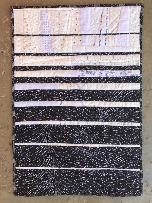
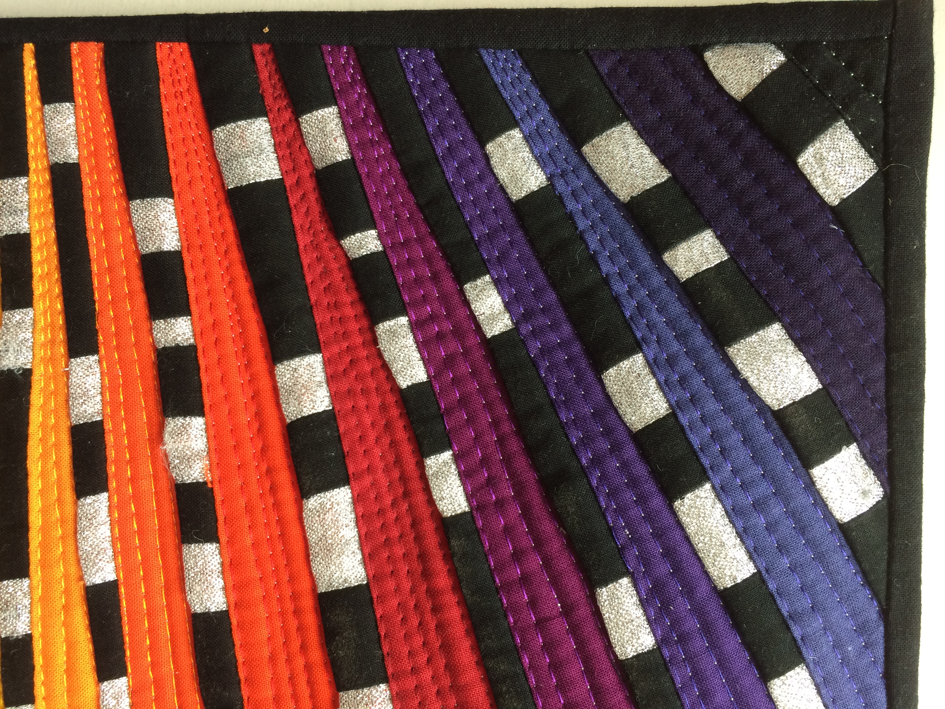
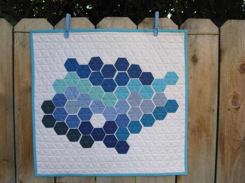
The shadows were linear like the slats in the blinds: they started light, the bright lines gradually decreasing until the dark bands became more prominent, obliterating the light. Half shadow, half light. Half of each. The realization that I was halfway there settled into the cracks in my fractured thinking. The timer on the Christmas lights clicked off, all was shadow and I finally fell asleep, exhausted by the pain, the mental struggle — and, as anyone who has been through this knows — the isolation.
 Our theme this year is Light, and Camilla chose this quarter’s theme of Light in the Darkness. I certainly had time to think about it. I loved the nuance and the subtlety of it, and was glad to figure out how to interpret it.

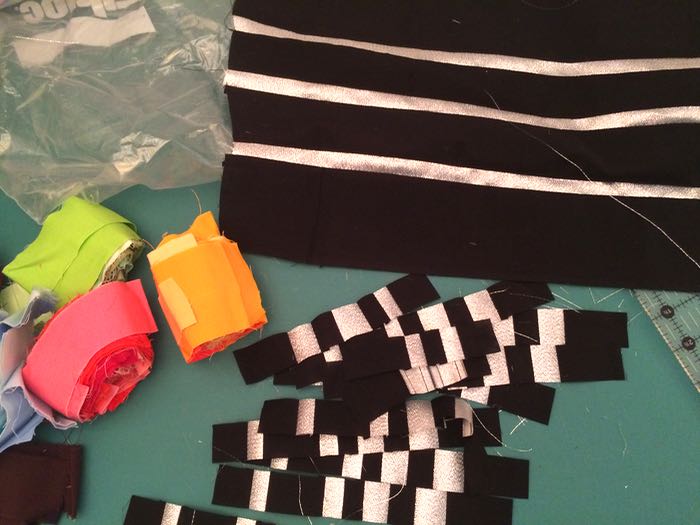
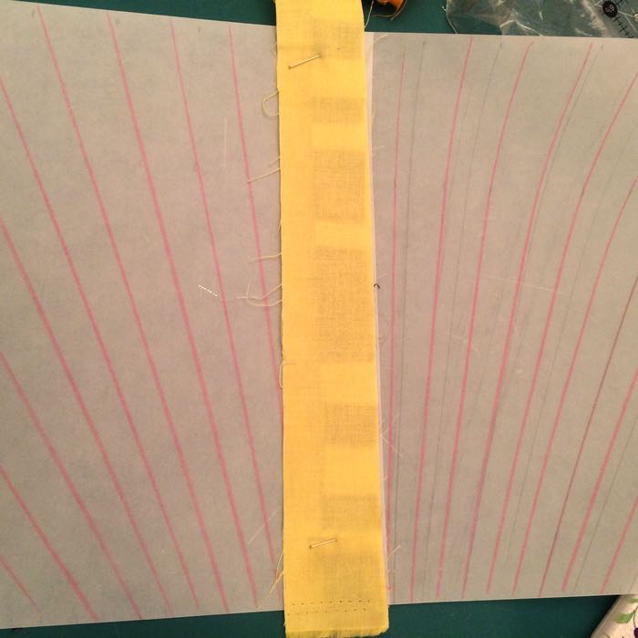
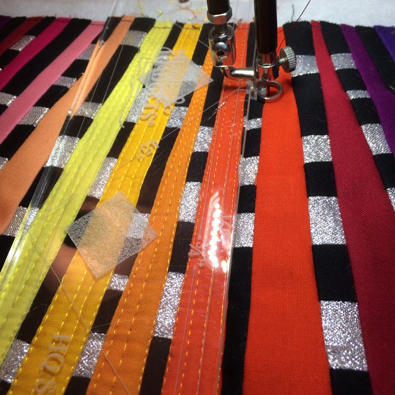
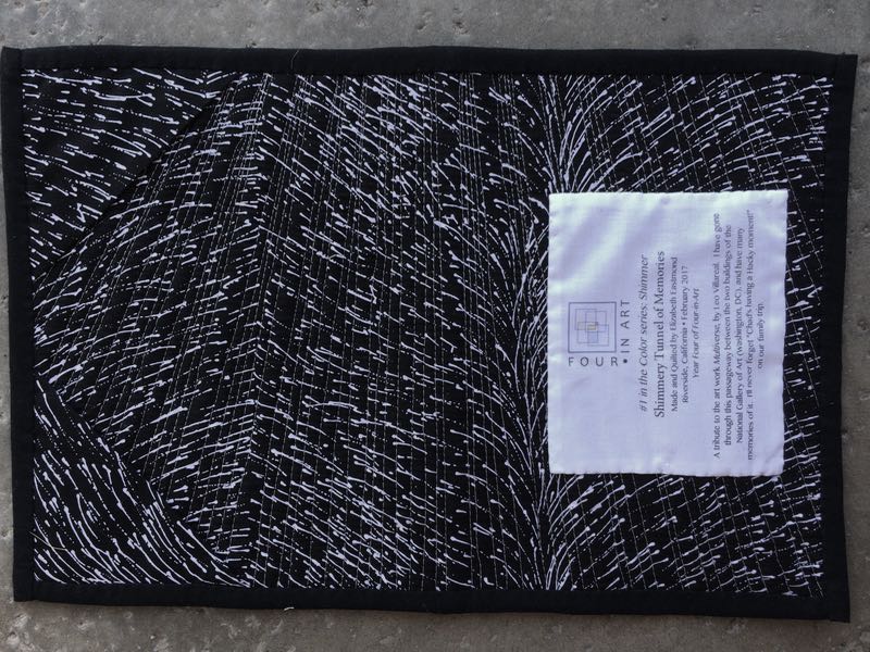
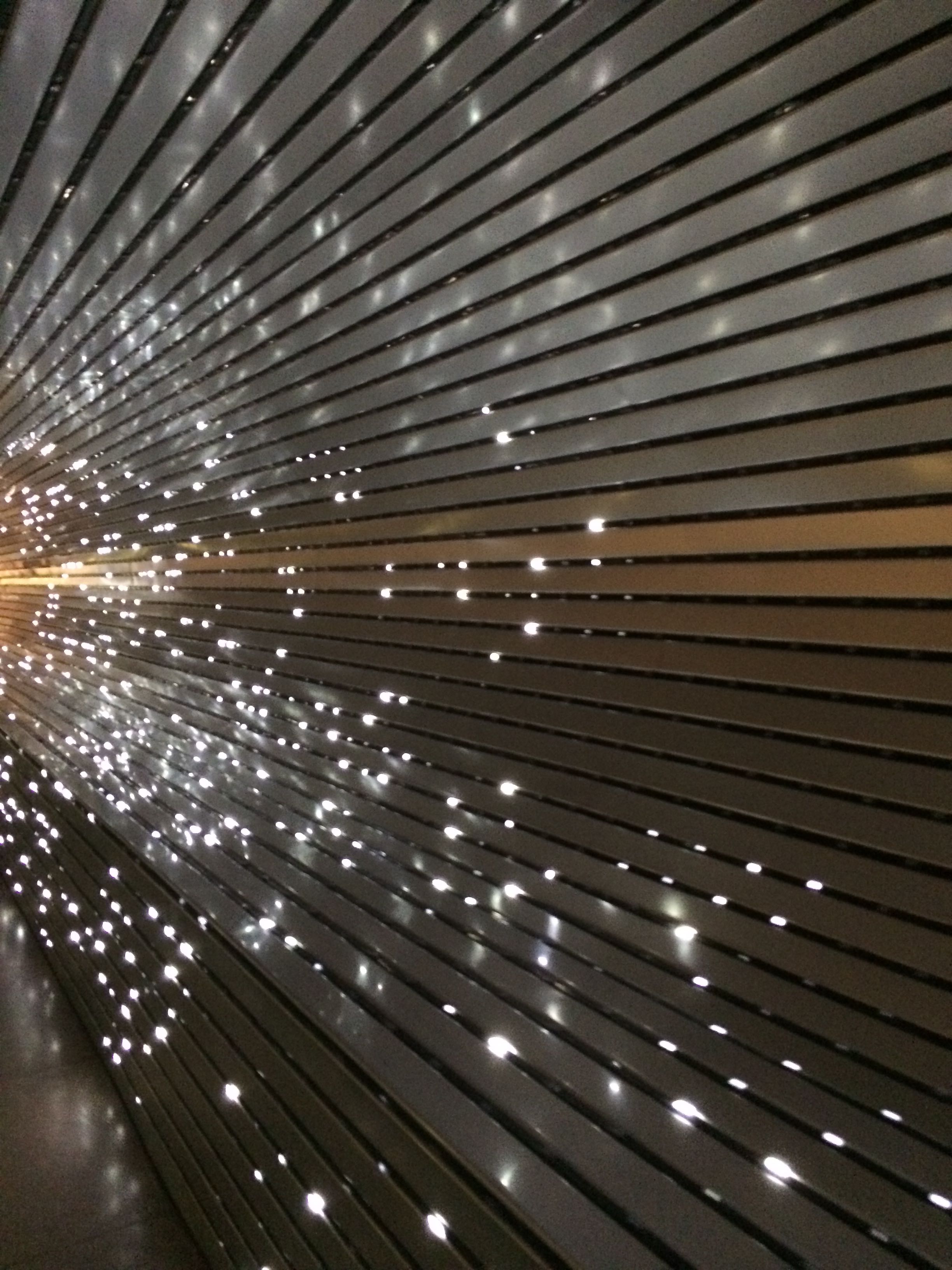
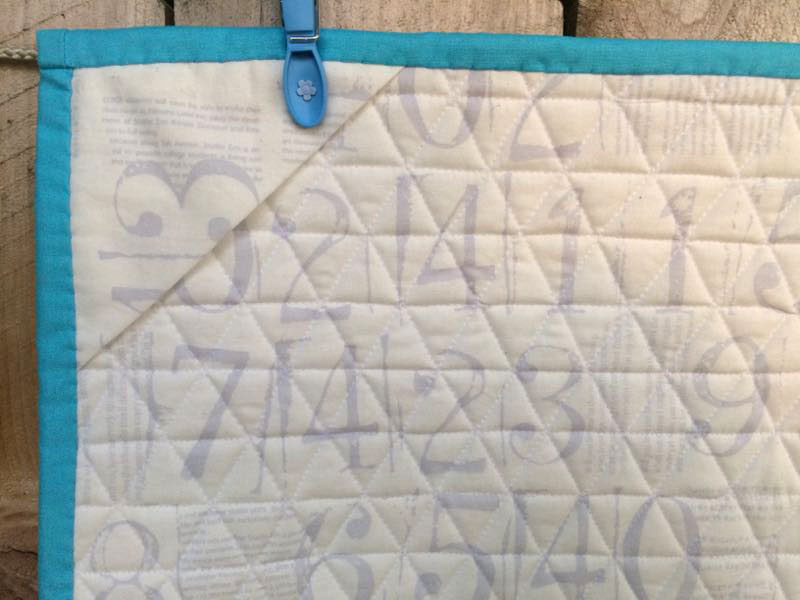
There is no deconstruction post for this art quilt. I had to cut off lots of outside edges when I trimmed up my Piggies! quilt blocks, and used those pieces to make a “whole cloth” of low-volume prints to be my “ceiling” fabric, as we have those old-time popcorn ceilings with texture. Using flat white cloth didn’t seem right for what I had seen night-after-night. I also liked that all those blocks sent from my friends helped pull me along and out of the sadness and loved their significance in this quilt, and appreciated anew all the encouraging comments from those who cheered me on (thank you). The darkness seemed to have a texture of its own as well. I did indeed have time to study it, and thought this seed print from Australia would stand in well for the shadows seen by a quilter, staring at the ceiling, late into the night.
It’s my turn to announce the next theme so look for it in my next post. And my recovery? It’s going well. I’m now past the three-month mark and while occasionally achy, don’t have much pain. I go to physical therapy regularly. When I hit the 12-week mark, my therapist said, “You’re about halfway there.” I guess that finish line moves, depending on the perspective; I do expect at six months I will hear it again.
You’ll notice that the quilt is sometimes light-on-top and sometimes dark-on-top. I think it works either way.
Last thought: when I stood in the aisles at Road to California this past year, not buying anything, I hoped that by next year’s quilt conference I would be able to say it was all done and all behind me.
I still have that hope.


Please take the time to visit the other Four-in-Art Quilters in our Fifth year, as they interpret their visions of Light in the Darkness:
Betty Backyard Camping
Camilla http://faffling.blogspot.co.nz/
Catherine http://www.knottedcotton.com
Janine http://www.rainbowhare.com
Nancy http://www.patchworkbreeze.blogspot.com
Rachel http://www.rachel-thelifeofriley.blogspot.com
Simone http://quiltalicious.blogspot.com
All of our blocks are on our blog, Four-in-Art.