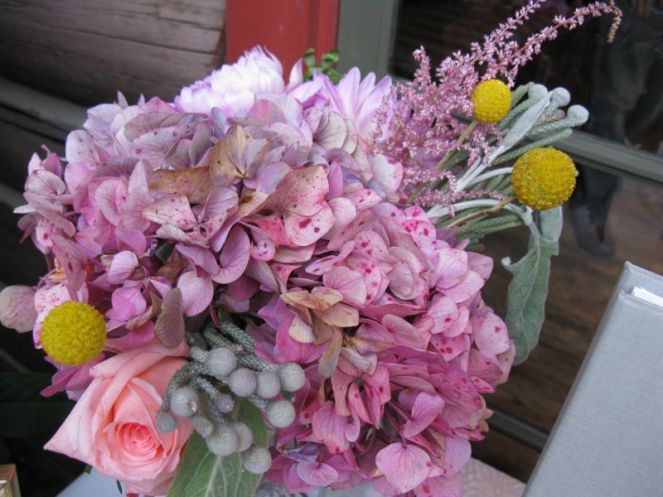
Over Labor Day weekend, I headed up to my nephew’s wedding and was completely entranced with the flowers on our tables. No brights anywhere. Dusky hydrangeas, mossy-textured greens that were soft as baby’s ears, pastel roses, grayed down tones everywhere. The bridesmaids’ dresses were a pinky-tan color. The bride was in a rich ivory dress. This is a couple who is on the cutting edge of everything, including fashion and design. Now consider this:
This is the latest from the Moda design team and the collection is entitled “Little Gatherings.” While the tones and colors are similar to what I bought in the 1970s, what I noticed was the design: little bitty designs.
So the question that some are asking around on the blogs, as they drag out those uncompleted quilts from the 1970s is: are the dusky tones from that era making a comeback? I would have said yes to the colors and the tonality but no to the itsy bitty calico-type prints, until I saw the Moda line above. So, are we returning to that era? Have we tired of the brights and bolds and large scale prints and heading back to the 1970s? 1880s? If we look to fashion for inspiration, it’s often said that short skirts are a sign of a healthy economy and that long skirts indicate that we are all in for tough times. Since our economy is pretty much in the tank, I wonder if we can make the same predictions based on fabrics.
And by the way, here’s a view from the runways. Even those with shorter, body-conscious clothes had a few longer skirts in their line-up. In many shows, that’s ALL they had. And judging from some of the fabrics being used, looks like we’re still in love with large-scale prints, although in fashion, I think only those who are 6 feet tall pull them off really well. That lets me out. And the colors? They trended to the dusky, darker tones, but hey–it is the FALL fashion shows, which of course will be shown in deeper-toned fabrics. (Designers’ names are under the picture, newspaper-caption style.)
L’Wren Scott
Chloe
Vuitton
Missoni
Missoni
Discover more from OccasionalPiece--Quilt!
Subscribe to get the latest posts sent to your email.


