200 Quilts · Four-in-Art · Quilts

Eclipse, deconstructed

This is the post where I reveal all my beauty secrets.  Kidding.

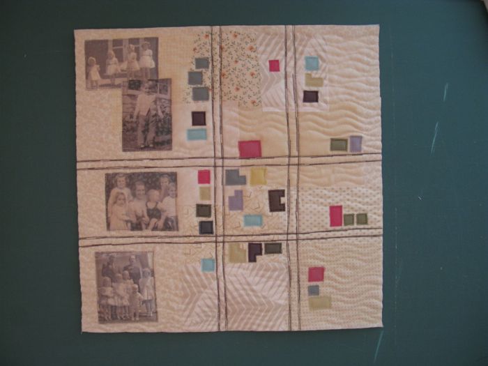
This is the post where I tell you how I made my Four-in-Art quilt, showing a technique   I’d read about this technique somewhere, but that crazed-woman-at-the-computer didn’t bookmark it or file it away neatly.  So I had to wing it, which is okay.

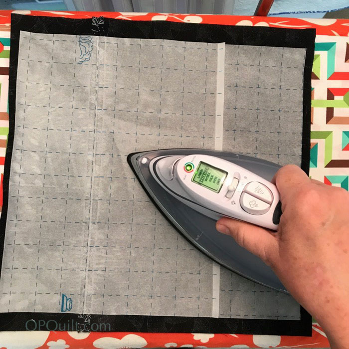
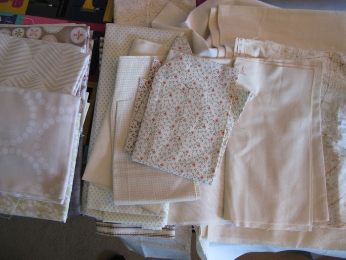
First, cut yourself a square of black fabric.  I used the wrong side of a fabric that I hoarded about 15 years ago, and I’m still trying to get rid of it.  (It’s a great fabric, really.)  Then get yourself some Steam-A-Seam II, the fusible applique stuff that will be sticky when you lift up the transfer paper, after you’ve ironed it on.

I did check to make sure that I adhered the non-release side of the Steam-A-Seam II, leaving the side that would release easily facing me.

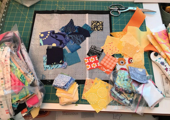
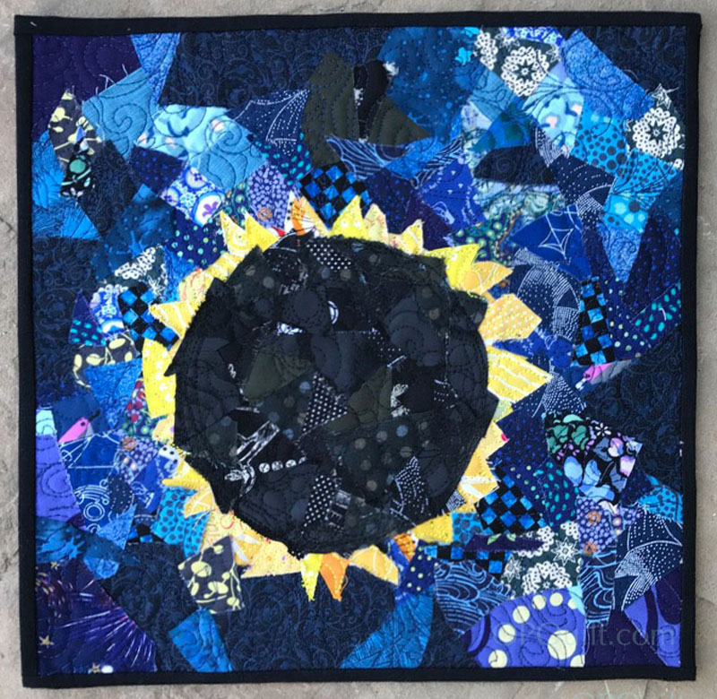
Gather together some scraps in the colors you want to place on your background.  Since I was doing the eclipse, I basically had three: yellow, black, blue.  Throw in some related colors, just to keep it interesting.  For me, that meant some lighter blues, and orange.

Pile up your color, then randomly cut through the fabrics, and then do it again.  You need some bigger pieces (1-1/2″), but also lots of smaller pieces (1/2″).

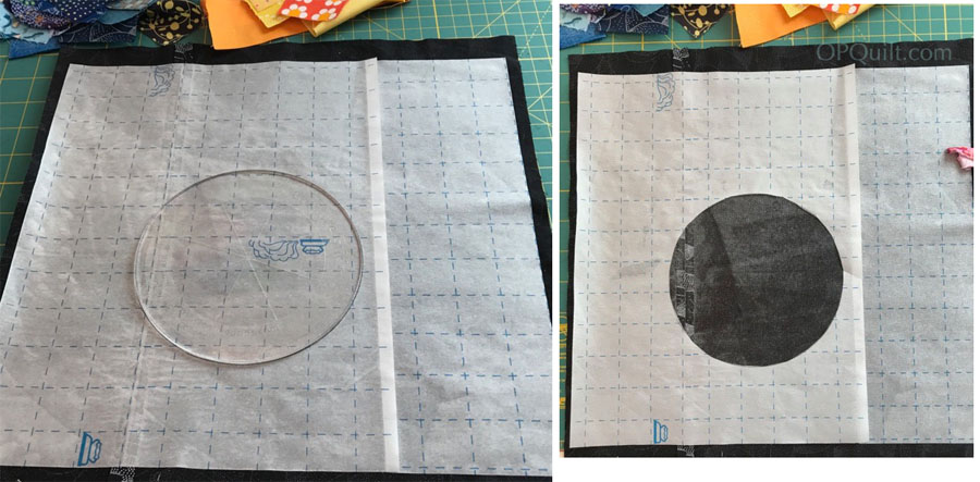
I traced a circle on my paper, slightly off-center — because none of us saw that eclipse dead-center — and cut out a hole out of the paper backing.

I laid out my black scraps, making a loose circle. Then I tucked my yellow/orange sun flares behind the circle, pressing down with my fingers to make them adhere to that sticky surface.

Then I oopsed:

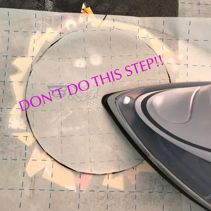
I went to the ironing board and ironed it all down.  WRONG.  While this seemed like a good idea, you know–to make sure all those pieces were not going to go anywhere — in reality it prevented me from lifting up the edges and tucking in more yellows,  and the blues.  So maybe if you can protect the edges of your design from the hot iron it might be a good idea?  Or just wait until the end?

Milky Way MJA
Star Fields, by Matthew Anselmo of MattsClicks

Then my son Matthew, who is an expert landscape photographer, put up pictures of the Milky Way on his Instagram, MattsClicks.  This gave me to freedom to really add in color to the heavens, so I pulled a greater variety of blues (and some with purples) and started scattering them around, trying to keep a “street” of lighter blues to represent the Milky Way. (Thanks, Matt!)

Eclipse_4inart_methods8
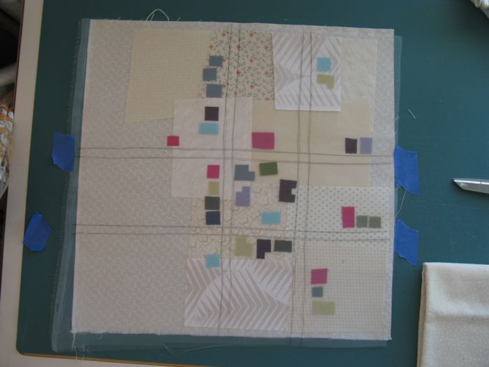
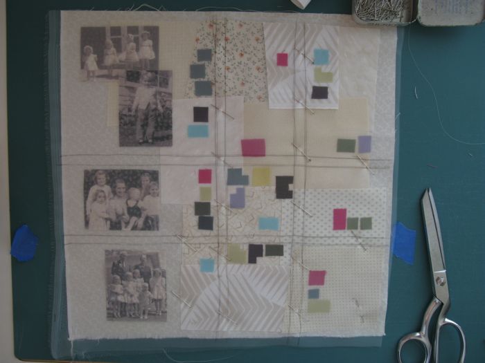
Add in your bits and pieces, filling up the background in a random, organic way.

NOW go to the ironing board, lay your transfer paper over the design (the crackly sheet that came with your fusible), and press, lifting up and down, not sliding, until you think it’s adhered.

Eclipse_4inart_methods10

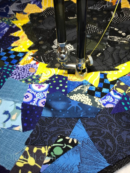
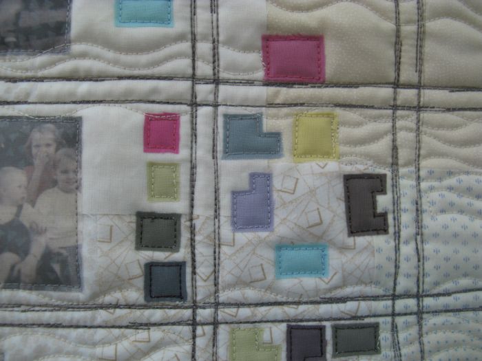
I used three different colors of thread, and just scribbled free-motion-quilted the pieces down.  I did a series of circles in black in the moon, the followed the shapes for the solar flares, then a random loopy design in the heavens.

Eclipse_4inart_methods9a
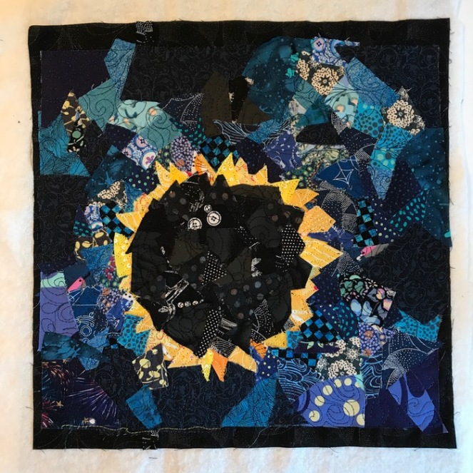
This is where I notice that the moon has two eyeballs staring right at me.  And this is where I go get some more scraps, use a regular old-school glue stick and paste more fabric scraps over the eyeballs (you don’t see it in the first one, do you?).  Quilt, again.  And then I thought that the moon looked more like a black lump of coal than the moon (even though it does have a mountain-y horizon…it’s not THAT bumpy).  More scraps glued on, more FMQ. I finished up by going in giant circle around the perimeter of the moon, to reinforce that Orb in the Sky thing.

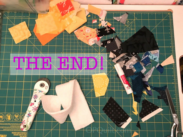
Well.  Not quite.  But that’s what my work table looked like after I trimmed it up, bound it, and made the label.  I’m a total believer in a clean workspace at all times.  I’m a total believer in a clean workspace at least once every couple of weeks.  I mean, I’d like it to be all the time, but I create in small room, and I decided to adjust to the life I have.

Hope you’ve enjoyed the Deconstruction Post for the Final Four-in-Art Quilt.  I probably won’t leave the art quilt in the dust, though, as it’s a quick way to make a quilt while trying out a new technique.  Given that it is often smaller (most of mine were 12″ square), you can crank one out in a day, or an afternoon, if your design is not too complicated.

Thank you for coming along on this five-year journey.

~Elizabeth, of OPQuilt.com

Rewards for WorkingCreatively

Quilts

[in Just-], Deconstructed


4-in-art_3buttonin Just_in the garden

Yesterday, I revealed my quarterly art quilt challenge, and as is my usual, this post is about some of the how-to’s.

in Just_1

When trying to think about how to illustrate this poem, I kept thinking of all the pictures I’d taken in Washington DC during cherry blossom season and was thinking that they might work for this.  I first searched for a picture of a balloon seller, and found an illustration from what looked to be c. 1950s, perfect for I wanted–a nice, clean interpretation.

Photoshop Balloon Man Poem

This is a composite of several photos; I added in the balloon man last.  I saved all this (multiple times) and then started to prepare my fabric.  I wanted to use the Bubble Jet Set again, like I did for an earlier art quilt (more info *here*), so soaked my Kona white squares and hung them to dry.

in Just_2a

I ironed them to freezer paper, then tried to feed them through the printer just as they were.

Biff_1

Fail.

in Just_4a

So this time I trimmed down the edges and taped it to a piece of cardstock on three edges and then fed it through the printer (I have a flow-through feed path, but I have done in those printers that do a U-turn).  Success.  I didn’t care that the image was a bit wider and spilled out onto the tape, as I knew I was going to sew fabric strips around the edges.  I let it sit for 30 minutes.

in Just_3

The other part of using Bubble Jet is to rinse the printed fabric in their Bubble Jet Set, so after waiting the allotted amount of time, I rinsed the printed images, and hung them to dry (below).

in Just_3b

in Just_4b

I’d printed two different versions of the balloon man.  One with all full-out color everywhere, and one where I had lightened the background by about 30% to let the man and the children pop out a bit more.  That one worked best for fabric.

Contrasting Balloon Man Pix

On the screen, they don’t look too different (lighter background is on the right).  But my husband said the full-color print was “all a bit much,” language for toning down one part of the picture so that the other could shine.  He liked the difference.

in Just_5

in Just_5a

I cut the strips 1 1/4″ wide as I wanted a narrow range of gradated colors.

in Just_5b

Strips on.  I made it a wee bit bigger than our 12″ so when I sew all four of these together at the end, I’ll have room to maneuver.

in Just_6a

I drew out the balloons on some waxie paper squares that they use in delis. I’d purchased a big box ages ago and I use them to try out quilting ideas.

in Just_6b

I tried drawing it on with a white pencil, but it didn’t show very well, so I just pinned on the waxie paper, and kept flipping it back and forth.

in Just_6c

If you read the post about the quilt and the meanings of the motifs, you’ll know why these balloons are here.

Biff_2

I like to attach the label before the reveal date.  On this day, my father was going into surgery for a broken hip.  He fell when he was hanging a painting in his art studio.  Did I mention that he’ll be 90 in December, and is still a source of inspiration for me–still going down to his studio to paint daily?  But today, while I thought about him, I couldn’t make the labels at all–something I usually can do in my sleep.  The middle shows the label. . . printed on the freezer paper backing.  Next.  The righthand side shows the label when I forgot to print only the first page, plus I obviously put the fabric down too low and it printed partially on the masking tape.  I finally got it the third time.  He had his surgery, and is fine, but to say I was feeling a wee bit distracted and out of sorts would be an understatement.

Spiffing up Other quilt

Now I’m thinking that the other quilt needs to be spiffed up with a photo or two.  I need to get those woods darker and deeper, but will have to think about how to do this.

PostscriptI always enjoy trying to interpret a theme or an idea in these little quilts, but there are some days I approach the task kicking and screaming.  It’s always soooo much easier to just pick up a block or two, start whacking away with my rotary cutter and tada! a stack of blocks is sewn and done.  It is harder to take the time to think about what I want to say and how to say it.  It’s on days like that I’m keenly aware that I’m not an fine arts artist like my sister Christine, or my father.

However, I’m my own kind of quilt artist, and I choose to keep doing these little art quilts because it stretches my brain and pushes me to explore new techniques.  Everyone has to find a way to keep growing in their quilting, otherwise we become stagnant and stale and slip out of the conversation.  For me, this is one way to remain in the stream of creativity, and I’m always glad to have these art quilt challenges come around again.

Many thanks to the other quilt artists who participate–they inspire me!

Quilts

Deconstruction of Ted and Maurice at Lorinc Pap Ter, an Art Quilt

On the Bench at the Park

This post is a deconstruction of the techniques I used to create Ted and Maurice at Lorinc Pap Ter, a small (12″ square) art quilt for the Four-in-Art Quilt group.  Our challenge this quarter was Contrast, under the overall yearly theme of Urban.  Often an idea will come to me, but sometimes I start with the technique.  I knew I wanted to drag out those bottles of Bubble Jet Set and Bubble Jet Rinse that I’d ordered some time ago, and find out if this whole process was difficult or easy.  It was easy.

Bubble Jet Set is a type of mordant that binds to your fabric and allows the ink from your inkjet printer to adhere more easily.  I’ve printed on fabric for years, but haven’t ever prepared the fabrics.  I first started by reading a lot of blog posts, and I’ll post the links at the end.  The one website that described the process best was Caryl Bryer Fallert-Gentry’s (Bryerpatch.com), and I followed her instructions.

Bubble Jet Set

I bought a shallow plastic container at Target, about 4 inches deep with a latch-type lid, as I wanted to store the prepared fabric in there afterwards.  I cut my fabric about 9 inches by 12 inches, grabbed the container and the Bubble Jet Set (I only needed that one at this time) and went down to the kitchen sink.  I put on dishwashing gloves, as suggested, then laid the first piece of fabric in the bottom of the container.  I sparingly glopped some BubbleJet Set (BJS) onto the fabric, smoothing it out until it was thoroughly moistened.  I placed a dry piece of fabric on top of that, again, smoothing until it looked like it had picked up most of the excess BJS, then glopped a little more.  I’m being quite stingy with the BJS, actually, but do want to make sure that the fabric is sufficiently soaked.  I repeated this until all four sheets were saturated.

Prepared Fabric DryingI lay down some towels underneath my improvised clothesline in the garage (some say you can put containers to catch the extra drips, but I didn’t have that much excess) and hung up my sheets of fabric until dry.  In our summer heat, it only took about an hour.  Meanwhile, I washed and thoroughly dried my container, and when the fabric was dry, put them in the container until I could get to them.  I read one blog where the crafter cautioned about letting too much time pass between treatment and printing. I had a space of about 4 days, and that was fine.

In yesterday’s post, I talked about how I created my art conceptually, but what I did technically was begin with a good photo of the square in Budapest.  I overlaid the baseball backstop photo, sized it, then took it down to 20% transparency, and used the Eraser tool to start erasing a space to let the statuary shine through.  I could have created a Path and selected it, but sometimes I think the Erase Tool does just fine.  I did change out the size of brush I was using, from 1 pixel in some places to 75 pixels in other places.  I did the same with Ted and Maurice, first flipping them around so they faced the other way, as that’s where I had some space to put them.  I merged the layers, as I know from experience that when printing on fabric, it’s wise to pump up the Saturation of colors (enhancing the image without making it garish), and to Lighten/Brighten the entire image.

Four Squares of 9Patch

For the border pieces, I sized each combination of colors to four inches, then pasted them into one document so I could print all the colors at once, first flattening, then then increasing the Contrast/Saturation and then adjusting the darkness through the Lighten/Brighten menu.

Trimming Fabric

When I was ready to print, I backed the prepared fabric in freezer paper, ironing it thoroughly but using NO steam at all — I wanted the freezer paper to really bond with the fabric.  I trimmed it to exactly 8 1/2″ by 11″ inches, and used a High Quality photo setting to print.

Image Printed on Cloth 4-in-art_1

It worked like a charm!  I let it set for the recommended 30 minutes then peeled off the freezer paper.  I let it set some more to let it thoroughly dry–a caution I read on many blogs.

Bubble Jet Set Rinsing

I put four capfuls of Bubble Jet Set Rinse in my container, then added about a gallon of water (about 3 inches) and set the first printed sheet in the water.  I kept it agitating the whole time of two minutes, as you see above.  I held up the sheet to let it drain and in the other sink, I rinsed the sheet well and laid it out on towels that I had set on the counter.  I did the same process with all the other prints, agitating them (apparently to keep the dye from the printing to re-settle back onto the fabric — they cautioned several times to keep it flat, and to not let it crease!).

Leftover Rinse Water

This was the color of the rinse water after I did all four sheets.  The Bubble Jet Set Rinse is a mild detergent formulated to remove excess dye.  In my reading, many said that Synthrapol would work also, but I had this so I used it.

Blotting Printed Sheets

I blotted the sheets gently, pressing out the excess moisture.  I did not wring or crumple the printed fabrics at all, working to keep them flat.

Sheet to Dry in Garage

I hung them in the garage again to let them dry, again taking only a short time.  I was pretty happy with the results.  The colors were vibrant and the fabric was soft and I knew it was washable, although there are cautions about what type of detergent you use.  I never wash my art quilts so it wasn’t a concern, but if you plan on doing so, here are some good websites with information on their experience with using BJS:

http://vickiwelsh.typepad.com/field_trips_in_fiber/2009/04/bubble-jet-rinse-whats-the-point.html

http://quiltbug.com/articles/bubble-jet-set.htm

http://www.bryerpatch.com/faq/bjs_q&a_page.htm

http://www.cjenkinscompany.com/Frequently_Asked_Questions_s/25.htm

The C J Jenkins Company manufactures the Bubble Jet Set, and I thought their page on printers was helpful, although I swear by my EPSON with their Archival Inks.

First Layout of Printed Sheets

After this, the construction was pretty straight forward, although I had to do some cutting and stitching to get the dimensions correct around the central image.

Sashing Printed Sheeets

I sashed the central image because I felt it might get lost in the tiny square borders.

Quilted 4-in-art_Aug2014

I quilted it, using matching threads (mostly lots and lots of gray).  Detail below.  I didn’t want to “over-quilt” this, but did want to emphasize the various elements.

Lorinc Pap Ter_detail front

Lorinc Pap Ter_front

And that’s it!  I’m pretty happy with how the BJS and BJR turned out, and glad that I had this little art quilt to nudge me into trying that preparing-fabric technique.

Circles EPP Button

Next up? The third block in my Circles English Paper Piecing Sew-Along.  I’ve remade this thing twice, so I’m ready to put it up and move on to the next block.  See the above tab if you haven’t started yet.

˚˚˚˚˚˚˚˚˚˚˚˚˚˚˚˚˚˚˚˚˚˚˚˚˚˚˚˚˚˚˚˚˚˚˚˚˚˚

My blogging software places ads here so I can use this site for free.  I do not control the content of these ads.

200 Quilts

Childhood’s Wide Avenues, deconstructed

Childhoods Wide Avenues Art Quilt_front

Thank you all for your lovely comments yesterday and for visiting the rest of the Four-In-Art quilts.  The reveal day is one of my favorite days of all the blog writing I do, as it’s such a shared experience.  Today I’ll talk about the technique and the how of the quilt, but first, a little clothing and textiles lesson about four sheer fabrics:

Organza

Organza is a thin, plain weave, sheer fabric traditionally made from silk. Many modern organzas are woven with synthetic filament fibers such as polyester or nylon.  The Casa Collection of sheers at JoAnn Fabrics is an light-reflecting organza, and it is light and soft with lots of drapability.

organzabags

You usually encounter this fabric as jewelry, or wedding favor bags.

OLYMPUS DIGITAL CAMERA

Organdy is a balanced plain weave. Because of its stiffness and fiber content, it is very prone to wrinkling. Organza is the filament yarn counterpart to organdy, meaning it has very thin fibers in the weave, and is used often for interfacing in lightweight clothing construction, or as petticoats or slips for formal wear or wedding dresses. (All images pulled from web.)

organdy apron

You’ve probably seen it in your grandmother’s or great-grandmother’s aprons–a crisp, sheer construction.

Chiffon

Chiffon is a lightweight, balanced plain-woven sheer fabric woven of crepe (high-twist) yarns. The twist in the crepe yarns puckers the fabric slightly in both directions after weaving, giving it some stretch and a slightly rough feel. Chiffon is made from cotton, silk or synthetic fiber, and under a magnifying glass it resembles a fine net or mesh which gives chiffon some see-through properties, but it is more filmy in its appearance than organza.

Tulle is a lightweight, very fine netting, made of various fibers, including silk, nylon, and rayon. Tulle is most commonly used for veils, gowns (particularly wedding gowns), and ballet tutus.

Lesson over, and this is why I brought those up first: I was a bit stumped on this quilt, feeling like I had no idea where to go.  I keep an art quilt journal just for these projects, and began writing down my impressions (see yesterday’s post) and drawing a few possible ideas.  Once I knew the general direction of where this quilt would go, I wanted to think about a new technique to try, and I wrote down “use tulle,” as I had seen very successful use of this as an overlay to keep teensy pieces in place during appliqué, used to great success by Karen Eckmeier.  But in this smaller piece I thought the texture of the tulle might be a distraction, so decided to explore some alternatives.  I purchased chiffon and organza in both white and ivory/off-white.

Now I had the materials I needed, I began.

Art Quilt Maps book

Quite a few of us had seen Valerie Goodwin’s book on art quilt maps; I enjoyed it, but the bigger takeaway for me was to build up the background with texture, in terms of the visual space and use of fabric.

CWA_1Choosing Fabrics

So I pulled all my neutral fabrics (the current vogue term is “low-volume”) and laid them out.  Because this was the background, I rejected any that were to figured or obvious in the print.  I randomly cut out oblongs, squares and rectangles and laid them out over my base muslin.  In my art quilt journal, I had sketched out a few possibilities of layout, and I knew I wanted a clearer left-hand margin of the background for photos.

I auditioned my two colors of chiffon, and my two colors of organza, and decided on an off-white organza as the sheer overlay.

CWA_2 drawing grid

Slipping a piece of paper under the organza so the pen marks wouldn’t transfer to the fabrics, I sketched in my wide avenues, free-handing it (look ma, no rulers!).

CWA_3 adding houses

I cut itsy-bitsy little houses, but trying for a variety of shapes.  I carefully laid them under the organza, along the avenues.  I was temped to draw in streets and lanes, but decided that, for this particular theme, it would only be distracting.  The houses kept moving every time I added a few, so I got out my glue stick and stuck them to the background fabrics, which also had a few dabs of glue to keep them in place.  You can see I used masking tape to anchor the organza to the composition.

CWA_4 adding family

I printed out some family photos, using the usual method (freezer paper-backed fabric, taped to a piece of paper and fed through my trusty Epson inkjet printer), and started to add them.  This was the first try.  I kept moving them around until I got what I wanted, trimming some edges to make it fit, visually.

CWA_4a

I used straight pins everywhere to secure the organza, and then took it to the machine.  Because they are such a small size, it’s easy to manipulate them under the machine.

CWA_7 detail front

First I used a dark gray and “drew” in the avenues, using the reverse button on my machine to simulate how it might look if hand-drawn.  I went over those several times.  Then I outlined all the houses, using matching thread.

CWA_5 quilted

I quilted in wavy lines that to me represented the flow and movement of the landscape–it could be slight hills, or the movement of grasses, or whatever, but I didn’t want straight lines.  Once quilted, the organza overlay began to act and feel like that thick coating that some topographical maps have, and this change in texture was an interesting surprise.

CWA_6 trimmed

Trimmed up.  I auditioned several bindings–and no binding–but decided to go with a stripe, to further echo the idea of roads.

Childhoods Wide Avenues Quilt_back wo label

For the backing I chose a taupe-cream fabric which depicts the streets of Paris. . .

ChildhoodWideAvenues Art Quilt_label

. . . then added the label.  This is our fifth quilt as Four-In-Art quilters, but I chose to delineate our new series: Urban.

I’m pretty happy with this little quilt, and it joined the others in the Nature series, above my sewing room window in my own little art gallery.  I hope, if you haven’t already, will click back to yesterday’s post and go and view all the other quilters’ creations.  You’ll see some similarities in our quilts, even though we are geographically located all over North America. And perhaps the interesting differences in our vision of this theme come from the different places we live.

The Map As Art

I’m currently reading this book as an adjunct to our study of urban landscapes, and in the introduction the author, Katherine Harmon, notes that maps “can act as shorthand for ready metaphors: seeking location and experiencing dislocation, bringing order to chaos, exploring ratios of scale, charting new terrains.”

In this context of all of the above, I look forward to working with the new theme revealed by Leanne yesterday: Structures.

200 Quilts · Four-in-Art · Quilts

Congruence, Deconstructed

Congruence Owl quilt front 2

Our reveal for the fourth challenge quilt in our art group, Four-in-Art Quilters, was yesterday and today I’ll tell you how it came together.

I first started by looking a what seemed like billions of photos of owls.  I did a lot of this through Flickr, where I found this photo:

OWL ese

I wrote to Matt Smith, the person who posted it, and asked permission to use this photo and he gave it to me.  And then I sat on it for a couple of months, not knowing how to approach this.  Did I want to paper-piece it?  Not really.  Embroider it?  Pixelate it into little squares?  None seemed satisfying.  And then it was in the background reading that it came to me that I would fracture it, play with it a little and see where that went.

OWL ps desktop

I digitally chopped the owl picture into fourths and then chopped into fourths again, making sixteen parts.  And then I began to play with filters, one of the least used, but really fun parts of Photoshop.  I applied at least one, and sometimes multiple filters to each segment, approximating the sizes so I could get this bird back together again in the end.  You can see the mock-up on the lower right.  That was me, trying to reassure myself.

Congruence Owl quilt construction 1

Then I printed it off on paper, cut it apart, and still tried to reassure myself. I grabbed a previous art quilt off the wall (I knew it was 12″ square) to use as a template.  It seemed okay. But how to get it to fabric?  I usually iron freezer paper to the back of a piece of fabric, tape that to a piece of paper like I did in English Elizabeth, then run it through my Epson color printer. But I’d read in a blog about someone who simply ironed the fabric and freezer paper together, making sure it was a standard paper size, and then ran it through the printer.

Congruence Owl quilt construction 2

Don’t you love the ink smudges?  The next time, I made sure the freezer paper was really well-adhered to the fabric, then set the printings for thick matte paper on high quality and ran it through again, using a long thin tool to assist it through the last phases and so the fabric wouldn’t touch anything.  The closest thing I could grab was a nail file — but it worked.

Congruence Owl quilt construction 4

I peeled off the freezer paper carefully and cut apart my sixteen squares of Mr. Owl.

Congruence Owl quilt Layering up the backing

Layering the background — Kona Ash — with the backing and batting.  Kona Ash?  Light taupey gray?  Cindy of Live a Colorful Life is probably laughing her head off now because she knows how much I hate gray.  Really, I do.  In so many modern quilts it acts as a big hole in the composition, especially if it’s a medium gray.  I think if a quilter has to go gray in a quilt (and I’m not talking about those low-volume quilt compositions where it is intentional and where it works) they ought to go charcoal.  Or slate.  Ash is what I had on hand, as I don’t generally keep gray around (I bought it for a bee block I had to do).  But it worked for this as the picture, except for the owl’s eyes, is all in taupes and grays.  Yeah, low-volume.

Congruence Owl quilt construction 3

Using the paper mock-up as a guide, I start layering the cloth images onto the backing.

Congruence Owl quilt 2 layout

Congruence Owl quilt 1 layout

Moving things around, trimming down the pieces so some aren’t square, trying for balance.  Trying for that little artist’s lightbulb to go off in my head.  I got about a night-light’s worth of illumination, but from my writing in grad school, I knew that showing up wouldn’t get you anywhere–you have to keep trying.  To fully put this concept into action,  I went to dinner, then let it sit for a week while I went to our quilt retreat.

Congruence Owl 1

Then one morning it was simply time to tackle it again.  I couldn’t decide between satin-stitching a thicker line (close zig-zagging) or straight-stitching a narrow line of thread around each piece.  Narrow won.  I trimmed it up to 12 inches and then thought I’d like to try a faced binding (tutorial on how to do a faced binding coming in a couple of days).

Congruence Owl 2

I cut strips to match the backing, sewed them on.

Congruence Owl 3

When I ironed them to the back on a couple of sides, it became apparent that I needed that “frame” of the binding for this particular quilt.  Rip off the binding.

Congruence Owl quilt tiling

I kind of liked the way the binding corralled those tiled pieces.

Congruence Owl quilt label

I made the label, sewed it on, then went outside to photograph it.  I made an interesting discovery.

Congruence Owl quilt 5 textures

This lower section of the feathered wing imitated the gnarly bark of my silk oak tree in my backyard.  Maybe because I’d dampened the literal image of feathers with Photoshop filters?  I don’t know, but I liked the effect.

Congruence Owl quilt front tilted

So, all the incongruent small pieces — the images, the tiling, the layering, the stitching — all merged into a lovely congruence of an owl, just like the metaphoric meanings discussed yesterday.  All combine into that creature that captures our imagination while mystifying us as well.

And now I leave you with a poem by Mary Oliver, that I think captures this idea:

“Praise,” by Mary Oliver

Knee-deep
in the ferns
springing up
at the edge of the whistling swamp,

I watch the owl
with its satisfied,
heart-shaped face
as it flies over the water–

back and forth–
as it flutters down
like a hellish moth
wherever the reeds twitch–

whenever, in the muddy cover,
some little life sighs
before it slides into moonlight
and becomes a shadow.

In the distance,
awful and infallible,
the old swamp belches.
Of course

It stabs my heart
whenever something cries out
like a teardrop.
But isn’t it wonderful,

What is happening
in the branches of the pines:
the owl’s young,
dressed in snowflakes,

are starting to fatten–
they beat their muscular wings,
they dream of flying
for another million years

over the water,
over the ferns,
over the world’s roughage
as it bleeds and deepens.

from House of Light, 1990

200 Quilts · Four-in-Art · Quilts

Doleket, deconstructed

Doleket Art Quilt-front

When the theme of fire was announced for our Four-in-Art group, I immediately thought of all those days spent roasting marshmallows over campfires, just like Betty did.  And then afterward, when people would gather back and just sit and watch the flames, as they moved and shifted.  It was that movement I was trying for.  I had thought about taking a lot of pictures of fire and scanning them onto fabric.  What was I going to do, light a bunch of bonfires and take photos?  Nyet.  Then it was patch together a lot of squares, and “color” them by doing rubbings of a textile crayon onto the surface.  Because I couldn’t come to a vision of that one, it faded, too.  So one day in a church meeting, I sketched the bit on the left:

Doleket Sketch Two

I dropped the notebook and when I picked it up, I noticed I liked it better the other way (the version on the right).  With the triangles pointed upwards, it also had a birthday candle effect.

Gathering Fabrics Doleket

I dutifully drafted and cut out a bunch of orange and yellow-gold miniature triangles, and pulled red, ochre, rust, magenta fabrics from the stash.

Doleket beginning

I chose whatever colors I had in my stash that had that “fire” color to them.

Laying out strips

Because I wanted that idea of movement, I pieced up the strips with two colors.  It’s about this stage in the process that I begin to talk about it to my husband.  I told him I’d been reading in a book, Why Faith Matters, by David J. Wolpe, and although I hadn’t gotten very far, I had read the section about Abraham and the idea of doleket, and how the duality of fire was presented in that passage.  I began to research this idea, and to think about it as I worked.

Sewing strips

If this was to be a consuming fire, then wouldn’t there be fallen timbers?  I took a few of the strips, laid them across the upright timbers, stitched down on edge, then folded them over.  I figured I didn’t need to really nail these appliqued pieces to the cloth, for it was in a place of construction/destruction.  I may sound like I’m spouting malarky, but how do you explain where the brain wanders?

first draft Doleket

First draft Doleket.  This measured way over our constraints of 12″ per side.

Doleket too tidy

So I laid two pieces of cloth over the top and bottom, trying to figure out where the trim line would be.  Whoa!  Tidying up that jagged line really bothered me.  I’m usually one who likes her quilts — and edges — all tidy and pristine, but this wasn’t where this quilt was going.  Construction, or creativity, and destruction by fire happen in a random, haphazard manner.

second draft Doleket

So from the back, I raggedly hacked at the edges, purposely making them uneven and slightly unkempt.

Piecing Batting

Our group is keeping to the idea of a quilt sandwich and I knew I wanted the batting to be organic–cotton, rather than my usual.  But I needed to piece some scraps. I auditioned several pieces for the background of the burnt timbers, but ended up going with a text written in a vintage style.  I was thinking about words, how they also are permanent, yet ephemeral.

Doleket side view

Now to quilt.  I just started stitching along the strips, quilting right over the crosswise strips.  I’d done a few, and really liked the hanging threads — they reminded me a prayer shawl (seen mostly in the movies, to be quite frank), and I liked them.

Doleket on yellow ground

I took it outside on a bright sunny day, laid it on this yellow cloth and took a photo, but realized that the small details of the threads couldn’t be seen.  I also had a hard time photographing this because the reds would freak out the camera sensors.  I think this version is the best representation of the color.

Three in a Row

Betty had started making labels for her pieces, and I wanted to follow suit.  So here are the three we’ve finished so far.  Our next theme is “owl.”  I’ve known lots of owl collectors (of trinkets, mostly) in this world and I’ve never been one.  But it’s really in nod to wisdom, so Betty says, so I’ll have to think about that.  Our next reveal is August 1st–right after Rachel delivers her baby.

We’ve settled into a comfortable groove now, and while sometimes it’s been interesting to bring the discipline to get these done on time (we did move one deadline), I’ve appreciate how the process, and the product, has been gratifying.  I was curious to see if I could make “art.”  And with this last piece, I think I can say I’m approaching it, if only in my small way.

I’ll end with a few thoughts from a recent obituary for Eudorah Moore in the LATimes, describing her as someone who “blurred the boundaries between art, design and craft.”  She championed “mixed-media inclusivenss,” working for years as curator at the Pasadena Art Museum, which later became the Norton Simon Museum.  In 1973, she wrote:

“We’re going to put down the 19th-century idea that unless you are an easel painter you aren’t an artist.  We’re going to accept that an artist is a person who has a definite statement to make, and can make it in any material.”

Now onward to wisdom, and owls!