This is in two parts: the top is the bits and pieces.
The bottom are the quilts. Yes, they are all in one post, so get your popcorn and let’s get scrolling.
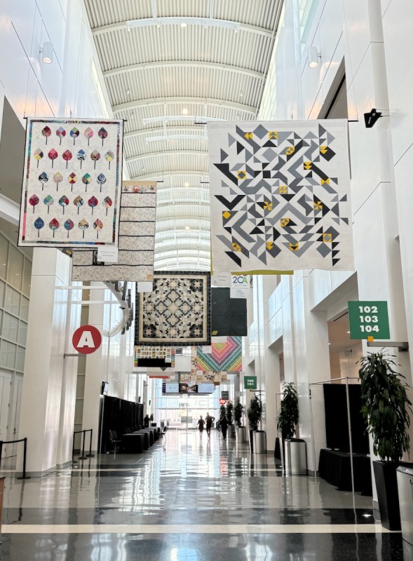
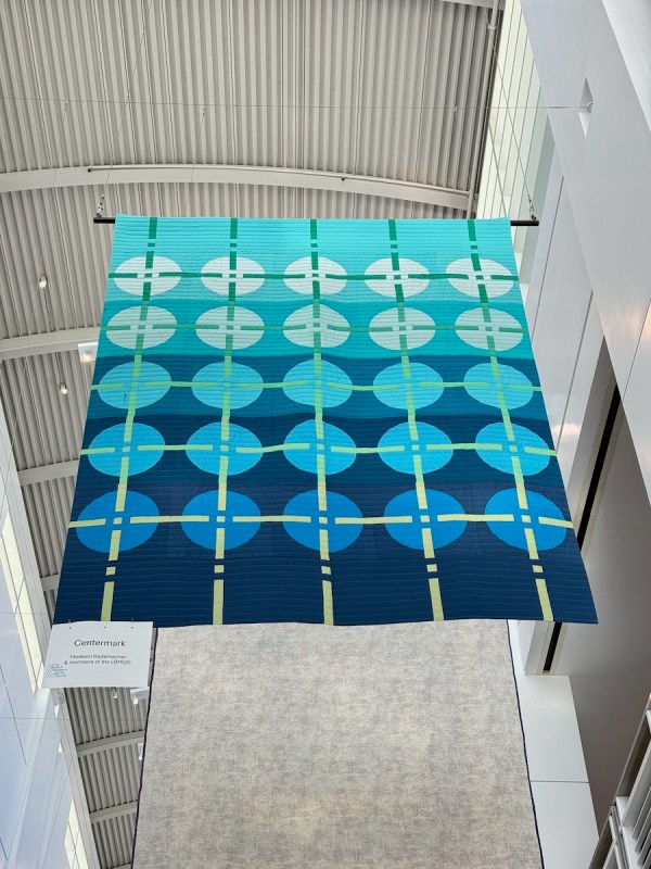
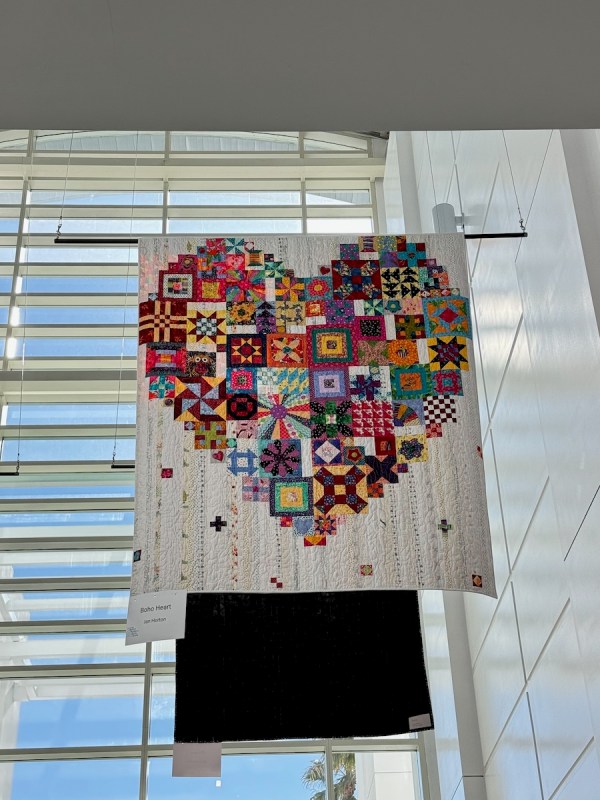
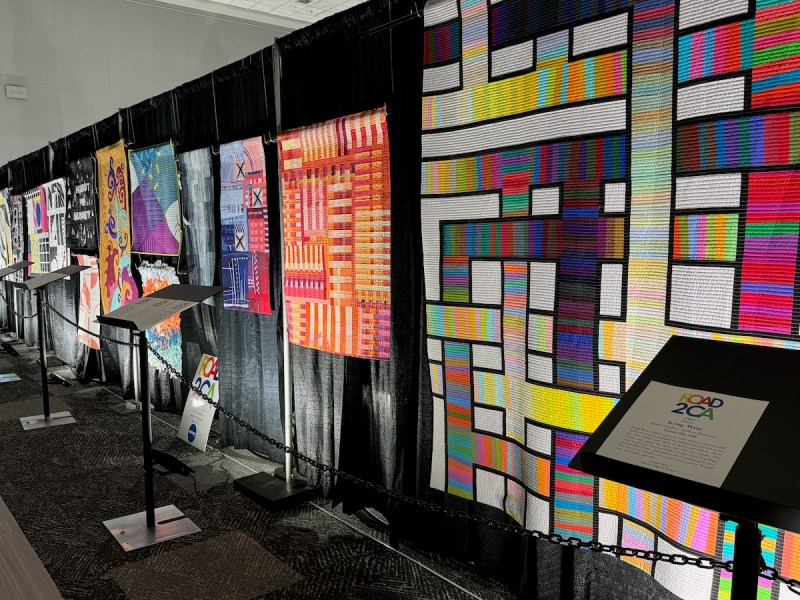
Road to California, for me, always begins with this hallway lined with hanging quilts. So many different styles and colors, all from one Guild that is chosen at random from those who enter their names. This was at about 8:30 am. on Tuesday morning, January 21st, and I was there to take the Blackwork Embroidery class from Kathie Kerler.
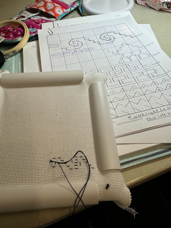
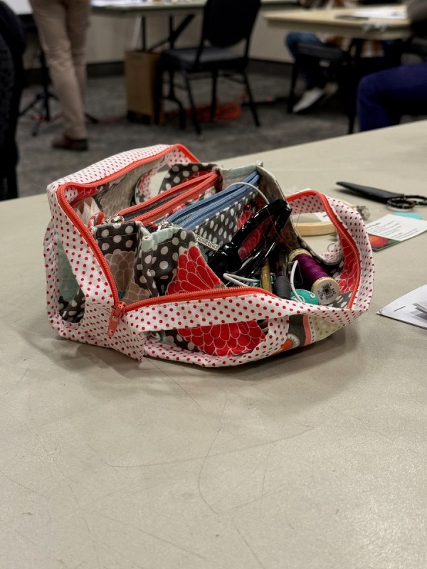
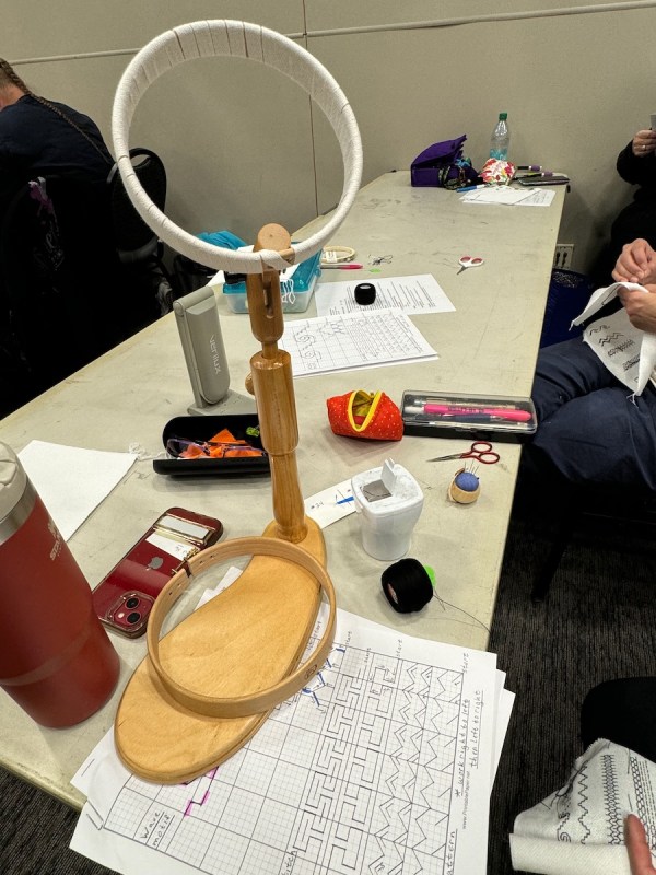
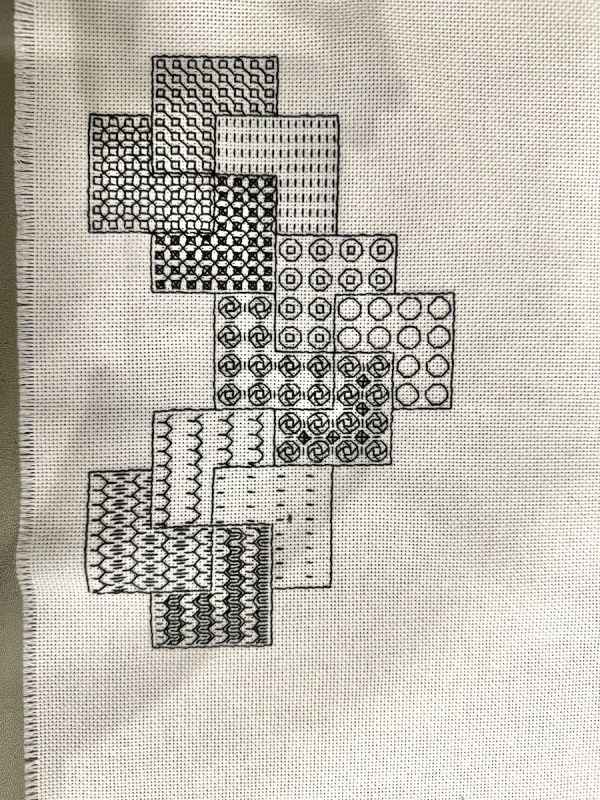
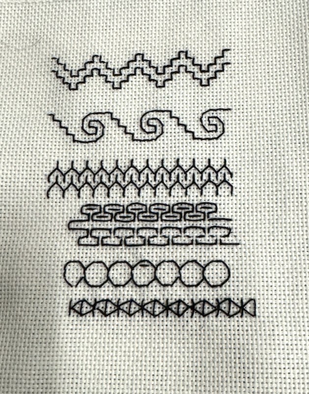
Her sample is on the lower left. Mine is on the lower right. The room temperature went from freezing-your-hands-stiff to overheated-hot-flash territory. (They did caution us to dress in layers.) My seat mate, Chris, had open her little bag (upper center). I said to her, “That’s my pattern!” Yep, it was my Mini Double-Pocket bag, and we had a good chat–fun to see one out in the wild. I also admired the hoop stands in our class — it seems it would be much easier with one of those.
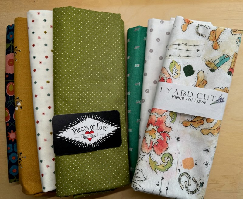

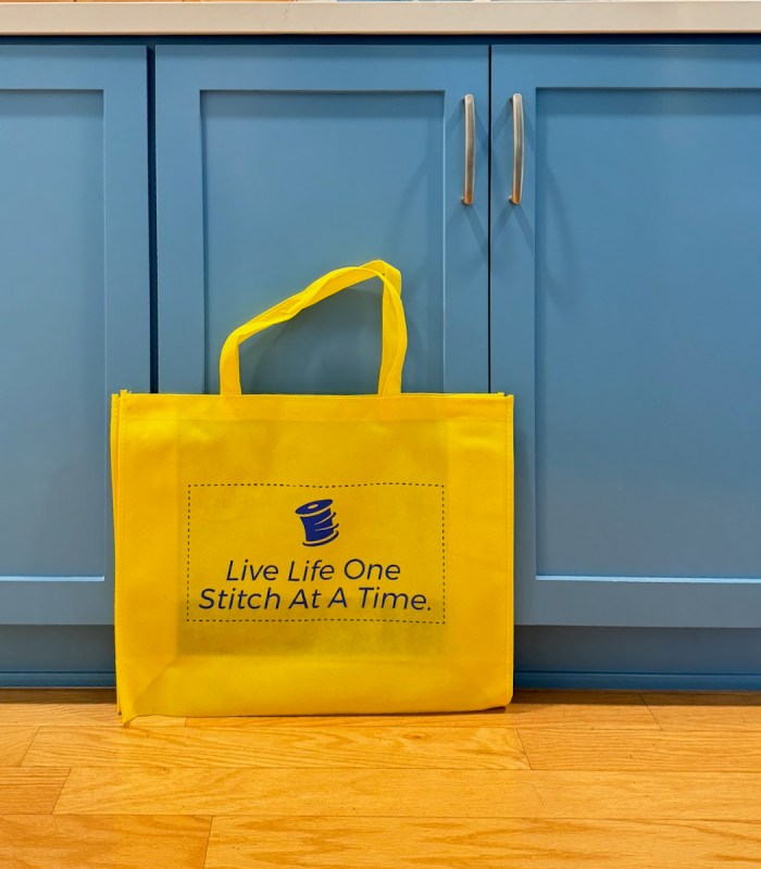
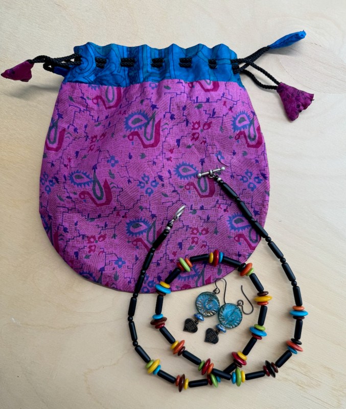
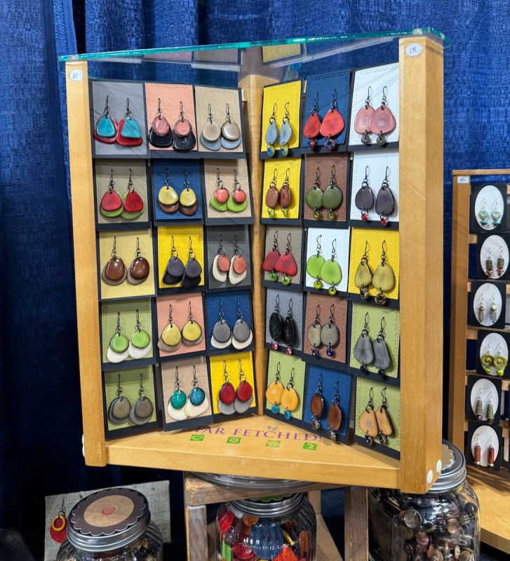
Souvenirs! I always buy some jewelry from Merry of the Button Box. Contact me if you want her email address. I picked up a few bits of fabric and that freebie yellow stitch-saying bag, posed here once I got home again.
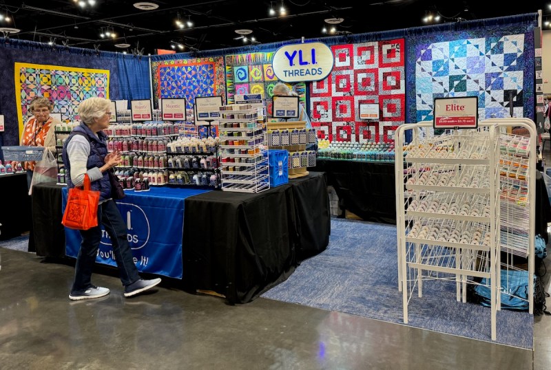
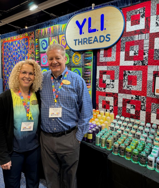
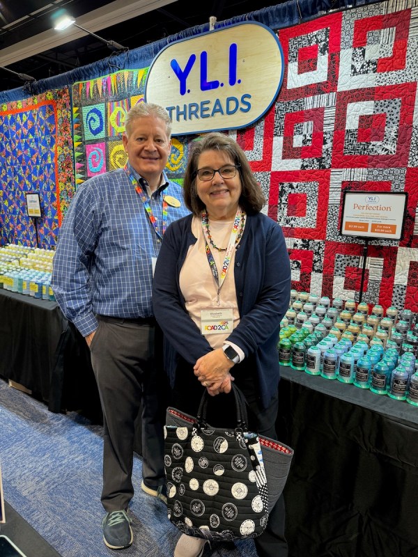
Bob is back, now with YLI Threads (You’ll Love It says Bob), and I was happy to see him, and meet his new wife and chat with them. Quilt shows are ideal for that, especially if you get in before the tour busses and the vendors are just killing time until customers show up.
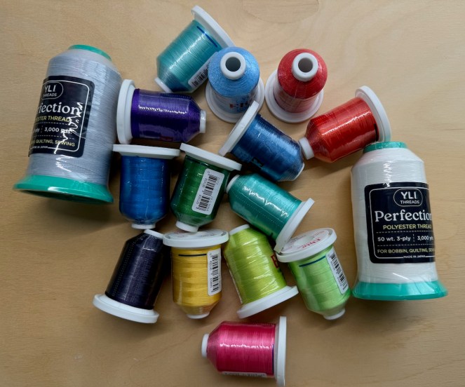
I bought just a few (haha) colors of their line Elite to try out. It’s a thread similar to Bob’s old Magnifico, which is my all-time favorite thread for quilting. I also picked up some piecing thread; yes, lately I’ve been using polyester thread (fairly fine, at 50 weight) as it cuts down on the lint build-up in my machine. I’ll report in later, after I test them.

Now on to the quilts. I stayed for Preview Night on Tuesday, then went back Thursday morning, before I wimped out and headed home. If you are on BlueSky social media, I have a video of us all lining up next to the scooter carts before it opened — it was a crush! And if you are on BlueSky, please follow me, so we can build our quilting community (#quiltsky) over there.
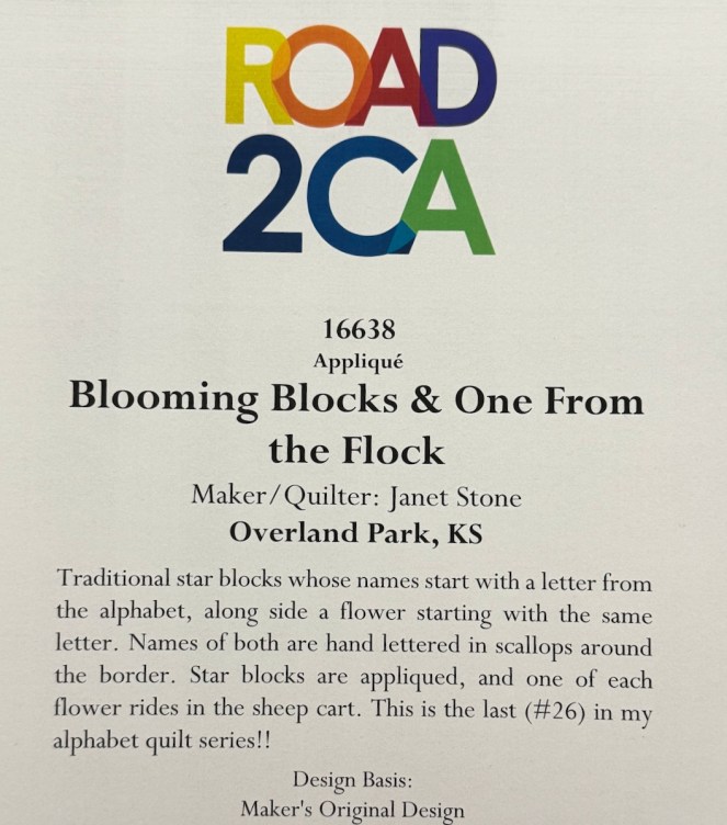
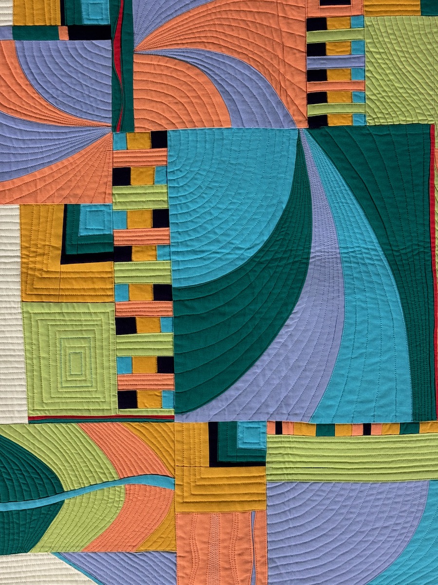
One of the quilts I always look for, or have for the past 20+ years, is the alphabet quilt from Janet Stone.
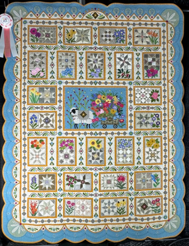
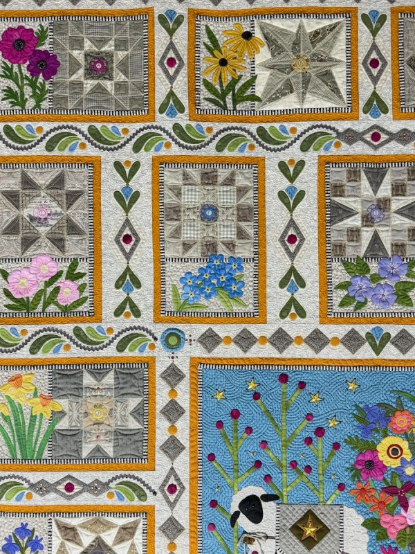
She is a master of details and I had fun figuring out that the flowers and the blocks all began with the same letter, indexed around the outside edges of the quilt. Here are some detail shots:


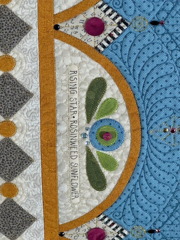
I’ll miss seeing this series. Wonder what she has going on next?
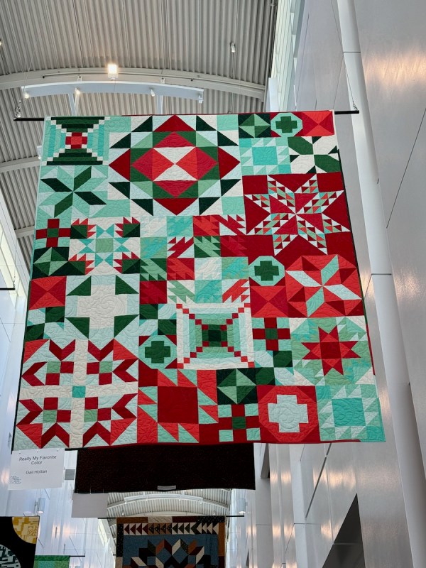
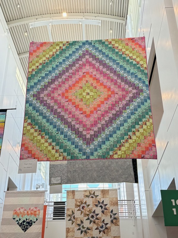
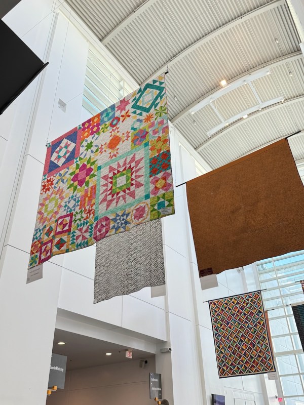
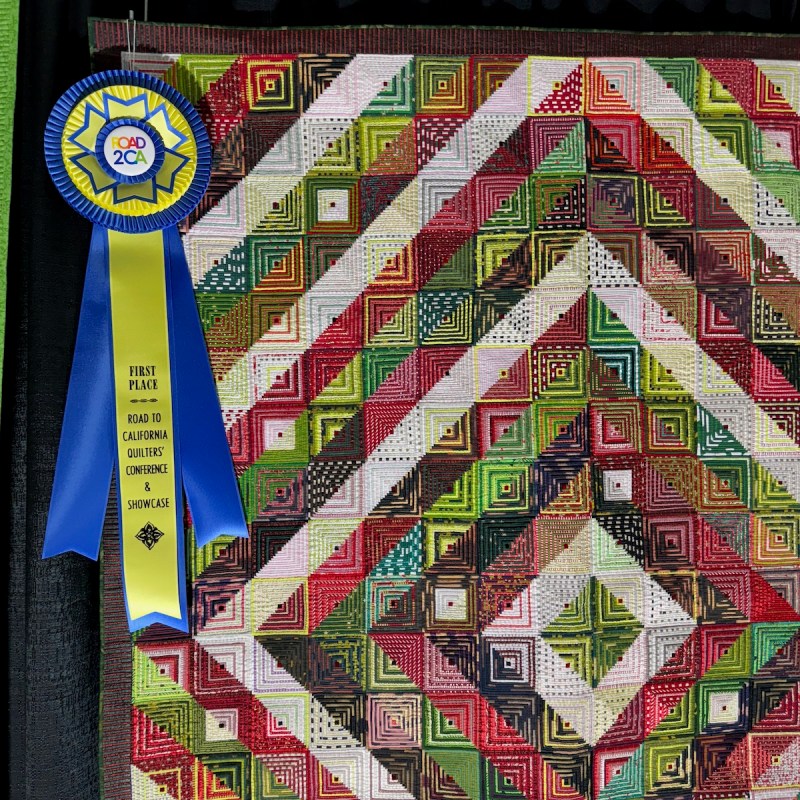
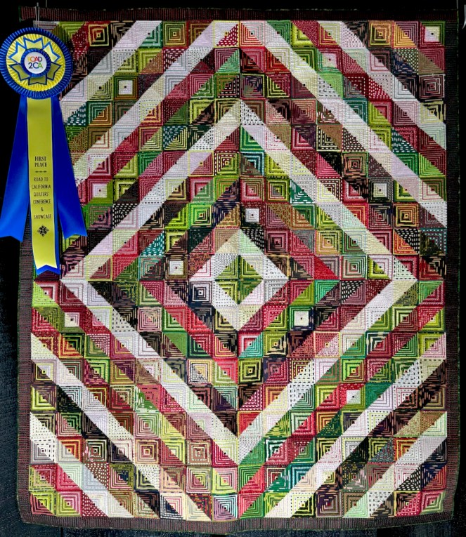
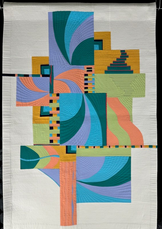
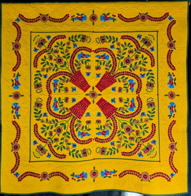
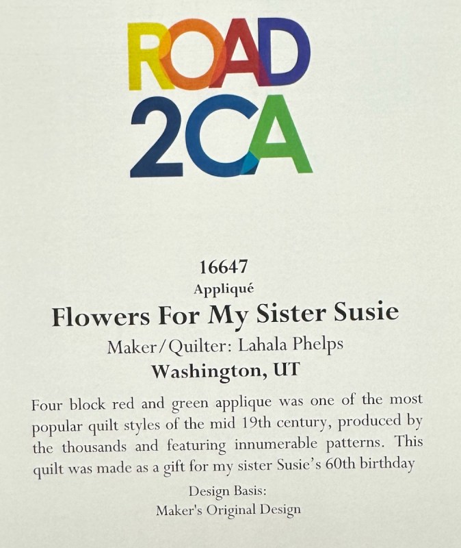
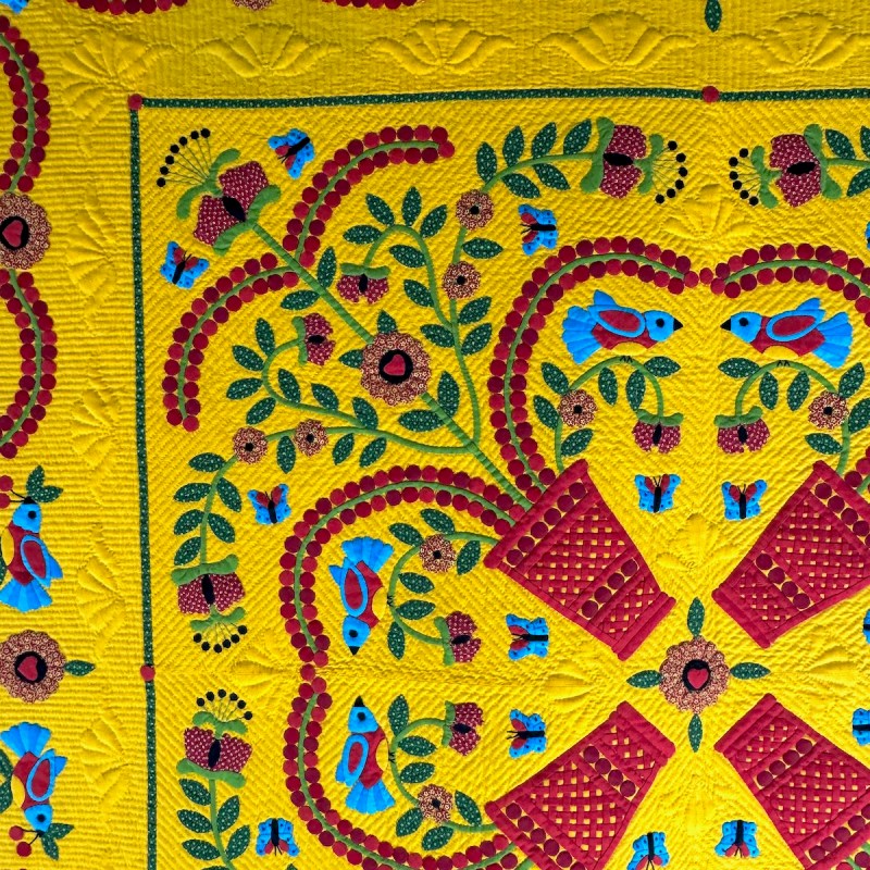
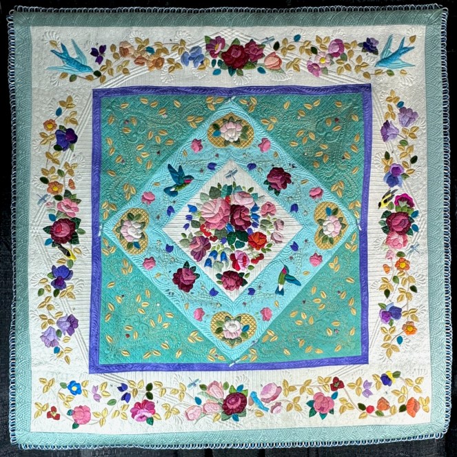
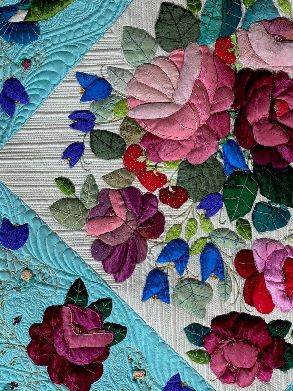
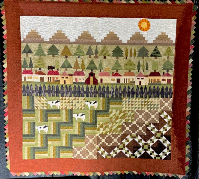
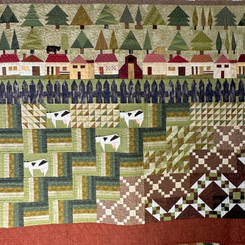
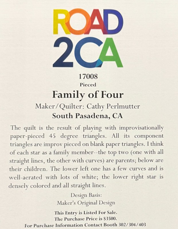
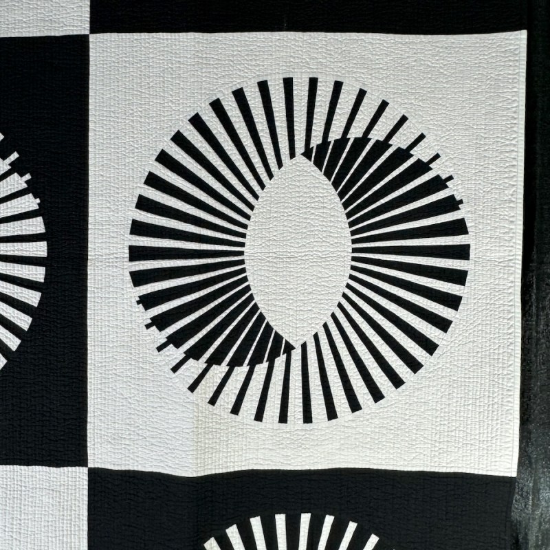
I found the show this year to be subdued, but still — happy to have it here. It feels like they’ve cut down drastically on the number of single-person entry quilts, and they are all crammed together, perhaps evidence that it is expensive to host a show like this? For each quilt, I’ve generally taken three photos: the quilt, a detail and the title card. Click on any of the photos to enlarge.


Amy Pabst is a genius at teensy quilting. Each of those log cabin “logs” is about like a matchstick.
This one was just beautiful.

One of the challenges for photography is the way the quilt show is lit: spots directly underneath the quilts, and NO LIGHTS ON IN THE HALL!! Call you believe it? There’s a pianist on an electronic piano playing lovely music and the first impression is wow. But then you try to actually look at the quilts, and nearly everyone around me is complaining. Or leaving quickly, which was my experience. I usually like to really study and look at the quilts, but seriously? In the dark? It’s fancy, but not functional. Okay, enough whining but now you understand why this is dark on the top and light on the bottom, and that’s even after several different filters being applied at home in my photo-editing program. (I did my best.)
These colors!!
Loved the trapunto flowers.

Although the title card is in Spanish, it’s a tribute to her town. On the back, she’d created her family tree (not shown).
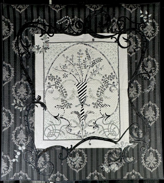
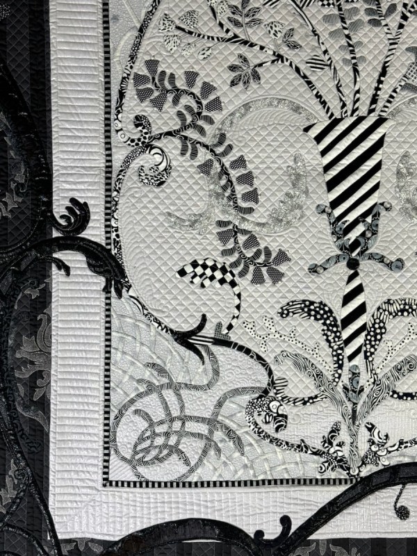
Tough to see this beautifully created quilt (black on black in darkness…).
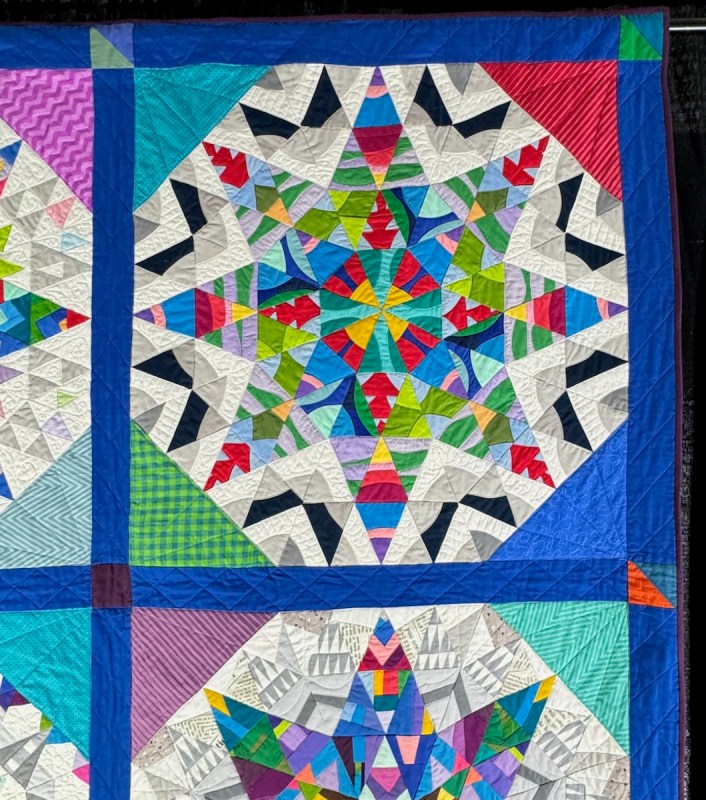
You can purchase this quilt…

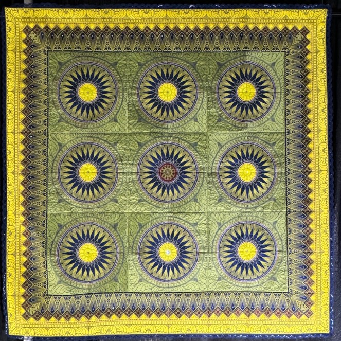
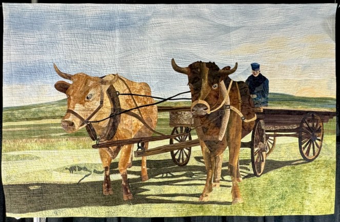
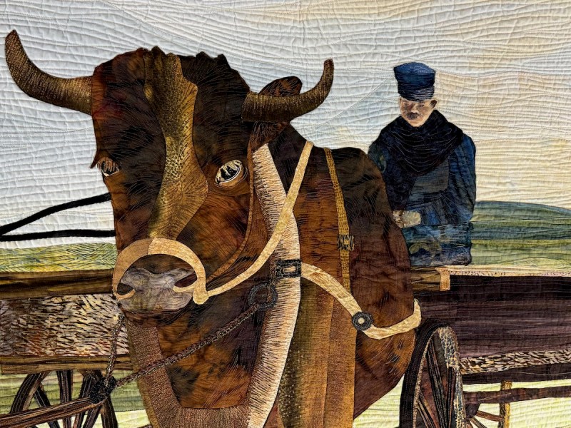
Amazing detail in both the piecing, appliqué and the quilting.
This quilter was standing nearby, but too shy to pose for a photo.


Especially good to remember on this freighted week of Inauguration. My classmate and I carefully talked around the events, trying to figure out if we were a match in current events thinking. We were (whew!). She lived near the fires and told me that her in-laws’ home had burned to the ground with almost no warning. So much damage and so many lives affected by this disaster. [Note: when I came out Tuesday night at 8 p.m. to head home, the whole area smelled like smoke, and I immediately wondered: another fire somewhere?]


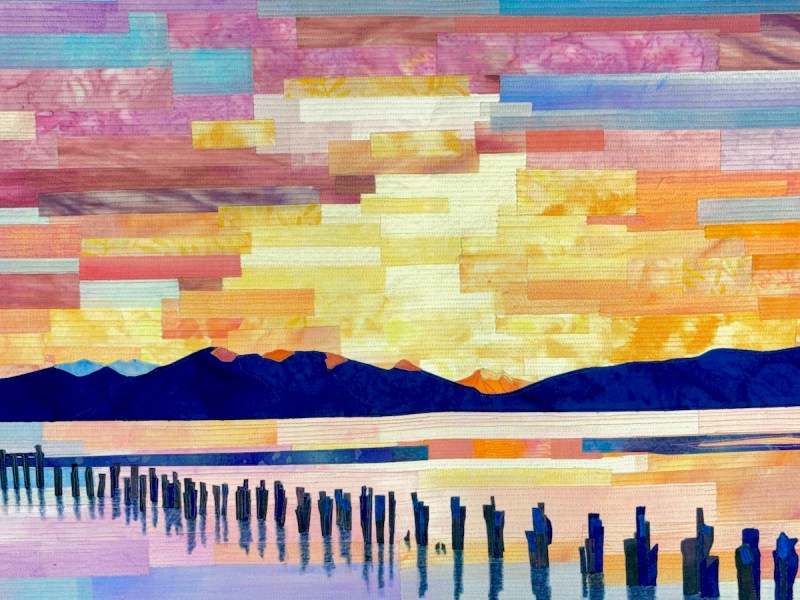
A simply drawn landscape, but it was just lovely.

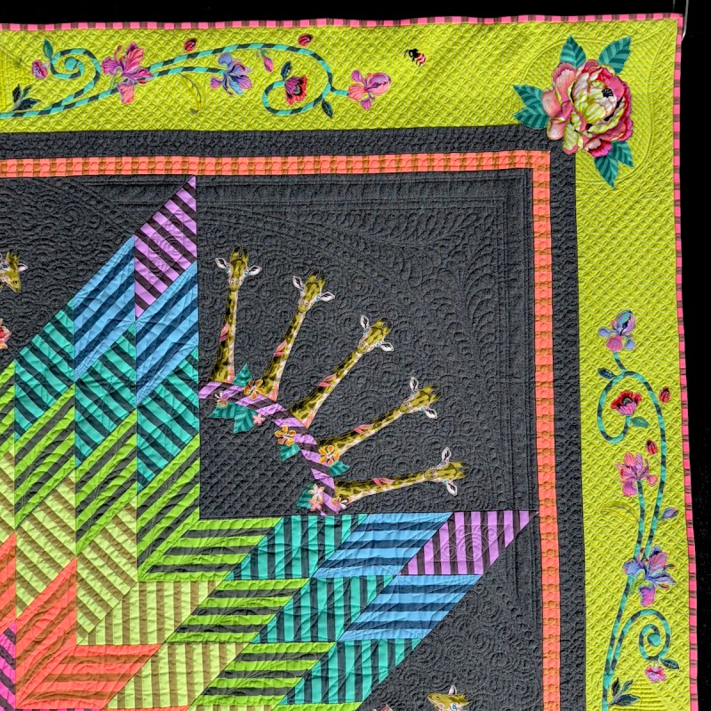
Giraffes! How fun is that?

So that’s the second quilt of Ben Darby in the show — both were beautiful!
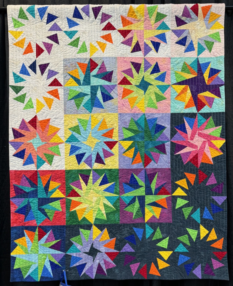
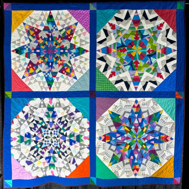
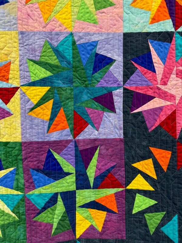
Since I should be quilting on my very own New York Beauties quilt, this one below caught my eye.
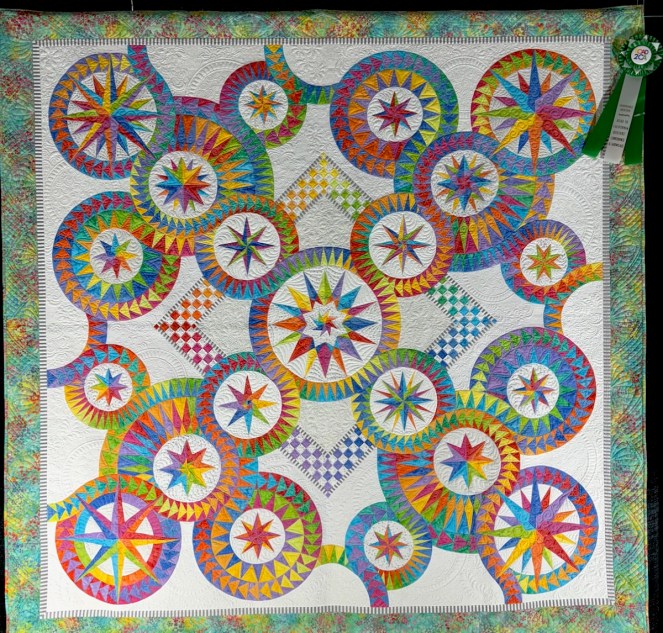
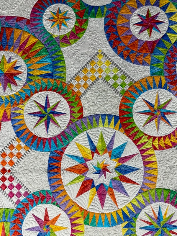

Just stunning!

One guild had a series of quilts, 100 Days of Tula Blocks, and Tina Curran made this one, in red, white and blue.
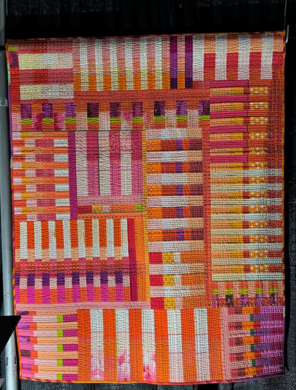
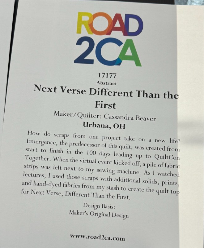
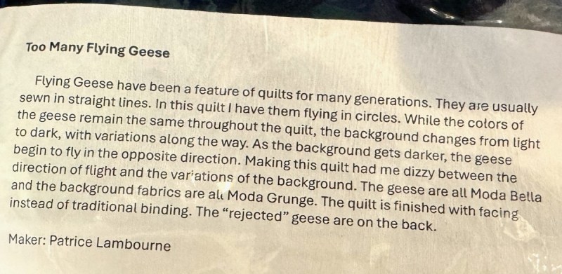
Sometimes it’s interesting to see how the quilts are displayed. I showed you this so you could see how tightly they were hung. But Cassandra Beaver always has an interesting quilt to show.

Click to enlarge title card. Really fun quilt, full of bright color. This was a from a grouping in the hallway outside, another guild showing off their quilts.
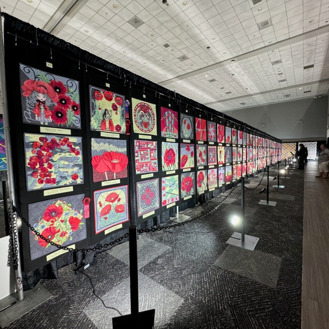
Cherrywood had a huge display, all along the final back row in this exhibit hall. I think you can tell how dim the lighting was in this photo.
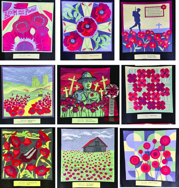
Lots of Flanders Fields themes, and since we’d just been to Normandy, they resonated.
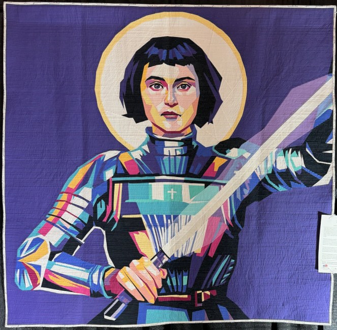


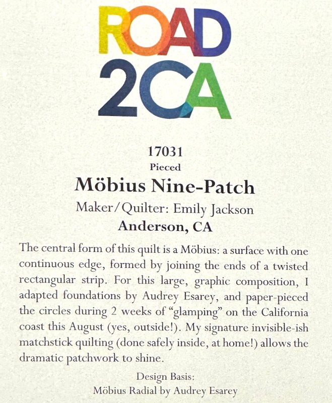
Verushka Zarate’s masterpieces were in a special gallery at the front of the vendor’s hall, where they put all the fancy ones. If you’ve never seen one in person, I hope you get a chance sometime. I took her class at QuiltCon Phoenix, the first year after we came back from covid, and I credit her for teaching me once and for once and for all how to do paper piecing.

Here she is with her boys. Again, if you are on BlueSky, here’s a wee video of the entire series of quilts.

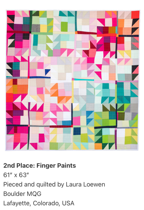
Obviously there are many more quilts and lots of vendors, so come on out to California next January and see us.

The show closes tomorrow, and it will be all over for another year….but we’ll be back!