Free Download · Quilts · Something to Think About

Small Stuff at the Bowers Museum Quilt Exhibit

Efficiency is ruining your happiness.

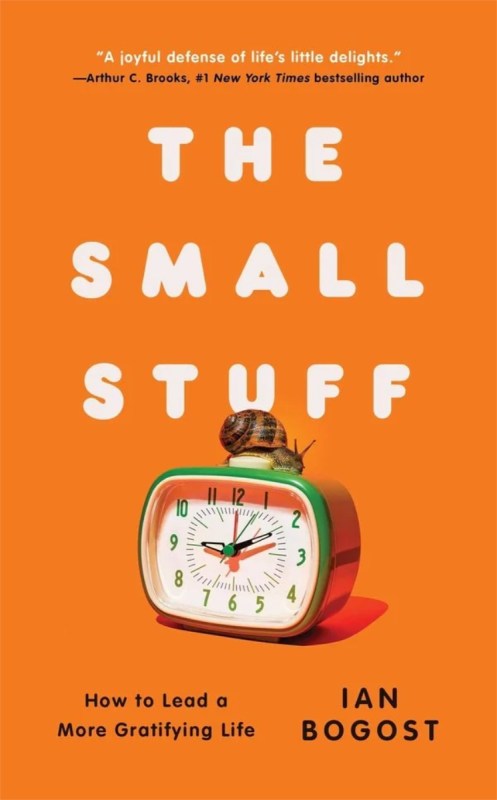
Or so says Atlantic podcaster Charlie Warzel about Ian Bogost’s new book, “The Small Stuff: How to Lead a More Gratifying Life, and why the tiny rituals, sensory pleasures, and routine interactions we tend to overlook may be the very things that make us feel connected—to one another, to the world around us, and to ourselves.” (gift link to podcast transcript).
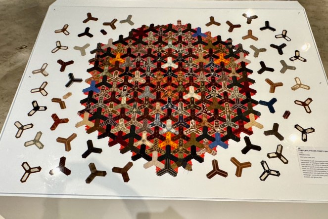
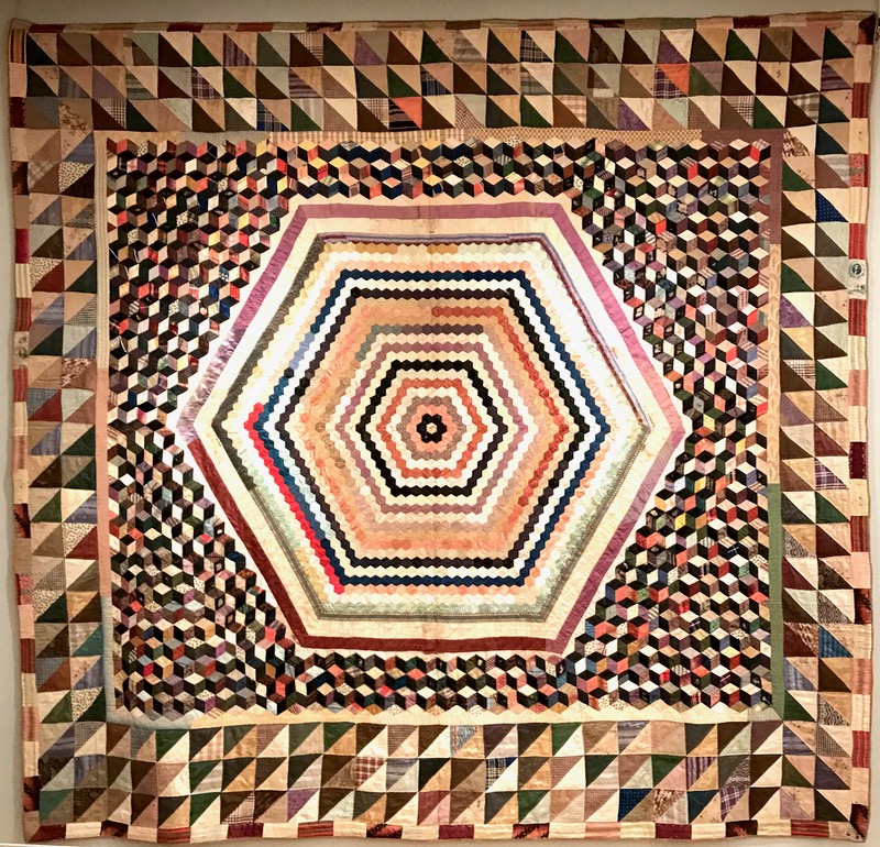
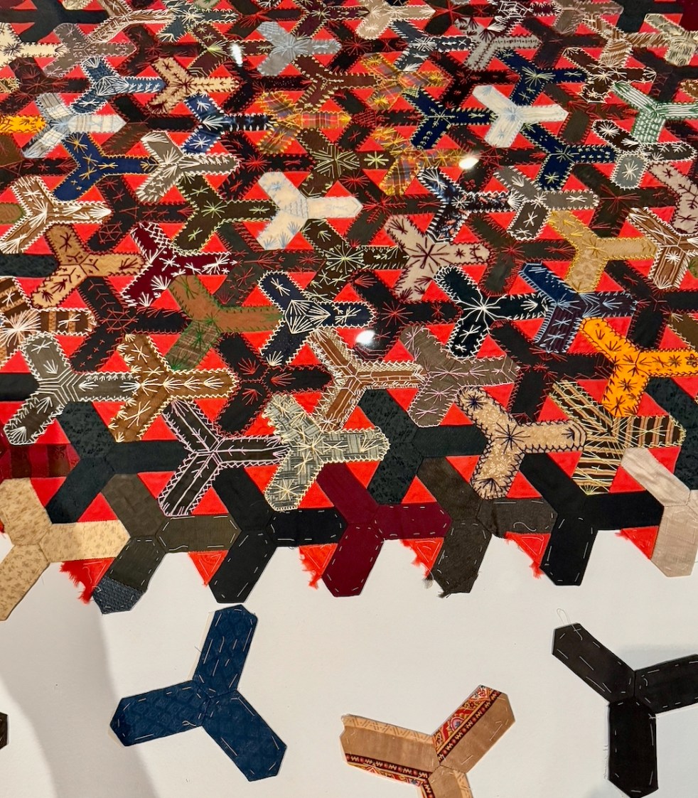
Template-pieced Crazy Quilt, c. 1890

Writer Ian Bogost “makes the case that some of our societal obsessions—self-optimization, career satisfaction, this constant fixation on whether we are adequately happy or not—those are all aimed at the Big Stuff. But our lives are actually dominated by the Small Stuff: the [messing] around that gives texture to our days. This, he argues, is good news, because the Small Stuff is abundant, and it’s actually much easier to notice, to control. And doing so can bring us a sense of genuine gratification, the kind that so many of our technologies just automate away” (source above).
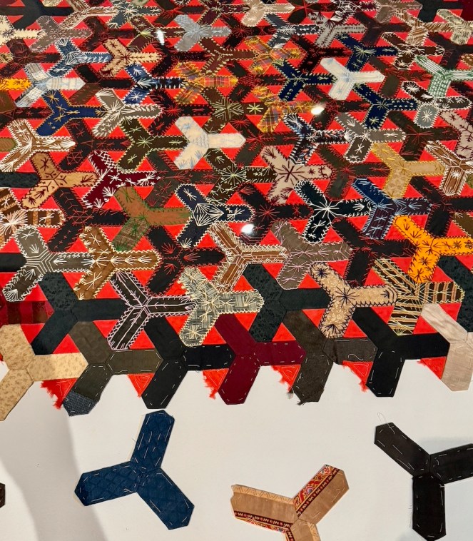
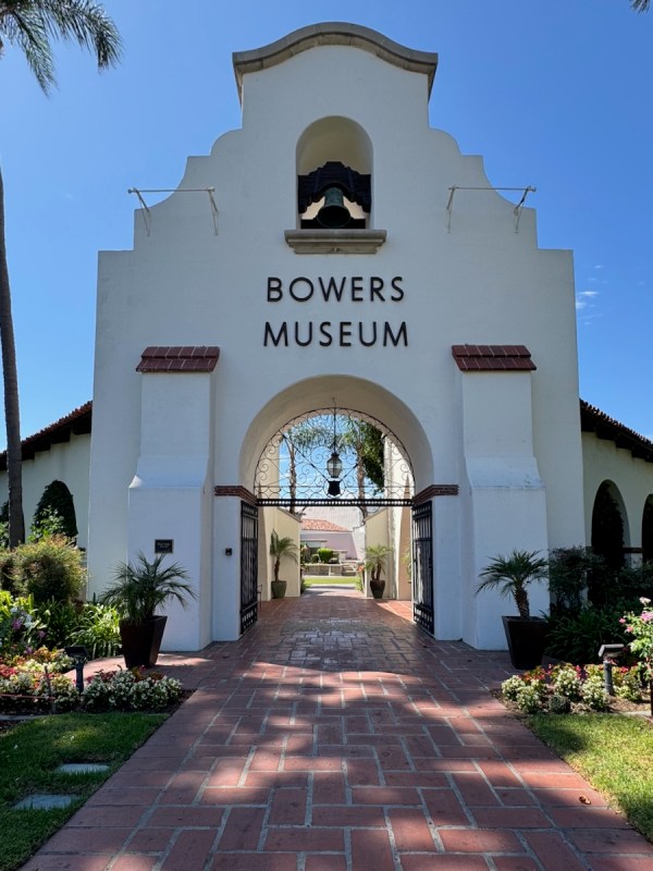
As I’ve been feeling disconnected in more ways than one, I was intrigued. So when I went to an exhibit at the Bowers Museum in Santa Ana with these ideas swirling in my brain, I decided to slow down, to look, to notice, to see the Small Stuff in the quilts.
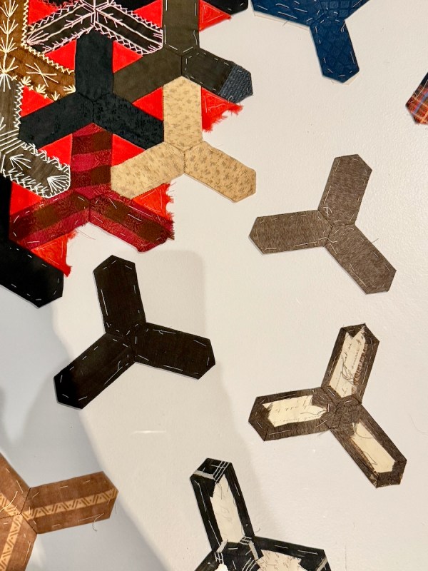
If you are like me, you usually hit a quilt show, camera in hand and have a rhythm: take the big photo of the quilt, take the detail shot, take a snapshot of the title card and move along. While I started that way, I made a decision to not be so efficient. To notice the details.
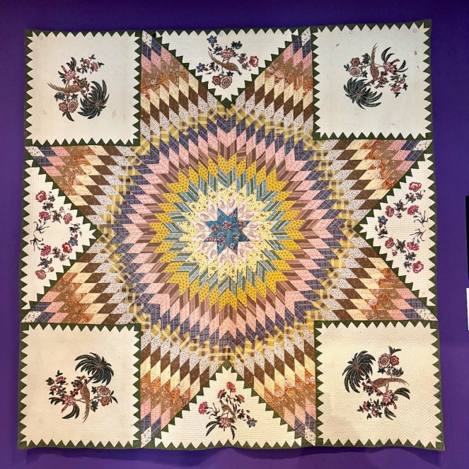
Star of Bethlehem quilt with broderie purse

The title card points out that in this quilt from the 1820s-1830s, the use of broderie perse, or the appliquéd chintz cut-outs, may have been a technique to manage the expense of printed cotton, grown and made in America, but then shipped to England to be printed…and then shipped back again to the United States.
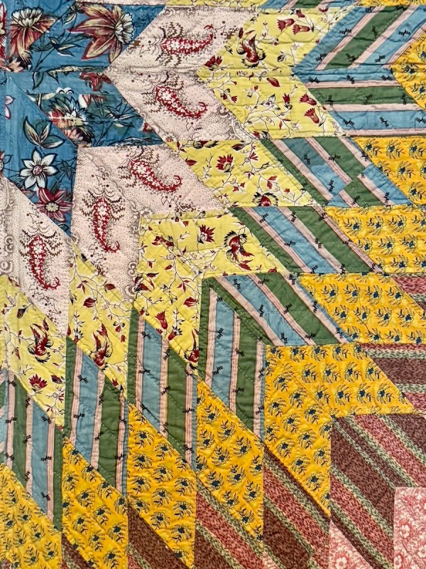
The lights were dim in the galleries, so the resolution on some of these photos is very low. But I was fascinated by these two yellows against that Prussian blue center.
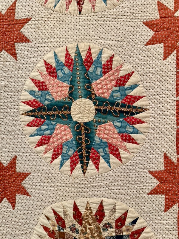
Inscribed Mariner’s Compass Quilt, c. 1850

Here, in another medallion quilt, is that color again.
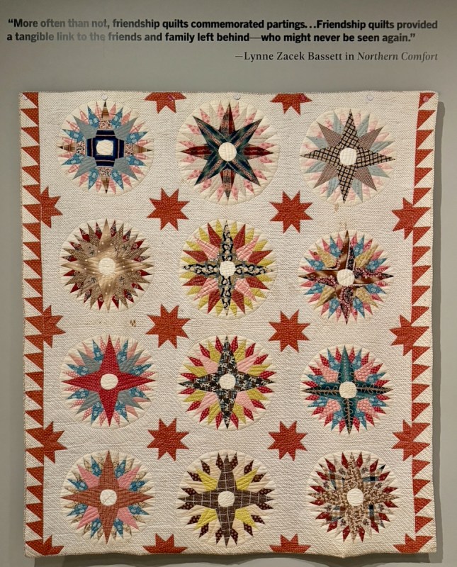
On the right side of the quilt, the binding matches the background. But not on the left.
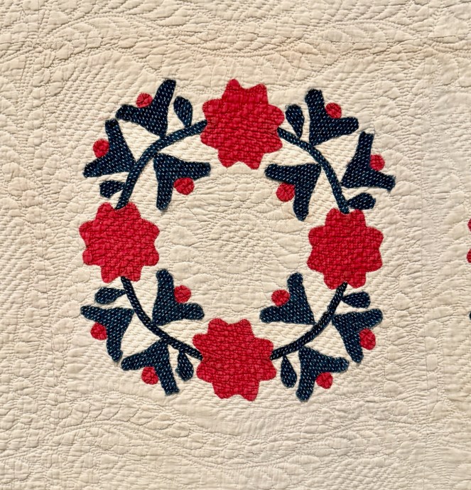
Rose Wreath Quilt, c. 1850

This Rose Wreath quilt has Turkey red fabric, so named because the process for obtaining the color from madder root was originally developed in the region of Turkey. As I have noted in other writing on this website, we really don’t know how people in the past constructed and lived their lives except in the broadest strokes and outlines. Were they excited to have this red? Did they pre-wash like we do? (probably)
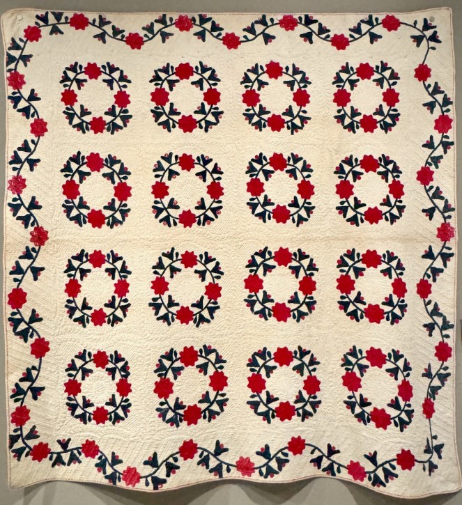
(Sorry for the blurry shot — the low light was a challenge, but I knew it helped preserve the quilts and fabrics.)
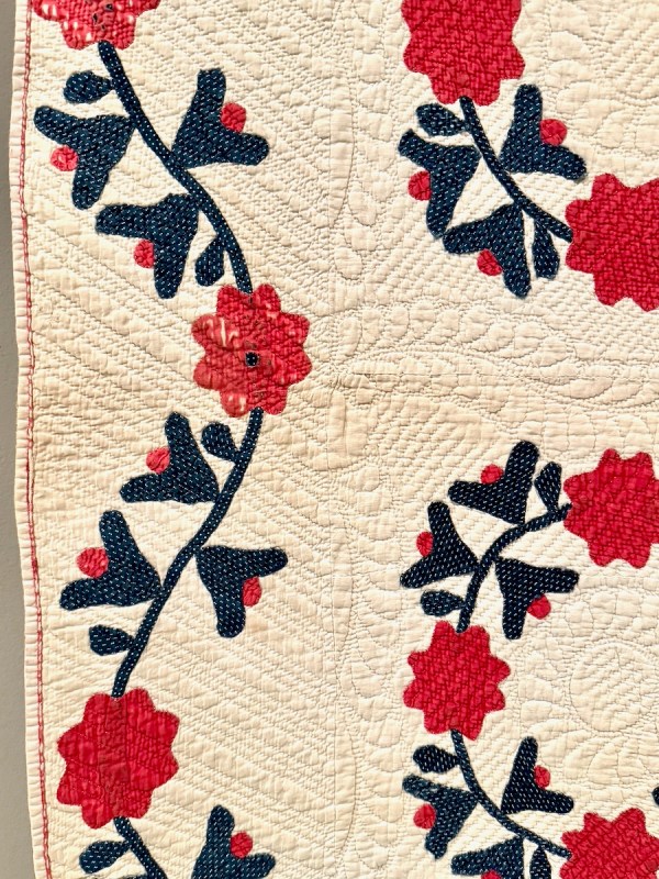
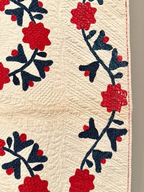
These vines, on opposite sides of the quilt, were not symmetrical, but instead echoed each other, curving in exactly the same way. Usually we see those vines mirrored. One hallmark of Turkey red is that it leaves the cotton fibers more vulnerable to abrasion and wear, as you can see here on the edges of the quilt.
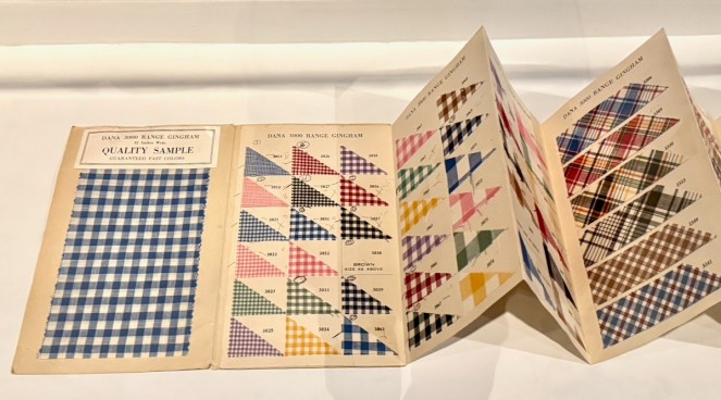
Around the perimeter were some displays; one included this Mail Order Fabric Sample card, from Montgomery Ward & Co, c. 1926. Okay, that’s a century ago.
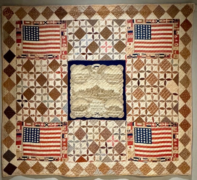
Centennial Handkerchief Quilt, by Sarah Angelina Andrews Whitman and Gertrude Spurr Whiman, c. 1883.

I loved the combination of quilt patterns: the handkerchiefs and panel in the center, the orange peel blocks interspersed with squares on the diagonal, with squares set diagonally around the border. According the title card, “Sarah Whitman collected the handkerchiefs during her visit to the Philadelphia Centennial Exposition, and made the quilt with her young daughter’s help a few years later.”
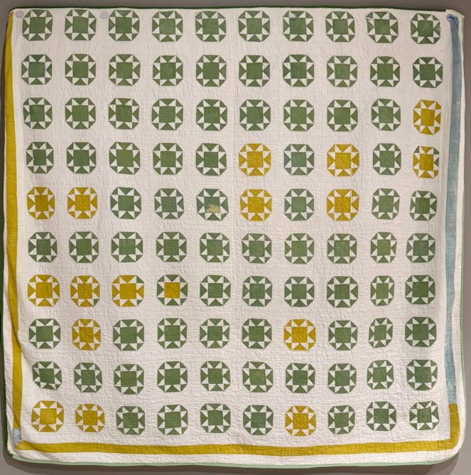
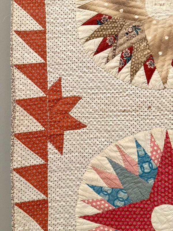
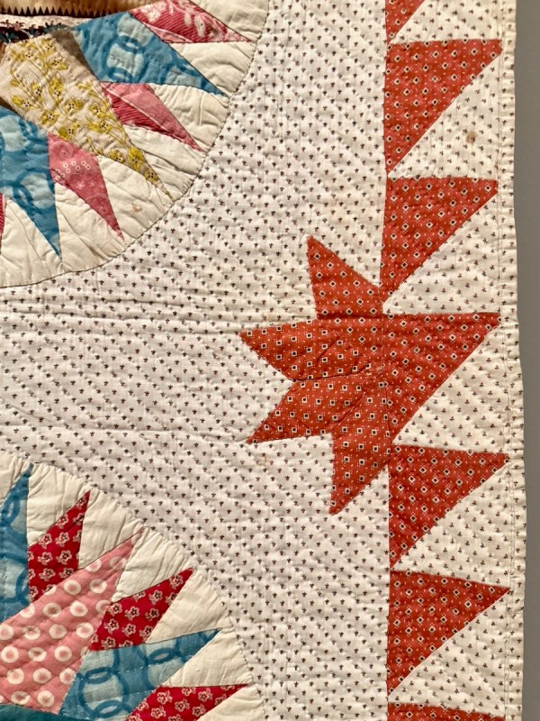
This one really caught my eye with all the variety of colors on the sawtooth blocks. My mind was whirling with possibilities that the quilter had tried, but was disappointed to read that they were all originally the same color (but two different fabrics). The title card says that “laundering the quilt in an alkaline detergent at some later point caused the blue dye to fade from only some of the green fabrics, leaving the yellow behind.” I still think it’s very cool, but I wonder how the quilter felt. The quilt is from somewhere between 1840-1910. And check out that outside border — I suppose that had the Detergent Blues, too.
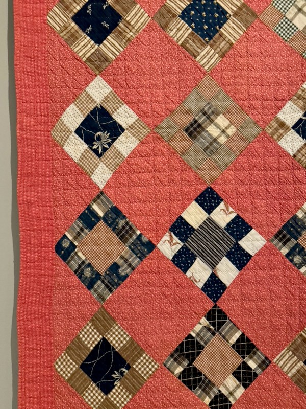
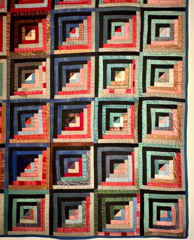
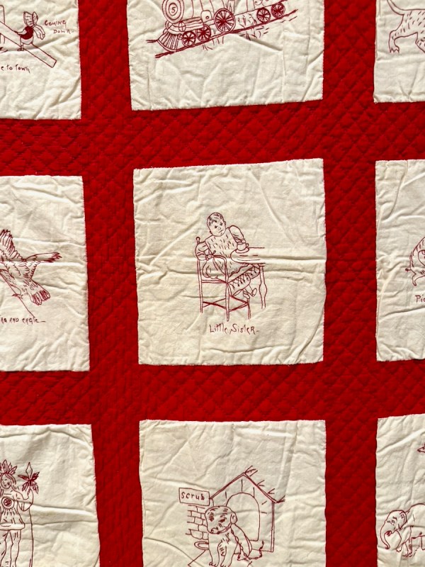
Details from 1) Square within Squares quilt, c. 1980; 2) Log Cabin Quilt, 1880s (made in silk and wool); and 3) Redwork Quilt (1890-1910).
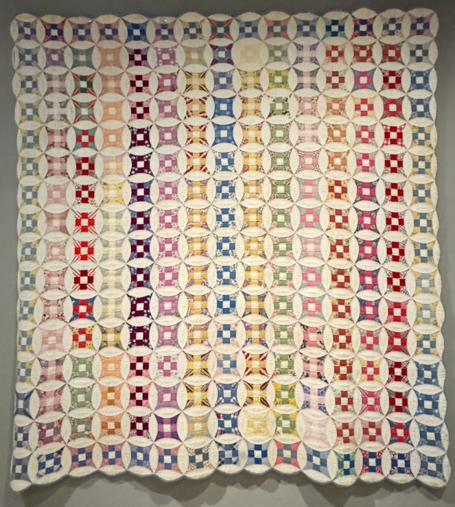
Glorified Nine Patch Quilt, 1930s to 1940s

The nine-patch is a favorite block of mine, but this one was quite “glorified,” if by that you mean “making someone or something seem more important or better than they are.”
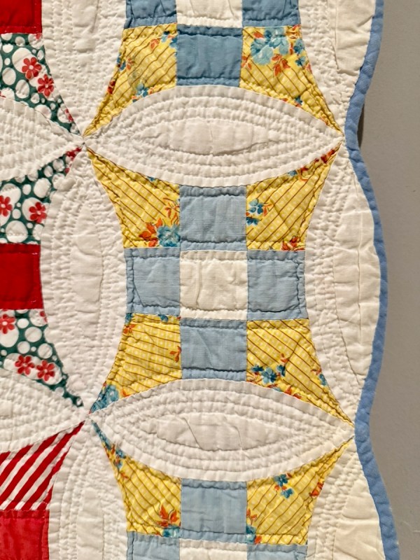
What interested me here was how those pointy outer corners were laid on the bias, as shown by the diagonal lines in this print (well, one wasn’t, but the rest were). Was that a design choice, or because it would be easier to piece the curve on the bias?
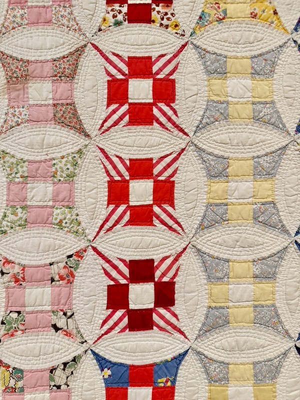
Here it is again. I think the bold stripes lend some pizazz to the 1930s prints.
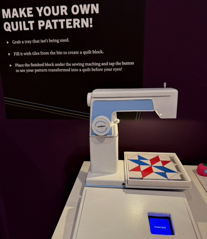
Keeping in line with the idea of messing around and enjoying it as I go, I decided to play their Make a Quilt Pattern game.
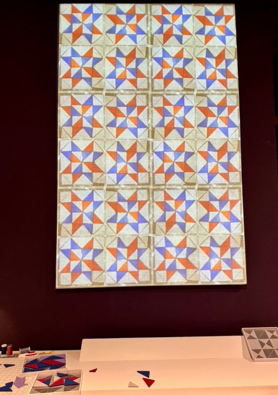
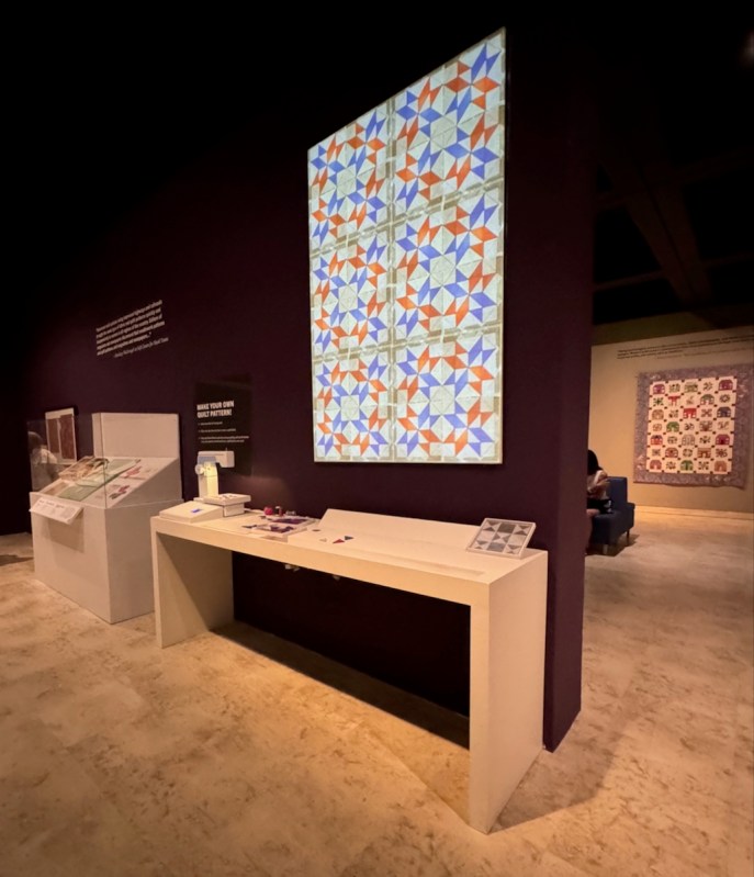
I did the first one on the left, then discovered I could switch a couple of the sawtooth points and get the second (shown here on an angle).

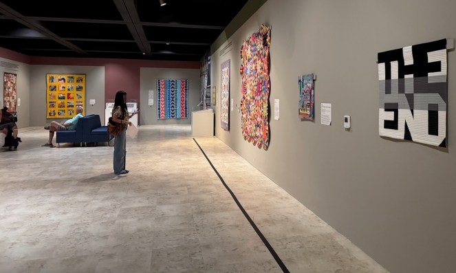
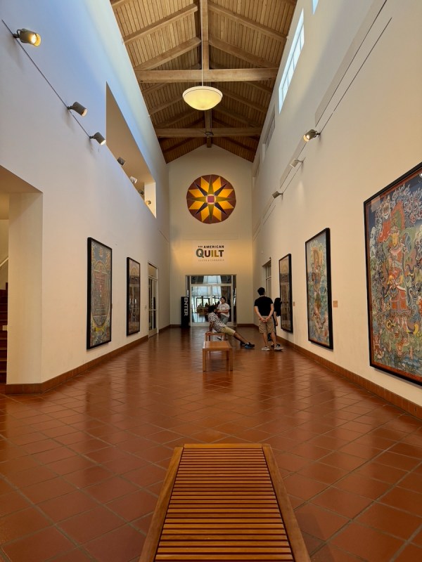
The last room was filled with more contemporary quilts. The exhibit, The American Quilt: Cloth and Commerce, runs through August 30th, if you are in the area. More information can be found on their website.
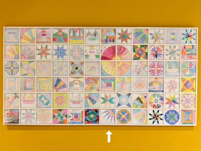
In one corner of the last room, you could color in a block and slap it up into their frames. I chose the “Fan Block,” then said, to heck with Fans, and went to town as if it were a New York Beauty, drawing lines to make it more interesting (mine is just above the arrow). I was in my element:
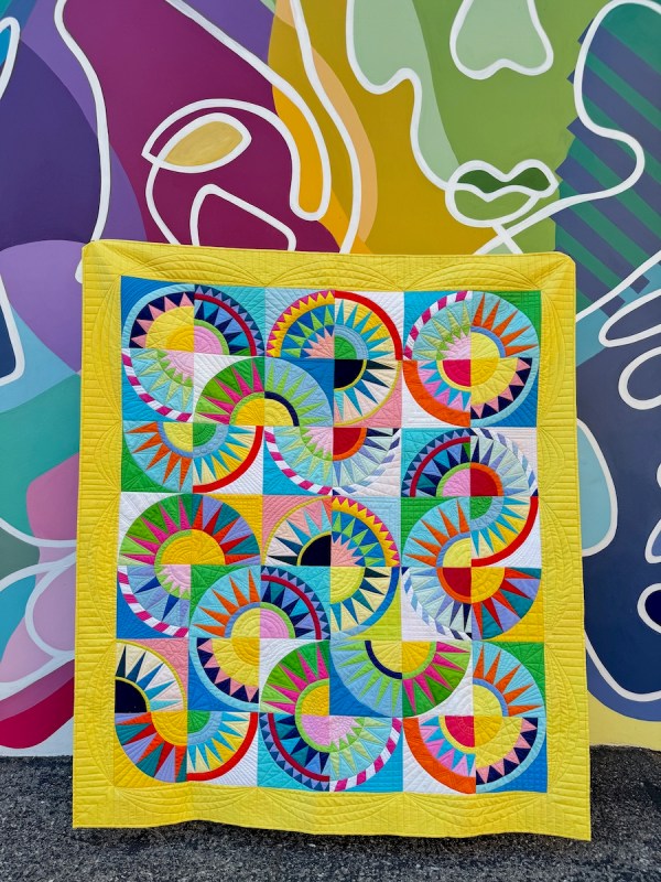
New York Beauties (from here)

THE END is by Janet Tranbarger, a well-known local quilter.
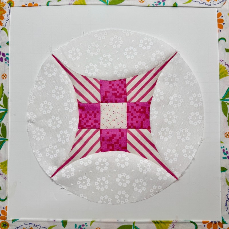
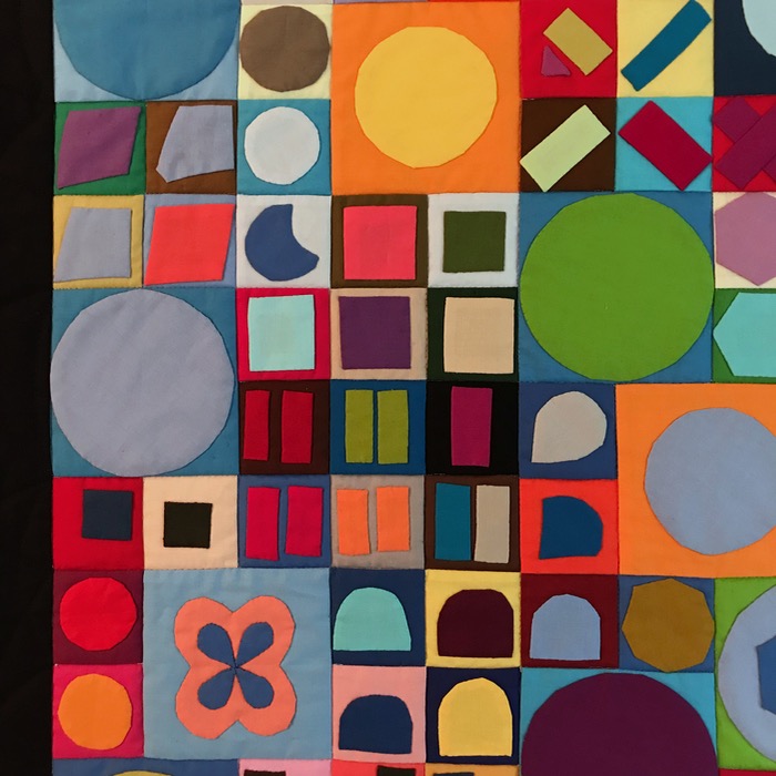
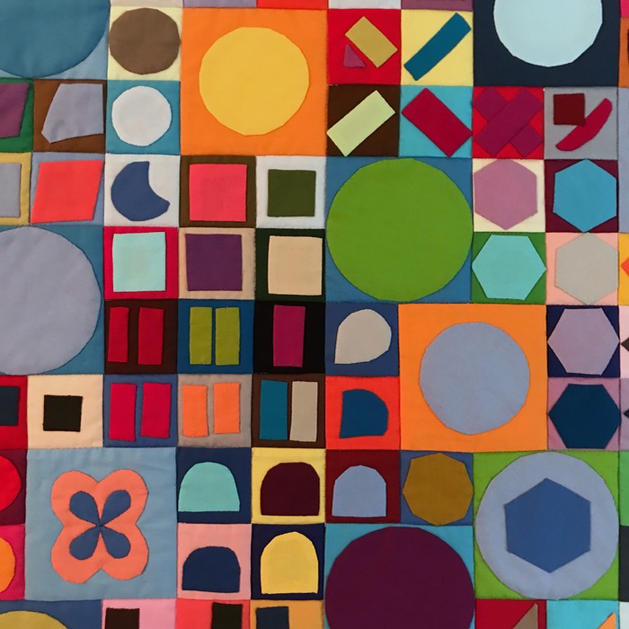
So I found the glorified nine-patch block in the Brackman, and one of its names is Circle upon Circle. I tried it out. This one finishes at 8 1/2″ inches. I’ve got a larger version I want to try (12″) but for now, here’s a free download from my day of doing Small Stuff.

To be truthful, I have no idea how you would put this thing together. Maybe try it as an EPP? Or just be really clever about how you’d sew on the ovals to the fancy nine-patches? Whatever, it’s free to download, if you want it.

Last two quilts:
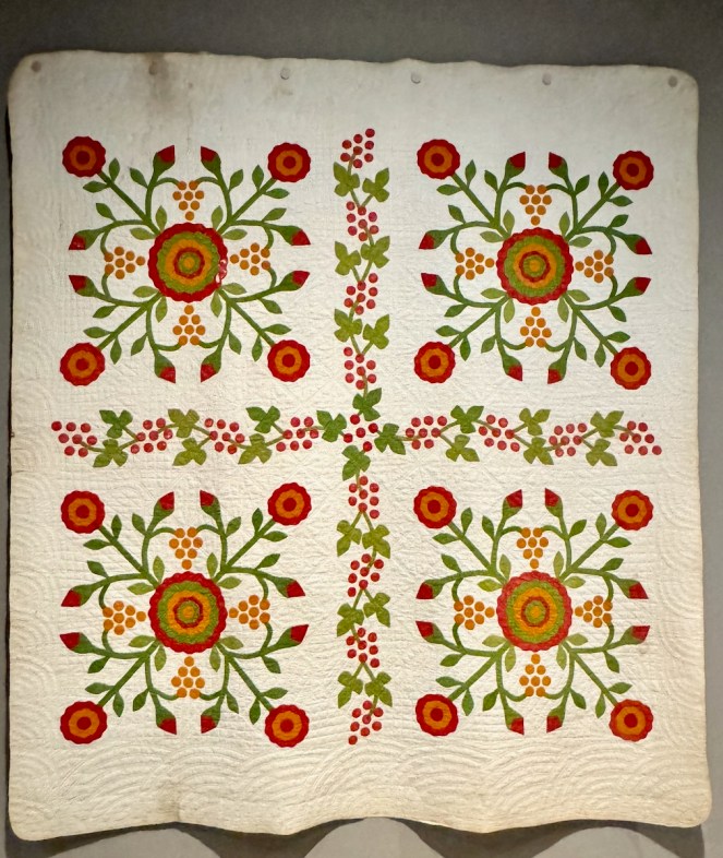
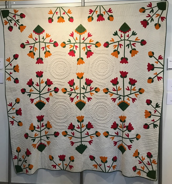
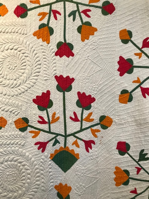
Rose of Sharon — or — Whig Rose Quilt, 1850 – 1870 (possibly Missouri)

The title card said this is made of three different dyed fabrics: 1) “poison green,” an arsenic-based dye; 2) “Turkey red;” 3) and “cheddar,” a dye created with chromate pigment which yields a bright orange similar to the color of the cheese.
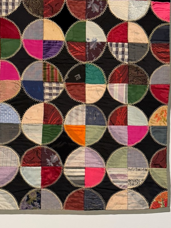
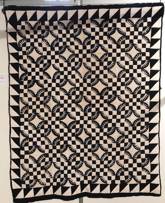
Snowball Quilt, detail (1920s): rayon, silk and wool

The title card noted that “The Treaty of Versailles, which was signed in 1919 to end World War I, included a clause that required Germany to share synthetic dye secrets with the Allied Powers as part of war reparations….The brightly colored patchwork in this quilt indicates that it was likely made after these dyes had become more prevalent in American fabrics.”

I couldn’t get close enough to see for sure, but I’m betting those stitches around the outside edges of the snowballs are done by machine. I’m also guessing that they “snowballed” quarter-circles onto black squares, then sewed them together. You can see some of the disjoint seams here and there.

Final word, from author Ian Bogost (I’d recommend listening to the whole podcast, or reading the transcript):

“So the idea is that we have become disconnected from our sensory lives. That’s sort of the thesis of the book. And this happened slowly over years and decades. It happened in part because of technology, but not entirely because of technology. And we kind of didn’t notice that that was happening. And we maybe, we blamed smartphones instead of a whole host of other factors. But the result is that we feel disconnected, you know? Like, decoupled from the world that we live in, from the physical world.

And that connection, that sensory connection where you engage with the world with your senses, which is what I call gratification: We’ve lost a lot of that. We forgot about it. We were too busy optimizing, planning for the future, trying to make our lives more purposeful or happier, that we forgot how to be gratified. And that’s what I think we should reclaim.”

I did my best to reclaim some Small Stuff, to forget the bigger issues that led me find refuge in this lovely museum, and to get lost in the world of quilts.
Museums · Quilts · Travels

A Piece of Her Mind: DAR Exhibit 2019

DCDAR_1

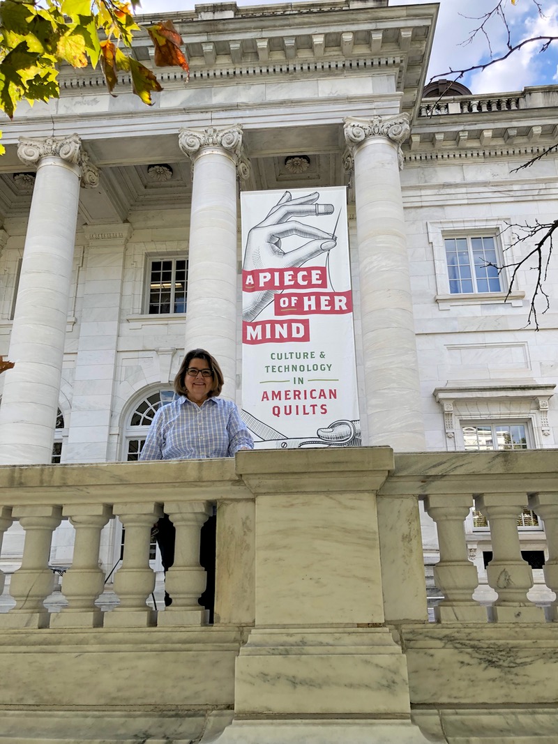
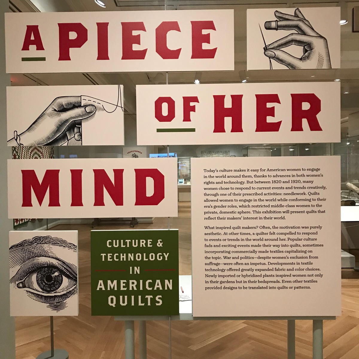
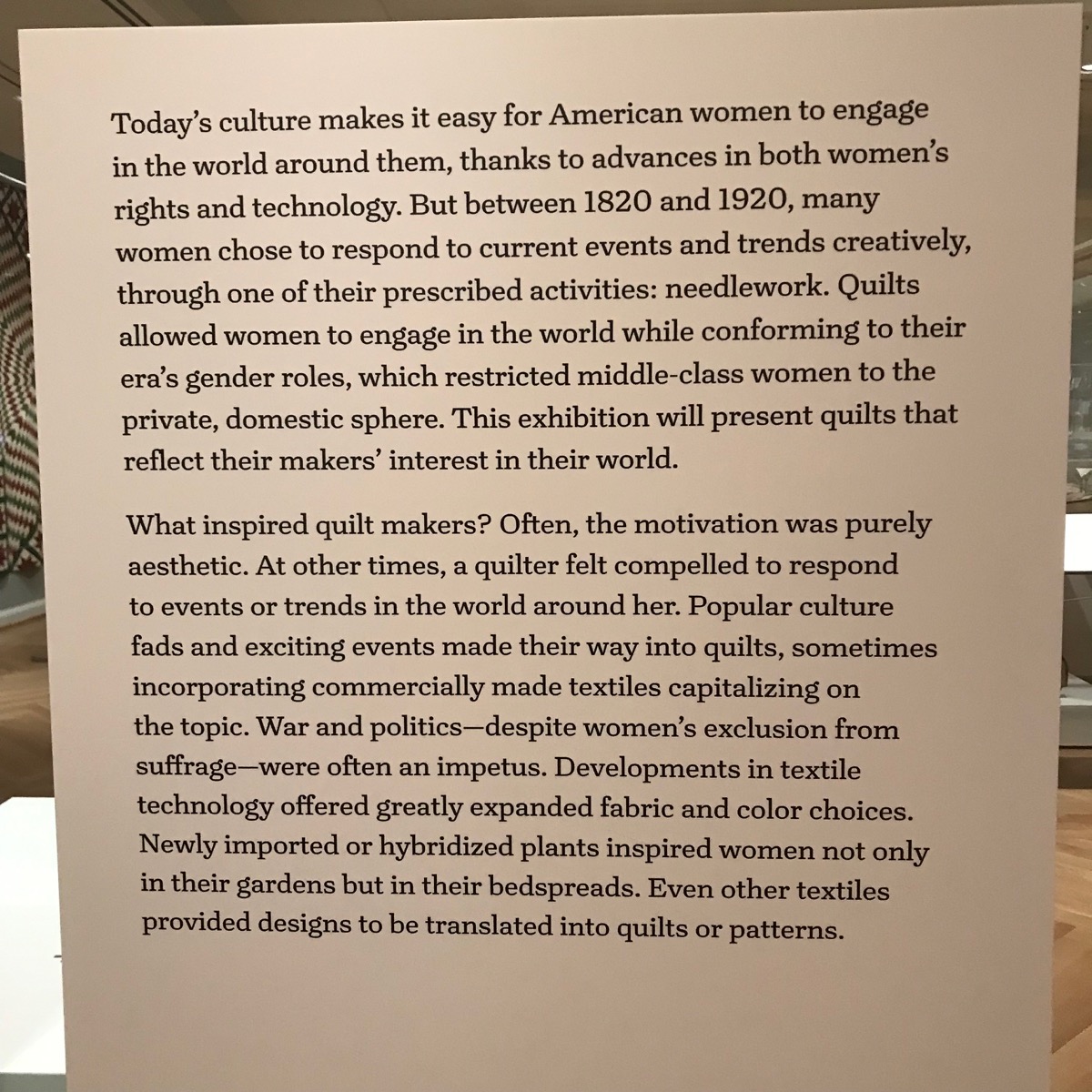
When my husband and I traveled to Washington, D.C. recently, we took in an exhibit at the DAR Museum titled, A Piece of Her Mind.  It had a focus on how technology — in an historical sense — affected quilters at an earlier time, just as much as it affects us today.  I thought you’d like to see some of the quilts, so here we go.

DCDAR_2
DCDAR_2a
DCDAR_3
DCDAR_3a

I actually have to give a lecture in 2020 about the impact of technology, and all that was swirling around in my mind were topics such as social media, rotary cutters, our fancy high-speed sewing machines.  But this showed me that technology’s impact is not just a recent phenomena.

DCDAR_4

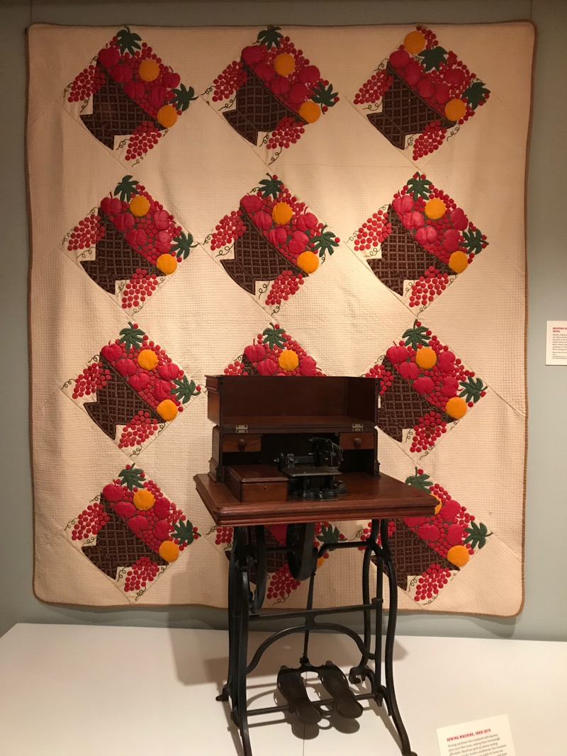
An example of a table-top sewing machine with foot pedals was in front of a beautiful quilt of basket blocks.

DCDAR_4a

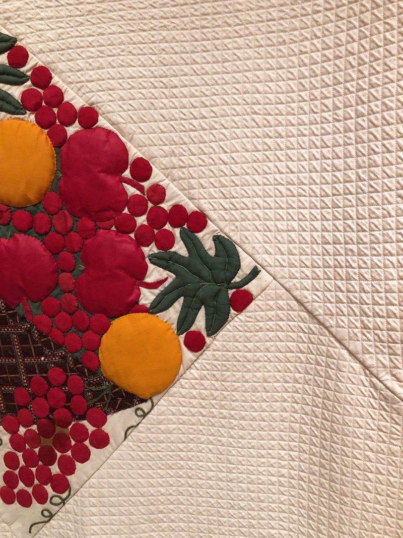
The blocks were appliqued (interesting to note her use of black thread, no matter what color the fruit), and from the appearance of it, stuffed (trapunto?).  It also looks like she quilted the “plain” blocks first, then sewed the basket blocks in between the quilted blocks — a really unusual way to construct a quilt.

DCDAR_4b
DCDAR_4b.jpg
DCDAR_5

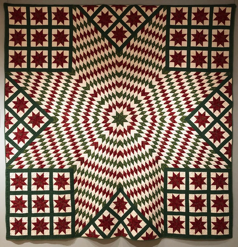
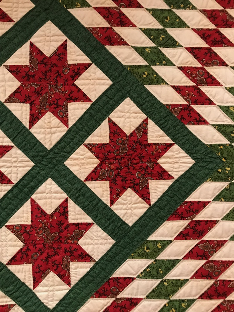
The Red and Green Bethlehem Star Quilt (1840-1860) benefitted from the relatively new ‘Turkey red’ dyes.  According the title card, previous to this invention, “dying cloth this color of red was a complicated dye process. [In addition] [g]reen had to be dyed in two steps (yellow, then blue) until late in the 1800s, but a more reliable option called ‘chrome green’ provided the leafy and emeral hues seen in mid-century quilts.”  This cotton quilt was made by Sarah Hall Gwyer (1819-1882) in North Carolina, or Omaha, Nebraska.

DCDAR_5a
DCDAR_6

DCDAR_6a

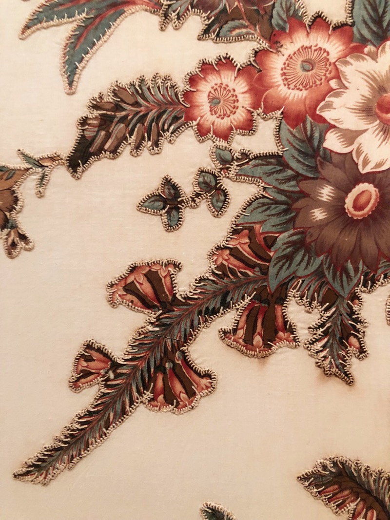
I loved this broderie perse (or appliquéd chintz panel) quilt from the 1820s not only because of the design, but because of those stitches!  Seeing evidence of another woman’s handwork always makes a quilt more personal for me.

DCDAR_7

This Baltimore Album Quilt is from about 1850, and is made by a member of the Hayden family from Baltimore, Marlyand.  It’s cotton, with wool embroidery.

DCDAR_7a

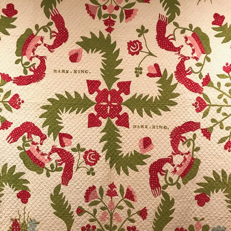
This appliqué quilt was made by Mary Swearingen King (1811-1902) in Findlay, Allegheny County, Pennsylvania.  I loved the applique birds:

DCDAR_7b
DCDAR_7c

They look almost pre-historic, here, feeding berries to their young.

DCDAR_8
DCDAR_8a

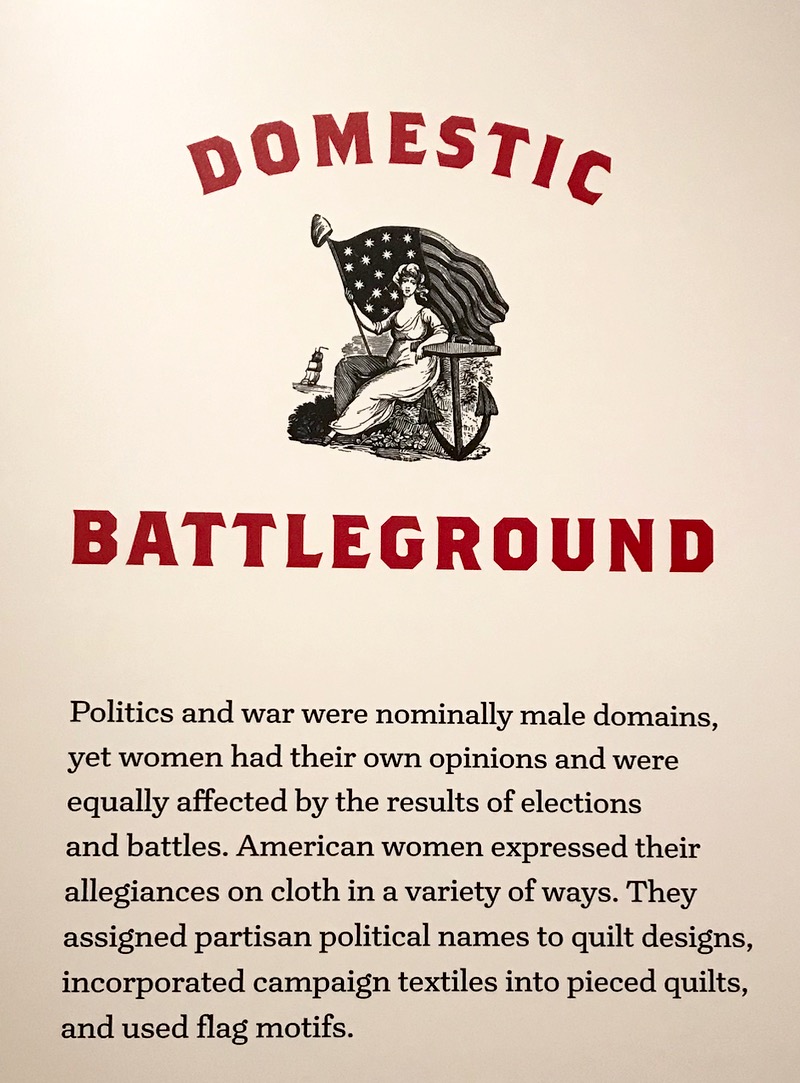
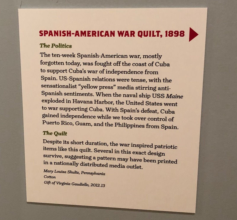
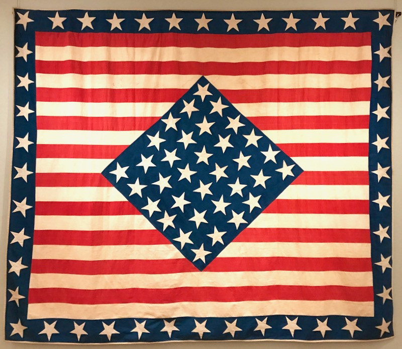
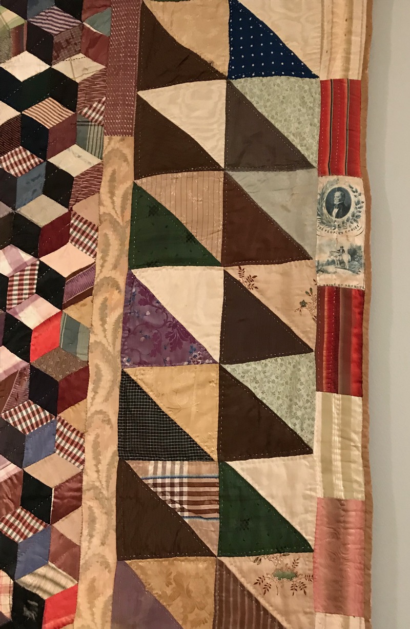
Beyond the technology-oriented quilts, there was a section on quilts that were affected by the culture of the day.  I was drawn to the red, white and blue quilts.  That center block is the flag from Cuba, explained below:
DCDAR_8b
DCDAR_8c
DCDAR_8d
DCDAR_9
DCDAR_9a
DCDAR_9b
DCDAR_9c

I zoomed way in (the ropes around the quilts didn’t permit close inspection) so the picture is a bit globby, but you can see the Clay ribbon in the outside border.

The exhibit also had a series of crazy quilts, some quilts made with toile prints, and quilts inspired by popular fictional characters.

DCDAR_10 library

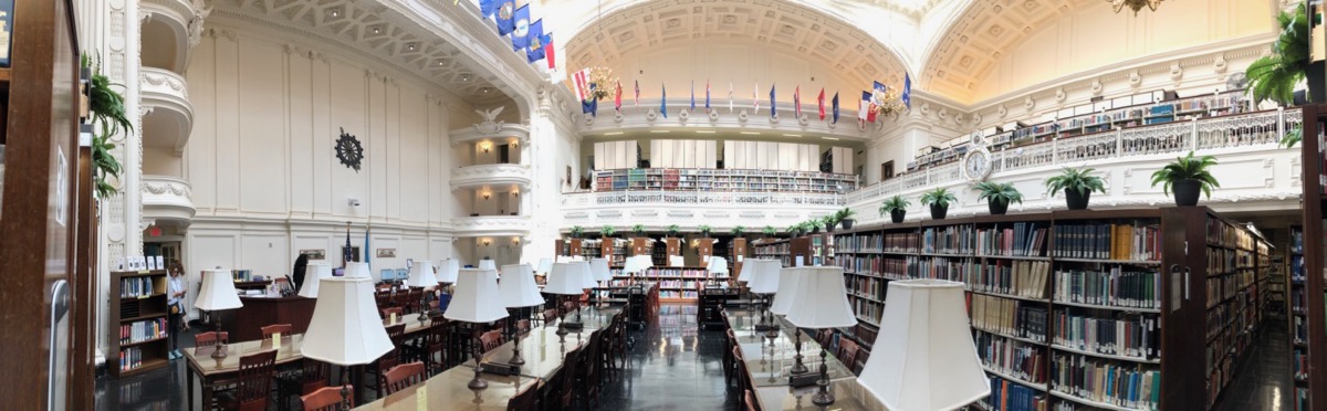
Afterwards we went to the library–quite stunning in a panoramic view.

DCDAR_Renwick1

There was also a quilt of another kind in the Renwick Gallery, just up the street, made out of snippets of movie film.  The title of this is “Fibers and Civilization (1959)” and was made in 2009, using 16 mm film and polyamide thread.  This piece of art is from Sabrina Gshwandtner, and I’d seen some of her work before at LACMA.

DCDAR_Renwick2

Then we hopped on the Metro and went over to the National Museum of American History.  Can you tell I looked up on the internet where all the quilt exhibits were?

DCDAR_SI_1

Unfortunately, this spectacular quilt was behind a piece of highly reflective glass, so the only way I could get a photo was to gently lean my photo lens on the glass to cut the glare.  This means that I couldn’t get a photo of the complete quilt, but here are some segments.

DCDAR_SI_1a
DCDAR_SI_1b
DCDAR_SI_1c
DCDAR_SI_2

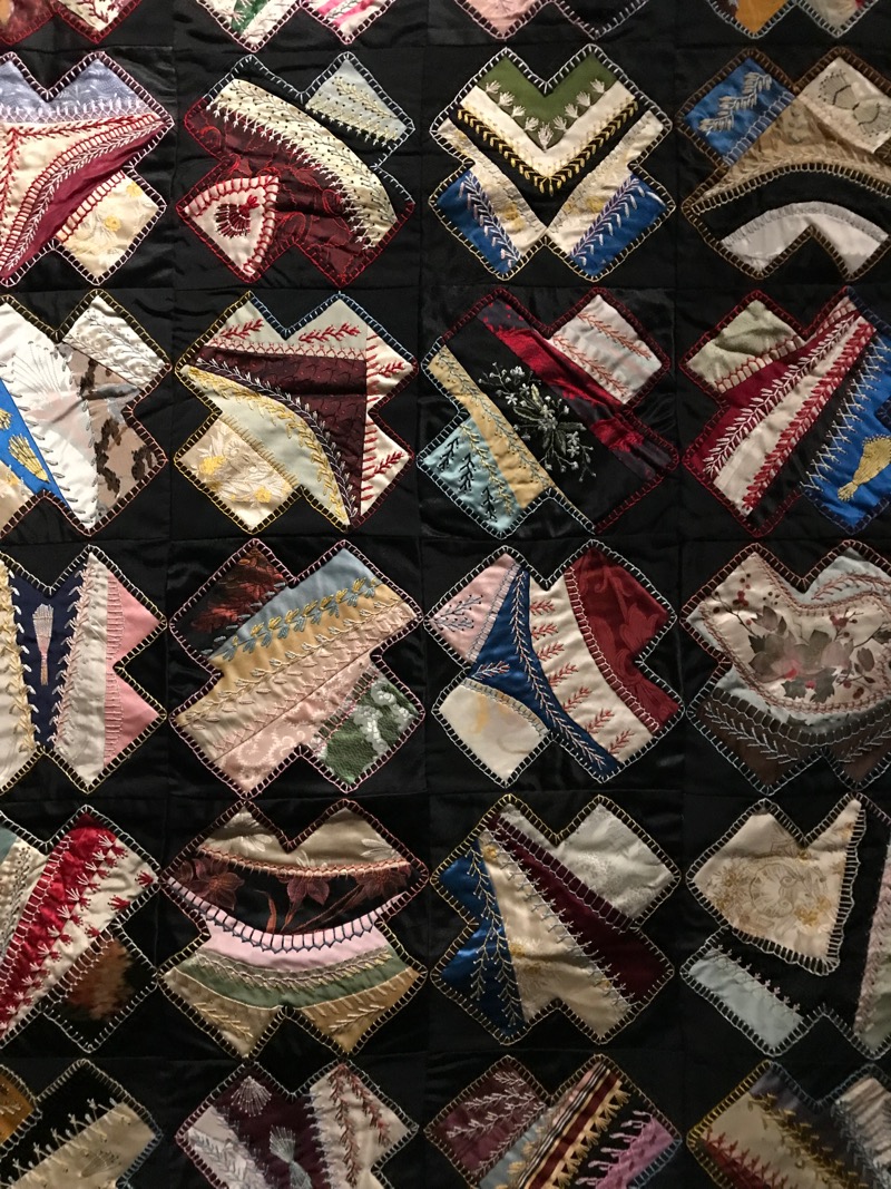
In another small exhibit, they had a lot of crazy quilts.
DCDAR_SI_2a

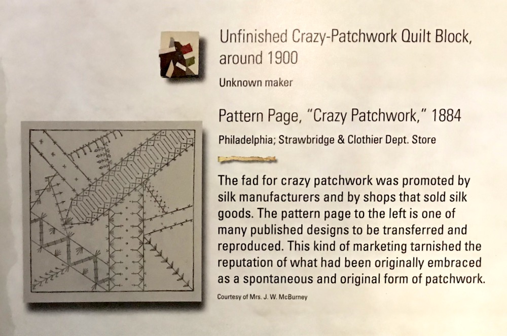
I was quite interested in what this title card (above) said about the advent of patterns for crazy patchwork.

DCDAR_SI_3

In between all this, we stopped for some lobster rolls at Luke’s Lobster shop, meandered around the Mall, and hung out together.  We really like DC, as you probably know.  More photos can be found on Instagram.

DCDAR_pressclub.jpg
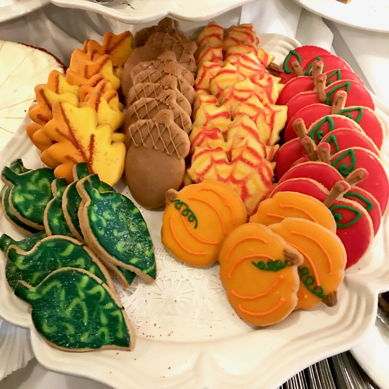
Fall Cookies 2019

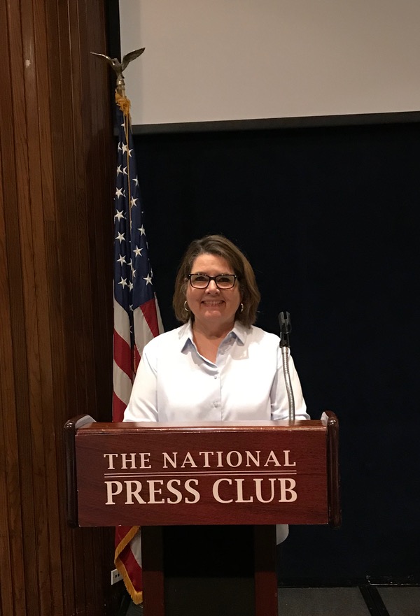
Later that week we had a gathering at the The National Press Club in D.C., where they host the White House Correspondent Dinners, and we had a spread of yummy desserts to choose from.  I chose one of these (it’s the color, naturally!) after I’d had the requisite chocolate treat.

So, here’s your spot of fall color–happy quilting!


200 Quilts · quiltcon

Cinque Terra Tiles • Improv Applique (Part 2)

Cinque Terra Tiles_3

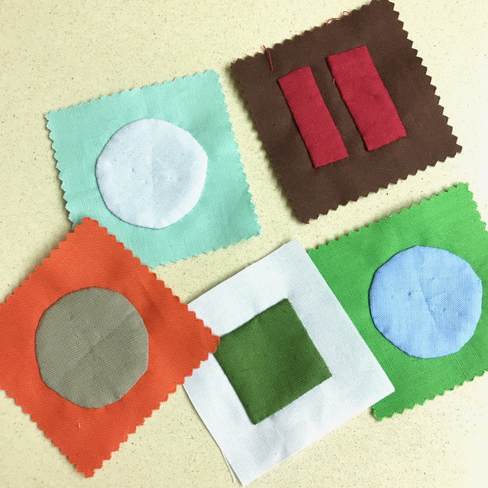
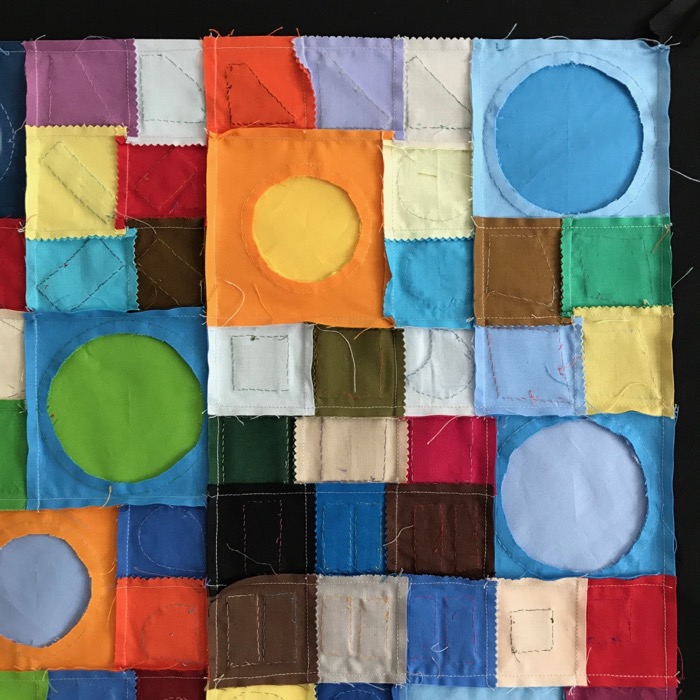
This is the story of my Improv Appliqué Demo, coming up at QuiltCon 2018 in Pasadena.  In the last post, you saw me making a whole gang of these little bits squares, some with slightly wobbly shapes.  And lo and behold, one day they all turned into this:

Cinque Terra Tiles_ front

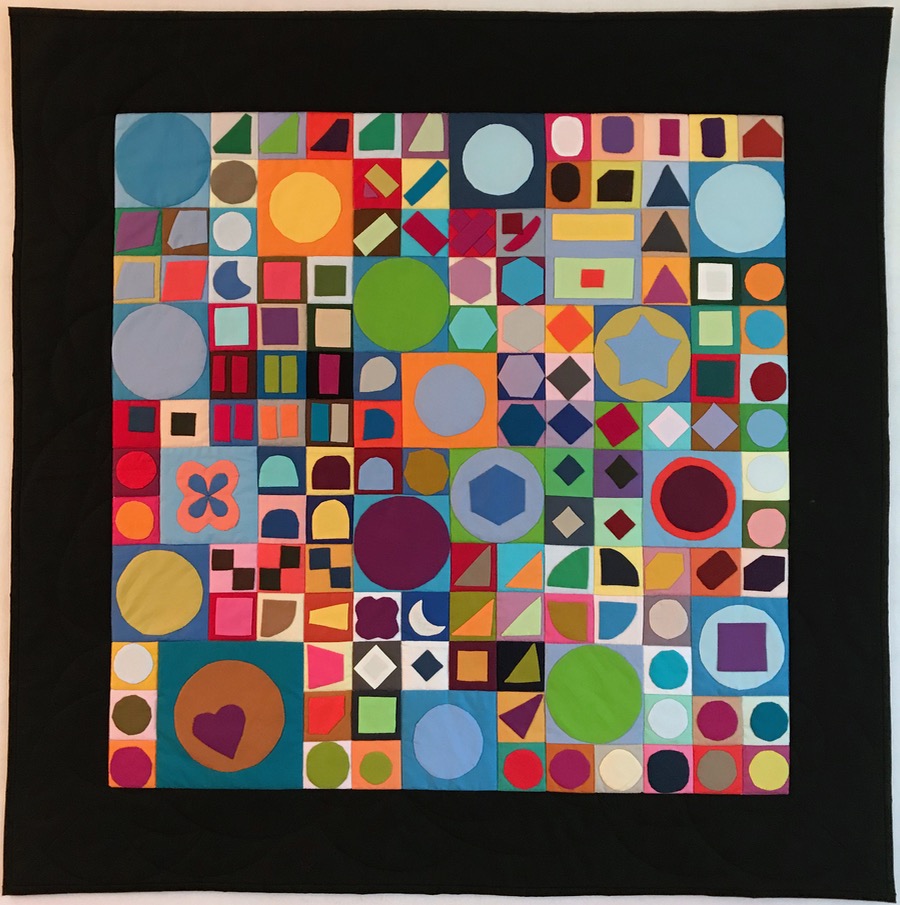
Cinque Terra Tiles, Quilt # 193

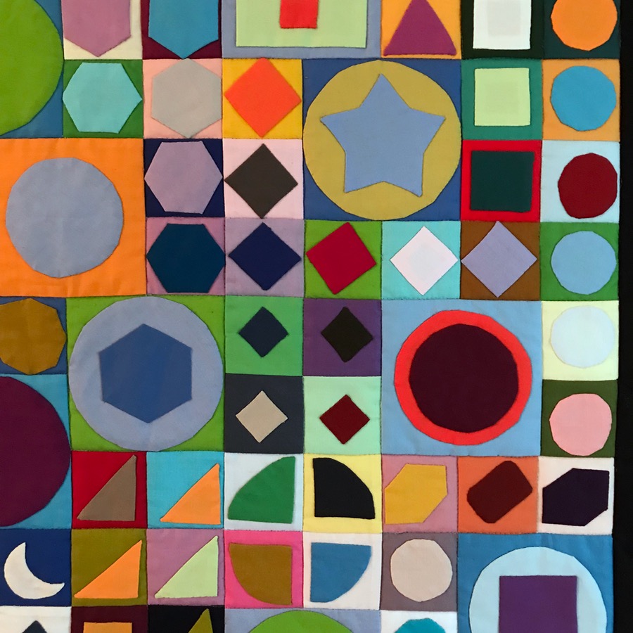
Yep.  I arranged those little bits and bigger bits until they coalesced into this quilt, which I love.

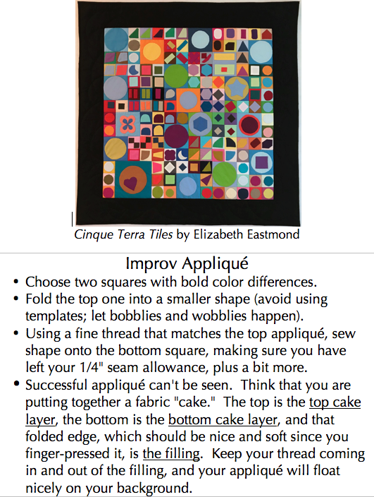
At the request of Paintbrush Studios, I’ll be doing two demos of this Improv Appliqué technique during QuiltCon 2018:
•  Friday, February 23 from 2:45 to 3:15 p.m.,
•  Sunday, February 25, from  11:00 to 11:30 a.m.

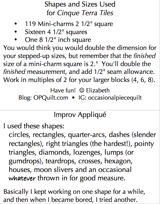
If you come, you’ll get a little kit to get you started, complete with needle and thread, and a mini-charm pack of fabulous Painter’s Palette Solids.  I’ll have a set of printed directions for your improv appliqué, plus tips on folding techniques as well as basic hand-appliqué directions.

UPDATE: Here are the directions I passed out at QuiltCon (right click on each to download):


I loved working with this fabric, as it has a nice tight weave, but not so tight that it won’t ease and fold into shape.  The colors are saturated and rich and play well against each other.  I’m totally sold on this fabric, especially after working with it in such close circumstances: handwork reveals everything, I think.

Cinque Terra Tiles_1aCinque Terra Tiles_1bCinque Terra Tiles_1cCinque Terra Tiles_1d
I’m deluging you with photos, because if you want to make one, all of a sudden you’ll say, I need a new shape! a new color combo! Feel free to steal one of mine.Cinque Terra Tiles_5

I did cut out the back of the larger appliqué shapes, but you can see where I appliquéd smaller on larger. You can also see that I did NOT press seams open, but instead, to one side.  I grouped them together, sewing four smalls, then seaming that onto one larger, and so on (sew on?)

Cinque Terra Tiles_5a

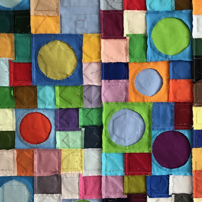
Sometimes it’s fun to see the undersides of our quilts, right?

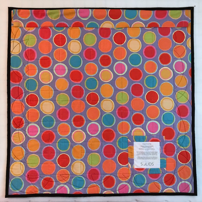
Cinque Terra Tiles_6 back

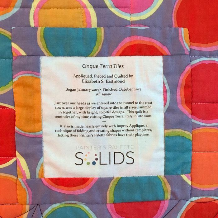
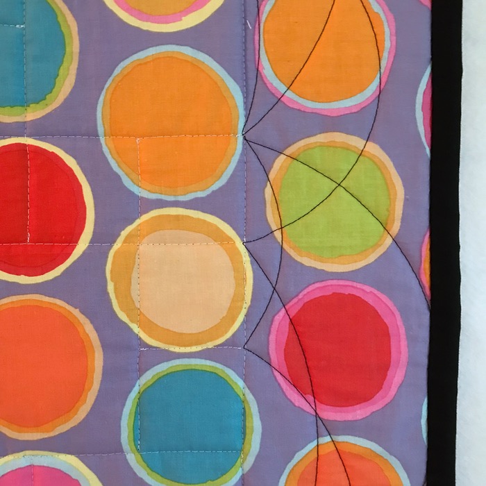
I chose a fun Kaffe Fassett circles pattern to back it with.  I decided not to gild the lilly, that is, to excessively quilt the little bits: I just stitched in the ditch.  But on the borders, I picked up the circles theme again, and did arcs in varying sizes with black thread.  It’s nearly invisible on the front, but you can see it very well on the back.Cinque Terra Tiles_6alabelCinque Terra Tiles_7quilting

Hope to see you in Pasadena–come and learn how to do some Improv Appliqué!

European Patchwork Meeting · Quilt Shows · Quilts

A Study in Opposities: Lea Stansal and Mary Koval

All posts in order are on the European Patchwork (Carrefour) page.

I am posting my experiences at the recent European Patchwork Meeting, held in a series of four small towns in the Alsace region of France.

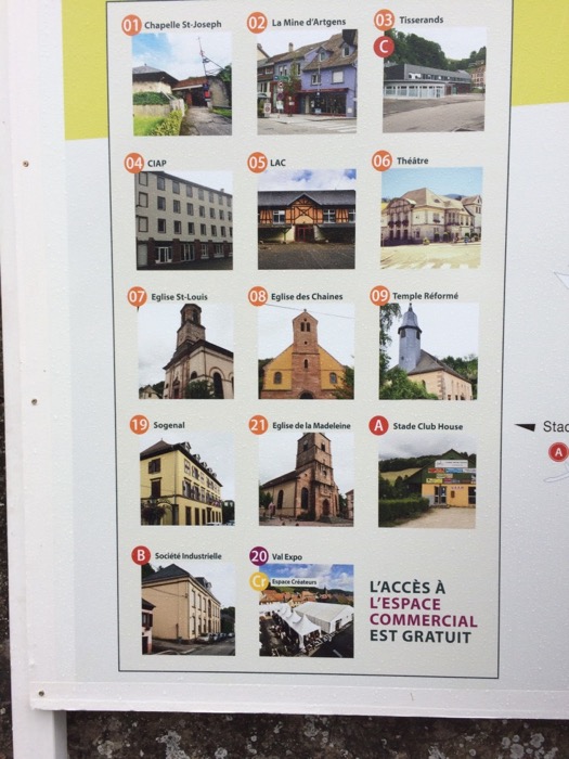
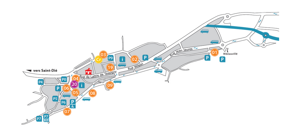
 The town of Saint Marie-aux-Mines, the main venue, had many places to find quilts:

Ste MarieauxMines Map

Patchwork Mtg_venues SMAM

The poster above links to the numbers in the map.  Once we left the L’Espace Commercial, we walked across the street to the Theater, where two sets of quilts curated by two different women provided a study in contrasts.

EPM Theater StansalKoval_1

One set of quilts, by collector Mary Koval, was exhibited on the ground floor of a beautifully restored old theater, which you can just see from around the edges of some of my photos.  This set of quilts were all American antique quilts.

EPM Stansal_6

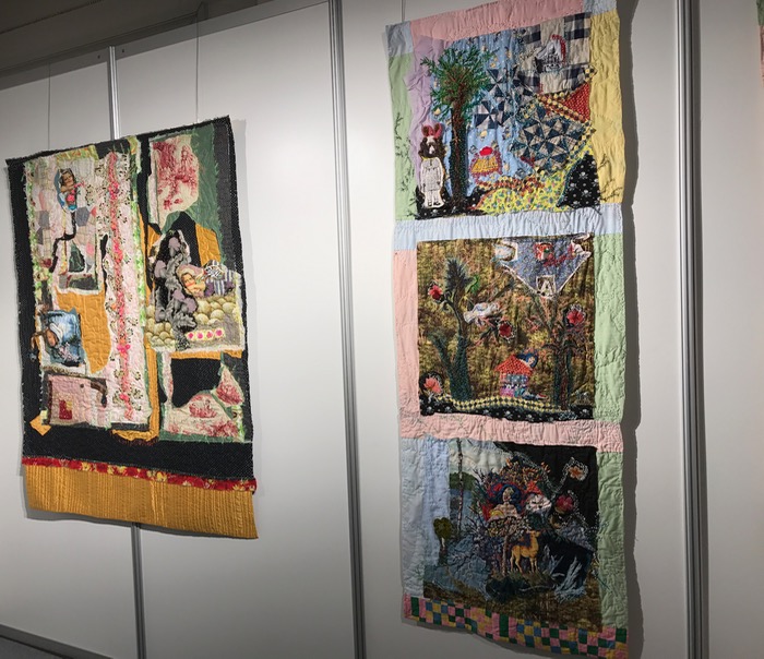
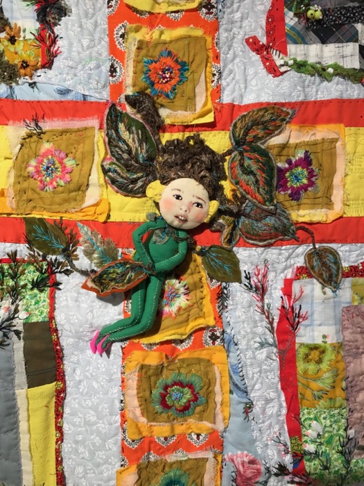
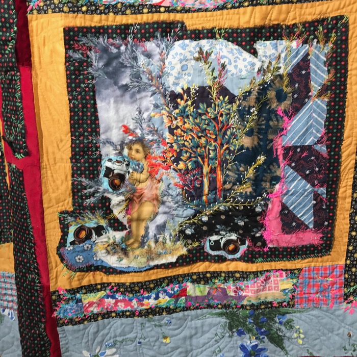
The other woman (from France) is Lea Stansal, who mounted a one-woman exhibit titled La Broderie d’embellissement, which can be roughly translated to The Embroidery of Embellishment.  Her biographical statement from her blog (which I used Google Translate to read) says:

Trained at Met Penningen’s Higher School of Decorative Arts and Interior Architecture. After twenty years in the world of fashion as a textile designer, Léa Stansal decides to explore and deepen more traditional aspects such as patchwork and embroidery.

“Since then, with a thread and a needle, she has created a poetic and original work, which is widely exhibited in the world and has given rise to the publication of half a dozen books of art.”

EPM Stansal_0
Is this the artist? I don’t know, but I did love the quilt behind her head.
EPM Stansal_1
EPM Stansal_3

EPM Stansal_3a
Detail.

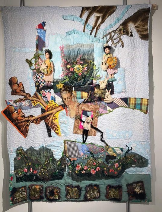
None of these are titled, and it flattens them out to put them on this digital medium; I wish you could have seen them in person.  They were wild and embroidered and free and filled with a happiness of creativity.  I think if I could spend 10 minutes in her studio, I’d break all those Rules of Quilting that I carry around inside me.

EPM Stansal_1
EPM Stansal_2

EPM Stansal_2a
Detail from the upper panel, above
EPM Stansal_4

EPM Stansal_4a
Detail.
EPM Stansal_4b
Detail.

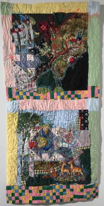
I kept thinking about how the Pied Piper had charmed all the little tin soldiers.  Was this a statement about war?  About peace?  I’ll never know, but I’m still thinking about it.

EPM Stansal_5
EPM Stansal_7

Detail from above.  The layers!  The collage!  The broderie perse!  I kept sighing.

EPM Stansal_8

I love how the deer and its antlers are in this piece, but not in the static, overused version we see in America.  Shall we turn some quilts on their heads?

EPM Stansal_8a

My husband, who loves symmetry in all its forms kept sighing, too, as he admitted that this just wasn’t his type of quilting.  Mine, neither, but I kept admiring that freedom to create, a freedom that was a delicious anarchy of cloth and threads.

EPM TheaterStansalKoval

We headed downstairs to Mary Koval’s antique quilts, in an exhibit titled “Piece by piece, our life with quilts.”

EPM Koval_1

I had carefully included the identifying titles in my photos, but back home, found I couldn’t read them most of them.  The quilts range from the late 1800s to the early 1900s.

EPM Koval_1a
EPM Koval_2

Pickle Dish quilt, from the 1920s.EPM Koval_2aEPM Koval_3

I liked the juxtaposition of these two–the orange-clad guard and the riotous early-American quilt.

EPM Koval_4
EPM Koval_4a

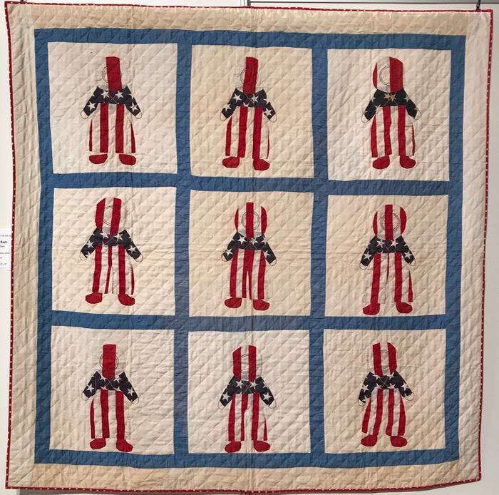
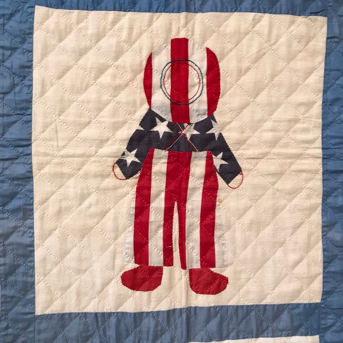
I liked the embroidery detail on this little Uncle Sam. a quilt from the 1920s.

EPM Koval_5
EPM Koval_5a

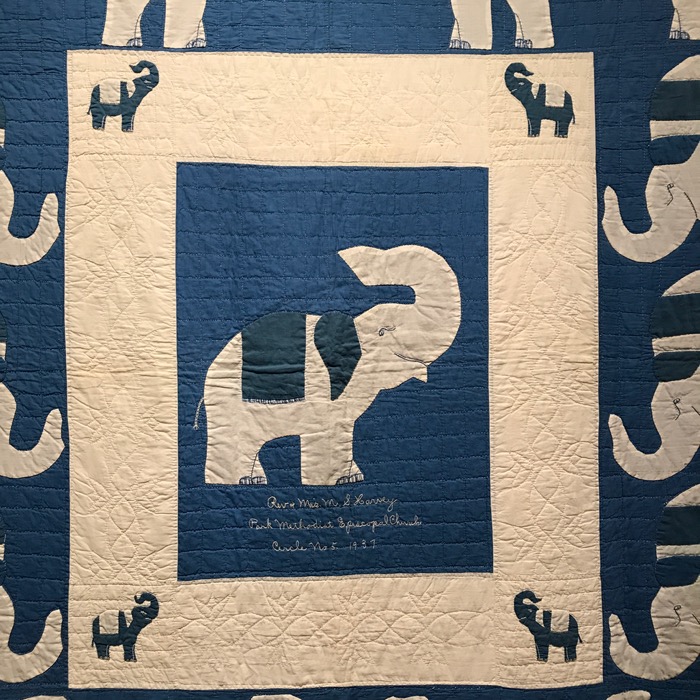
One of my favorites of the antiques because of its exuberance.  The name “Rev. and Mrs. (?) S. Harvey” is on the first line, with “Park Methodist Episcopal Church” on the second.  “Circle No. 5 1937” on the third line.

EPM Koval_6

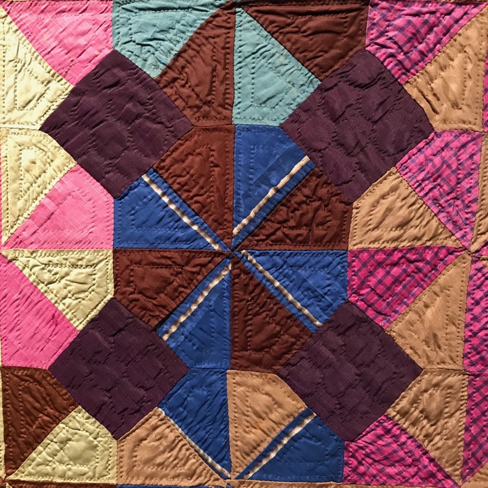
Made from silks.

EPM Koval_6a
Detail.
EPM Koval_7
EPM Koval_7a

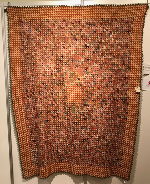
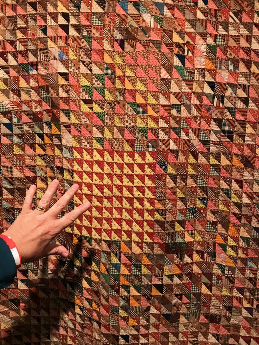
We weren’t allowed to touch the quilts (of course!) so I held my hand up to show how tiny those triangles are.  This quilt is from Berks County, Pennsylvania, but I don’t have a date.

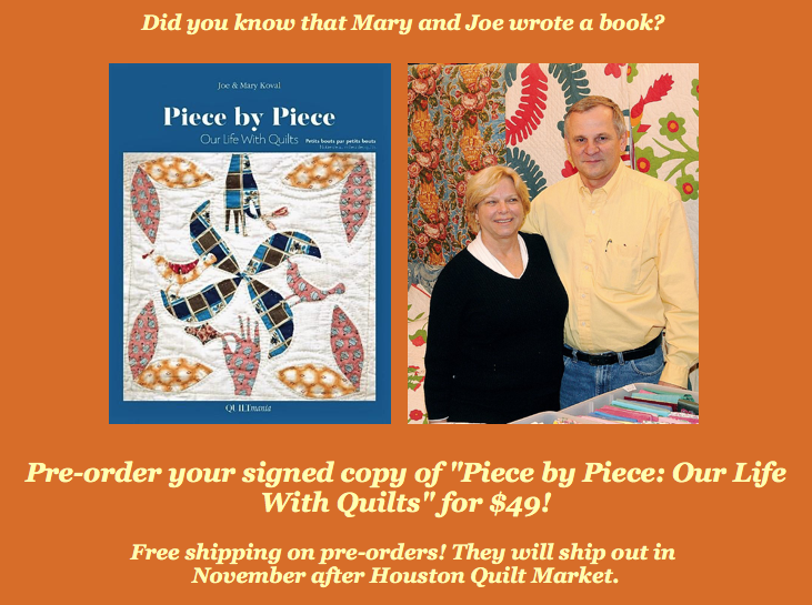
Kovals

I’m sure all these quilts are from their new book.  Info can be found on their website.EPM TheaterMeal_3

Now we were hungry, so we found this little “cafe” in the back of the theater, with fabulously dressed servers.

EPM TheaterMeal_2

Although the flowers were pretty tired, I loved the attempt at patchwork on the vase, with bits of cloth glued to the glass.

EPM TheaterMeal_1

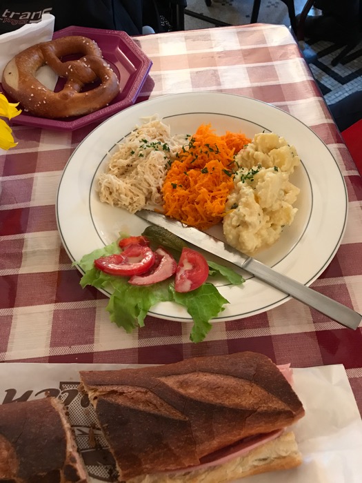
And this, folks, was the traditional Alsace salad with bretzel (with a “b”).  My husband ordered this, but I went mainstream with the ham sandwich below.  They were doing an active business, so we hurried and ate and went back out hunting quilts.

Note: this series about the European Patchwork Meeting has a main page, with a listing of posts.