Quilts

Jazz, Light, Montreal, a Four-in-Art Quilt, November 2014

4-in-art_3button

JazzLightMontreal_frontJazz, Light, Montreal
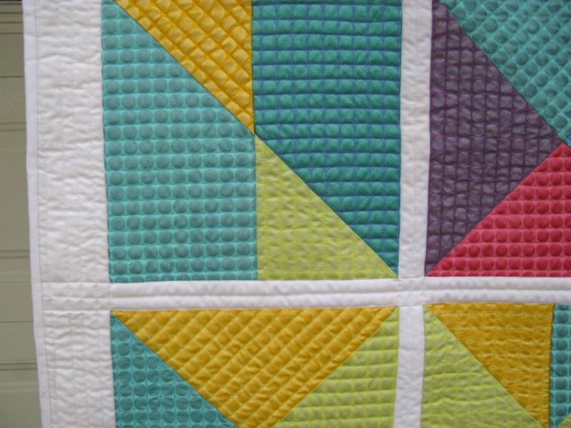
#5 in the Urban Series

When the challenge theme was announced, of Light, I started looking and noticing urban light–both that which sheds or projects the light, and that which receives the light.  Multi-hued lights intrigued me, as well as light fixtures (as you saw before).  I was also interested in reflections of city lights on windows and in rain puddles.  But in the end, I went with a memory–the graceful arching lights of Montreal, swirling over the Jazz Festival that was in its final days.

montreal-street-lightsMontreal City Lights

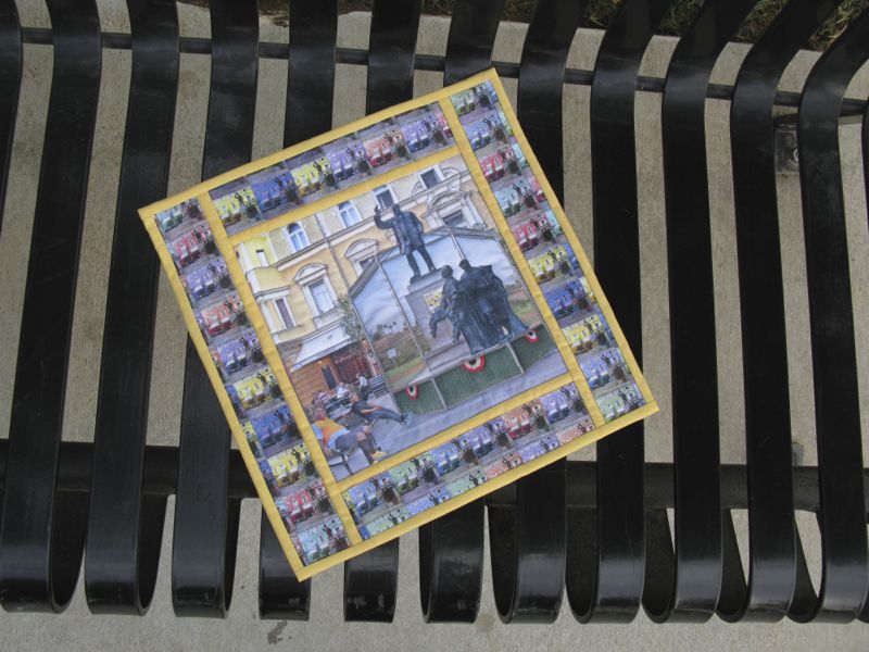
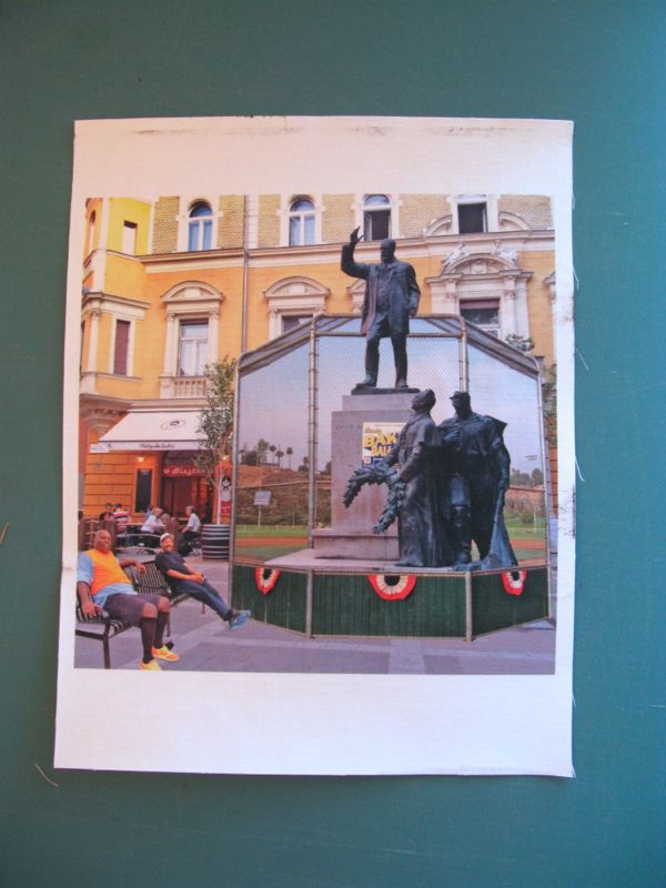
Yet the artistry in that photograph comes partly because of the different widths of the light poles, changing from thicker to more slender as they were sited in the field of view.

JazzLightMontreal_construct1

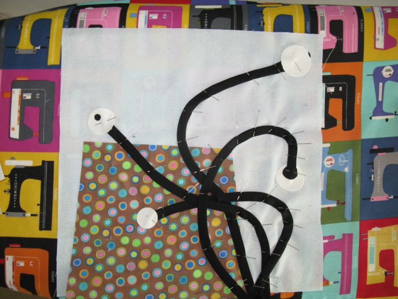
I fiddled and widgeted my stuff, moving and trying to get that look but with my bias tape, I could not really manipulate the widths easily, although I tried.  So mine resembles a spider the day AFTER Halloween, squished beyond recognition.  How appropriate that today’s reveal date is November 1st. Since this little foray into representation is not one of my favorite art quilts I’m not going to do a deconstruction post.  I tried out multiple brown fabrics and thought about trying to mimic the interesting placement of windows as shown in the photo above, but in the end, went with one that conveyed the pane-pierced facade.  Okay, maybe not so much, but I gave it a try.  I fused it on, satin-stitched around it.  Sewed down the light posts, then used a zig-zag stitch to quilt clouds into the sky.

In fact, the more I write about this, the more I realize that not every art quilt will challenge me to learn a new technique, which is what I want to do.  Sometimes you come to the project tired and worn out and your brain cells look more and more like the spotted building in my art quilt, or perhaps that splayed spider thingie and pulling out the stops means Getting It Done and Moving On.

JazzLightMontreal_back

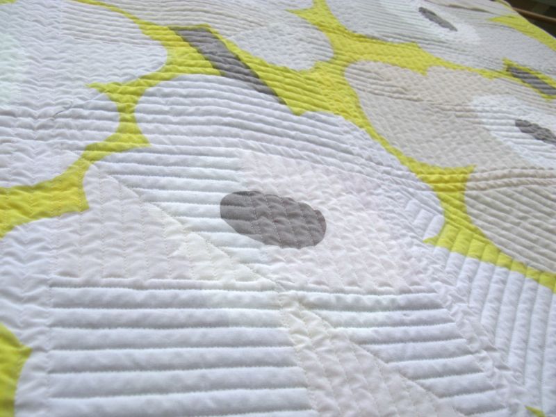
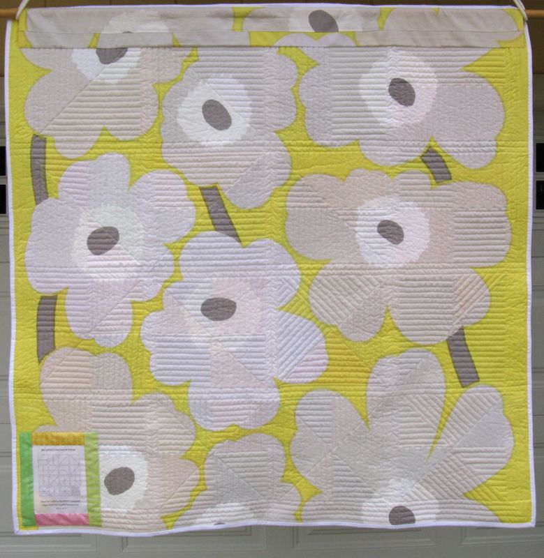
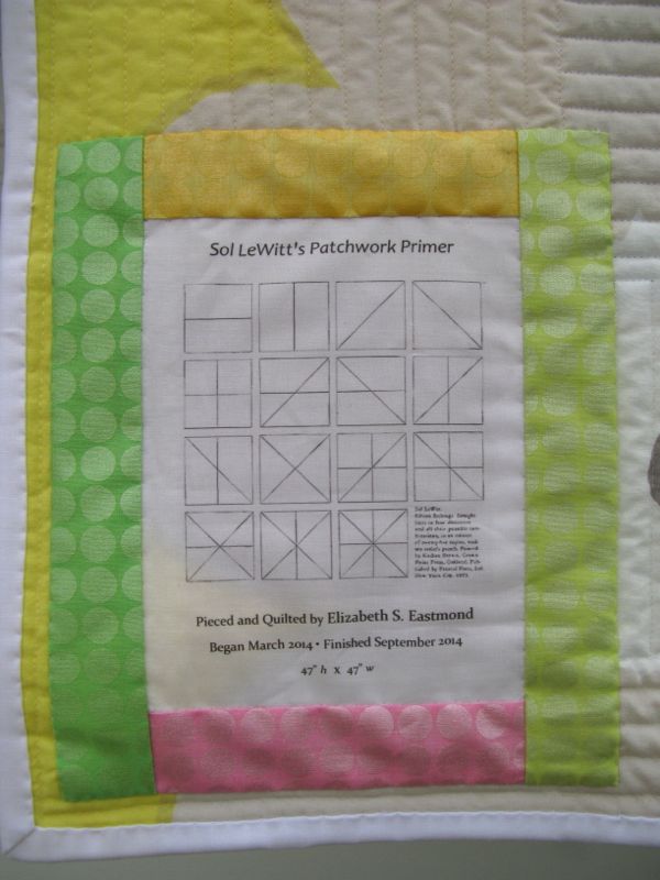
I do like the back quite well.  No complaint about that Anna Maria Horner fabric from eons ago.  And ever since Betty started putting labels on hers, I’ve copied her example and now have a lovely collection of art quilts, properly provenanced.  The quilt is 12″ square, and I used a fancy little bit for the binding (hoping it would redeem the front?).

Montreal-Jazz-Festival-DAE-ESE

But the best thing is the memory of that horribly hot night, sitting on the steps listening to jazz, getting photo-bombed by a tourist behind me who turned out to be a quilter, and we spent a long time showing each other quilt photos from our phones.  I look somewhat different now, but it was a great night watching people bee-bop to the doo-wap (try and find them!), sitting under that graceful swirling street light.

JazzLightMontreal_bylightNormally we only have four challenges a year (hence, the name: Four-in-Art), but this year we decided to jive up to the calendar year, and so added in this last challenge, making it a #5.  In the next cycle we’ll be back to four, and we’re trying something different.  Our overall theme will be Literature, but each quilter will think up her own quarterly challenge, instead of having a group challenge.  We’ll still reveal on the first days of February, May, August and November.  We have also had some subtractions and additions in the last few weeks, so won’t have a full compliment of eight quilters until next February.

JazzLightMontreal_label

Come see what other quilters in our Four-in-Art Group have done!
Amanda at www.whatthebobbin.com
Betty at  Flickr//www.flickr.com/photos/toot2/with/12251011196
Nancy at patchworkbreeze.blogspot.com
Rachel at rachel-thelifeofriley.blogspot.com
Simone at  quiltalicious.blogspot.com
Anne at SpringLeaf Studio

and please head *here* to vote for Anne’s Cascade quilt, a finalist in the Craftsy Pattern Design Awards!!

˚˚˚˚˚˚˚˚˚˚˚˚˚˚˚˚˚

Circles EPP Button

Coming in a couple of days. . .

Circles Block #6!

Quilts

Sol LeWitt’s Patchwork Primer

Sol LeWitt's Patchwork Primer_final

Sol LeWitt’s Patchwork Primer
Quilt #135 of 200 Quilts
47″ square

sol-lewitt

It started with a catalogue my father had of Sol LeWitt’s work, and I read it cover to cover, bookmarking different pages and ideas of his, impressed with his breadth and depth and interesting ideas.  I selected this image, “Fifteen Etchings,” thinking it looked sort of like a “how-to” or primer of sorts, for dividing squares into quilt patchwork.  You can read more about my process and sample some of LeWitt’s notes on getting to work in *this post,* including the 6900 variations of the arrangement of quilt fabrics into squares (maybe I’m exaggerating a bit).  The fabric I chose to use was Mirror Ball Dots.  After a long hiatus (I started this in March of this year), I finally got it out, pinned it and got the quilting going:

SolLewittPatchworkPrimer_quilting the quiltI started in the middle, quilting in between the lines of dots.  In the neighboring color, I sewed the other direction, and so on, around the quilt.  I changed out thread on each color, but used my go-to thread in the bobbin: Bottom Line, by Superior Threads.  I lowered my upper tension to keep the thread balanced in between the layers so no white popped up to the top and no colors popped through to the back.

SolLewittPatchworkPrimer_binding

White binding (what else) goes on next.

SolLewittPatchworkPrimer_detail

I think with the combination of the dots on the fabric and the quilting, it reminds me of what I envision a 1960s quilted jacket might have looked like.  I’m sure my sisters had them.

SolLewittPatchworkPrimer_quilting

The backing is a Marimekko fabric of large grey blossoms over an acidy-yellow background.

SolLewittPatchworkPrimer_back

SolLewittPatchworkPrimer_label

I included the picture that inspired me on my label.

SolLewittPatchworkPrimer_stainedglasslook

I love the “stained glass” look of quilts, shot from the front when they are illuminated from the back.

SolLewittPatchworkPrimer_front2It’s nice to have a finish!

Now here’s your quote on creativity for today:

“The creative act is not an act of creation in the sense of the Old Testament. It does not create something out nothing: it uncovers, selects, reshuffles, combines, synthesizes already existing facts, ideas, faculties, skills.  ~~Arthur Koestler, in the 1960s

Quilts

Deconstruction of Ted and Maurice at Lorinc Pap Ter, an Art Quilt

On the Bench at the Park

This post is a deconstruction of the techniques I used to create Ted and Maurice at Lorinc Pap Ter, a small (12″ square) art quilt for the Four-in-Art Quilt group.  Our challenge this quarter was Contrast, under the overall yearly theme of Urban.  Often an idea will come to me, but sometimes I start with the technique.  I knew I wanted to drag out those bottles of Bubble Jet Set and Bubble Jet Rinse that I’d ordered some time ago, and find out if this whole process was difficult or easy.  It was easy.

Bubble Jet Set is a type of mordant that binds to your fabric and allows the ink from your inkjet printer to adhere more easily.  I’ve printed on fabric for years, but haven’t ever prepared the fabrics.  I first started by reading a lot of blog posts, and I’ll post the links at the end.  The one website that described the process best was Caryl Bryer Fallert-Gentry’s (Bryerpatch.com), and I followed her instructions.

Bubble Jet Set

I bought a shallow plastic container at Target, about 4 inches deep with a latch-type lid, as I wanted to store the prepared fabric in there afterwards.  I cut my fabric about 9 inches by 12 inches, grabbed the container and the Bubble Jet Set (I only needed that one at this time) and went down to the kitchen sink.  I put on dishwashing gloves, as suggested, then laid the first piece of fabric in the bottom of the container.  I sparingly glopped some BubbleJet Set (BJS) onto the fabric, smoothing it out until it was thoroughly moistened.  I placed a dry piece of fabric on top of that, again, smoothing until it looked like it had picked up most of the excess BJS, then glopped a little more.  I’m being quite stingy with the BJS, actually, but do want to make sure that the fabric is sufficiently soaked.  I repeated this until all four sheets were saturated.

Prepared Fabric DryingI lay down some towels underneath my improvised clothesline in the garage (some say you can put containers to catch the extra drips, but I didn’t have that much excess) and hung up my sheets of fabric until dry.  In our summer heat, it only took about an hour.  Meanwhile, I washed and thoroughly dried my container, and when the fabric was dry, put them in the container until I could get to them.  I read one blog where the crafter cautioned about letting too much time pass between treatment and printing. I had a space of about 4 days, and that was fine.

In yesterday’s post, I talked about how I created my art conceptually, but what I did technically was begin with a good photo of the square in Budapest.  I overlaid the baseball backstop photo, sized it, then took it down to 20% transparency, and used the Eraser tool to start erasing a space to let the statuary shine through.  I could have created a Path and selected it, but sometimes I think the Erase Tool does just fine.  I did change out the size of brush I was using, from 1 pixel in some places to 75 pixels in other places.  I did the same with Ted and Maurice, first flipping them around so they faced the other way, as that’s where I had some space to put them.  I merged the layers, as I know from experience that when printing on fabric, it’s wise to pump up the Saturation of colors (enhancing the image without making it garish), and to Lighten/Brighten the entire image.

Four Squares of 9Patch

For the border pieces, I sized each combination of colors to four inches, then pasted them into one document so I could print all the colors at once, first flattening, then then increasing the Contrast/Saturation and then adjusting the darkness through the Lighten/Brighten menu.

Trimming Fabric

When I was ready to print, I backed the prepared fabric in freezer paper, ironing it thoroughly but using NO steam at all — I wanted the freezer paper to really bond with the fabric.  I trimmed it to exactly 8 1/2″ by 11″ inches, and used a High Quality photo setting to print.

Image Printed on Cloth 4-in-art_1

It worked like a charm!  I let it set for the recommended 30 minutes then peeled off the freezer paper.  I let it set some more to let it thoroughly dry–a caution I read on many blogs.

Bubble Jet Set Rinsing

I put four capfuls of Bubble Jet Set Rinse in my container, then added about a gallon of water (about 3 inches) and set the first printed sheet in the water.  I kept it agitating the whole time of two minutes, as you see above.  I held up the sheet to let it drain and in the other sink, I rinsed the sheet well and laid it out on towels that I had set on the counter.  I did the same process with all the other prints, agitating them (apparently to keep the dye from the printing to re-settle back onto the fabric — they cautioned several times to keep it flat, and to not let it crease!).

Leftover Rinse Water

This was the color of the rinse water after I did all four sheets.  The Bubble Jet Set Rinse is a mild detergent formulated to remove excess dye.  In my reading, many said that Synthrapol would work also, but I had this so I used it.

Blotting Printed Sheets

I blotted the sheets gently, pressing out the excess moisture.  I did not wring or crumple the printed fabrics at all, working to keep them flat.

Sheet to Dry in Garage

I hung them in the garage again to let them dry, again taking only a short time.  I was pretty happy with the results.  The colors were vibrant and the fabric was soft and I knew it was washable, although there are cautions about what type of detergent you use.  I never wash my art quilts so it wasn’t a concern, but if you plan on doing so, here are some good websites with information on their experience with using BJS:

http://vickiwelsh.typepad.com/field_trips_in_fiber/2009/04/bubble-jet-rinse-whats-the-point.html

http://quiltbug.com/articles/bubble-jet-set.htm

http://www.bryerpatch.com/faq/bjs_q&a_page.htm

http://www.cjenkinscompany.com/Frequently_Asked_Questions_s/25.htm

The C J Jenkins Company manufactures the Bubble Jet Set, and I thought their page on printers was helpful, although I swear by my EPSON with their Archival Inks.

First Layout of Printed Sheets

After this, the construction was pretty straight forward, although I had to do some cutting and stitching to get the dimensions correct around the central image.

Sashing Printed Sheeets

I sashed the central image because I felt it might get lost in the tiny square borders.

Quilted 4-in-art_Aug2014

I quilted it, using matching threads (mostly lots and lots of gray).  Detail below.  I didn’t want to “over-quilt” this, but did want to emphasize the various elements.

Lorinc Pap Ter_detail front

Lorinc Pap Ter_front

And that’s it!  I’m pretty happy with how the BJS and BJR turned out, and glad that I had this little art quilt to nudge me into trying that preparing-fabric technique.

Circles EPP Button

Next up? The third block in my Circles English Paper Piecing Sew-Along.  I’ve remade this thing twice, so I’m ready to put it up and move on to the next block.  See the above tab if you haven’t started yet.

˚˚˚˚˚˚˚˚˚˚˚˚˚˚˚˚˚˚˚˚˚˚˚˚˚˚˚˚˚˚˚˚˚˚˚˚˚˚

My blogging software places ads here so I can use this site for free.  I do not control the content of these ads.

Quilts

Elizabeth’s Lollypop Trees, final

Lollypop Trees Quilt_final Front

Elizabeth’s Lollypop Trees
began May 2011 • finished April 2014

Lollypop Trees Quilt_final BackA Kaffee Fassett Lotus Blossom print for the back, and I am finally done.  I know you’ve seen an overabundance of photos of this quilt, so this is just a simple, abbreviated post to say I’m finished.  (Or should I say: I’m FINISHED!!!)

Lollypop All Quilted

Lollypop Tree 1Some time ago, my granddaughter Keagan saw my blocks up on my design wall, and quietly made a picture for me of what she saw. (I think it’s the block in the lower righthand corner of the quilt.)  I love it, so I put it on the label.

Lollypop Trees Quilt_labelQuilt #132 on my 200 Quilts list
73″ square

˚˚˚˚˚˚˚˚˚˚˚˚˚˚˚˚˚˚˚˚˚˚˚˚˚˚˚˚˚˚
This blog software has an excellent search engine box.  If you want to see details about this quilt, type “Lollypop Trees” in the search box to the right, and you’ll get more posts than you know what to do with.  If you have specific questions, feel free to leave a comment and I’ll get back to you.  Thank you to all who cheered me on and kept me going, in spite of days of wondering if I’d ever finish.  It’s very satisfying to see that quilt, to run my fingers over the quilting, and to know that I did it.

That’s three finishes in two weeks.  Now to grade research papers until my brains fall out and my fingers fall off.

Counting Down

 But look!  Only four more days of teaching in this semester!