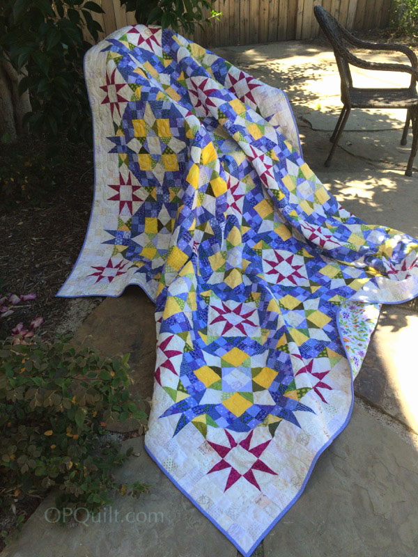
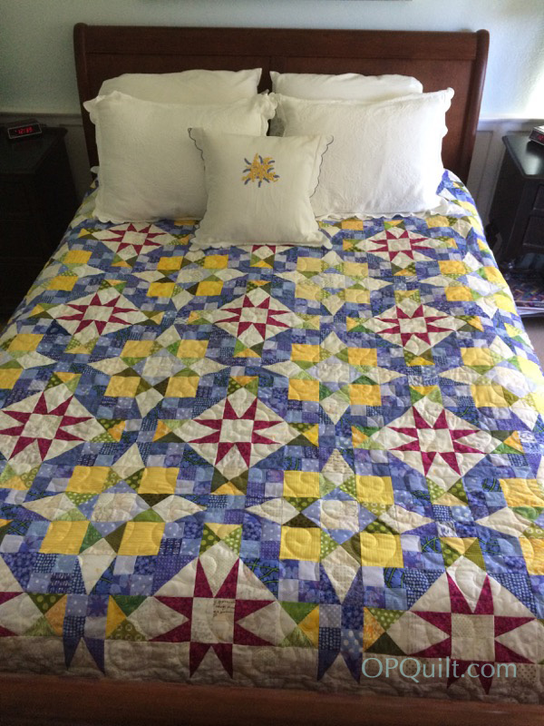
Belle Etoile du Jour
Quilt #181 of 200 quilts, 88″ square
Began December 2016 • Finished May 2017
A couple of weeks ago, I had my son and grandson hold up the unquilted top of this creation, and I include it here so you can see the quilt top. I was late starting this quilt, as everyone else in the world began making it in November when Bonnie Hunter announced her En Provence Mystery Quilt for 2016, based on colors she’d seen in her trip to France.
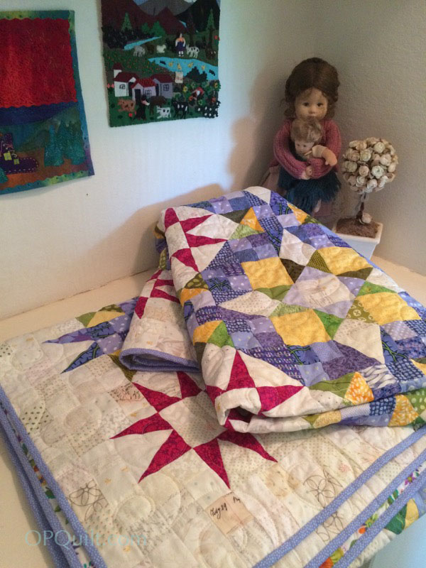
I decided that if I made the various units, as described in the mystery, then stowed them away, I might be able to get back to the quilting even when I was convalescing from the planned rotator cuff surgery. I was able to finish all but two steps. When it was time for me to do those, I figured out how to sew one-handed, and my saintly friend Lisa trimmed up 60 blocks for me.
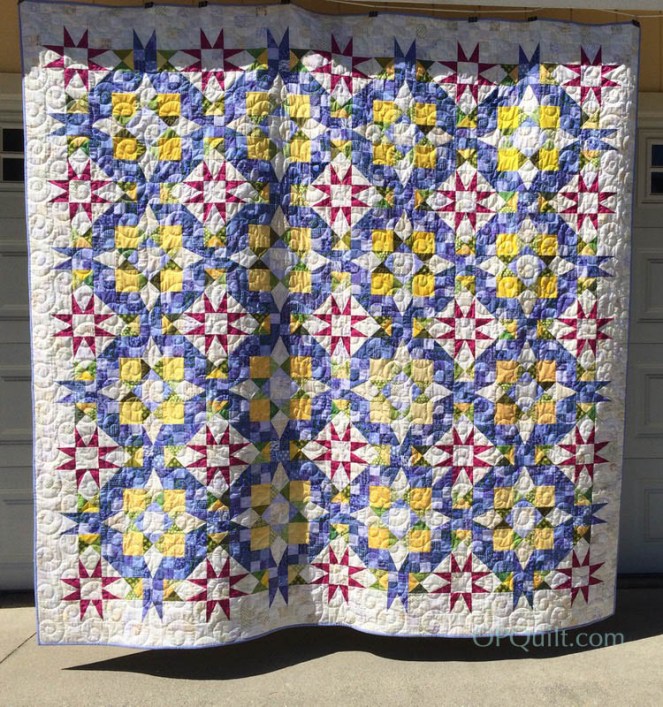
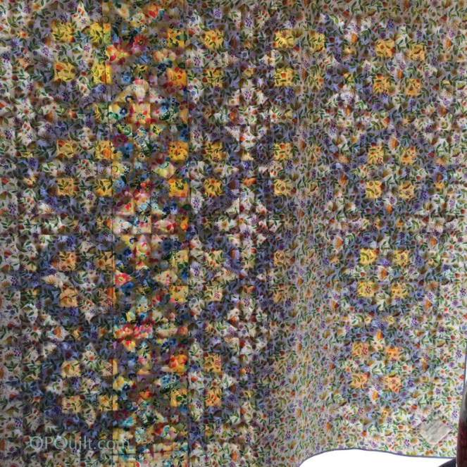
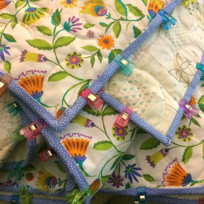
I did my best to get it up on my garage-door-photo-studio today, but I had a wrinkle in the quilt that I just couldn’t manage to ease out, so I have to resort to other photos to show it off. I like looking from the back of the quilt outward, like it’s stained glass. I had purchased about 5 yards of backing fabric, unable to remember how big the quilt top was. I needed more, so spliced in a yellow coordinating print, then took it all over to my Cathy, my quilter.
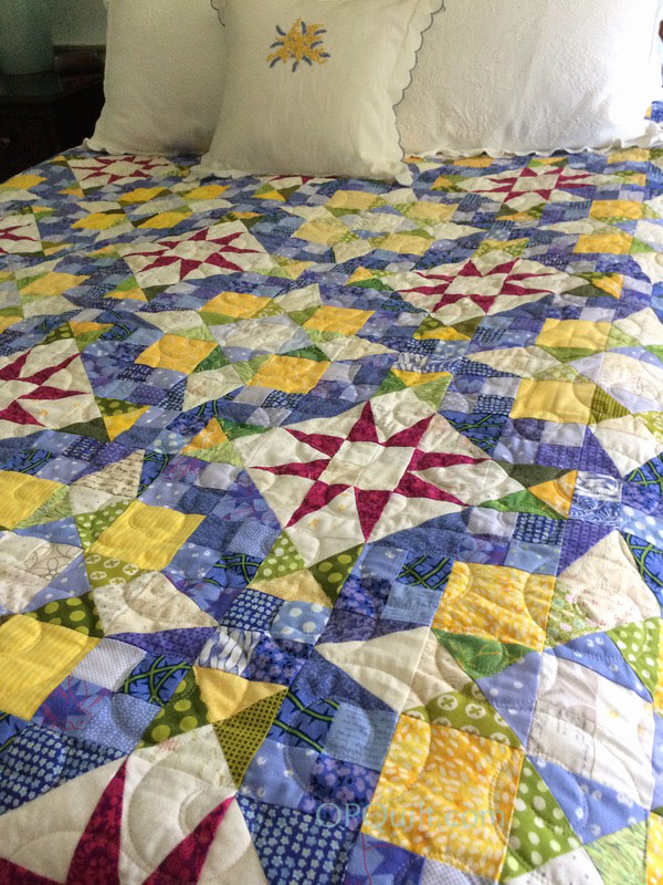
She was a good sport and let me choose a new pantograph for her collection, which I think really works well with the quilt. The original quilt called for purple fabrics in those 18″ blocks, but I went instead with periwinkle, a favorite color of mine.
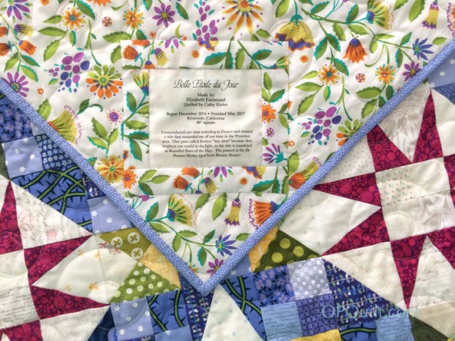
The title comes from an old poem, where the poet calls flowers “Day Stars.” I had Google translate “beautiful day stars” into French, then ran it by my French-speaking husband who said it was fine. (I didn’t want to be swearing in French, or something.) I don’t really believe there is a top or bottom to this quilt, so I sewed the label on an angle, just for fun.And again, if you haven’t started your listing of your quilts, start now!
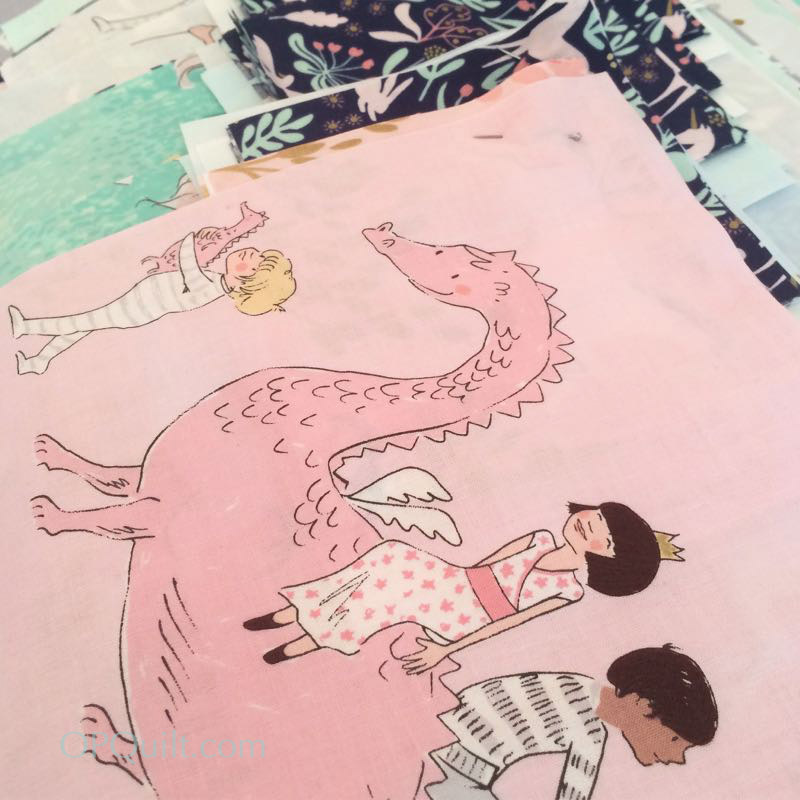
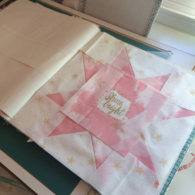
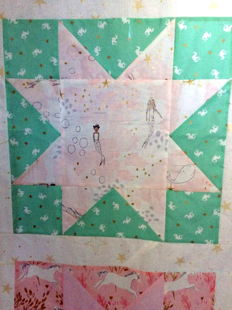
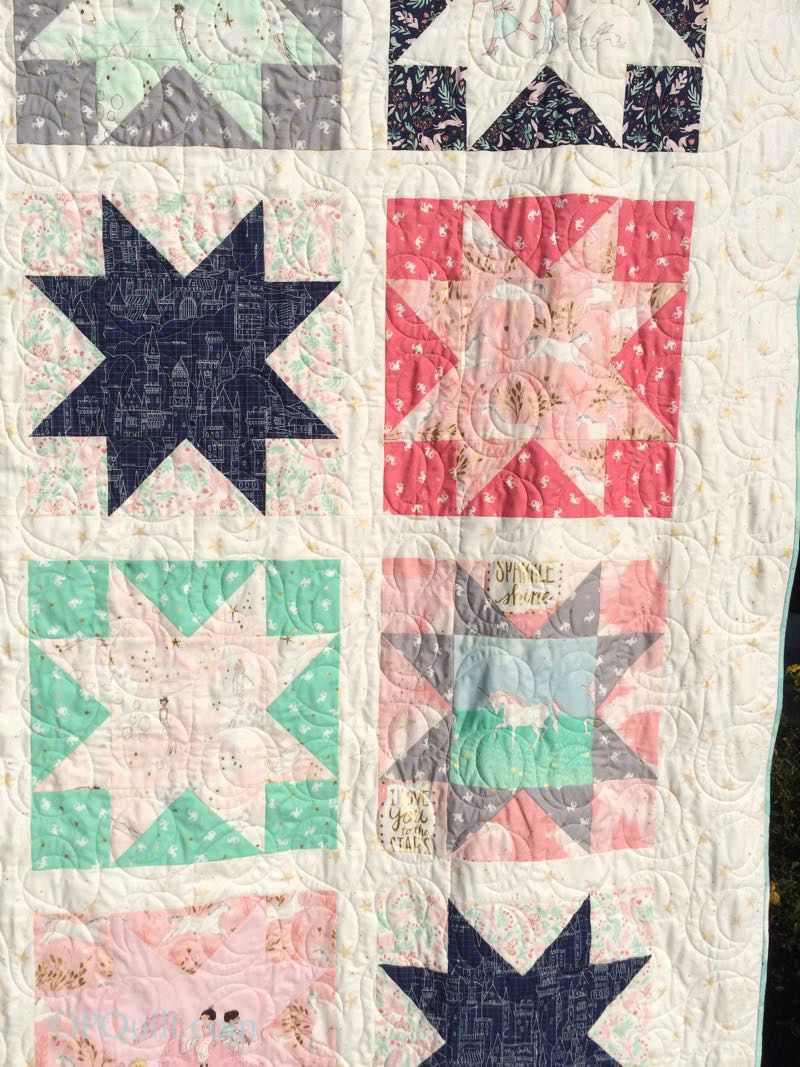
…with fabric by Sarah Jane. A relative of mine fell in love with her work and asked me to make her a quilt for her daughter, who has a name similar to mine.
(I couldn’t say no.)
I found the pattern on Michael Miller’s Website, and followed it exactly.
I made it over the break between Christmas and New Year’s. You can see my husband’s nutcracker collection on top of our hutch.
I trundled it off to my longarm quilter, and she did a quick turn-around. It’s always a happy day to pick up a quilt from Cathy. This fabric is very silky, and I enjoyed working with it.
And on my birthday, I declare it done! Happy New Year, Happy New Quilt. This is Quilt #176 on my list of 200 quilts. I never thought I’d reach 176 quilts. If you haven’t started your list, do so now.
We chose a pattern called “party ribbons” for the quilting, as it fit in with the theme of the fabric.
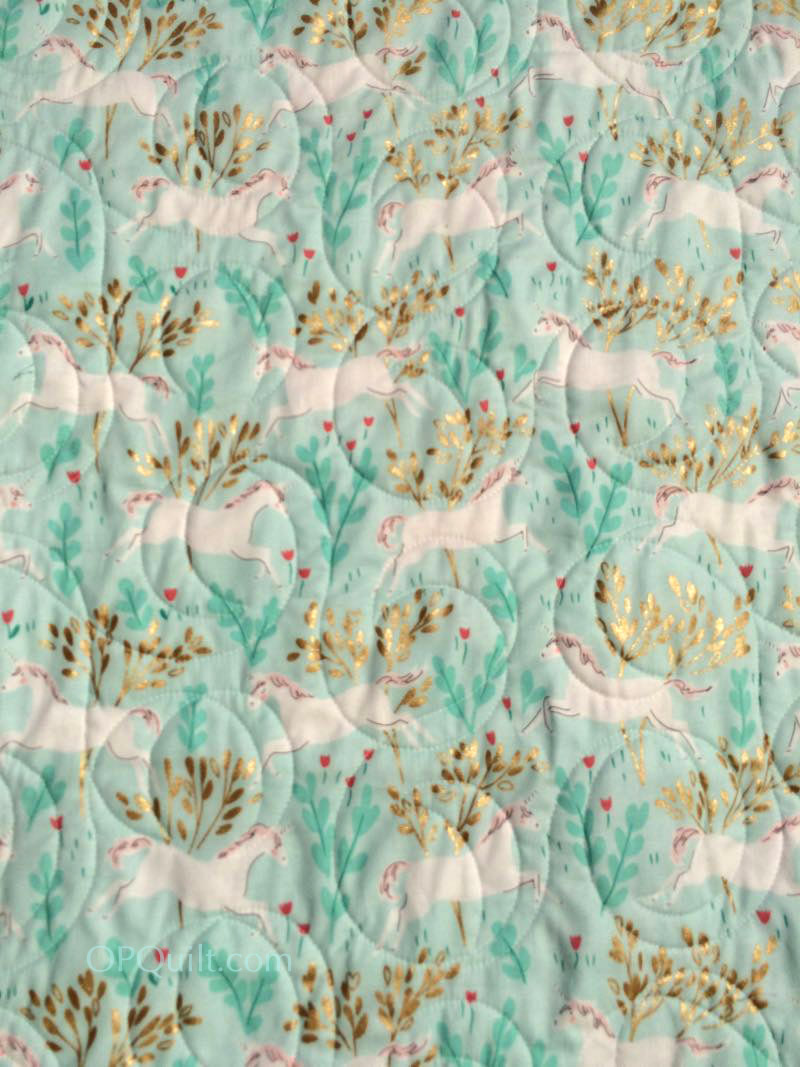
The backing has unicorns with touches of gilt bushes.
I packaged it up and sent it off, the people in the Post Office helping me find just the right box.
(I love my post office.)
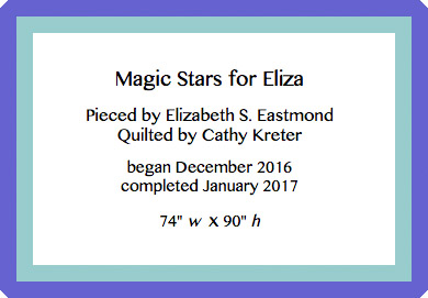
I didn’t label it because it was going to live at someone else’s home, but if I could, it would look like the one above.
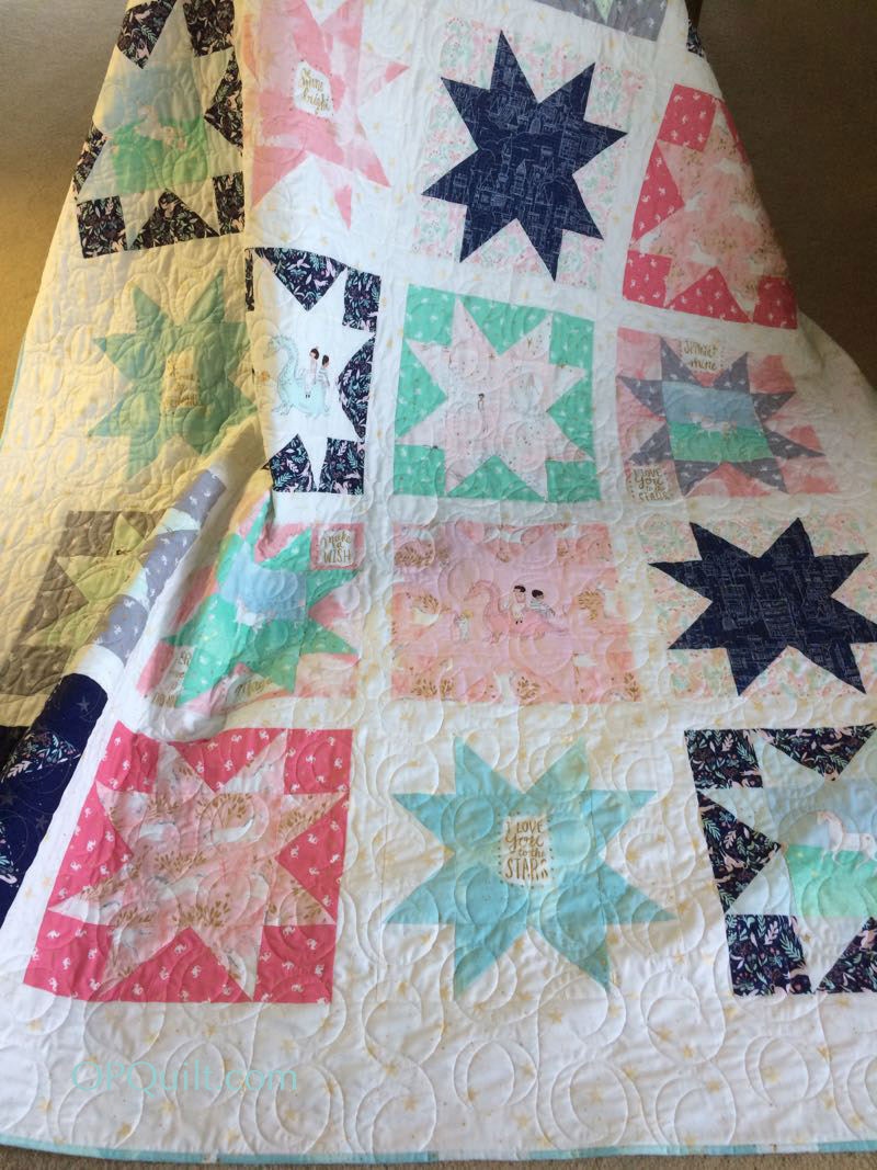
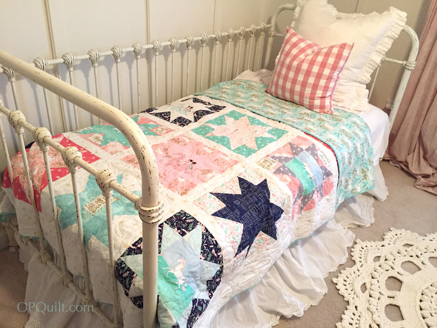
Rebecca sent me this photo of the quilt on her daughter’s bed. So glad they both like it!
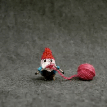
My friend Leslie sent me this knitting gnome (so I had to share it with you), and although the holidays are past and gone, I think many of us have been as busy as this little guy, creating and sending them out our quilts and things with a heart full of love.
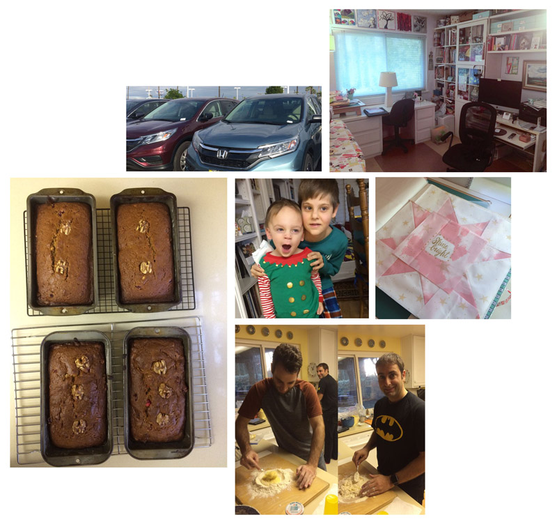
Here is a composite of What I Did Over the Holidays:
I made bread from a bunch of gifted persimmons, hugged a sleepy elf (and his brothers) in my kitchen, enjoyed watching my oldest son Chad and my youngest son Peter make home-made pasta for our Christmas Eve dinner, pieced a quilt with Sarah Jane fabrics (always lovely), shopped for a new car (but I didn’t like any of them better than the one I have, so I came home without one), and cleaned up my sewing room (always an event).
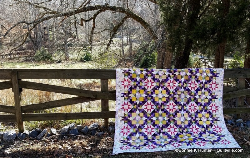
I jumped into the En Provence Mystery Quilt, hosted by Bonnie Hunter of Quiltville and had fun trying to find the color periwinkle in my stash and in shops, as I decided to slant it that way, instead of the straight purple.
Here’s a picture of HER finished quilt–mine is still three clues behind and mostly in pieces. If you ever needed a good blog post to encourage you to save your scraps, *here* it is, courtesy of Bonnie.
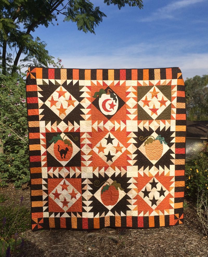
But I do have one finish I can share. I finished up the binding (my quilter did the quilting) on my Halloween quilt. I’ll be updating the final post of the Quilt-A-Long on this pattern to include these two photos (front is above and back is below), but I wanted to say…
…Happy Halloween to you all!
But wait. Isn’t it January? Full of snow and storm and putting away the holiday boxes? Watch this.
This is how I feel when I’m working on something not in the season it’s intended for. I’m am distracted/entranced by the cues all around me. In July, I see red, white, blue, stars, stripes, but not green pointy growing things called Christmas trees. In April, it is flowers flowers flowers and complete absorption into planting my summer garden. It is nearly impossible for me to focus on turkeys and fall decor. Or snow. As a result of this focus, I rarely see the proverbial gorilla among the basketball players.
Perspective, exhibit A
Yet so many of us work “out of season” in planning, buying and creating that I thought I’d look into it. The 99U article (where the video is found) noted that “We see the world, and our work, through countless lenses of assumption and habit—fixed ways of thinking, seeing and acting, of which we’re usually unconscious.” The author, columnist Oliver Burkeman (a personal favorite of mine), observes that “This urge toward making things unconscious is a blessing if you want to do the same thing, over and over, ever more efficiently. But it becomes a problem when we’re called upon to do things differently—when you hit a roadblock in creative work, or in life, and the old approaches no longer seem to work.” He suggests using physical or temporal distance to get perspective, to get past that creative block.
When you use physical distance, you institute physical distance from your creative problem, such as when you take a break from piecing or quilting to look at Instagram, or take time to research, perhaps see something in a quilt book. Or you might take a trip and get your best flash of insight while flying over the country. Research has been done that shows that for many people implementing creative ideas begins with recognizing creative ideas. While this sounds circular, it’s fairly common: how many times have you read a magazine and decide to add two new quilts to your List of Quilts To Make? You recognize the creative in others, and choose to implement it for yourself.
To proximate temporal distance, Burkeman suggests that we can “externalize our thoughts by writing them down in a journal. The point isn’t necessarily that you’ll have an instant breakthrough, but that by relating to your thinking in this ‘third-person’ way, you’ll loosen the grip of the old assumptions, seeing your thoughts afresh, and creating potential for new insights.” Sounds like an argument to begin a creative journal to me.
Perspective, Exhibit B
The title of his article is “You Don’t Need New Ideas, You Need A New Perspective,” and I thought it fitting to start out the new year with this creative idea of perspective. Now that all our holiday boxes are up in the rafters, the tinsel and glitter and ornaments and the fall boxes with autumn colors are all put away, the minimalist environment we live in come January can provide a clean slate — and a new perspective — for our creative work.
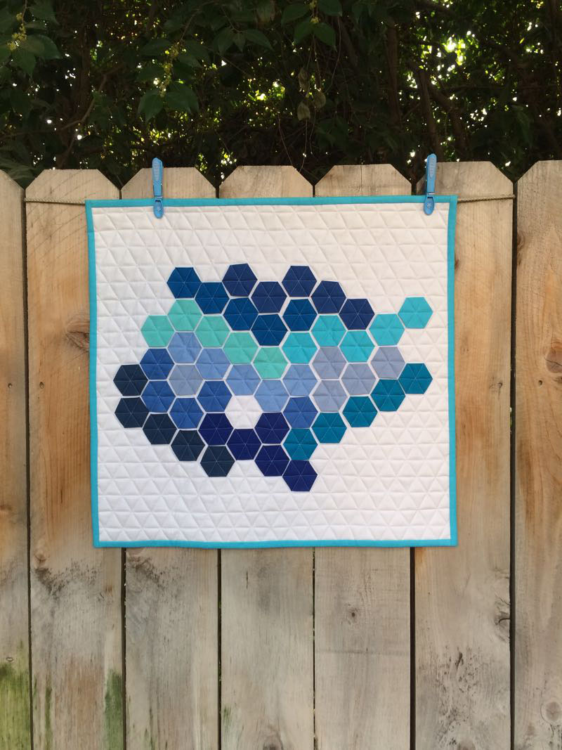
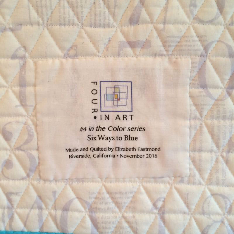
Six Ways to Blue
Quilt #169, November 2016
19 1/2″ high by 21″ wide
#4 in the Color Series: I’ve Got the Blues
Blues can mean too many things, all at once. Peacefulness, depression, sadness, the thrill of a line of music (a wailing saxophone), my favorite crayon in the box and the color of my husband’s eyes. I could think of references to blues six ways to Sunday and never run out of things to link that color to: ocean, sky, geysers, crystals, ice, flowers.
Blue also has a powerful connotation to mood. The other day when I was feeling a bit blue, my blue-eyed son surprised me with a FaceTime call from London, just before he was calling it a day (having traveled through the blue skies and over the big blue ocean to get there). We chatted about his recent travels to Madrid, our travels to Lisbon last year, where we together with my blue-eyed husband saw the azulejos (blue and white tiles) of that country. It lifted my spirits, and I was thankful for his true-blue devotion and caring.
The only ancient people who had the word blue in their vocabulary were the Egyptians, largely because they had developed a blue dye. In 1858 a scholar named William Gladstone, who later became the prime minister of Great Britain studied Icelandic sagas, the Koran, ancient Chinese stories, and an ancient Hebrew version of the Bible. Of Hindu Vedic hymns, he wrote: “These hymns, of more than ten thousand lines, are brimming with descriptions of the heavens. Scarcely any subject is evoked more frequently. The sun and reddening dawn’s play of color, day and night, cloud and lightning, the air and ether, all these are unfolded before us, again and again … but there is one thing no one would ever learn from these ancient songs … and that is that the sky is blue.” (from here)
Wikipedia notes that the clear sky and the deep sea appear blue because of an optical effect known as Rayleigh scattering. When sunlight passes through the atmosphere, the blue wavelengths are scattered more widely by the oxygen and nitrogen molecules, and more blue comes to our eyes. Rayleigh scattering also explains blue eyes; there is no blue pigment in blue eyes.
We’re not the only artists inspired by the blues.
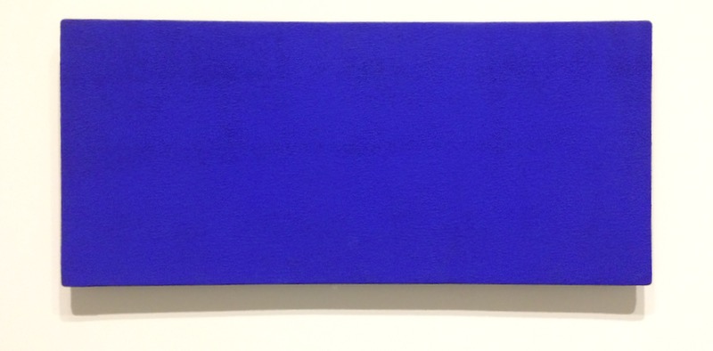
Untitled Blue Monochrome (1960)
Yves Klein (1928-1962) was a French artist who worked with a chemist to create a startling Ultramarine Blue when he mixed powder with synthetic resin. He patented this as IKB: International Klein Blue, and became known for his use of this color.
When Klein came to California to work as a visiting artist, Edward Kienholz “gave him this kit as a welcome gift, providing Klein with tools to create…while away from his home studio.” The valise, which has a tag that reads “resident of the universe,” includes “such things as a spray can of IKB paint, a page of instructions, [and] a jar labeled GRIT” (text taken from National Gallery of Art label next to painting).
“Klein’s attraction to blue was rooted in his belief that it was the least material color: ‘All colors bring forth associations of concrete ideas, while blue evokes all the more the sea and the sky, which are what is most abstract in tangible and visible nature.”
I love blue in all its variants, and enjoyed bringing the abstract to the tangible in cloth and thread.
We will begin again next year with a new challenge, going on our fifth year. We have people who join us, leave us, but a few of us keep going on. Please visit the other members of our group and see how they interpreted this challenge:
FYI: The next post talks about the construction, the pattern I used, and the next challenges, and why I want to make this all over again (because some parts really bug me).
˚˚˚˚˚˚˚˚˚˚˚˚˚˚˚˚˚˚˚˚˚˚˚˚˚˚˚˚˚˚˚˚˚˚˚˚˚˚˚˚˚˚˚˚˚˚˚˚˚˚˚˚ My blogging software puts ads here so I can use their site for free. I do not know about, nor choose, the content, nor do I receive any money from these ads. ˚˚˚˚˚˚˚˚˚˚˚˚˚˚˚˚˚˚˚˚˚˚˚˚˚˚˚˚˚˚˚˚˚˚˚˚˚˚˚˚˚˚˚˚˚˚˚˚˚˚˚˚˚˚˚
 Belle Etoile du Jour
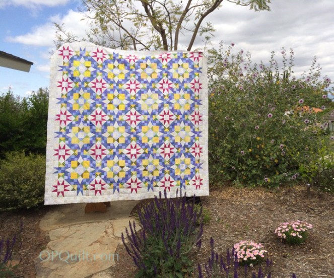
 And again, if you haven’t started your listing of your quilts, start now!