Is it a hard-to-make block? Not at all.

But it kinda broke my brain a little.
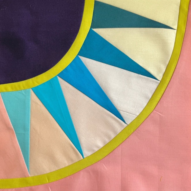
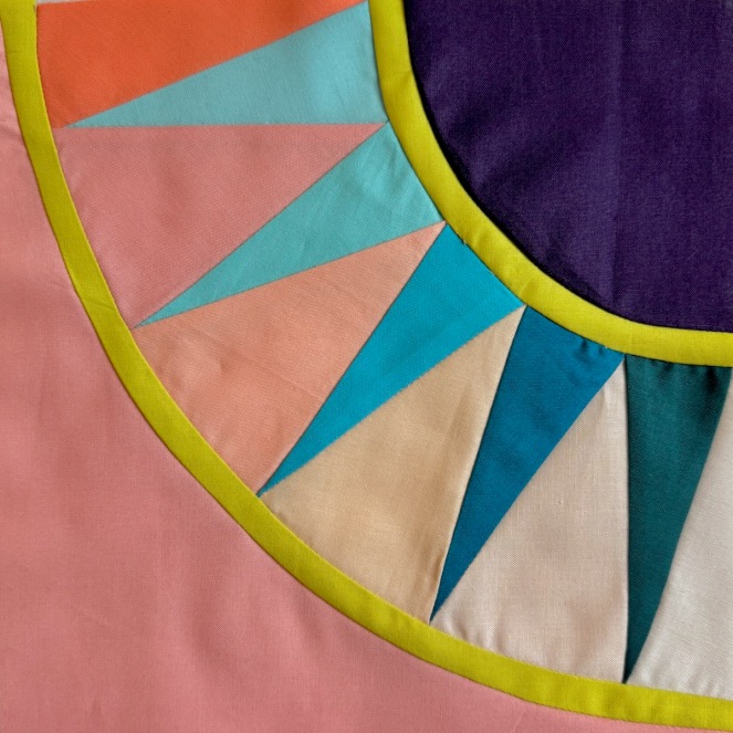
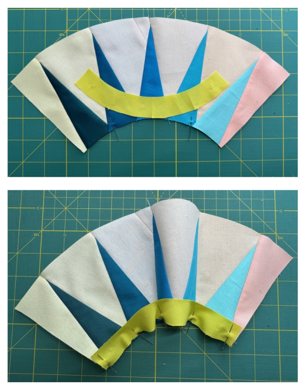
This picture illustrates my vexation. On the left, and using the color swatches in the top row, is Version 1 of this block. Not happy with how the ombre effect worked out, I tried Version 2 of this block (on the right), using the color swatches in the bottom row. So, first, color broke my brain.
Color
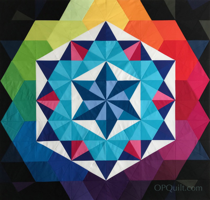
I’d envisioned this block to be a representation of that time in the evening when everything is settling down, with glowing shades of pink and yellow and deeply colored purple. On the left in the background of the rays, you can see that range of hues goes just so far. Then there is a huge color jump from the light pinks to that dark coral at the far left. Likewise in Version 2 on the right, there is a progression from soft yellows to corals and pinks, then another color jump at the end. I faced that sort of thing ages ago when I made Annularity. I ended up making two of these quilts:

Do you spot the anomaly in color? It’s at the very bottom, the warm-lavender diamond just to the left of center. That quilt went to Paintbrush Studio, because it was made from their first drop of their solids line. In the version on the right, made for myself, I pulled the exact blue-lavender color from another solids line that I needed to make the transition flow smoothly.
This is because we live in a world with limitations. And fabric colors, especially in solids, are one of those things. The fabric line, my favorite — Painter’s Palette by Paintbrush Studios — has since fixed that awkward color jump and they now have a perfect blue-lavender.
But now there’s a jump in the pinky coral tones. But I’m really giving this fabric line a workout: I’m creating color in my Affinity Designer program, using sliders and sampling colors from photos to get the exact color that I want in my designs. But the fabric manufacturers are working with cloth, dye, finishes, and budgets and no, they can’t make every color. (This is why I believe some people dye their own fabrics — just to get that precise color they want. But I decided long ago not to go down that road.) If this really bugs me, I may just buy it from another line, but I will be sure to prewash it twice to try and mimic what I have (both for colorfastness — the PPSolids are incredibly colorfast) and to shrink up the weave a little (PPSolids have a tight weave with a nice hand, or feel, to the cloth). Who am I kidding? I’ll just use what I’ve got.
Technique
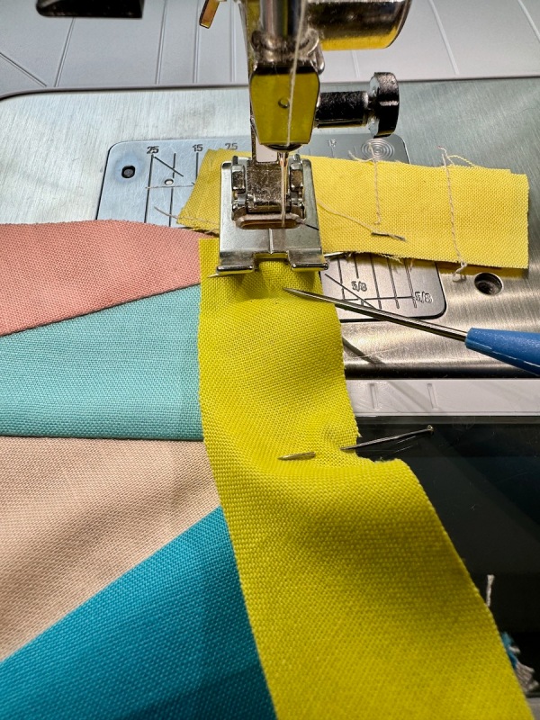
And the other reason I was struggling is technique, or “how I sewed it.” In that Version 1, above, if you use your critical eye you can see that the narrow green band seems more “lumpy” that the one on the right. When I was majoring in Clothing and Textiles at Brigham Young University (a major no longer offered), we had to make a wool suit. Our teacher had worked in the industry and precision was her specialty. I resewed the lower front corner of my jacket with its sloping curve from center front to hem probably four times, but in the end she still gave me a B. She wrote on my grading sheet that she knew I worked hard on it, but it still wasn’t as smooth as needed.
It wasn’t necessarily my skillset that wasn’t up to succeeding, it was my technique. I needed to slow down. We all are familiar with this feeling when we finish the center of a quilt and then its borders. Borders? And we throw on just something, and then it’s quilting, and then it’s the binding, which apparently many people don’t like. They just want to Be Done.
So I slowed way down in my sewing of the narrow bands on the Version 2 block. Pressing carefully, using a different order of construction, improving my technique as I went.
This is not a hard block. So choose your colors carefully, use your best techniques in sewing, and it will go well. That’s all I wanted to say on this, but I do include my tips and tricks for the block and sewing it together below.
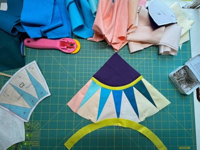
This is what my cutting table usually looks like, however I crop out the mess when I post photos, to keep the distraction level down. There’s a free pattern for Block One in my PayHip shop, where you can also pick up the patterns for all the blocks. Don’t forget to look at the other posts about this quilt, all found on the Master New York Beauties page.
Thanks for reading, and good luck with your colors and technique, in whatever you are stitching–

Tips and Tricks for Block 10: Vespers
Many other of the New York Beauties posts give you specific instructions on how to make that ray section; feel free to look at them for more help. We now pick it up after the parts are ready to be assembled. Please read all the way through before beginning.
Arrange the pieces so you’ll pin the INSIDE curve of the rays to the OUTSIDE edge of the narrow curved band. The Cereus block (9) discusses this. Divide the ray section and the small upper band into four sections, marking with pins, or finger pressing. Pin.
Sew a scrap, and at the edge, line up the two pieces to sew. I use a clay tool (the handle is nice and big) but you can also use a stiletto. Keeping the right-hand edges aligned, S L O W L Y stitch 1/4-inch away from the edge, easing in the fullness as you go. Remove pins as you go. To be truthful, It’s easier to put the concave on the bottom (the curving-out piece), but I think I flipped it for this photograph. The post on Cereus shows what I mean.

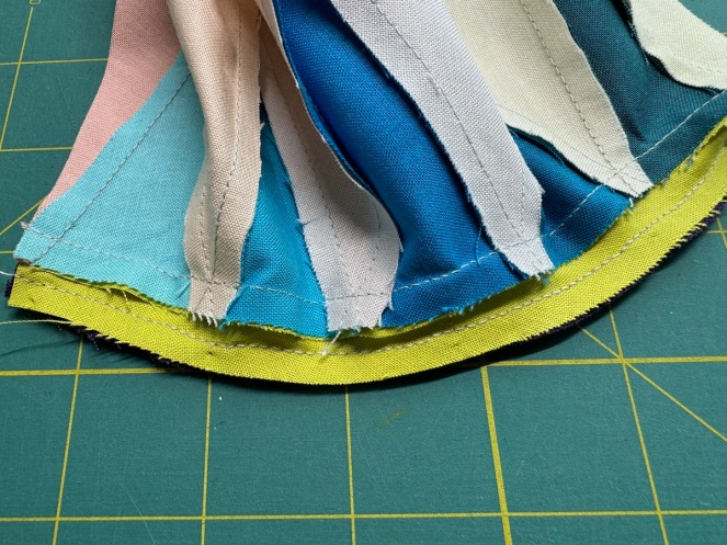
Press the band away from the rays.
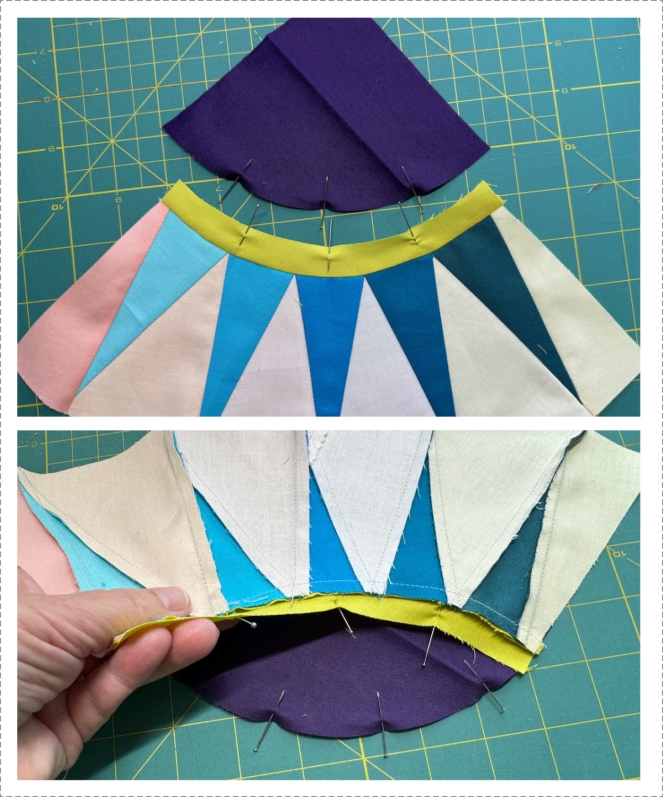
Now we’ll attach the corner quarter-circle. Again, divide the edge into fourths. And made sure you are sewing the INSIDE edge of the narrow curved band to the outside curved edge of the quarter-circle.

All pinned up. The purple (convex side) will be placed next to the feed dogs:
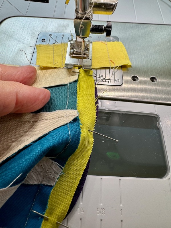
Again, I use a scrap to get started. I nudge those two edges on the right together with my clay tool and sew in a quarter-inch seam, slowly.
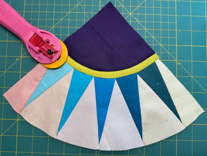
I like dimension in my blocks, so that seam is pressed under the quarter-circle. (I’m sure you’ve noticed the pieced wedge in the center. My order from Keepsake Quilting hadn’t arrived when I was making this sample.)

Readying the next joining: outer narrow band to the lower edge of the rays.

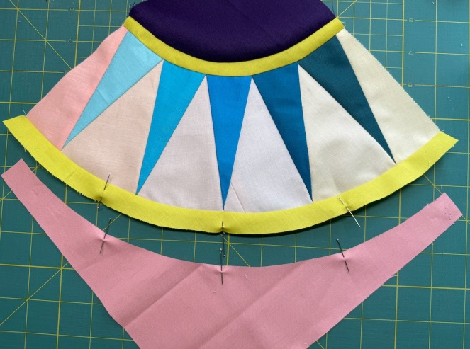
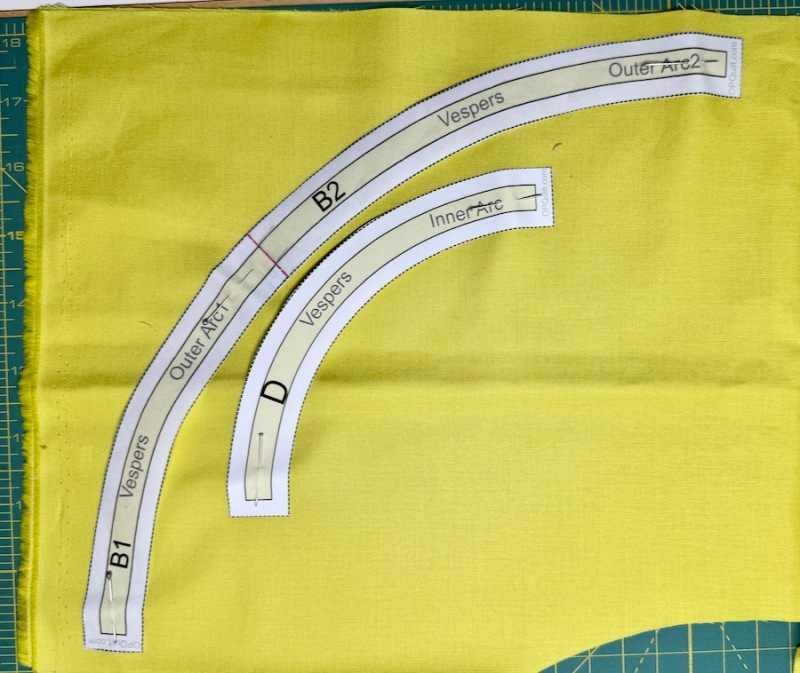
Preparing the last seam: narrow band to outside corner. All those curved edges have bias, with the grain on the outer edges because I cut them like this:
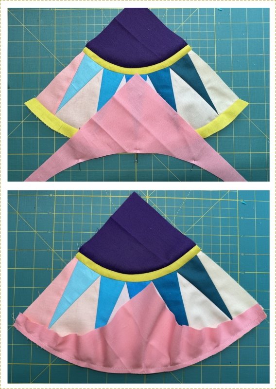
All finished. In every step I took my time, keeping a good technique and not rushing.

Trimming is keeping several balls in the air at once, juggling them all.
- First thing to check: your center. Make sure that diagonal line is as close to center of that center ray as you can get.
- Next, go for the bright green arrows, seeing if you can get the outer edge of that band as close to 9 1/4″ as you can. On both sides.
- Last, and only if you can, the bright blue arrows are asking you to see if the inner narrow band measurements are the same. Or similar.
Then trim off the excess. I designed the pattern so you would have some “play” on that outer edge.
Okay, that’s all for this block. Make 3. Will I use both blocks? Probably. In our lively quilt, I don’t think anyone will object:

I put them both up in our progress chart, and they are fine. This is all to say that if you make one and want to make a shift in colors of the same block, it will be fine. There’s another double-colored block up there now!
Discover more from OccasionalPiece--Quilt!
Subscribe to get the latest posts sent to your email.

Wish I’d had this tutorial when I was recently putting together a quilt with quarter circle blocks!
I love that you used what you believe is an imperfect block in a quilt. Things don’t have to be perfect to be beautiful! And sometimes I think we wear ourselves out trying to be perfect. Often “good enough” is just right.
Thanks for your blog! You pack so much into your posts.
Working with the limitations of colors that exist in fabrics can be a challenge indeed. I personally like the gradient for the pinks on the left (and I did take a screenshot to look at both in grayscale), but beyond value, color is also important as you move around the color wheel. It’s tricky stuff! Thanks for sharing about your journey with this quilt. It seems to be talking to you a lot. 🙂
You are way to hard on yourself Elizabeth. Both blocks are lovely and you do an amazing job on the limitations imposed by fabric companies. I believe tone and colour can be so subjective and often people see them quite differently! Thank you for all the detail you go to in sharing your knowledge and skill!
Well! I had in mind to use an ombre fabric for some of my blocks, but now I think I’ll limit myself to one ombre color per block rather than trying to balance them as you did. My brain is broken just thinking about it!