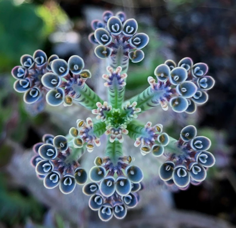
My husband is a photographer who specializes in small landscapes: detailed shots of flowers that he finds around our neighborhood. Since we live in a climate that is temperate, we have plants from Brazil, Australia, New Zealand, and even Madagascar, and he finds and captures them all in their exquisite tiny details. The plant above is called Mother of Millions.

But sometimes when you step back, the plant just isn’t quite so lovely. And so it is with quilts.

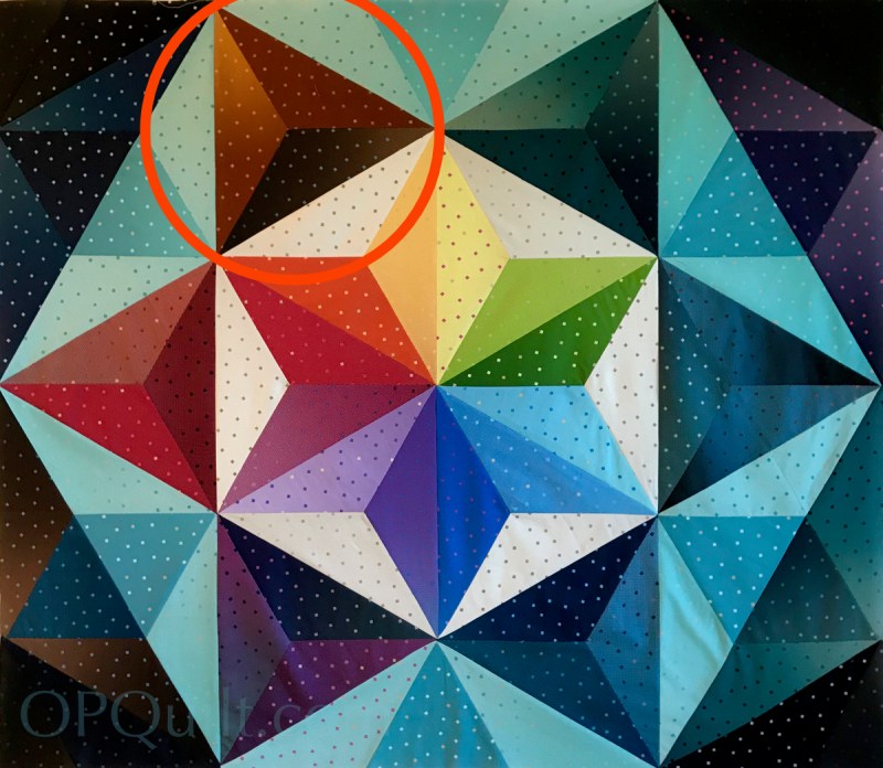
I had challenged myself to make a larger version of Triad Harmony, which — when it’s figured out — will be added into the first pattern. I had spent hours drafting patterns, printing them out, perfecting them, and finally it was time to try it in cloth.
Fail.
I really thought it was a loser. I had great fabric, Gem Stones by Riley Blake (shown on this post). I thought, well…every quilt starts out as spindly Mother of Millions plant, with their virtues disguised in the making. I wondered if this smaller quilt just couldn’t scale up to the larger version. So I stepped away for a day, a bit grumpy about the whole thing. But I just needed to look at the details.

And the details came down — as so often it does — to contrast. The second tier of triad blocks needed contrast from the outer heavens in which this star lives. I needed to change out some pieces, but now I think it’s on track. I will soon get the borders on, then take it off my design wall to quilt it. The moral of the story? Keep working, make changes and soon the quilt will show itself.
In other news, I had a wonderful class last Saturday with the Coastal Quilters from Santa Barbara, a Zoom class of 19 students. We have our follow-up session this coming Saturday, and their quilt pictures have been coming in. I am most excited about this–this follow-up session is such a wonderful time where we talk about quilts. That write-up is coming soon, as is a giveaway for the new Encyclopedia of Pieced Quilt Patterns. So stay tuned!

About the name: I had originally wanted to name this quilt Spectra, as that is plural for spectrum, or an array of light. But when I found out that it is the brand name for a breast milk pump (?!?), I quickly changed my mind. I read that car manufacturers go through this on a large scale, as not only do they have to check English, but the car’s name in many other languages as well.
And now, a little light reading:

Happy Quilting!
P.S. Did you notice I changed this triad piece, too? I subbed out the lightest piece for a really dark one — you know, more contrasting — and then I rotated it to put that darkest piece at the lower edge.
Discover more from OccasionalPiece--Quilt!
Subscribe to get the latest posts sent to your email.

Love this with the changes for better contrast
Those plants are beautiful and so is your colorful quilt design.
I love them!
You’re a quilt rescuer, Elizabeth! I love the new direction your quilt is taking. Lately, I’ve been thinking a lot about value, and trying to make sure I have a good range in my quilts. Spectral Light now has a great value range in the right places.
Your husband’s photo captured the beauty of Mother of Millions, which if viewed differently, looks downright homely. The top photo reminds me of the mille fiore paperweights from the island of Murano near Venice.
First you had to see something wasn’t working then you had to figure out what would make it work. And you did. Nice result.
Great post and great lessons for us all! You’ve always had an eye for color value and you, finally, nailed this challenge. Funny, there are quilts we see in the big world and know “it doesn’t do anything for me” when in reality it is likely that with a color (not pattern) change, the quilt blossoms. Glad you ruminated about this one – well worth the time! And I really do like this fabric and didn’t really see, until researching, that it is an ombre. Love Dave’s pics, BTW 🙂
The Mother of Millions close-up is so beautiful! Maybe the closer we get to something the better they get? Your eye for detail and subsequent analysis is always a lesson for us in perseverance!
The light that you brought into the quilt makes such a big difference. I love it. That flower is amazing. Sometimes we need to really look to see beauty in everything.
More contrast. How boring our lives would be if everything was exactly the same. I like to think we are all born with an inner creative spirit that seeks expression. Yours has come out beautifully in your quilts. Thanks for the light reading. 🙂
Value and contrast really do a lot of what we think of as “color” work in quilts. The changes really help the design pop to life. And boy do I love the photograph of the Mother of Millions!!!
Hi Elizabeth,
Enjoyed this post. Did you remake the quilt? I can just hear your perky voice explaining this. I’ll be watching for the Coastal QG pictures if their workshop.
Good choices and insight. I often think letting a project sit brings about changes for the better. I’m usually less happy with things I forge ahead with when I know they aren’t resolved in some way.
I had never heard of Mother of Millions. What an interesting plan. And you really nailed it on this version of the quilt.
A spectral color is a color that is evoked in a typical human by a single wavelength of light in the visible spectrum, or by a relatively narrow band of wavelengths, also known as monochromatic light. Every individual wavelength of visible light is perceived as a spectral color, in a continuous spectrum; the colors of sufficiently close wavelengths are indistinguishable for the human eye.
Thanks for sharing – both the quilt design progress with color contrast and values and the wonderful close up photo by your husband.
Your husband takes glorious photos! I never would have guessed that the first picture came from the second. Guess it pays to stop and give a close look now and again. The process for choosing colors (contrast) is one we all should – but don’t always – go through. Since my recent workshop with Maria Shell, I have improved (I think) my way of choosing colors that includes arranging, re-arranging, photographing, and black-and-white-ing pictures as important steps in the process. Did you check values before starting your quilt? I’m happy for you to be able, and continue to virtually teach. It’s got to be very gratifying. Enjoy yourself!
Where does he sell his photography?l
Ha! As usual, color gets the credit, value does the work!