Quilt Shows · Quilts

Road to California Quilt Show 2013—part III

This is the final post on the quilts I saw at Road.

BuckleyQuilt

Fiesta Mexico was made by Karen Kay Buckley and quilted by Renae Haddadin.

BuckleyBack

The back was amazing, with all the colored thread.  Details of the front are below.

Buckleydetail1

Buckleydetail2

Chromaticquilt

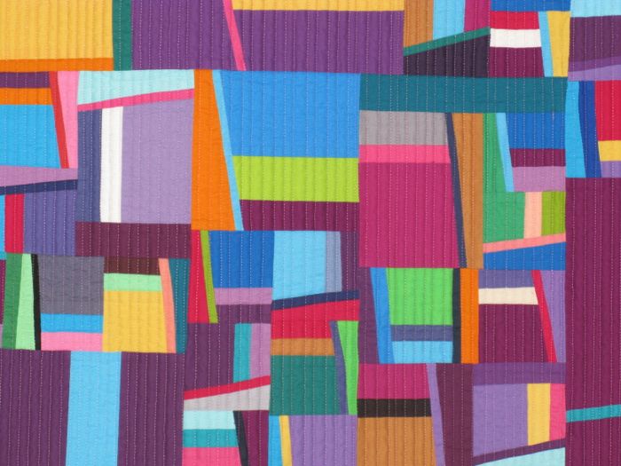
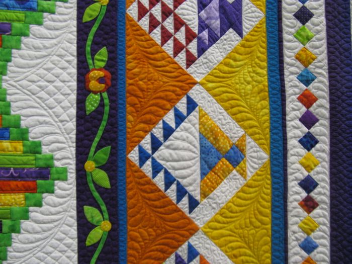
Chromatic Transitions.  Rachel Wetzler adapted a late 1800s Minton tile pattern to make her quilt.  Four tiles pivoting on center makes one block and there are 25 blocks in the quilt.  She played with the placement of values to de-emphasize some shapes and empasize others.  Details below.

Chromaticdetail1

Chromaticdetail2

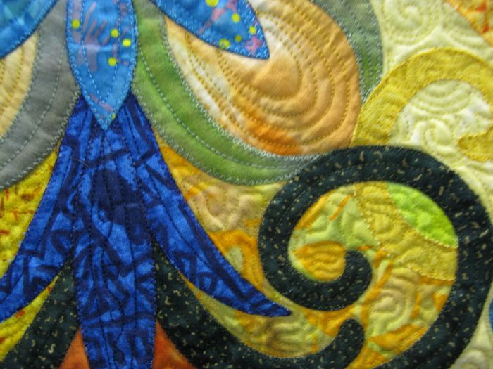
This quilt fascinated me by the way she appliqued it.  Some swirlies were turned-under (freezer paper method?) and then appliqued using a small zig-zag.

Chromaticdetail3

And then there’s this section which is raw-edge appliqued.  I love the combo of both in one quilt.

Cranes

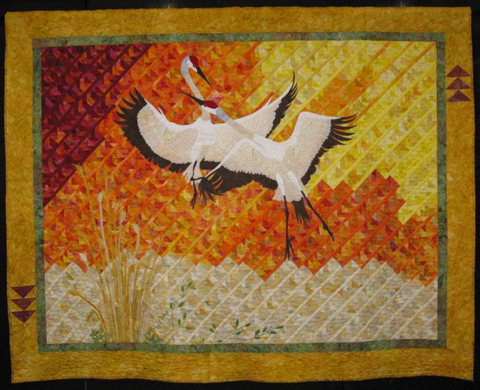
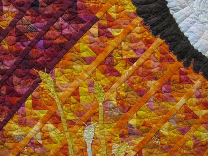
Cranes in Motion was made by Gloria Gilhousen and quilted by Jean McDaniel of Oregon. So you’re thinking: nice birds, nice autumny background.  And then you realize that the background is all flying geese, set on the diagonal.  Clever.

Cranesdetail

Inspiration came while she was vacationing in Florida where “cranes are ubiquitous and sunsets are an extraordinary visual experience.”

Cranesdetail2

FantasyLandQuilt

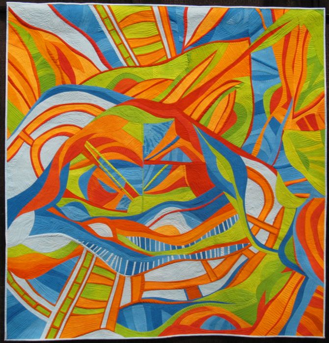
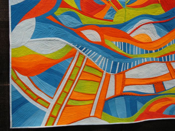
Sheil Frampton-Cooper is the one who put together the Perspectives exhibit where you saw lots of landscapes yesterday. This is her quilt, Fantasyland.  She writes: “Created during an emotionally challenging time, working on this quilt was an escape to a fun place.  It was my ‘amusement park’ and regardless of what I had to deal with, as soon as I entered my studio and felt its vibrant energy, I was comforted and full of excitement.”  She is from California.

FantasyLanddetail
GreenMiles

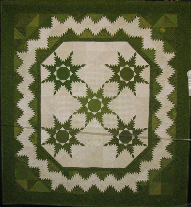
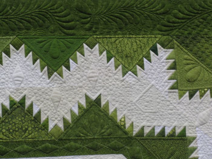
I included this quilt because when was the last time you ever saw a cream and green quilt?  Green Miles was made and quilted by Peggy Kragnes of Minnesota.  She writes that it was made “using green fabrics gathered on a 7,000 mile road tip with patient husband.”  No kidding.  There are many different fabrics in here and the quilting is wonderful, too.  Detail shots below.

GreenMilesdetail1

GreenMilesdetail2

GuerreroConverge

Annette Guerrero made two solid-fabric quilts.  This first one is titled Convergence.

GuerreroConverge1

GuerreroIris

This quilt is titled Iris.

GuerreroIrisdetail

She included a quote from Emile Zola on her sign: “If you asked me what I came into this world to do, I will tell you: I came to live out loud.”

HexiesQuilt

Lily Pad, made by Patti Van Oordt and quilted by Cory Allender (both of St. George, Utah) is a paper pieced design that had its origins in a class by Claudia Meyers.  Since I’ve been working on a hexie-shaped quilt for eons, I was interested in how she displayed the pieced hexies against the rusty-orange background.

HexieQuiltdetail1


McTangerine

This little stunner, titled McTangerine Rose, was the 2011 Block of the Month patter by Sue Garman for “The Quilt Show.”  Lynn Droege, the maker, added an additional border.  It was quilted by Lisa Sipes; both are from Kansas.

McTangerinedetail

MiniLogCabin

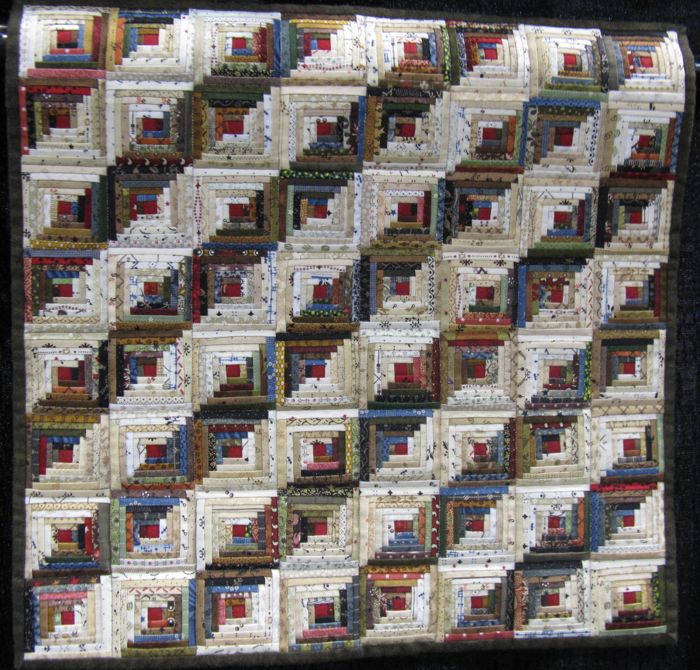
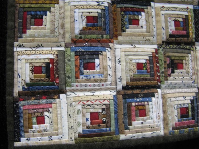
For a change of pace, here’s a miniature quilt.  Kaye Koler of Ohio, “set out to see how small I could make a log cabin.” Each block is ONE AND ONE-HALF INCHES!!  Which means, my thumb (and yours) would just about cover one log cabin.  She used 172 different fabrics.  All of the miniatures were amazing, but because of the plastic tape, I couldn’t really get in to see them.

MiniLogCabindetail

Moose

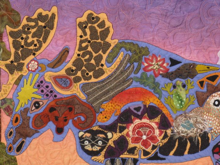
Pam Hadfield, from California, saw a trivet in the airport, and used it as inspiration for her quilt We Moost be in Yellowstone.  I have a Christmas ornament similar to this from when I visited Yellowstone: a moose filled with designs.

Moosedetail

PowerSuits1

Another exhibit in the show was something called “Power Suits,” and each quilter used their own ideas to depict the theme.  I liked some of these very much.

PowerSuits2

Someday I aim to make a pineapple log cabin quilt!

PowerSuits3

The annual awarding of The Ugly Quilt came from this exhibit, but this year we had a tie.  You’ll find them at the end of this post.

rarebirds

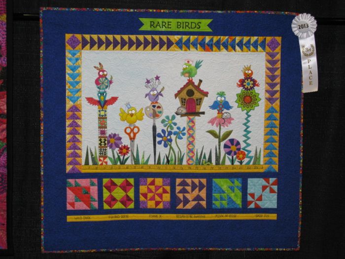
Remember the swirly quilt above in yellows and blues?  Well, Rachel Wetzler did it again: Rare Birds is a quilt depicting the six of her friends in a their quilt critique group: (l to r) Denise Havlan, Rachel Wetzler, Annette Hendricks, Beth Gilbert, Ann Fahl and Robbi Eklow.  That’s quite a group!

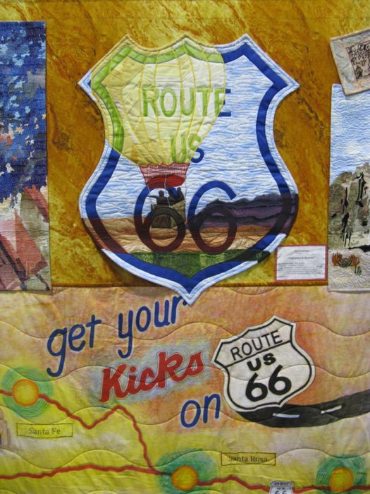
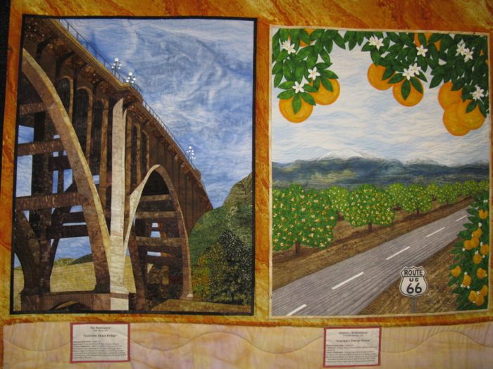
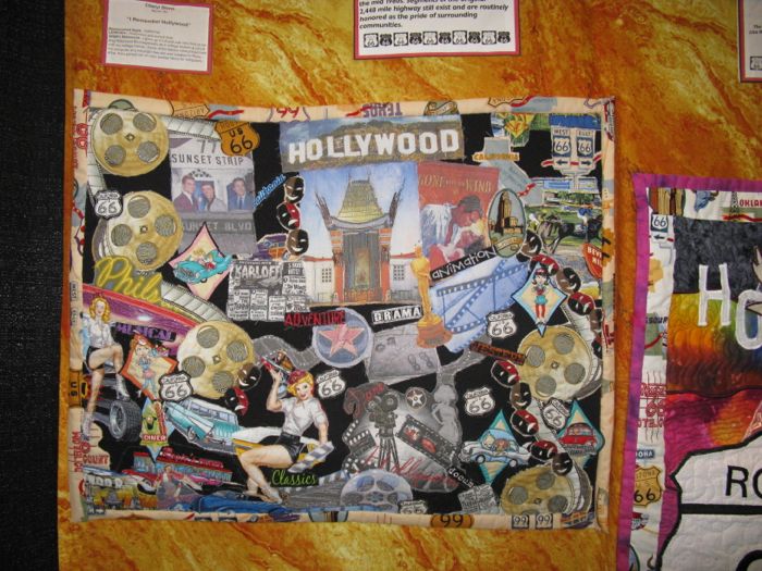
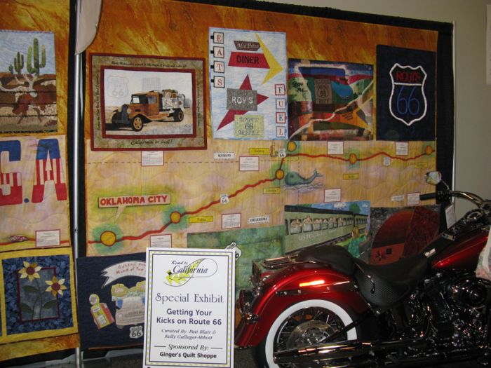
Along the front wall of the ballroom was a Route Sixty-Six quilt.  It consisted of large panels with lots of small quilts adhered to the “road,” showing off the sights in the area of the cities along the route.  Here are some of the panels, with some close-ups of the mini-quilts as well.

Rte66-1

Rte66-3

Rte66-5

Rte66-6

Rte66-7

Rte66-8

Rte66-9

Rte66-11

Rte66-12

Rte66-13

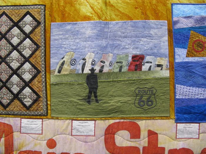
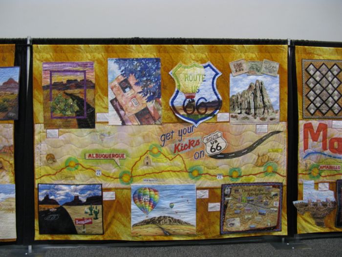
I included this one because my daughter used to live in Kingman Arizona, and I’m pretty sure the movie Cars was based on some of the scenery around there.

Rte66-14

We have a giant orange stand like this in Riverside, in our State Citrus Heritage Park.

Rte66-15

Rte66-quilt

Rte66

sleepingcats

Let Sleeping Cats Lie, by Cheryl Giovenco (quilted by Sheila Osbrink, both of Corona, California).  This quilt is made of 19 different batik fabrics, and was designed by Helene Knott.

starrynightquilt

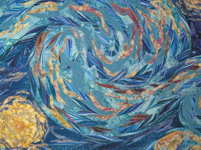
Vincent–Haunted Genius was made and quilted by Danna Shafer of Temecula, California and is her interpretation of Van Gogh’s “Starry Night.”  She used fused appliqué, secured with monofilament thread; it was five years in the making. Detail below.

starrynightdetail

TeaPartyQuilt

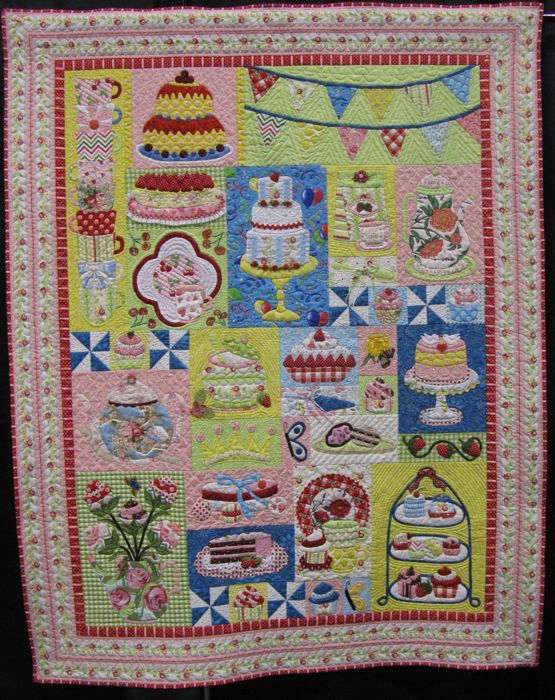
This is for you applique fans.  Joan Lebsack made Welcome to My Tea Party, based on a pattern by Verna Mosquera.

TeaPartydetail1

ThelmaChildersFlag

The sign next to this quilt was wrong, so I have no idea who made it or what the title is.  It’s really lovely.

ThelmaChildersREDquilt

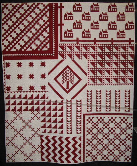
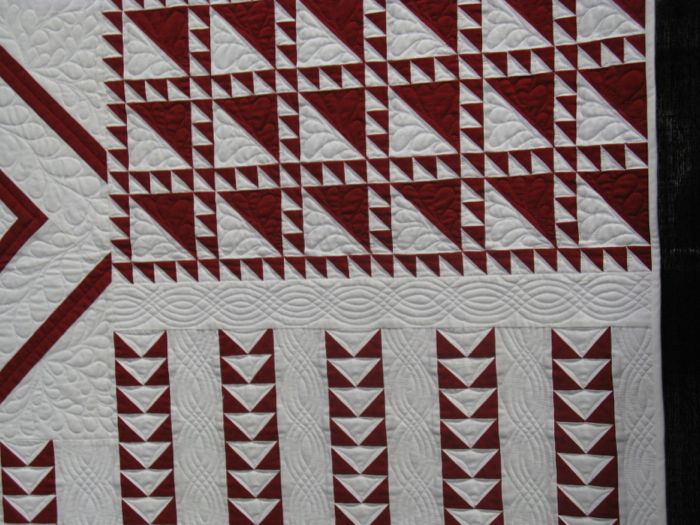
A couple of years ago (March 2010), there was an exhibit of red and white quilts in New York City, “Infinite Variety: Three Centuries of Red & White Quilts,” which took us all by storm.  Thelma Childers made this quilt as an homage to that amazing show, but also as a way to show many different quilts, and how one might have obscured the other as a person walked through that show. I’m a fan of Thelma’s, so was really excited to see it in person, as I read about on her blog as she made it.

ThelmaChildersREDdetail1

The beautiful quilting is by Connie Lancaster.

ThelmaChildersREDdetail2

ThelmaChildersREDdetail3

ThelmaChildersREDdetail4

ThelmaChildersStarquilt

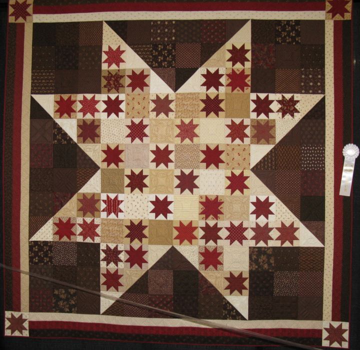
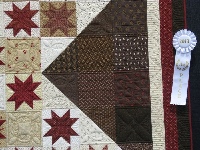
This is another Childers’ quilt: Two Score and Seven Stars, and it is quilted by Judi Madsen (both are from Illinois).

ThelmaChildersStardetail

TreeLifeQuilt

Tree of Life, by Allison Lockwood of California, was based on a trip to Thailand, where she was “enthralled with the color and sparkle of Thai Buddhist temples.”

TreeLifedetail


TwoCrows

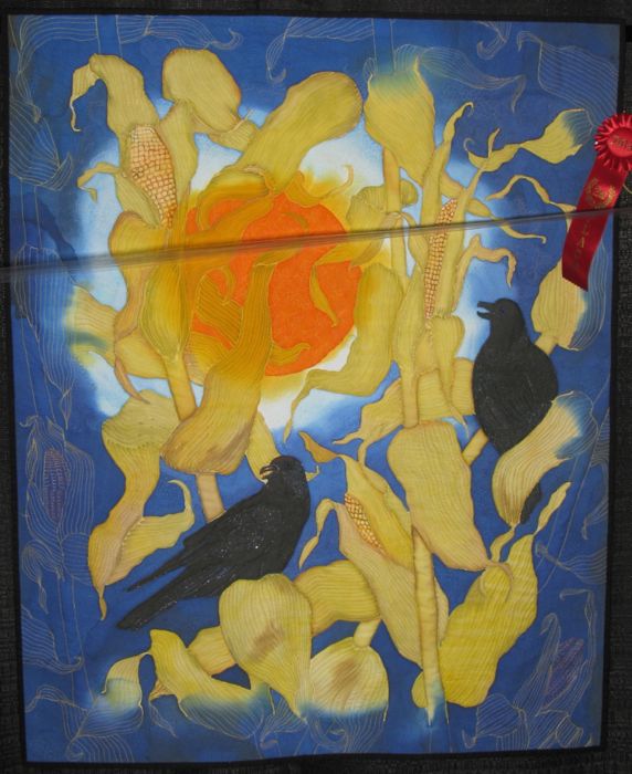
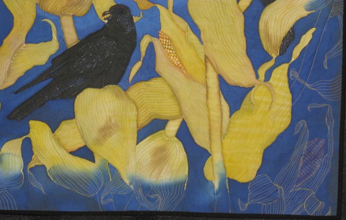
What made this quilt by Gayle Pulley stand out for me was not only the coloring of her hand-painting on a whole cloth, but also where the color isn’t, and how the stitching fills in.  Two Tenacious Crows are certainly having their feast in a cornfield.

TwoCRowsdetail

And now I bring you my truly subjective category: Ugliest Quilt.  One is easy and you’ll probably agree with me.  This first one, however, may make you howl, especially if you loved this Award-winning Quilt.  I couldn’t find anyone who did, so I think there are more that might give me a thumbs’ up on my awarding of this quilt one of two in the Ugly Quilt category.

UglyFeathers

I like red.  I like gold.  I’m not opposed to feathers.  But I couldn’t make any sense of this one, other than it was one of those quilts that was just a show-off for technique, and not for design, or cohesiveness.  It’s made by a couple of big-name artists (I never reveal my Ugly Quilt makers), and while a lot of times I see their quilts up here on Winners Row at Road, this one just made me scratch my head and realize that my puny efforts will NEVER get in, if this is what the winning quilt looks like.

UglyQuilt

This is just all wrong on so many levels: the art, the composition, the appliqué wads of dyed cotton batting for hair.  It has nothing at all to do with the subject matter, just like the quilt above.

I guess I look for quilts that have some intrinsic beauty, when I pick out my favorites, or colorations or design elements that are interesting.  I also appreciate technique, but “over” technique is just as big of a sin to me as is “under” technique.

Other observations: The people that hang the quilt show still have that affliction of hanging subjects together, such as all the flowers together, all the birds together, all the zombies together (I didn’t show any but we did have some Halloween quilts) so that you don’t let the quilts interact in a more natural way.  Wish that would go away.

I think the show overall was better than last year (it could only go one way), but I was not as charged up about the vendors as I usually am.  Perhaps that’s just because I’ve gone too many times and seen everything that is brought to the show (or maybe I have just too projects on the back burner with too many yards of fabric home in the closet).  I did buy a bead bracelet (quilt shows are a great place for jewelry), and some solids from Ginger’s, but other than a few bits here and there, it wasn’t a Big Haul.  I think the group that we were with didn’t buy as much as usual, either.

I do appreciate having a quilt show nearby, and look forward to Long Beach the first week of August.  The best time of all was with my friends–both new and old–eating together, doing Show and Tell, taking a break. See you all next year!

And that’s a wrap for 2013.

100 Quilts · Finishing School Friday

Be My Valentine

Okay, I know I’m late.  Late for Valentine’s Day.  But better late than never, right? Another entry into Friday Finishing School.  In fact, today I have two!mini-love-quilt

I finished sewing down the binding on my LOVE mini quilt–here it is!  Okay, on to the red and white.

be-my-valentine

Be My Valentine, Quilt #94

I threw a color catcher into the washer to catch the red dye–obviously I needed two, judging by the fact that the little ladies now have a light pink background instead of a white background.  It’s interesting how some of the whites were tinted pink and others were not.  Go figure.

The back.

I wanted something fun for the label, so I cut out a piece of fabric from the front, and printed onto that. It really is squared up.  Ignore the photo.

Beauty shot of the quilting on the front.  I used a thicker thread–King Tut, because I wanted those circles to stand out.  I have to say I really like quilting with Superior Thread’s King Tut.  And I buy my thread from them, just like everyone else does.  No, they are not a sponsor.  Yes, we are having a giveaway but only because I like their product.  I also use the Guterman that I get on a 50% off coupon at  the big box fabric store, but I’ve only really been happy with that for piecing, not for quilting the top.  (And no, I don’t buy into that myth about polyester thread “cutting” the cloth.)  I have also used Sulky on occasion, but sometimes I don’t like the shiny look of the polyester, and head back to the cottons.  Some quilts call for one kind of thread, other quilts call for other threads.

And on the back I used Superior’s Bottom Line thread in white. How did I ever start using this?  It was when I was sewing my Empty Nest, Full Life quilt, and I just couldn’t get the threads to balance properly with their locking of the stitch in between the front and the back.  I think I had purchased a spool of Bottom Line at the last quilt show I’d gone to and in desperation, wound it onto the bobbin to try.  It’s a lighter weight thread, and I think Heather (Mother Superior, as she is known on the website) told me that a lot of show quilters used it because they could more densely quilt their quilts.  That fact didn’t sway me at all (you know how much I hate densely quilted quilts), but the fact that I didn’t have loopy loops or pulled threads to the front did convince me it was something to have around.  I loosen the tension on the top a little, sometimes a lot.  Then I write that on a post-it note and keep it near the machine for when I have to come back to it.  Generally, with a thicker thread on top, I lower it by one full point–from a 4.0 to a 3.0.

So I tend to use it always in the bobbin.  I’ve always wanted to try it in hand piecing, as it is as fine as silk.  Some day.  There you go–two Friday Finishes!

Quilt Shows

Red/White Mini Quilt Show

After seeing the quilts along the streets of Temecula, I headed to the Temecula Quilt Company, a shop that specializes in reproduction fabrics, which lies about 4 miles inland from Old Town Temecula.

As usual, she had done the displays in such a perfectly arranged fashion.  There’s a little excitement when you have a quilt in a show, even a mini one, and I hunted for my two.

Right away I see one of mine: the folded quilt on the lower left.

It’s a deeper red than those around it and I like how she harmonized all the patterns together along with color tones.

Some quilts were tiny, some small, some larger.  Sometimes we think we can only make giant-sized quilts, but these little ones carry great visual punch.

Some quilts have more red, some have more white.

What makes this starry quilt intriguing for me, is the tilting of the central stars in the blocks.

Teensy little rooster quilt.

With a fabulous label.  Wouldn’t it be very cool to have a “signature label” like this one?  I suppose that #184 in the upper left corner is her personal number of quilts?  I’ve got to make smaller quilts so I can catch up!

The quilt on the upper right (center-ish) is compelling with all the applique symbols.

In the classroom area, she had this giant red/white quilt top started.

More classroom quilts.

Close-up.

I started chatting with the shop owner as I exlaimed at how much I enjoyed her display.  Next year, she said “Blue and White!”  I laughed.  She asked me if I’d seen my quilts and I told her I hadn’t found my table runner.

“The sampler from around the world?” she asked?  “We put it up front where we could display the full length of it.”

Ah, there it is!  Thanks again to all my participants.  It looks great.

As I sat and ate my lunch — she’d provided All-American Hot Dogs to go with these deeply All-American quilts of her mini-quilt show — I could take in all the quilts around in this area.  It was a lovely, satisfying day, spending time with quilts and with other quilters, and I appreciated all the efforts of those who put up displays for all of us to enjoy.

I strolled around the shop once more, trying to see everything.

The show will be up for the month of October — if you are in the area, I’d suggest heading there to enjoy all these quilts!

Quilt Shops

To Temecula!

What does that mean?

It means that today was the day I dropped off my Red/White Challenge Quilt to the Temecula Quilt Company.  The grand opening is October 1st and will run for a month.

My friend Leisa helped me measure them for the tags we placed on them.

I received a very cute thank you gift, shown here with one of Temecula Quilt Company’s patterns (they have a line of their own).  I love the slogan printed on the top of the pattern: What has been done will be done again, there is nothing new under the sun (Ecc. 1).  This is so appropriate for their shop as they use a lot of traditional patterns with reproduction fabrics.

This is a little kit to make a pillow (see above photo) and on the back of the thank-you gift were three magnets from the great Red White quilt show in New York!  I was pretty jazzed about this.

One of the things I love about this shop are the displays.  Everything is so creative and interesting which makes you want to take everything home.  But of course you can’t.

So this is why I bought the pattern.  I may make it in different colors, but their theme resonates with me.

Another clever display.  Most of us have these wooden spools hanging around and here’s what you can do with them: make a mini quilt and wrap them up for display.  The spool will keep the quilt from flopping over, and you’ll have done something interesting with the spools.

Check the  website of the *Temecula Quilt Company* for more.

Finishing School Friday

Red/White Table Runner

Ta-Done!

Gathered here are:

a block from Sue (Canada)
a block from Kay (Australia)
a block from Leisa (California)
a block from Sarah (California)
a block from Rhonda (Virginia)
a block from Lisa (California)
and a block from me, all combined to make a table runner that will remind me of these lovely quilting friends.  For even if I didn’t know them at the beginning, I’ve made some new friends by the end.  Thank you, one and all.

I stippled it with invisible thread on top, and red rayon thread on the back.

Because I might want to turn it over and use the reverse on occasion, I hand wrote my initials and the date.  But I have this blog to remember everyone by–now to take it to Temecula and enter it in their Red/White Challenge.

(Originally labeled FSF, for Finishing School Friday, a series I ran for a while.)

Creating

RedWhite–Painting

I’ve been gone to see my mother and father (he had an art show of his paintings) in Utah.  While I was there, I took the chance to download the recent red and white quilt exhibit app onto her iPad.  This made it necessary to stay up late a couple of nights to look at all the quilts.  I’ll be posting about this off and on, but given that red and white is on my mind, I was struck by the lead photo in the New York Times about the current Hirshhorn exhibit of Blinky Palermo, a German artist.

The write-up of the exhibit extolled Palermo’s”breaking” of the canvas, and using other shapes and textures to create his art–even to the extent of creating with the canvas off of the stretcher bars.  In other words, what we quilters do.  But when will we ever have our art exhibited in the Hirshhorn?  When a chicken has lips.  We’ll have to content ourselves with being exhibited in folk art museums, as well as art/craft museums.

The piece above is titled “Composition With 8 Red Rectangles,” and was produced in 1964.

And here’s one from an anonymous woman, which I have titled Stacked Bars, date unknown.  But I know that even if I titled it “Composition with Multiple Red Rectangles” it still wouldn’t make the Hirshhorn.  It’s not ground breaking (notice that Palermo’s composition has squares, not rectangles?), the woman didn’t die young (as did Palermo), she didn’t have time to make more than one quilt a year–if that–and furthermore, she only worked in mediums that are particular to women: cloth, needles and thread.

But maybe, just maybe, in her neighborhood or sewing circle she was looked on as someone who came up with interesting ideas and new ways to arrange them and so influenced the “art” produced in her neck of the woods.  She was the go-to girl for new quilt patterns. She was the one people sought out if they had to get something interesting on the bed and they only had two colors: turkey red and white.  And given the mortality rate of early Americans, maybe she did die young–in childbirth? from a fever?–and is only memorialized by this intriguing composition of stacked squares that fool your eye into thinking they are bars.  A veritable artist who broke the mold.