Do you ever finish a quilt, but not quite finish it? Like forget the label? Or find scraps that needed to be put away from a quilt that is two years old? Or do you have tasks that still await you even as you transfer them from list to list to list? Or do you add tasks to your list of things to get done? Or do you feel like you spend so much time working off your list that you have no time to think, to create, to play, to imagine?

All of these are types of things that plague creatives, as we are known now. The list is endless, and we can keep adding to it. I was quite intrigued, then, with Mark McGuiness’s solution: a 3″ x 3″ Post-It Note. Actually, he uses two of them. On the first one — as outlined in this article from 99U — he writes one main task in the upper left corner, and then adds the rest of the day’s chores to the Post-It Note. Since it is only 3″ by 3″ it can’t get overrun. McGuiness writes: “But what about all the rest? All the phone calls, emails, and requests that come in during the day? Not to mention all the new ideas that pop into my head as I work? Good question. There’s a place for all of these things, and that place is the second Post-It on the stack, a.k.a. my to-do list for tomorrow.”
He then quotes Mark Forster, noting the idea of an “open” and “closed” list. The first Post-It Note is closed. The second one, is open.
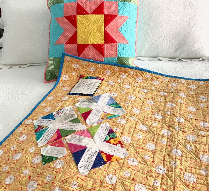
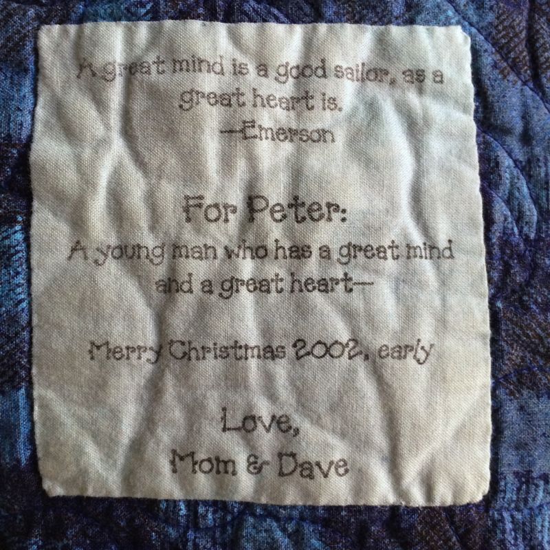
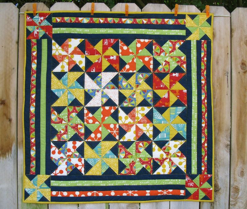
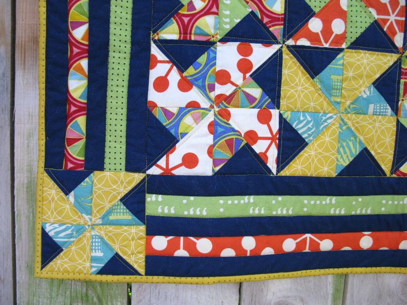
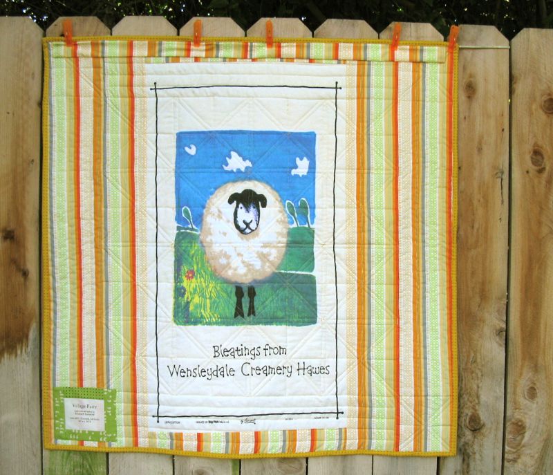
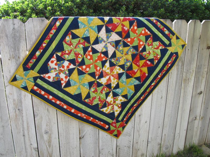
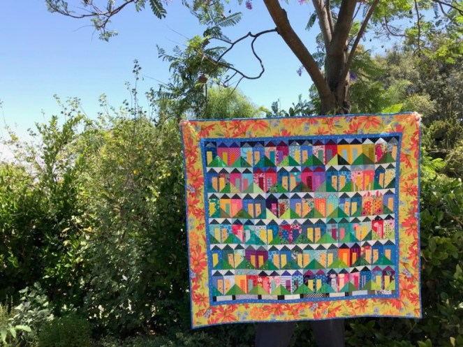
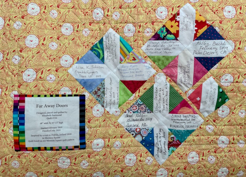
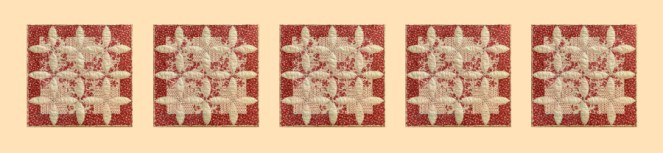
Here are some of the things I did this week that were on my list, putting together disparate parts of my life. I made this quilt with the help of the Gridster Bee, but had misplaced the signature blocks. And then when I would find the signature blocks, I couldn’t remember which quilt they went to. But we put a new shelf in our closet to hold the stack of quilts, and in the shuffling, I was able to put the two together.
I did the bulk of the little houses on the front of the quilt, but it’s fun to look at all the different houses my bee-mates and others sent to me. I often keep my quilts hanging up around my house, because I enjoy them finished.
That is something that Janet Choi might appreciate: “The simple act of pausing to reflect and acknowledge your efforts provides valuable boosts of motivation, focus, and insight that would otherwise be lost amidst your busy day.” It’s like the other side of the To Do List…it’s the Done List.
“Your done list acts as a signpost, a manifestation of all that day’s hard work. This flips an overwhelmed mindset into action mode to correct course, learn from mistakes, and ultimately make better progress” (Choi).
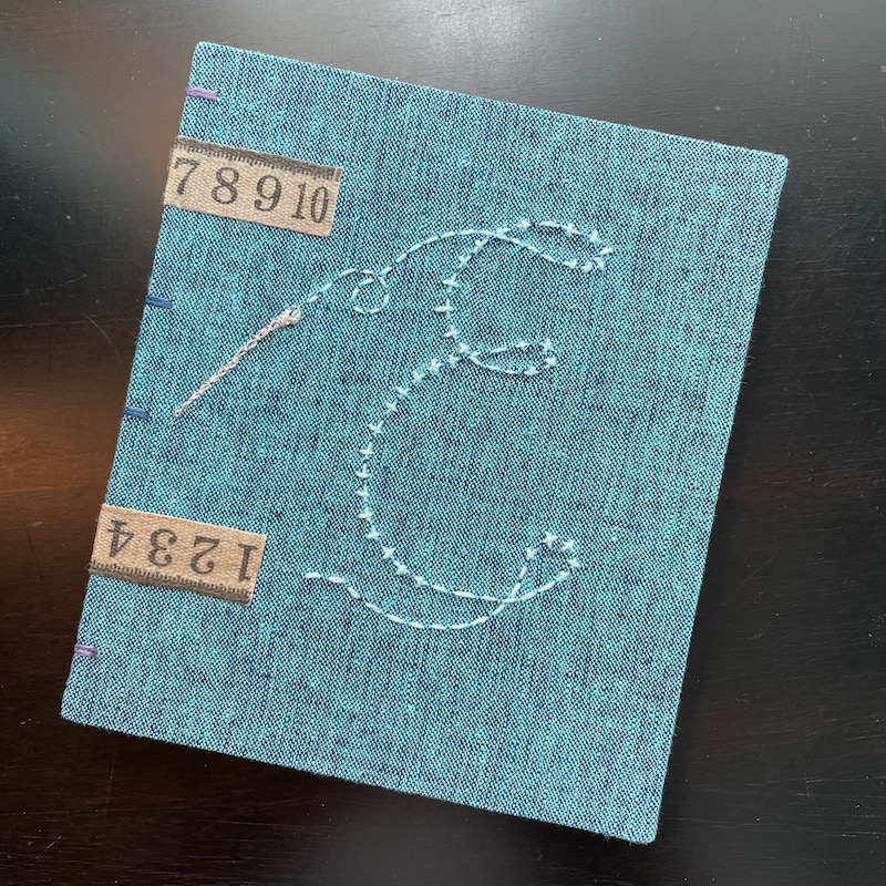
I tend to write my “Dones” at the end of the day in my journal, made for me by Amy, an artisan book maker. I was in a workshop of hers at Camp Create, and she made me this. It’s a treasure, but not only for what it is: it holds a lot of my Dones, but I also like reading backwards to find out what I thought about things a year ago, or even a month. Although I don’t write every day, I write enough that there is a general trend.
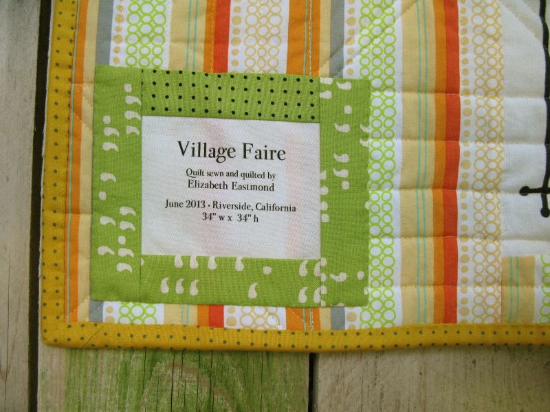
I also write my Quilt Dones up on my master Quilt Index at the top of this page, cataloging them on this blog, and then listing them one by one. I know several of you have started a Quilt Index of your own, judging by my emails.
Choi says to count our smaller wins, too: “Don’t wait until you’ve hit big goals like completing a project or getting a promotion — which happen only occasionally and make it difficult to appreciate small but important advancements. Don’t dismiss all the smaller things that fill out your days and are building up in the long run.”

Which brings me to this: the little rotary cutter in the illustration above. I was making images for my new workshop, Blossom, and I always like to have a visual header as to what is going on in the paragraph where it links to the instructional video, and gives tips. I had the scissors in my digital image file, but when I went hunting for a rotary cutter, I thought: I could make my own. So I did. I have the how-to’s below for those of you who are so inclined (including a video!), but for the rest of you, I leave you with this: I hope you will now not only consider not only a To-Do List, but also a Done List. Isn’t that why we started quilting in the first place? To have things stay done?
Happy Quilting!
How to Make a Digital Rotary Cutter in Affinity Designer, by a Verified Amateur.
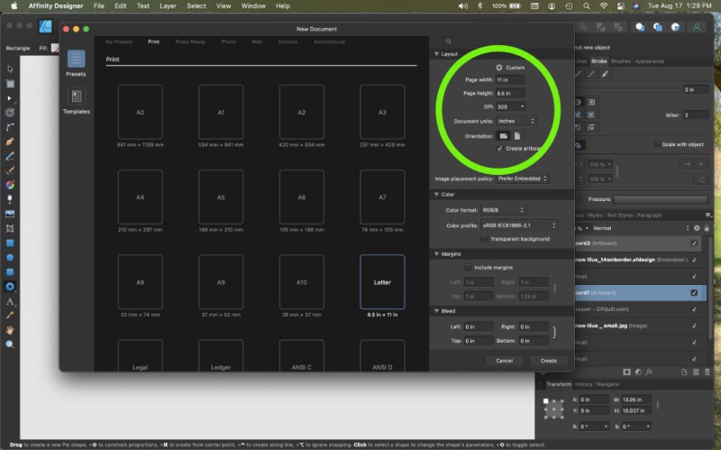
- Start the program. Open an artboard. If that already feels like a foreign language, an artboard is basically just a big scratch pad. I can open multiple artboards in one file and save them all under one name. So I can have a scratchpad for rotary cutter, a scratchpad for a quilt block, etc.
- Open Affinity Designer, click on “New.” A screen will show up with lots of sizes to choose from. I usually go with 9 x 11 as I can always resize it, but it fits on my laptop screen neatly. I choose “inches” not pixels from the set-up screen and I like mine sideways, so I click on Landscape. Don’t forget to click “Create Artboard.”
3. And then I realized I would be writing a book, so instead, I made a video.

And then I uploaded the video to YouTube, where you can watch it. (And I do not know why the full-screen version is blurry. Working on that.)
It runs about six minutes, if you have that much time. Of course, it took me three Google searches to figure out how to record from screen (pretty nifty, once you learn it), then I uploaded into iMovie so I could cut off the end where I keep saying, “How do I stop recording this?” over and over all the while critiquing my voice. I then uploaded titles on the front and back and even a little Title Card saying Thank You For Watching. Yes, sirree. I’m a rank amateur trying to act professional.
But there you go. Obviously I should have majored in graphic design in college, but that was some years ago when it was Photoshop Version 1.0. (Now, I’ve left Adobe behind and moved over to Affinity where there are NO monthly subscription fees. I’m just saying.)

I’m most excited about how Affinity Designer now has a gazadget that will let me automatically draw quarter-inch seam allowances around any shape I make (called a Contour Tool). So, so happy with this!
Happy Drawing! Happy Quilting!