Mini-quilt

Mad for Solids 2018…Voting Time!

March Madness 2018 FB Header

Basic RGB

Today is the day!  I’m over there on the right in Game 6, paired with the ever-lovely Rene.

Northern Lights_circular

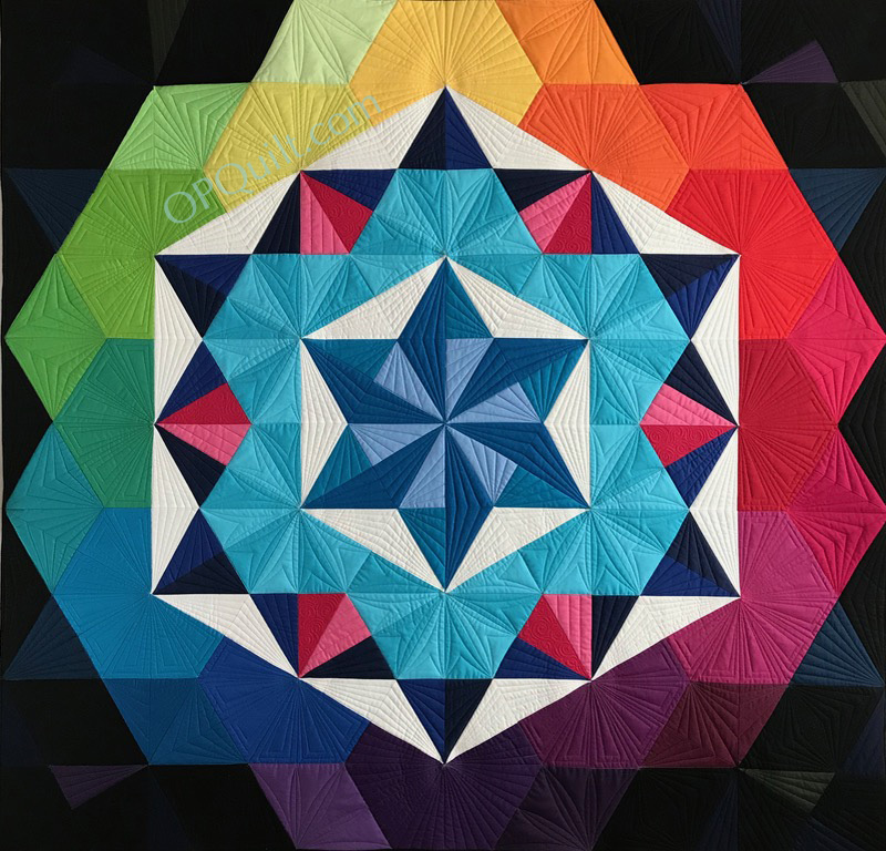
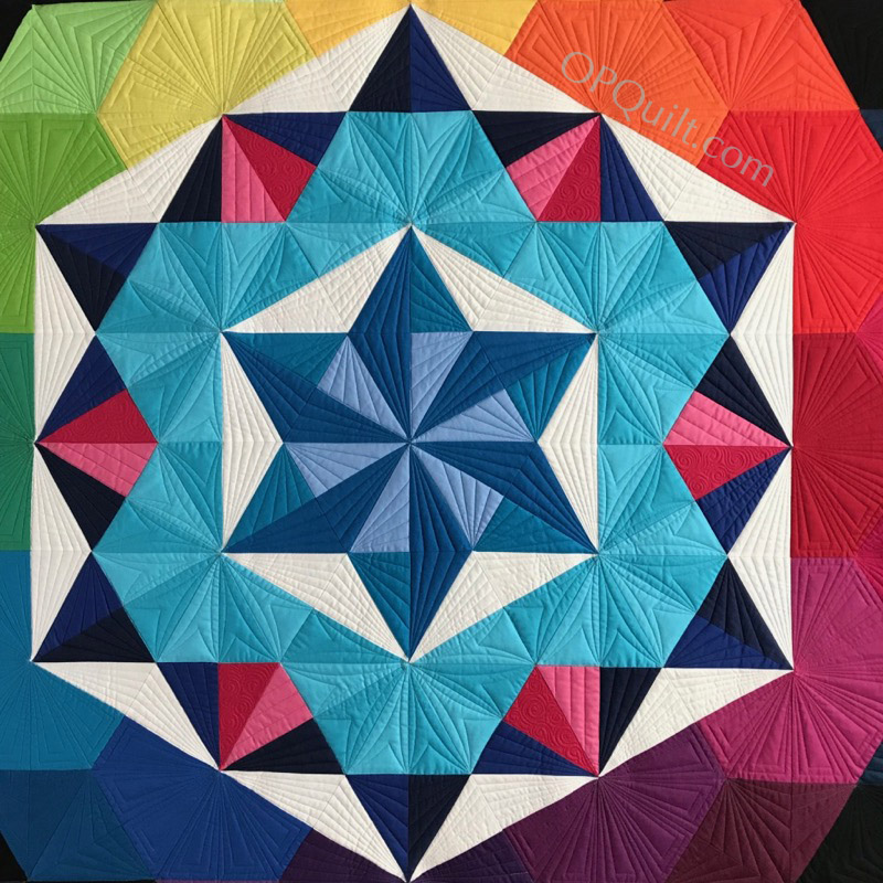
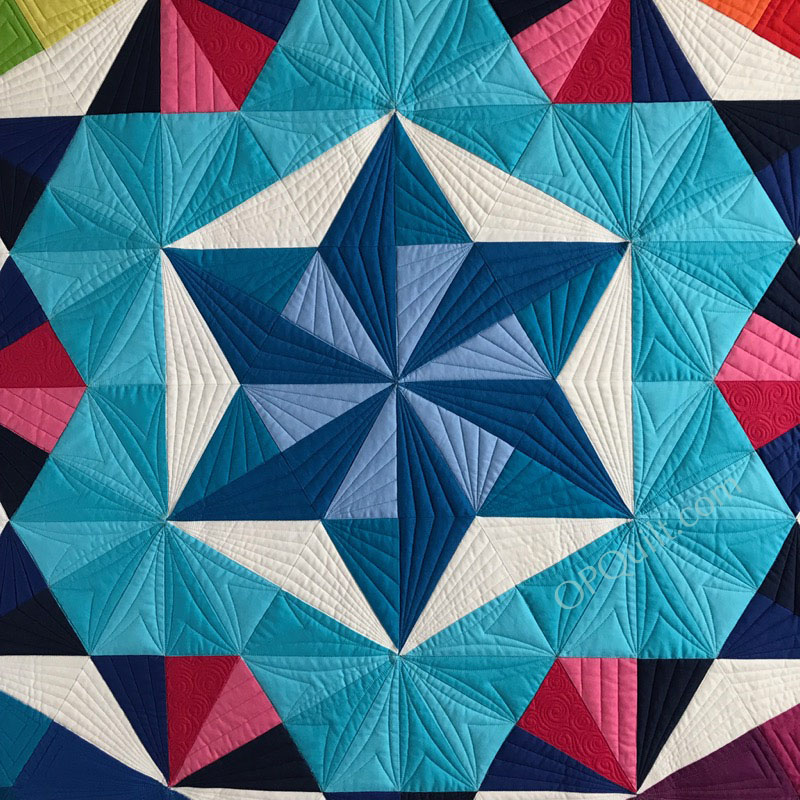
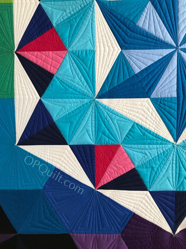
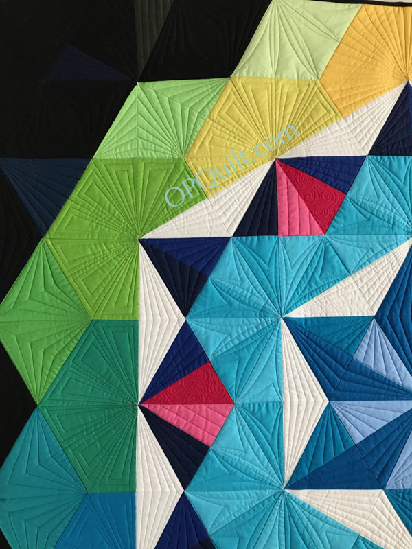
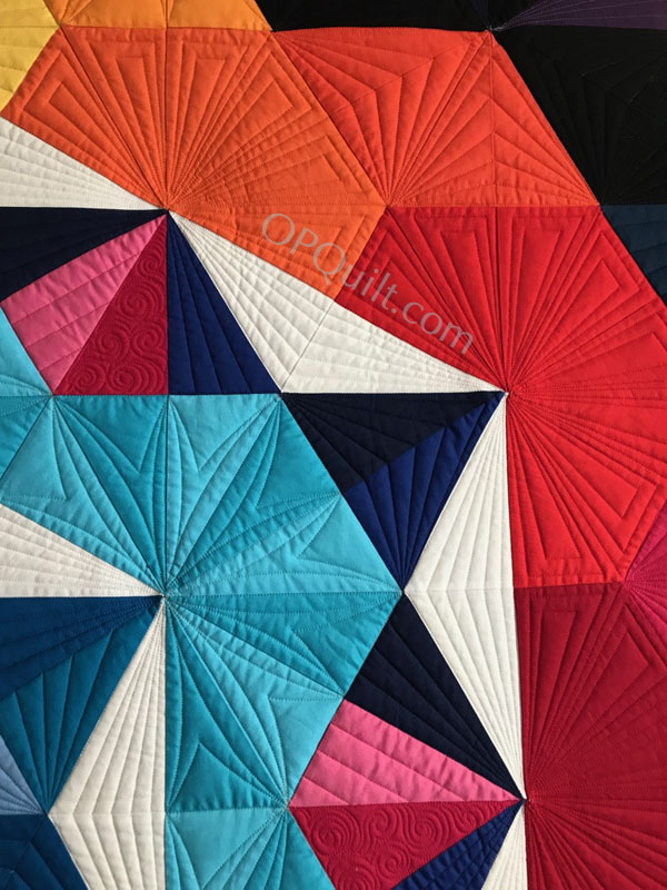
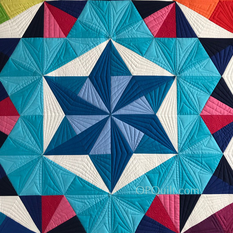
The name of my Painter’s Palette Solids bundle is Northern Lights.  Because why?  Because I’ve always wanted to see the Northern Lights, and because we watched a movie about surfing in Iceland, and well, because:

Northern Lights_pix

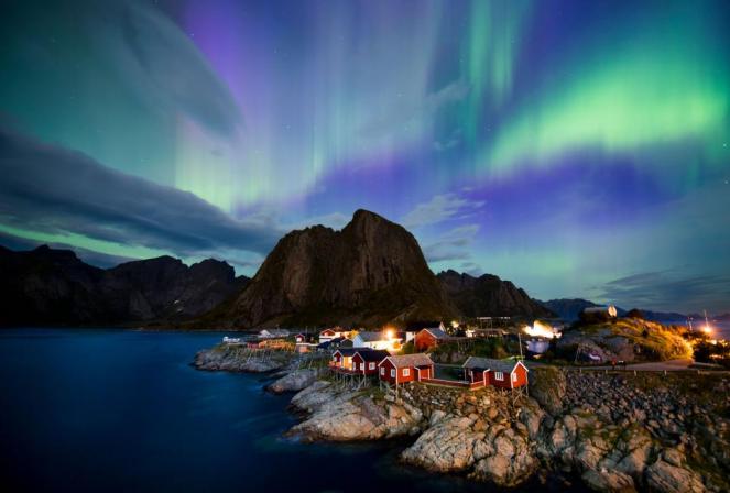
So, if you like the colors of the heavens in the photo above, and feel like you want to vote to send me to the next bracket, head here:

•  Paintbrush Studios Blog
•  Paintbrush Studios on Instagram
•  Paintbrush Studios on Facebook

Voting begins at 6 p.m. CDT [Central Daylight Time, or UTC -5] on March 23rd (today) and goes through to tomorrow at 6 p.m. CDT.  I’ve timed this post to hit a bit early in the day, so please wait until the Paintbrush Studio posts go live to place your vote.

March Madness 2018 FB Header

You Can Be A Winner

More information on how you can be a winner is on found on a previous post. So here’s my story about this fabric and why you’re going to want some.  I was at Guild on Tuesday night.  In Show and Share, I showed my Improv Appliqué quilt that I’d demo-ed at QuiltCon.  My seat mate, Angie, commented that the borders “were like black velvet,” so rich and saturated was the color.  And that’s how everyone reacts when seeing these fabrics.

I participate in these little contests for one reason only: I love these solids and want them to be everywhere, on everyone’s stash and retail shelves.  Come and join us in using Painter’s Palette Solids!

Northern Lights_horizontal


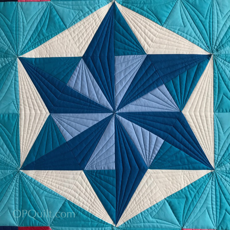
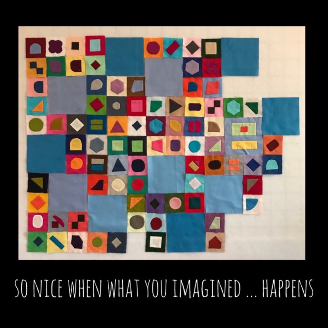
I’ve been playing around in QuiltPro and making blocks with these colors.  If I head to the next bracket, I’ll have a mini quilt to show.  So, thanks!

PBStudios Mad for Solids.jpg

Giveaway

March Madness 2018

March Madness 2018 FB HeaderMM Bracket 2018-round 1.jpg

For the last couple of years, the fine people at Paintbrush Studios have hosted a Mad for Solids Competition, where quilters create a stack of colors, give them a name & describe their inspiration, and they go up against each other.  (Why should basketball fans have all the fun?  Quilters need some play time, too!)

Above is the bracket where many beautiful colors of Painter’s Palette Solid fabrics will vie to reach the championship match-up.  The first “game” is already up online, and it features two different stacks of fabrics (seen below).  I hope you’ll take time to vote for your favorite each day.

Here are the links:

•  Paintbrush Studios Blog: Introductory Post, where you can see all the 16 bundles and read about each quilter and their inspiration
•  Paintbrush Studios on Instagram
•  Paintbrush Studios on Facebook

You Can Be A Winner

You can also win free fabric by voting.  They will randomly select four voters from the championship game to win fat quarter bundles of the winning palette.  To make sure your favorite bundle is the winner, vote for the one you like best to get it to the championship game.

My game day is this Friday, March 23rd.

Please sure to check back here for info on how you can vote for me, and to see why I chose the grouping that I did.

But for today, head over to Paintbrush Studios to start your voting with two beautiful different stacks.  You’ll only have one day to get your vote in, a 24-hour period from 6 p.m. on the day announced, when a new round will take its place.

March Madness18 Game 1 stacks.png

Have fun!!

200 Quilts · Creating · Quilt Patterns · quiltcon · Quilts

Annularity II

Annularity1PBStudios

This is the story of the design of my quilt Annularity.  It is also the story of Annularity II, which will hang at QuiltCon in Paintbrush Studios Booth.


Annularity II
Quilt Number 194
Designed and Pieced by Elizabeth Eastmond
Quilted by Natalia Bonner
59″ square

The story of this begins when I was contacted by the fine people at Paintbrush Studios, who make the ever-lovely Painter’s Palette Solids.  I submitted one design for review, time passed, things changed; I thought the process was dead in the water.

AnnularityDesign_1fabrics

But I had all these lovely fabrics, so we started the process again.

Annularity Fail

I played around in QuiltPro, my favorite quilt design program and came up with the above design messes.

annularityfailalmost

I showed them to Simone, seeking advice, and she said, “Don’t forget the white.”  Negative space is critical, but sometimes you get in the weeds of a thing and you can’t see your way clear.

Given that the Great American Eclipse was on my mind, I started calling my quilt Annularity:

Screen Shot 2018-01-05 at 11.11.41 AM.png

I began building the quilt top, remembering the white.  But when I got to the outer edges, something still wasn’t right.  A designer can do all the designing they want to, but then the fabric takes over and slowly, the outer edges morphed from the planned design to what you see at the very top.  Then there was the problem of the center.

AnnularityOPQuilt Centers

I tried lots of combinations: yellow, aqua, violet, maroon but finally finished with periwinkle, one of my favorite colors in the Painter’s Palette Solids line-up.  I finished it and when Paintbrush Studios told me that Natalia Bonner was going to quilt it, I was over the moon, because I quite admire her work.  I bundled up the quilt, sent it off, and then waited.  And waited.  And waited.  And I began to wonder, even though I’d tracked it to her address, if it had gotten lost.  I worried, then did the next best thing:

My Annularity

I made another.

In the rush, I didn’t have all the correct fabrics, so some are pieced.  But then I heard from Natalia that she had the quilt.  Whew!  Since it’s going to be hanging in the booth at QuiltCon 2018 in Pasadena, I gave the first one a new name, since now there were two in the world: Annularity II.

Pineapple Fabrics has the complete line of colors needed to make this design, and you can soon buy the quilt pattern from them.  Come and see Annularity II in the Paintbrush Studios booth, #905.

But I’ll be quilting mine, Annularity, bit by bit, sharing that experience as I proceed.  In the meantime, enjoy the photos of Natalia’s fine work:

SaveSave

200 Quilts · quiltcon

Cinque Terra Tiles • Improv Applique (Part 1)

Cinque Terra Tiles_Italy1

The kind folk at Paintbrush Studios asked me (some time ago) to give a demo at QuiltCon 2018.  I set to wondering what I could teach in a short amount of time (20-30 minutes) that would be interesting. Shortly after they asked me, I visited Cinque Terra, Italy, and stood on a plaza in Riomaggiore, overlooking the sea (above).

Cinque Terra Tiles_Italy2

We walked down the steps, and underneath the plaza was a passageway, the walls decorated with these tiles in all sizes. It was on the way to Via dell’amore (the Walk of Love).

Cinque Terra Tiles_Italy3

When I returned home and started looking at my photos, I thought about all those mini charm packs we pick up everywhere, and how they could become something along the lines of this impromptu artwork in Riomaggiore.  Cinque Terra Tiles1_1

So I got out my mini-charm pack from Paintbrush Studio Solids and started pairing up the colors, trying to make the duo sing together–have a little friction together–trying to get pairs that would play against each other.

Cinque Terra Tiles1_1a

I found a worksheet online that had a whole bunch of oddball shapes, and I began trying some.

Cinque Terra Tiles1_1b

I sent away for more mini-charm packs.  Once I got started, I kept wanting to make more.

Cinque Terra Tiles1_2

And more.

Cinque Terra Tiles1_3Cinque Terra Tiles1_3aCinque Terra Tiles1_3b

I carried around a little baggie of paired squares, and did them while watching TV, getting my hair colored and while in Urgent Care one bad flu season.

Cinque Terra Tiles1_3cCinque Terra Tiles1_4Cinque Terra Tiles1_4aCinque Terra Tiles1_4b

I loved watching my collection grow.  I would do one shape for a while, then another.  I used up bits and pieces of squares.  I even tried some paper-piece-wrapped hexagons; I ended up not liking them so much because the charm of these squares was in their wobbliness, their wonkiness.

And then one day, I put them up on the wall with other, larger, squares–just like the Walk of Love passageway in Italy.  And wouldn’t you know it–it was really looking fun.Cinque Terra Tiles1_5

I wasn’t finished, but what I hoped would happen, did.  I took this photo and put it up on Instagram, using the SnapSeed app to expand the edges and add the text.

Next post: the finish and the details about my demos at QuiltCon.