Quilts

Deconstruction of Ted and Maurice at Lorinc Pap Ter, an Art Quilt

On the Bench at the Park

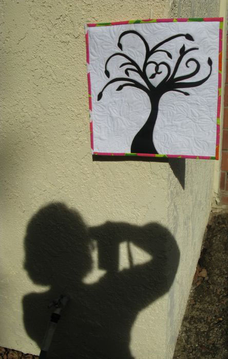
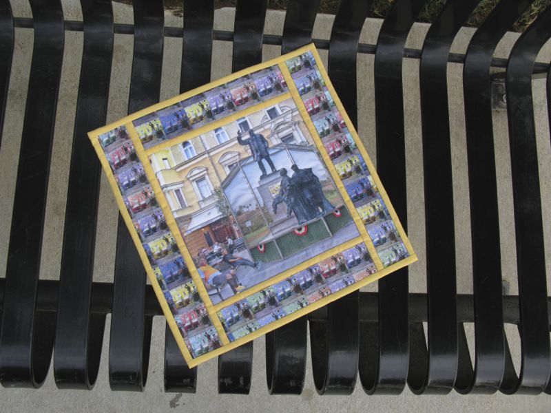
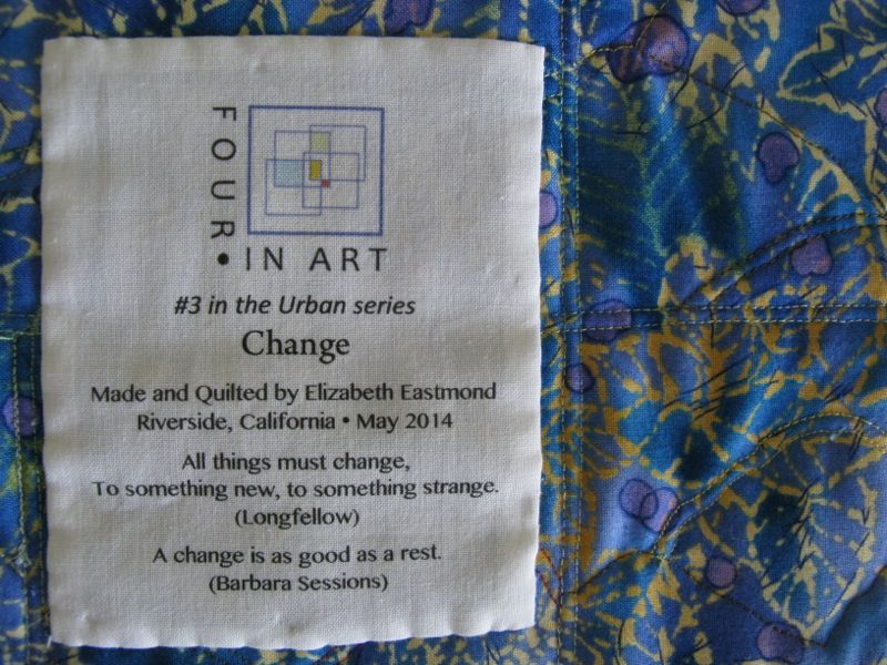
This post is a deconstruction of the techniques I used to create Ted and Maurice at Lorinc Pap Ter, a small (12″ square) art quilt for the Four-in-Art Quilt group.  Our challenge this quarter was Contrast, under the overall yearly theme of Urban.  Often an idea will come to me, but sometimes I start with the technique.  I knew I wanted to drag out those bottles of Bubble Jet Set and Bubble Jet Rinse that I’d ordered some time ago, and find out if this whole process was difficult or easy.  It was easy.

Bubble Jet Set is a type of mordant that binds to your fabric and allows the ink from your inkjet printer to adhere more easily.  I’ve printed on fabric for years, but haven’t ever prepared the fabrics.  I first started by reading a lot of blog posts, and I’ll post the links at the end.  The one website that described the process best was Caryl Bryer Fallert-Gentry’s (Bryerpatch.com), and I followed her instructions.

Bubble Jet Set

I bought a shallow plastic container at Target, about 4 inches deep with a latch-type lid, as I wanted to store the prepared fabric in there afterwards.  I cut my fabric about 9 inches by 12 inches, grabbed the container and the Bubble Jet Set (I only needed that one at this time) and went down to the kitchen sink.  I put on dishwashing gloves, as suggested, then laid the first piece of fabric in the bottom of the container.  I sparingly glopped some BubbleJet Set (BJS) onto the fabric, smoothing it out until it was thoroughly moistened.  I placed a dry piece of fabric on top of that, again, smoothing until it looked like it had picked up most of the excess BJS, then glopped a little more.  I’m being quite stingy with the BJS, actually, but do want to make sure that the fabric is sufficiently soaked.  I repeated this until all four sheets were saturated.

Prepared Fabric DryingI lay down some towels underneath my improvised clothesline in the garage (some say you can put containers to catch the extra drips, but I didn’t have that much excess) and hung up my sheets of fabric until dry.  In our summer heat, it only took about an hour.  Meanwhile, I washed and thoroughly dried my container, and when the fabric was dry, put them in the container until I could get to them.  I read one blog where the crafter cautioned about letting too much time pass between treatment and printing. I had a space of about 4 days, and that was fine.

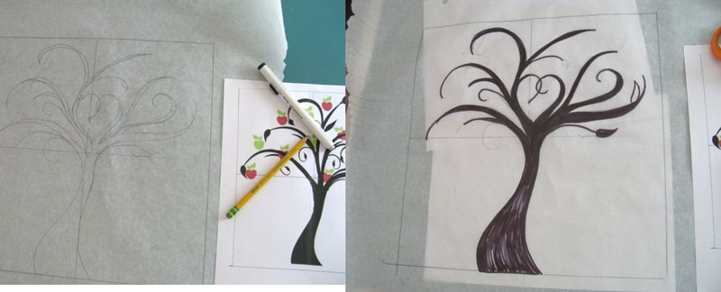
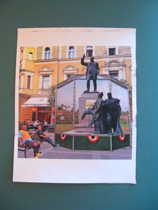
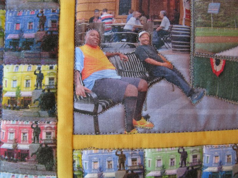
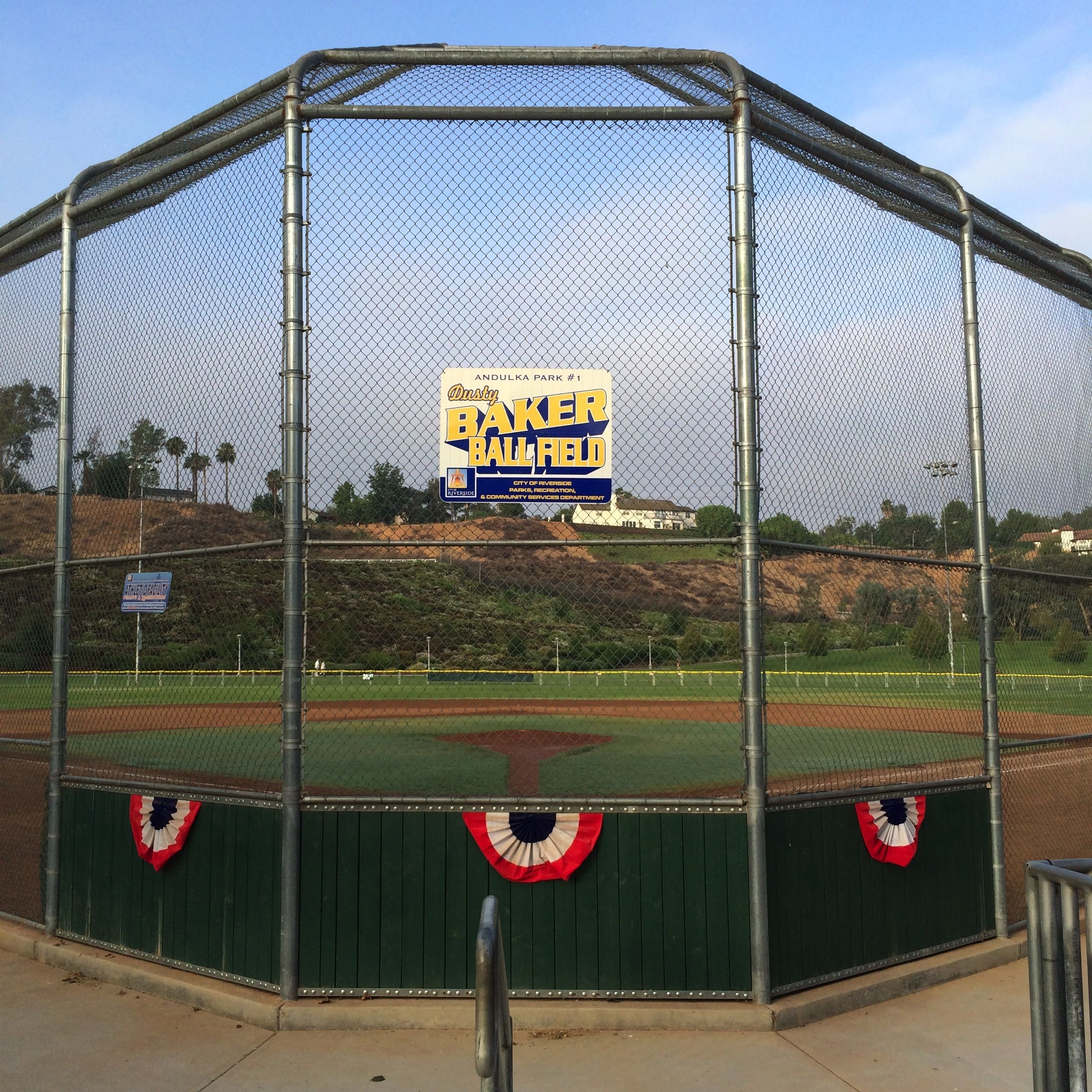
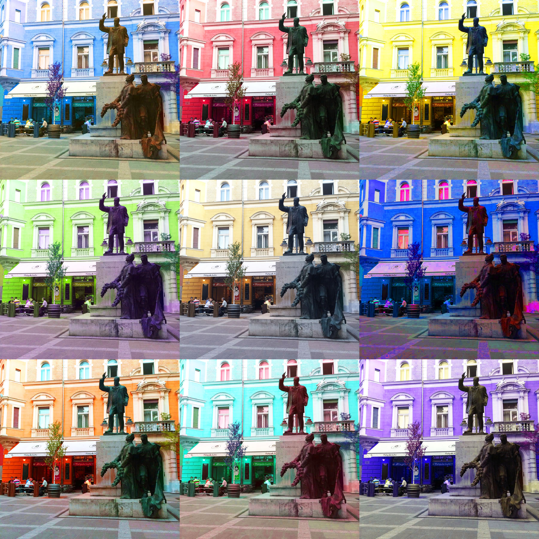
In yesterday’s post, I talked about how I created my art conceptually, but what I did technically was begin with a good photo of the square in Budapest.  I overlaid the baseball backstop photo, sized it, then took it down to 20% transparency, and used the Eraser tool to start erasing a space to let the statuary shine through.  I could have created a Path and selected it, but sometimes I think the Erase Tool does just fine.  I did change out the size of brush I was using, from 1 pixel in some places to 75 pixels in other places.  I did the same with Ted and Maurice, first flipping them around so they faced the other way, as that’s where I had some space to put them.  I merged the layers, as I know from experience that when printing on fabric, it’s wise to pump up the Saturation of colors (enhancing the image without making it garish), and to Lighten/Brighten the entire image.

Four Squares of 9Patch

For the border pieces, I sized each combination of colors to four inches, then pasted them into one document so I could print all the colors at once, first flattening, then then increasing the Contrast/Saturation and then adjusting the darkness through the Lighten/Brighten menu.

Trimming Fabric

When I was ready to print, I backed the prepared fabric in freezer paper, ironing it thoroughly but using NO steam at all — I wanted the freezer paper to really bond with the fabric.  I trimmed it to exactly 8 1/2″ by 11″ inches, and used a High Quality photo setting to print.

Image Printed on Cloth 4-in-art_1

It worked like a charm!  I let it set for the recommended 30 minutes then peeled off the freezer paper.  I let it set some more to let it thoroughly dry–a caution I read on many blogs.

Bubble Jet Set Rinsing

I put four capfuls of Bubble Jet Set Rinse in my container, then added about a gallon of water (about 3 inches) and set the first printed sheet in the water.  I kept it agitating the whole time of two minutes, as you see above.  I held up the sheet to let it drain and in the other sink, I rinsed the sheet well and laid it out on towels that I had set on the counter.  I did the same process with all the other prints, agitating them (apparently to keep the dye from the printing to re-settle back onto the fabric — they cautioned several times to keep it flat, and to not let it crease!).

Leftover Rinse Water

This was the color of the rinse water after I did all four sheets.  The Bubble Jet Set Rinse is a mild detergent formulated to remove excess dye.  In my reading, many said that Synthrapol would work also, but I had this so I used it.

Blotting Printed Sheets

I blotted the sheets gently, pressing out the excess moisture.  I did not wring or crumple the printed fabrics at all, working to keep them flat.

Sheet to Dry in Garage

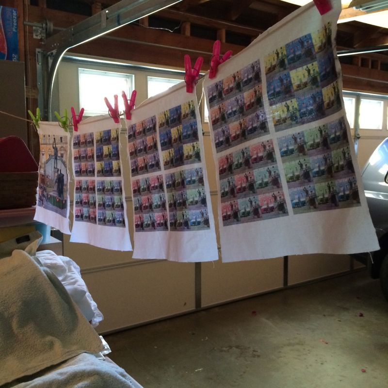
I hung them in the garage again to let them dry, again taking only a short time.  I was pretty happy with the results.  The colors were vibrant and the fabric was soft and I knew it was washable, although there are cautions about what type of detergent you use.  I never wash my art quilts so it wasn’t a concern, but if you plan on doing so, here are some good websites with information on their experience with using BJS:

http://vickiwelsh.typepad.com/field_trips_in_fiber/2009/04/bubble-jet-rinse-whats-the-point.html

http://quiltbug.com/articles/bubble-jet-set.htm

http://www.bryerpatch.com/faq/bjs_q&a_page.htm

http://www.cjenkinscompany.com/Frequently_Asked_Questions_s/25.htm

The C J Jenkins Company manufactures the Bubble Jet Set, and I thought their page on printers was helpful, although I swear by my EPSON with their Archival Inks.

First Layout of Printed Sheets

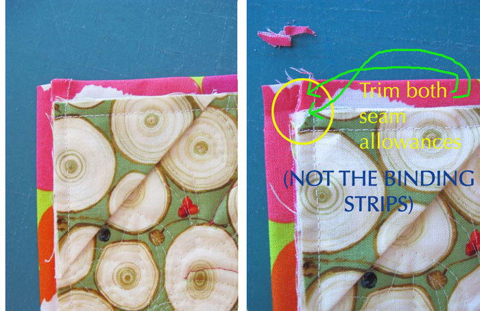
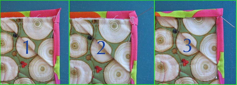
After this, the construction was pretty straight forward, although I had to do some cutting and stitching to get the dimensions correct around the central image.

Sashing Printed Sheeets

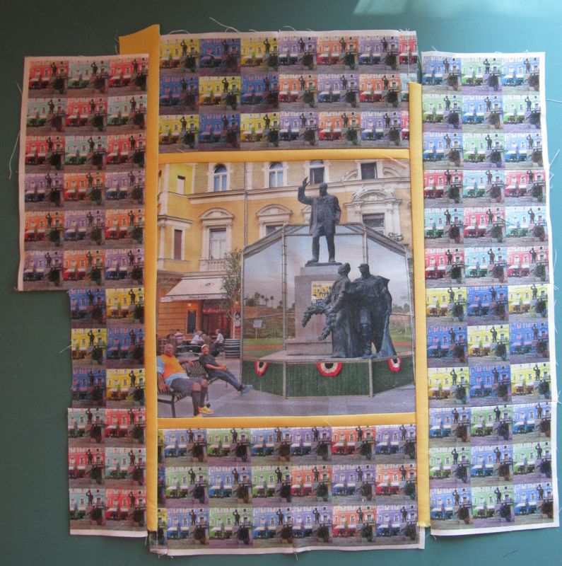
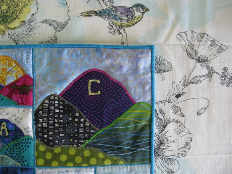
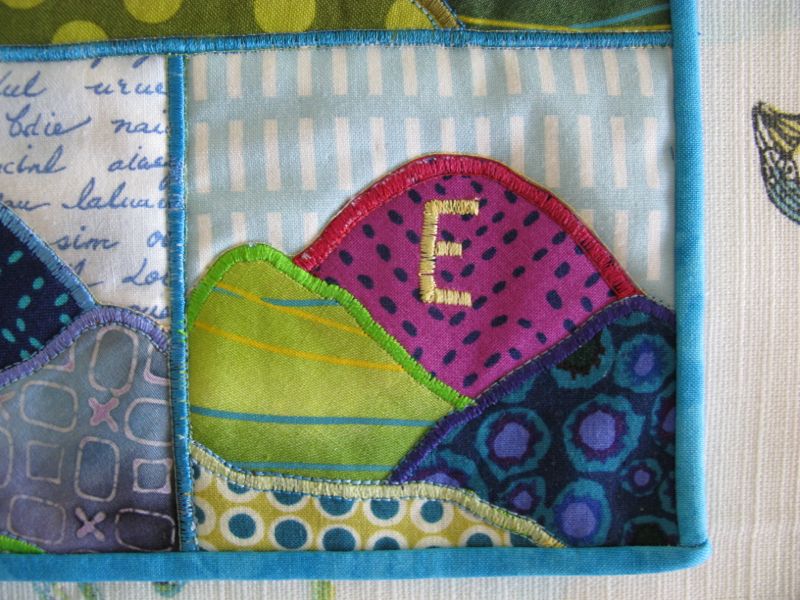
I sashed the central image because I felt it might get lost in the tiny square borders.

Quilted 4-in-art_Aug2014

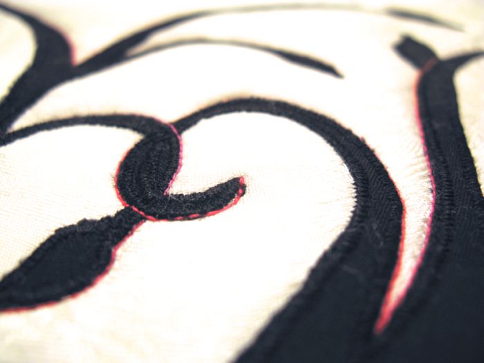
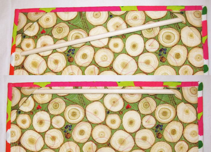
I quilted it, using matching threads (mostly lots and lots of gray).  Detail below.  I didn’t want to “over-quilt” this, but did want to emphasize the various elements.

Lorinc Pap Ter_detail front

Lorinc Pap Ter_front

And that’s it!  I’m pretty happy with how the BJS and BJR turned out, and glad that I had this little art quilt to nudge me into trying that preparing-fabric technique.

Circles EPP Button

Next up? The third block in my Circles English Paper Piecing Sew-Along.  I’ve remade this thing twice, so I’m ready to put it up and move on to the next block.  See the above tab if you haven’t started yet.

˚˚˚˚˚˚˚˚˚˚˚˚˚˚˚˚˚˚˚˚˚˚˚˚˚˚˚˚˚˚˚˚˚˚˚˚˚˚

My blogging software places ads here so I can use this site for free.  I do not control the content of these ads.

Quilts

Ted and Maurice at Lorinc Pap Ter, a Four-in-Art Quilt, August 2014

4-in-art_3

Lorinc Pap Ter_front

Ted and Maurice at Lorinc Pap Ter

No. 4 in the Urban Series

small plaza

It all started here, in a small square in Budapest right outside our hotel, on a recent overseas trip.  We walked through it several times a day, enjoyed a lovely dinner at the Matryoshka Bistro in the background, sat and ate ice cream on a bench the night before we left.  “Why don’t we have small squares like this?” I wondered outloud to my husband.  “A place where you can get an ice cream and enjoy the evening, and see your neighbors?” for several people had greeted each other as they walked through.  Another group gathered at the pub (just out of sight) for an end-of-the-day gab session.

Baker Ballfield Backstop

Then the next week, trying to recover from an extended case of jet lag, I went walking at our local park — part walking path, part baseball fields, part tennis courts, with lots of benches.

Ted and Maurice

I chatted with Ted and Maurice, two regulars that we see walking in the morning.

Other Regulars at the Park

And these three men who walk together, who do have names, but who I refer to as The Retired Guys.

Ball players

And on Saturday mornings I see the Little Leaguers warming up to play their early morning games.  It was after talking to Ted and Maurice one morning (both retired) that I realized that while my “square” is a contrast to that sweet little Lorinc Pap Ter in Budapest (“ter” means “square” in Hungarian), it is also fundamentally the same.  Of course, I want to go back to Budapest yesterday, but I’m content to notice the contrasts and take what I have.

Some of the obvious contrasts are the commercial enterprises: we work really hard to separate them in the United States, but interestingly more and more shopping centers are trying to recreate that “square” feel, setting out benches, have shaded trees to sit by, and playgrounds for tired children and their shopping parents.  Another obvious contrast is the size, and the purpose.  I think that Lorinc Pap Ter was meant to pay homage to Count Zichy (who is atop the statue, being honored by The Common Man, and The Neighborhood Priest, for the church is right behind me in the photo) and while the park where I walk in the morning is named for a local land donor, there isn’t a bit of statuary in sight.

small plaza+multicolor

I first thought of contrasting the differences felt in times of day, how many people were there, and certainly the colors do provide some visual interest, but I felt it was really a cliche, and didn’t point up the contrast like I wanted to.  So I got the idea to merge the two parks and some of the people, overlaying the backstop and adding Ted and Maurice. It’s a jolt to see a Little League backstop in a Budapest city square, and certainly most ballparks don’t have statues holding laurel wreaths.  By mashing them together it pointed out the contrasts in a quick sort of shorthand.

Walkers at Park

I felt like I’d lucked out to get a photo with the tricolor bunting on the backstop (it’s gone now).  I now was much happier with the outcome, and didn’t let the colorful square of squares go to waste: I shrunk them down and used them for the border.

Ted and Maurice and Quilt

And to end it off, here’s Ted and Maurice, holding my quilt.  They were thrilled to be honored that way, and told me about more regulars (they get there earlier than I do).  Ted took photos of my creation having never seen something like this, and we all laughed and joked around, especially as The Retired Guys came loping around to join us.  All we needed was some ice cream.

Tiny Nine-Patch

Please take time to visit the other Four-in-Arters, who have also put up their Challenge Quilts today:

Amanda  at whatthebobbin.com
Betty at a Flickr site: http://www.flickr.com
Elizabeth at opquilt.com (you are here)
Leanne at shecanquilt.ca
Tiny Nine-Patch
And come back for the next post, with instructions on how you can make your own little art quilt, including the use of Bubble Jet Set!
˚˚˚˚˚˚˚˚˚˚˚˚˚˚˚˚˚˚˚˚˚˚˚˚˚˚˚˚˚˚˚˚˚˚˚˚˚˚˚˚˚˚˚˚˚˚˚˚˚˚
My blogging software places ads here so I can use this site for free.  I do not control the content of these ads.
Quilts

Change, a Four-in-Art Quilt

Change Art Quilt_front(2)

Change
#3 in the Urban Series, Landmark Quarterly Challenge
Quilt #131

Y Mountain Provo(Y Mountain.  Photo courtesy of Judy Cannon)

This is the landmark I grew up with, a letter on a mountain in Provo, Utah.  Known as the “Y,” there are annual hikes, and a lighting of the letter on Homecoming.   I thought everyone had a mountain with a letter on it, but as I grew up and moved around, I found out that most of the world, and certainly the East Coast of the US, doesn’t.  Since I chose this idea for my landmark, I found there’s a whole Wikipedia page about these hillside letters.  Also known as “mountain monograms,” as one professor wrote in an article about the origins and the spread of these letters, I discovered that University of California-Berkeley was the first. And here’s a map of these letter landmarks, mostly in the mountain west.  (Maybe because we have mountains?)

529px-Mountainmonograms

RS Mountain with Town

The movie Cars even used hillside letters on the mountain above Radiator Springs, the fictional small town in the movie.  The RS is just to the right of the stoplight.  (Sorry for the weird image, but I had to take a photo of my computer to get this shot.)  The mountain from another view:

RS Mountain

Columbia University in New York does have a “C” painted just above their boathouse on the Hudson River:

NYC_Hudson_Bridge_C_rock

Yet most people think of this when I say hillside letters. . .

800px-Aerial_Hollywood_Sign

. . . but to me, neither of those counts.  A letter needs to be embedded on a hillside or a mountain to count as a landmark.  So that was the genesis of the quilt.

BigC_Box_Springs_Mountain

Our landmark hillside letter is a C, an imitation of that first University of California-Berkeley letter, which was set onto a hillside about 1905, the granddaddy of all the other mountain monograms.  This is a blurry image from Wikipedia of our local mountain (our letter isn’t really yellow).  I tried to photograph it, but couldn’t get a good vantage point, so this will have to do.

Change Art Quilt_Big C block

Here’s my little art quilt with its C on its mountain.  (Note: although I like to photograph outside, today we are having raging Santa Ana winds, so inside it is.)

Change Art Quilt_E block

What is the significance of these other letters, spelling out the word C-H-A-N-G-E?

Change Art Quilt_label detail

As Longfellow observed, “all things must change.”  And I keep my mother’s advice that “A change is as good as a rest” close to my heart, for that’s a truth as well.  But the C-for-Change  linkage came to me one weary night, when I had to go and do one more pick-up and one more errand when teenaged children were still at home.  It must have been during our University’s Homecoming Week, for when I rounded the street corner at the base of the Box Springs mountain, I could see the “C” all lit up. I pulled over and gazed at the glowing letter with that tired-behind-the-back-of-the-eyes fatigue, wishing that that I could go home and be home, like I could when the children were little and weren’t off at some activity that required me to be out and about picking them up.  I thought back to the “easy days” of tucking them in after a story and prayers and a drink, and about how wonderful those times were.  Why did things always have to change?

But I realized that change is the law of the universe, and instead of being at war with that constant mutability towards “something new, something strange” I should just accept it.  Change and I are now uneasy companions.  I know it won’t always be like that, for experience has taught me that change can come in steep cliffside drop-offs and hair-raising turns on a winding road.  But for now, I’ll be content gazing at my quilt where it hangs in the corner of my kitchen.

Change Art Quilt_on wall

4-in-art_3button Please visit the rest of our Four-in-Art group, and see how they’ve interpreted the Landmark Challenge:

Amanda  at whatthebobbin.com
Betty at a Flickr site: http://www.flickr.com/photos/toot2
Elizabeth at opquilt.com (you are here)
Leanne at shecanquilt.ca
Tiny Nine-Patch
And come back for the next post, with instructions on how you can make your own little art quilt.
Change Art Quilt_back
200 Quilts · Four-in-Art · Quilts

One Black Leaf, deconstructed

One Black Leaf art quilt1

Inspired by Betty’s photos, I took One Black Leaf outside to be photographed by her sister trees, because of course, with those curves, it’s evident this quilt is feminine.

OneBlackLeaf back

And just like Betty and Rachel’s quilts share a commonality, this one too shares something with Betty’s–we both used the Martha Negley slices of wood print; Betty’s was in the blue colorway and on the front, and mine’s the green on the back.  The binding is from that half-yard of Marimekko I purchased while in New York City last summer with my husband.  So far it’s been in two projects and I still have a scrap or two more.  This post is picture heavy, as I’m talking about the approach I took to creating One Black Leaf, including technical aspects, false starts and home runs.

One Black Leaf 1

So the poem is ringing in my head: one black leaf, one black leaf so I know it has to be a tree with bare branches.  I start by ripping off a piece of paper from the roll of doctor’s examining room paper I got a while back.  It’s great paper — it holds up to erasing, and is thin, flexible and cheap.  Try a medical supply house for yours.  I draw a 12-inch square because that’s one of our group’s parameters, and like what we did in high school art class, I draw a grid both on my square and on the illustration I found that I want to mimic.

One Black Leaf 2

I draw as best I can (not my strong suit), using the grid to guide me, yet I kept thinking of the espaliered tree I’d seen on the web (last post) and even though death comes around for us all, at the heart of it, I know that love survives even mortality.  I color it in with black marker.  Because I’m working on thin paper, I protect my cutting mat with scrap pieces of white paper so no bleed-through. I flip it over and color it in on the back, too, because I want to fuse this onto my fabric and know it has to be backwards.

One Black Leaf 3

I lay the Steam A Seam down, figuring out which of the papers should be taken off first completely ignoring their instructions to determine which is the pressing paper and which paper is to come off first.  I got lucky.  Reminder to fuse the whole design down onto the black fabric before you start cutting.  (Of course I did that.  Not.)  Sigh.  I fused the design to the Steam A Seam, then started cutting it, before I remembered you aren’t supposed to do that.  So I stopped, laid out the traced design on the Steam A Seam onto the black fabric, THEN cut it out.

One Black Leaf 4 fail

I had some problems.  Turns out (after a quick search on the web) that Steam A Seam “wears out” or loses its ability to adhere after it has been in your drawer for a while.  Since I know this batch is at least 10 years old, I’m in a world of hurt.  Who wants to cut out those teensy branches again?  So I call the Quilt Rescue squad. . .

One Black Leaf 5 rescue

. . . and first try placing the paper release sheet from the other part of the Steam a Seam and pressing it lightly to make it stick back on the teensy branches.  Worked okay, but there were still some spots that needed some help.  Then I remembered that once, in a class with Elinor Peace Bailey, she used a plain old glue stick to put things in place, giving it a press to disperse the glue.  I did this.  I had a few problems getting the tree back into place, so I laid my white fabric down onto my design, and arranged the branches until they matched the original design.  And by the way, it took me longer to describe all of this than it did to do it.

Your takeaways from this section:

1. Read the directions.
2. If your Steam A Seam is older, first fuse it back onto their release paper with a warm iron and light touch. And from now on, store it in a plastic bag.
3. Use your design paper to help you get the arrangement into place.
4. Use a glue stick if you still need some sticking down.  Press with a warm iron to disperse the glue.

I decided the block needed a bit more stability, so I ironed on some lightweight interfacing on the back of the entire piece (I did this also for the last art quilt I made, as I had seen it mentioned time and again in the Twelve by Twelve book. If you don’t have this book, you should.)  Then I set my zig-zag stitch for a narrow satin stitch, then went all around my tree in black thread.  I referred to my Jane Sassaman book where she talks about if you have it really close, it frames it, and if you have the zig-zags slightly loose, it blends more.  I was somewhere in the middle.

IMG_6211

She also cautioned the quilter to “take it slowly” and to take our time when doing stitching.  I need to have that tattooed on my forehead. I think if my Steam A Seam had been fresh, and I had been more careful about getting it to stick, I may have averted some of those sticky-outy bits of fiber from the edges.  But because this tree is going every which way, I think some was inevitable.  Small scissors took off most of them.

IMG_6213

Jane Sassaman also outlines her pieces with heavy thread.  I decided to use green for the inside curves and pink for the outside curves. Here’s the pink.   There was a ton of tying off on the back (as I pulled all threads to the back, tied and buried them), but I like how it gave a little pop to the quilt. I used pinkish King Tut (from Superior Threads) and their Poly-Quilter in green, which I understand is being discontinued (but I still love it).  Use a size 16 topstitch needle which has a larger eye, go slowly and you should be fine.  I use their Bottom Line in my bobbin — it’s my personal recipe for quilting success — and used what was close in color as I occasionally I like to use what I have.

OneBlackLeaf detail1

(Another view, after the quilting was finished)

One Black Leaf 6

I had used some white fabric from one of my trips to Germany.  It has a heavy damask woven design of flowers and I didn’t want to completely obliterate it with the quilting.  I laid some wax deli sheets over the tree and using a Flair pen (it won’t go through the paper with its soft tip), I auditioned some quilting ideas.  I’m not a really fabulous FMQ (free motion quilter) but I can do some.  I decided on leaves.

One Black Leaf 7 stitch

I liked the idea that while the black leaves on the tree are for us, there are others that have gone before who are still around us.  I can’t bear the thought that we all just go “poof” at the end of life, and judging from the memorial quilts I see, others feel the same.  Of course, a lot of these ideas are informed by my personal spiritual/religious beliefs as well.  I went at the quilting–doesn’t take long if you are doing a small quilt (another reason why I like this size) and in no time I was done.  And yes, it kind of obliterated the design in the fabric.

One Black Leaf 8 trim

Next big hurdle, which you wouldn’t think would be a big deal, is to trim.  It’s really a decision on how to frame it.  That blotch in the lower right-hand corner of the untrimmed piece?  Where I tried out my zig-zag stitches and also left a burn mark with my iron.  Luckily it was cut off.

One Black Leaf 9 corners

I have a method for hanging these small quilts which involves a dowel (photo at the end) but I have to put in corners to hold the dowel.  That square is about 2 1/2″ in dimension; fold it in half and pin it to the upper right and left corners.

One Black Leaf 10 binding1

My standard small-quilt binding: 2″ strips, folded in half, sewn to the upper and lower edges.  Trim even with the edges and press out away from the quilt.

One Black Leaf 11 binding 2

Repeat with sides, but be careful as you trim even with those sides. Press away from quilt.

One Black Leaf 12 trim

You’ll need to remove any bulk you can in a binding this tiny, so trim off a little of the corner and the bits of seam allowance as shown.  When I say not to cut anything off the binding strips, I mean the business part of the strips–the stuff you’ll need to fold over.  Just follow the diagram as I think my written description is confusing.

One Black Leaf 13 binding3

Then since my assistant left for the day, I had to use pins to hold things in place.  Fold in the sides (1), give a little push to the upper edge to fold in the bulk (2), then fold down the remaining strip (3).  If you go in this order, you’ll always enclose your raw edges.  If your raw edges are still showing after the folds, you’ve reversed it and folded in the top/bottom first.  You’re smart.  You’ll figure it out.

One Black Leaf 14

My friend Tracy taught me ages and ages ago that I didn’t need to pin or clip around the whole quilt, that I could just do the corners and fold in the rest as I stitch down the binding.  I do that even on my larger quilts.

dowel hanging device for art quilt

Cut a dowel the size of the back, minus a scoonch of room, then sand the cut edges.  Slip into place.  It will balance on a push pin nicely.

OneBlackLeaf quilting

OneBlackLeaf

Selfportrait OneBlackLeaf

Self-portrait
February 1, 2013