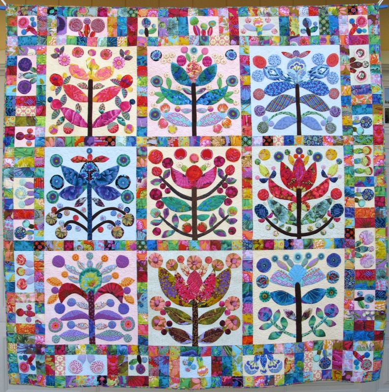
Elizabeth’s Lollypop Trees began May 2011 • finished April 2014
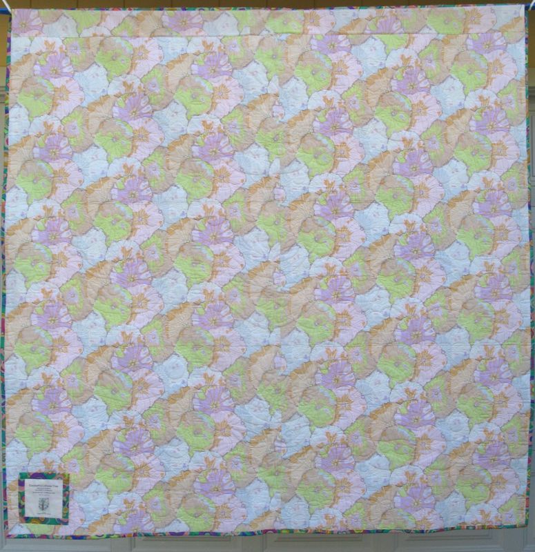
A Kaffee Fassett Lotus Blossom print for the back, and I am finally done. I know you’ve seen an overabundance of photos of this quilt, so this is just a simple, abbreviated post to say I’m finished. (Or should I say: I’m FINISHED!!!)
Some time ago, my granddaughter Keagan saw my blocks up on my design wall, and quietly made a picture for me of what she saw. (I think it’s the block in the lower righthand corner of the quilt.) I love it, so I put it on the label.
Quilt #132 on my 200 Quilts list
73″ square
˚˚˚˚˚˚˚˚˚˚˚˚˚˚˚˚˚˚˚˚˚˚˚˚˚˚˚˚˚˚
This blog software has an excellent search engine box. If you want to see details about this quilt, type “Lollypop Trees” in the search box to the right, and you’ll get more posts than you know what to do with. If you have specific questions, feel free to leave a comment and I’ll get back to you. Thank you to all who cheered me on and kept me going, in spite of days of wondering if I’d ever finish. It’s very satisfying to see that quilt, to run my fingers over the quilting, and to know that I did it.
That’s three finishes in two weeks. Now to grade research papers until my brains fall out and my fingers fall off.
But look! Only four more days of teaching in this semester!
Thursday, May 1st, was the reveal for our second series of Art Quilts. This year’s theme is Urban, and this quarter’s challenge was Landmark. And as is my usual, I do a post on how I put it together.
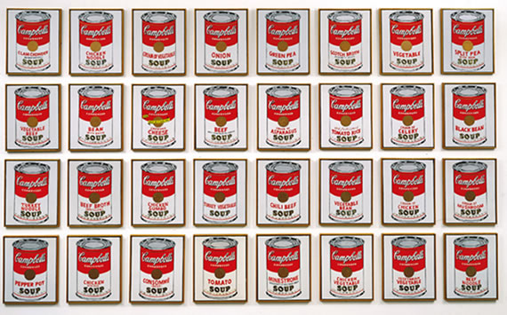
Marilyn Monroe, by Andy Warhol was the second step after making list of potential landmarks; I had chosen the hillside letters from a list of six ideas, but how to interpret the idea is always the next challenge. I liked the idea of Warhol’s repetition, and as a commenter on Reddit noted “Warhol does not give us one Marilyn; he gives us twenty-five. Perhaps he wants us to consider our obsession with celebrities, or to suggest that more is always better, especially in the case of a celebrity with an already ubiquitous image.” Okey-dokey. I think I just liked the different colorways, and the duplication. Here’s another famous one of his:
I thought about two different layouts: one like the Warhol’s Marilyn in a grid of three-over-three, or one where I’d displace some of the repetition with a larger image.
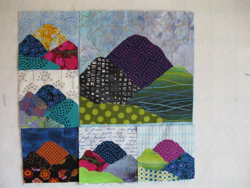
Guess which one I chose? I got out my Steam-A-Seam fusible webbing (it doesn’t gum up the needle too much in machine appliqué), a stack of fabrics from my stash (some are quite ancient), and cut and cut, and by the time I went to bed that night I had assembled this:
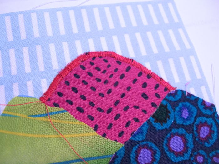
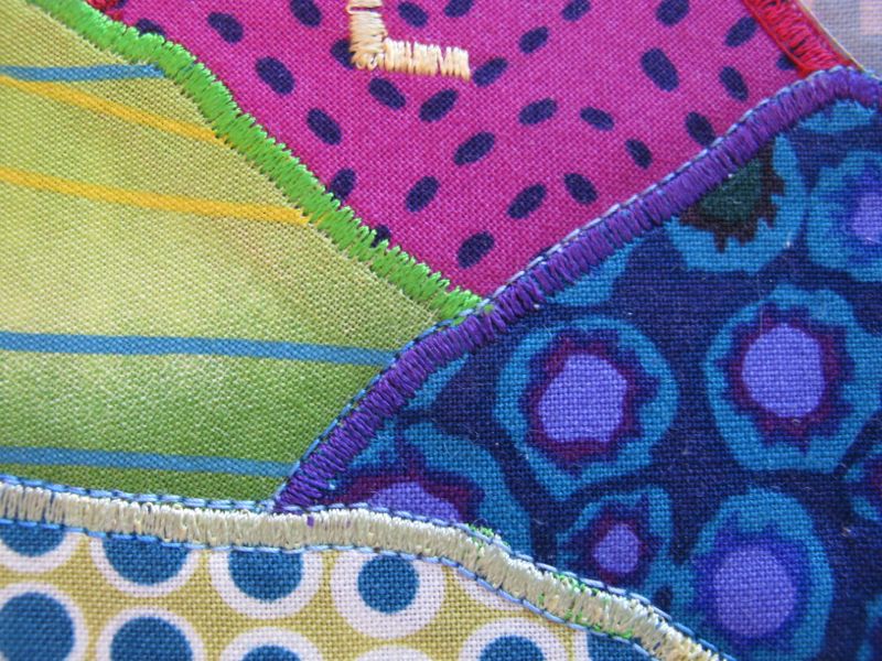
The next day, I went back and forth between using a straight stitch to secure the edge or a satin stitch. I’ve been using satin-stitch appliqué for about half my life, so that won. It’s my go-to technique when I want that distinct line around my raw-edge pieces and the fusible product holds them in place as I stitch. I dial that stitch length down as far as I can. I used to stitch using 0.3, but I can only get to 0.5 on this machine. So I have to “hold it back” a little with pressure from my fingers as I try to get that smooth lay-down of thread. I’ll explain.
I have always (ALWAYS) used two pieces of paper underneath my stitching and I *lower the upper tension* on my sewing machine. I want the bobbin stitches pulled to the underside. Because I use paper, that’s what I kind of hold onto as I “hold it back.” And by using paper, I also don’t have any buckling of the fabric. After I finished all my mountains, I stitched my hillside letters.
It’s really easy to rip that paper off after you are finished. This is what it looks like after the paper is removed. Look Ma! no buckling of the fabric! (I’m not kidding–use two sheets of paper–it works like a charm.)
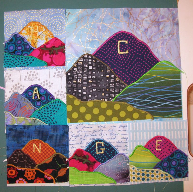
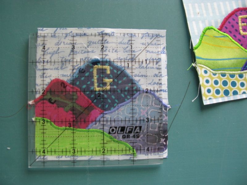
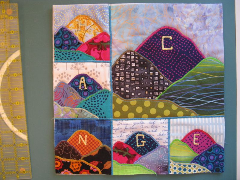
After all the blocks are all satin-stitched (and paper removed), I trim them down. I had decided I didn’t want to seam them, but instead butt them together, as I didn’t want that heavy ridge line that a seam would bring (all those layers!).
After I trimmed, I cut small strips of interfacing 1″ wide and laid the blocks side by side, fusing them onto the strip. (I did have a photo, but it was too blurry.) I assembled the quilt in units: (first) the three minis below the larger block, then (second) the two minis to the side of the larger block. Then (third) I attached the two side minis to the large mountain image, and fused those together. Then (last) I added on the lower three minis. Hope you are following all this.
I then satin-stitched the raw edges, using a slightly larger width (about a 3.5) to cover the seams. I layered it up with a backing and some batting, and then went to town quilting it.
I decided to quilt it by emphasizing the satin-stitching; I straight stitched on either side of that. Sometimes I’d use matching thread, sometimes I wouldn’t. I also lowered the upper tension for this step, but not as much as I did when I was doing the satin-stitching. I was happier when I had some King Tut thread to outline my satin-stitching (it’s a bit weightier thread and shows up better).
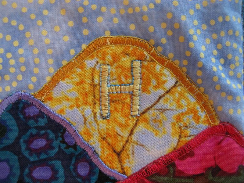
I also stitched around the H, as it just disappears into that autumn-colored mountain.
Here it is, quilted and trimmed. I used my preferred binding, of a strip 2″ wide, folded in half (this *post* tells how), as I like that look.
I made the usual triangle pockets in the corners for hanging, then attached the label.
Thanks for enjoying our little art show yesterday, of all the Four-in-Art Quilters. As per my usual (and I hear others in our group do the same thing!), I procrastinate too long, letting other chores, correspondence, phone calls and the usual detritus of life take up the space I need for creativity. The deadline gets me focused again, and I’m pretty happy to have this little quilt at the end of it all.
˚˚˚˚˚˚˚˚˚˚˚˚˚˚˚˚˚˚˚˚˚˚˚˚˚˚˚˚˚˚˚˚˚˚˚˚˚˚˚˚
Sketch of Mountain
If you want to make yourself a little mountain quilt, with your own set of letters, here’s a jpeg of the mountain, which should measure 4″ when printed. Enlarge it 200% for the bigger mountain so it’s double that, or 8″. This idea and technique can be used for any simple sketch: a baby’s hand, a simplified portrait, a household object (like Warhol’s Campbell’s Soup Cans?). Let your creativity lead you where it will, and if you do make a similar art quilt, drop me a note and let me know!
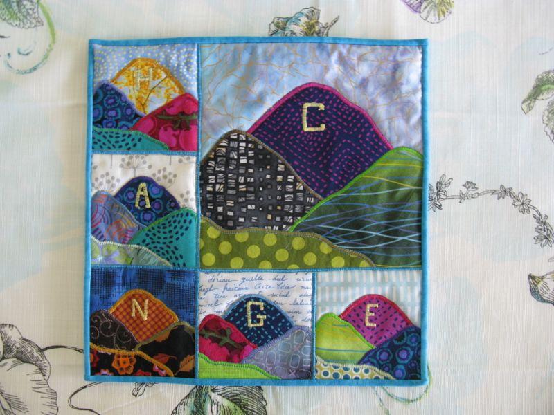
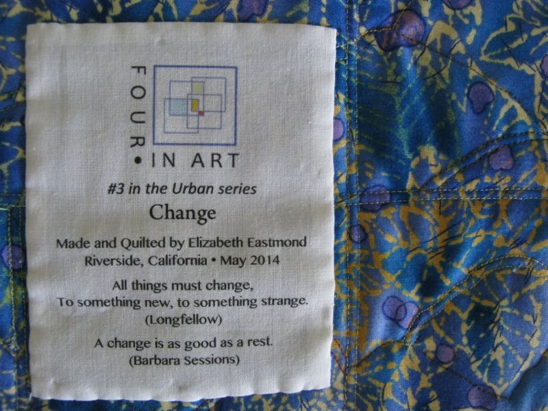
Change
#3 in the Urban Series, Landmark Quarterly Challenge
Quilt #131
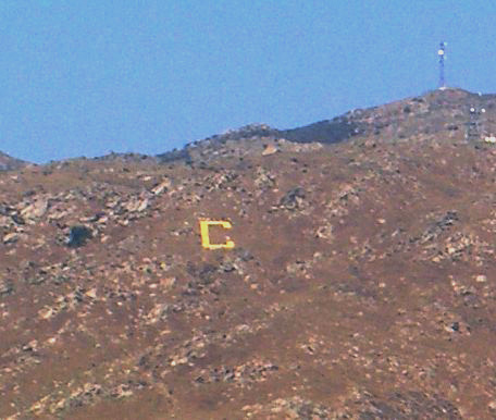
(Y Mountain. Photo courtesy of Judy Cannon)
This is the landmark I grew up with, a letter on a mountain in Provo, Utah. Known as the “Y,” there are annual hikes, and a lighting of the letter on Homecoming. I thought everyone had a mountain with a letter on it, but as I grew up and moved around, I found out that most of the world, and certainly the East Coast of the US, doesn’t. Since I chose this idea for my landmark, I found there’s a whole Wikipedia page about these hillside letters. Also known as “mountain monograms,” as one professor wrote in an article about the origins and the spread of these letters, I discovered that University of California-Berkeley was the first. And here’s a map of these letter landmarks, mostly in the mountain west. (Maybe because we have mountains?)
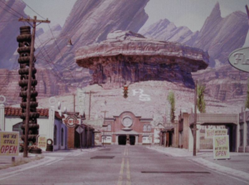
The movie Cars even used hillside letters on the mountain above Radiator Springs, the fictional small town in the movie. The RS is just to the right of the stoplight. (Sorry for the weird image, but I had to take a photo of my computer to get this shot.) The mountain from another view:
Columbia University in New York does have a “C” painted just above their boathouse on the Hudson River:
Yet most people think of this when I say hillside letters. . .
. . . but to me, neither of those counts. A letter needs to be embedded on a hillside or a mountain to count as a landmark. So that was the genesis of the quilt.
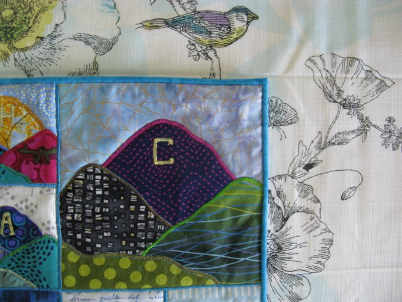
Our landmark hillside letter is a C, an imitation of that first University of California-Berkeley letter, which was set onto a hillside about 1905, the granddaddy of all the other mountain monograms. This is a blurry image from Wikipedia of our local mountain (our letter isn’t really yellow). I tried to photograph it, but couldn’t get a good vantage point, so this will have to do.
Here’s my little art quilt with its C on its mountain. (Note: although I like to photograph outside, today we are having raging Santa Ana winds, so inside it is.)
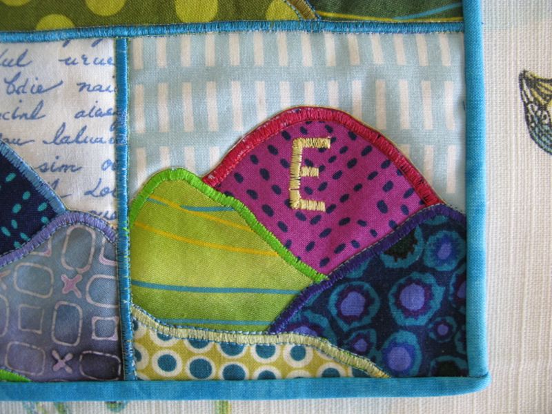
What is the significance of these other letters, spelling out the word C-H-A-N-G-E?
As Longfellow observed, “all things must change.” And I keep my mother’s advice that “A change is as good as a rest” close to my heart, for that’s a truth as well. But the C-for-Change linkage came to me one weary night, when I had to go and do one more pick-up and one more errand when teenaged children were still at home. It must have been during our University’s Homecoming Week, for when I rounded the street corner at the base of the Box Springs mountain, I could see the “C” all lit up. I pulled over and gazed at the glowing letter with that tired-behind-the-back-of-the-eyes fatigue, wishing that that I could go home and be home, like I could when the children were little and weren’t off at some activity that required me to be out and about picking them up. I thought back to the “easy days” of tucking them in after a story and prayers and a drink, and about how wonderful those times were. Why did things always have to change?
But I realized that change is the law of the universe, and instead of being at war with that constant mutability towards “something new, something strange” I should just accept it. Change and I are now uneasy companions. I know it won’t always be like that, for experience has taught me that change can come in steep cliffside drop-offs and hair-raising turns on a winding road. But for now, I’ll be content gazing at my quilt where it hangs in the corner of my kitchen.
Please visit the rest of our Four-in-Art group, and see how they’ve interpreted the Landmark Challenge:
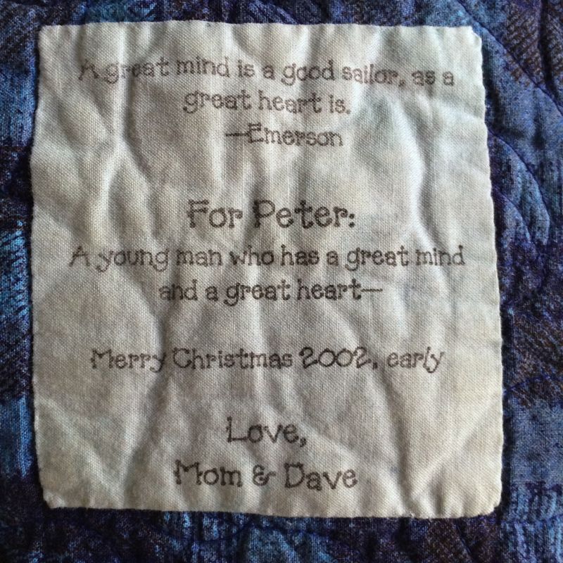
First up, some answers to all those questions that came in about the label post I did a while back. I provided a tutorial for my easy-peasy way to back your fabric with freezer paper and send it through your printer. Then the comments and questions came in about colorfastness and ink and fabric. Sigh. I am not a computer-printer expert. All lot of people noted that HP inks run and disappear. To figure out how your inks behave in the wash, I strongly suggest that you make a test sample with YOUR printer and put it in a lingerie bag and run it through your washer and dryer to see what happens.
While I was in Washington DC, praying for the cherry blossoms to open (they almost did), my husband and I visited my son and were able to sleep under the quilt I made him when he went away to college, some twelve years ago (my, how time flies!). He admits that he doesn’t wash it too often, but here is a picture of the label, printed on my EPSON printer. I think it looks pretty good for being done all those many years ago.
I have printed labels with my laser jet printer which did not survive the wash, so later on, when I visited that grandchild’s house, I simply traced over the wording with a Micron pen.
This quilt was made sixteen years ago, and I wrote on the label with a Micron Pen (I think I used about a .05 or .07). It’s been washed scads of times, and given that I hardly knew what I was doing at that time in the Label Department, it seems to have held up.
The poem that goes with the quilt, an homage to my mother, who loves pansies. I think what I’m trying to say is that there is no one way to make a quilt label, and if you like buying the fabric that’s pretreated, or making your own with some Bubble Jet and Bubble Jet set (a la Caryl Bryer Fallert-Gentry), have at it. If you have a success, please let me know and I’ll pass it along. But for now, I will keep plugging along with my EPSON printer and their fabulous inks and my easy-peasy freezer paper method.
A reminder that tomorrow is our quarterly reveal for our Four-in-Art group. See you then!
 A Kaffee Fassett Lotus Blossom print for the back, and I am finally done. I know you’ve seen an overabundance of photos of this quilt, so this is just a simple, abbreviated post to say I’m finished. (Or should I say: I’m FINISHED!!!)
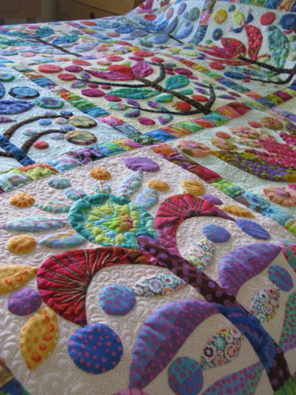
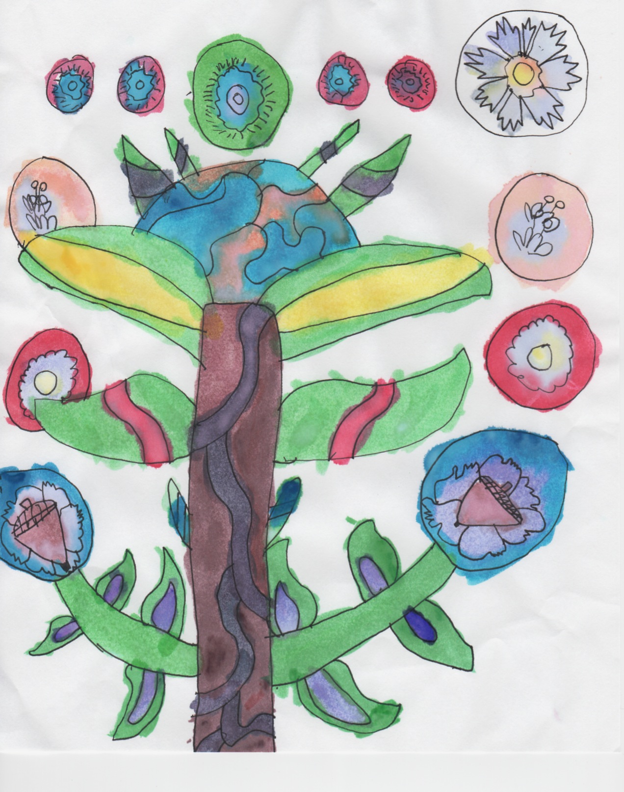 Some time ago, my granddaughter Keagan saw my blocks up on my design wall, and quietly made a picture for me of what she saw. (I think it’s the block in the lower righthand corner of the quilt.) I love it, so I put it on the label.
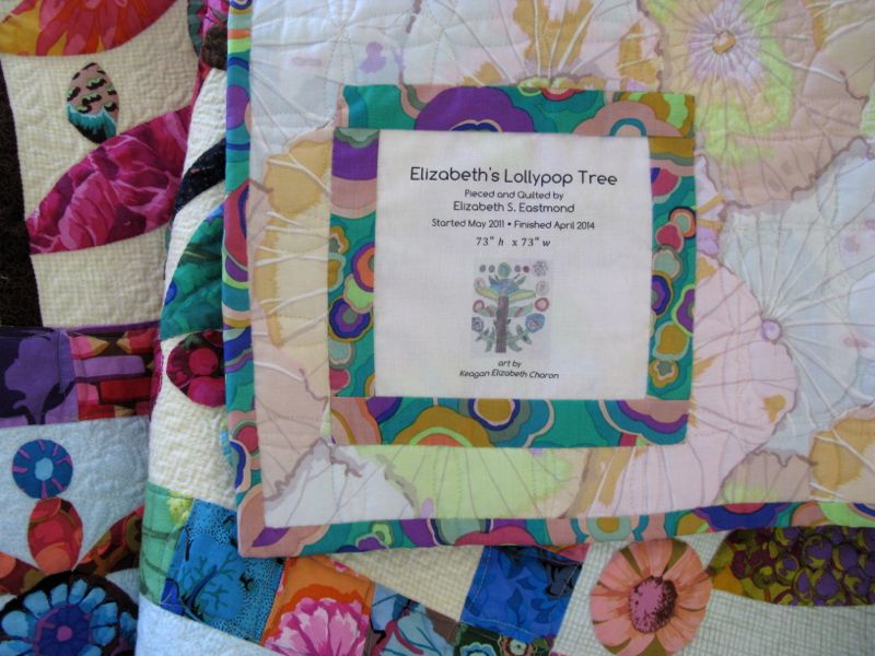 Quilt #132 on my 200 Quilts list


 Please visit the rest of our Four-in-Art group, and see how they’ve interpreted the Landmark Challenge: