Have you seen the phrase “low volume” used lately in the quilt world? I have, in many places, and it’s confused me to no end. How is it that we quilters have come up with a term that has almost no application outside our little quilty planet? Why do people say low volume when they really mean soft color or tint or pale or faded or neutrals (which is usually what it stands in for). Yeah, yeah, yeah, I thought, until I saw this in the New York Times this weekend:
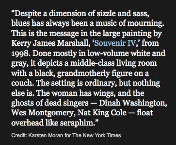
Check out that phrase: “low-volume white and gray.” So I did a Google search on “low-volume” and color and got lots of info on printers printing jobs that were low in page numbers. Then a bunch of references to hair coloring and beauticians, then a smattering of entries where bloggers have used this term in their blog posts.
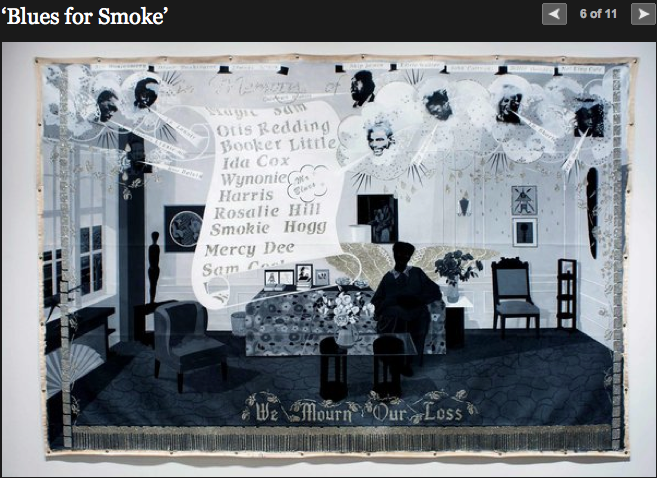
Both of these images are from the NYTimes write-up about Blues for Smoke, a newly opened art exhibit, taking its inspiration from the Blues (the music, not the color, although there does appear to be some riffing on the latter).
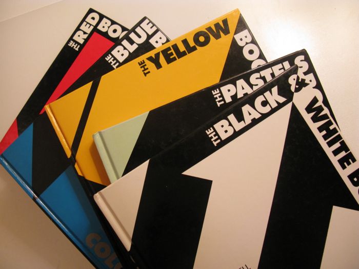
But where in heavens name does the term “low volume” come from? If you do a search on “low volume” in Google images, quilts predominate. But in the rest of the Google universe, it refers to sound, or how many pages your printer can turn out, or stocks you have traded. I turned to my trusty Colorworks books, esp. the one on pastels to see what terms Dale Russell uses.
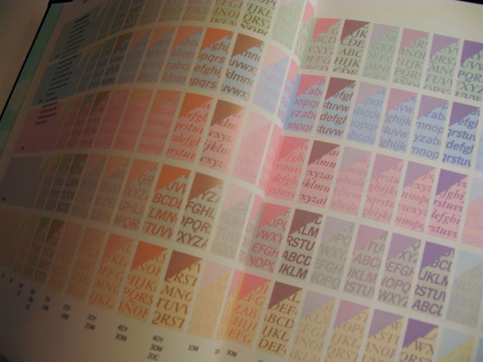
He doesn’t use the words low volume in references to those lightened colors. He uses the more common “tint,” which is a color that has had white added to it, lightening it from the pure hue. (And on the opposite scale, a shade has black added to it, darkening it.)
So, if you use the term low volume, where did you get it from? Does it come from industry? The art world (like my example above)? Graphic arts and design?
Or is it peculiar to quilters?
Discover more from OccasionalPiece--Quilt!
Subscribe to get the latest posts sent to your email.

How interesting! I did myself wonder what ‘low volume’ was all about when I first read it. I think in the past I would have said the background was made in ‘neutral tones’. It is a conundrum, isn’t it? Whose going to own up to it?!!!
That’s been bugging me too! Especially because hair product advertising use it & it doesn’t make sense to me. Volume means noise to me. Not hair or color. Although I have heard a color or print described as “loud” I have never heard hair described as such. But “big hair.” 😛
I am pretty sure that quilters made it up as a reference to patterned but not bright fabrics, even for a background of many different neutrals, because negative space was a term that did not really fit the bill for these. As it is so much better than the usual quilter’s terms that are, in my view, unfortunately silly (wonky, fussy cut, scrappy and such), I like it. It is sort of fun to see the New York Times picking it up as a way to describe colour choices.
I first heard it used in the quilting world. It didn’t refer to just the background fabrics but all the fabrics used. There wasn’t any contrast. They were fabrics that didn’t ” shout”. I was smitten and had to make one ; )
I first heard it mentioned by other quilters. I joined a low volume fabric swap and there was some confusion to what exactly it meant. Several people referenced Malka Dubrowsky, I got the vague impression maybe she’d used that expression to describe her work at some point. Whoever coined it, I sure do like the look! Though obviously it’s been done for years and years and years.
I have been wondering about this phrase as well; thanks so much for this interesting research. I had been trying to refrain from using this expression, but maybe I should re-think!
I remember when the word to use was “muted” but it doesn’t sound as hip or trendsetting so I think that “low-volume” has become the thing…. These ideas spread too fast to keep track of their origin lately.
I used the term low key as this says quitetly, without shouting, sort of like how I want the fabrics to speak. I prefer it to low volume.
Since we’ve often referred to bright colors as “loud”, I assumed that low volume was the opposite of this. (Or, as someone noted above, we’ve used “muted” also, another sound term.) Just a guess!
http://www.quiltingdaily.com/Quilt-Designs/
This is apparently where it came from. I’ve been wondering myself. I’d prefer “low color value” because that’s what it is. And low volume insinuates that all color is loud. I’m offended on color’s behalf. Lol!
Thanks for having this discussion. Just today I saw “low volume” and just couldn’t figure out what it meant but as I read the other posts and saw “muted” I certainly got the picture. I don’t see myself using the term because I don’t think that my circle of friends would know what I meant!
I first read the phrase in Sunday Morning, the quilting book by Nyberg and Arkison, where they wrote, “…hidden among the bolds and brights are what are often called low-volume fabrics…. The scale of the fabric design varies, but the overall effect is softer and quieter than that of most modern fabrics.”
When I understood that it meant fabrics with little color my first thought that the word “volume” (as in, cubic units to describe space occupied) was being used to describe quantity or amount. I just guessed it meant a lesser quantity of color which becomes equivalent to tint, pastel, pale, muted, etc..
I like other words and phrases better than “low volume.”
See, and I thought it had to do with either loft or the number of patterns/fabrics incorporated. Thanks for sorting this out! I like the notion of low-volume as opposite to loud, and not as dull as muted 🙂
Well, this has been a mystery to me! I had understood it as low value contrast, which it does, but only relative to paler colors. I have a great teals-and-greens border on a medallion quilt, for which all the colors are approx the same value. Now I understand this would NOT be considered low-volume. Thanks.
I suspect this term has been invented to avoid the stigma of using the word “pastel” which has gotten a bad reputation. Pastel and low volume both refer to colors with low saturation, but “low volume” sounds more hip.
More thoughts on ‘low volume’ which is still a conundrum to me — at a recent Modern Quilt Guild meeting, in preparation for a fabric swap, we got a lesson on low volume. I get ‘low contrast’ in the pattern, if there is one, but there also seemed to be the requirement that things be beige or gray. REALLY? If you made an entirely blue quilt with various close shades of dark blue in low contrast patterns, wouldn’t that be ‘low volume’? Someone else at the meeting was working on what she described as a low-volume quilt — it had a very bold, large graphic design based on log cabin blocks constructed from lots light grays and lots of navy blues. Within each color, the fabrics were low contrast with each other, but IMHO there was nothing ‘low volume’ about the quilt. It seems to me that ‘low volume’-ness depends on who is in the mix — just like an apparently medium-value fabric can act as a light or a dark, depending on its partners. Even among grays, one yellow-ish gray in a sea of blue-ish grays will stand out like a light-house.