And That Has Made All the Difference
Quilt No. 151, November 2015
#4 in the Literature Series
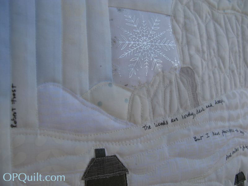
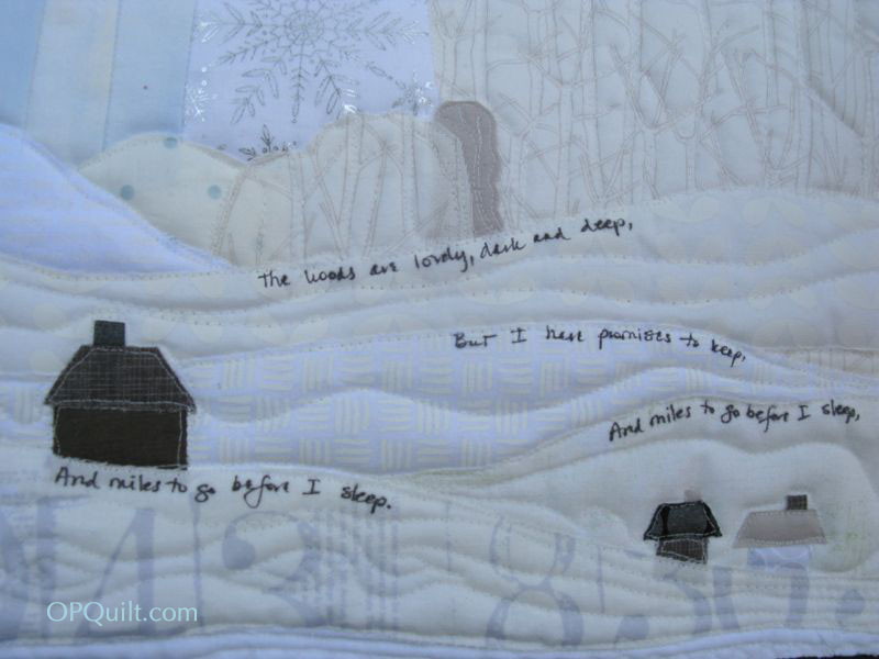
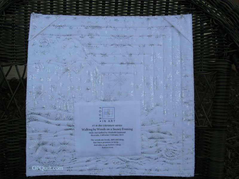
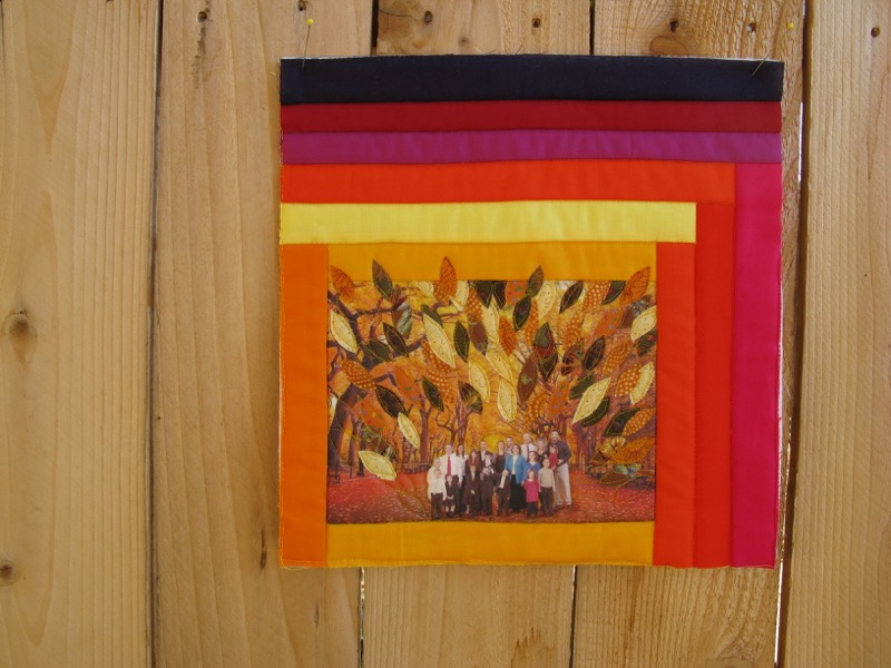
I close out the Literature Series with another poem, a famous poem, by Robert Frost. You can even guess what it is by looking at the colors, and those leaves — yes, I chose “The Road Not Taken.”

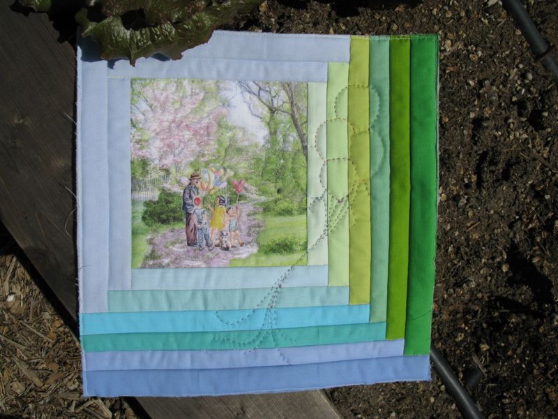
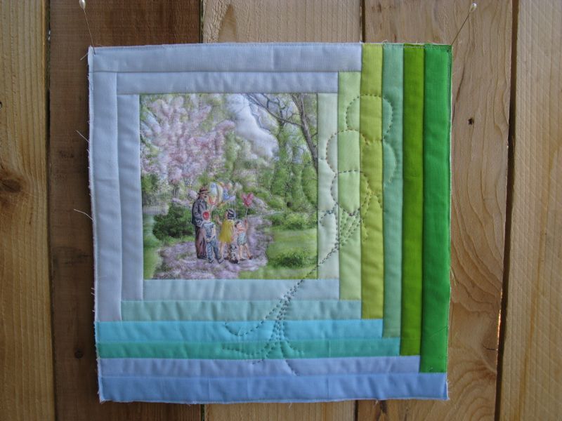
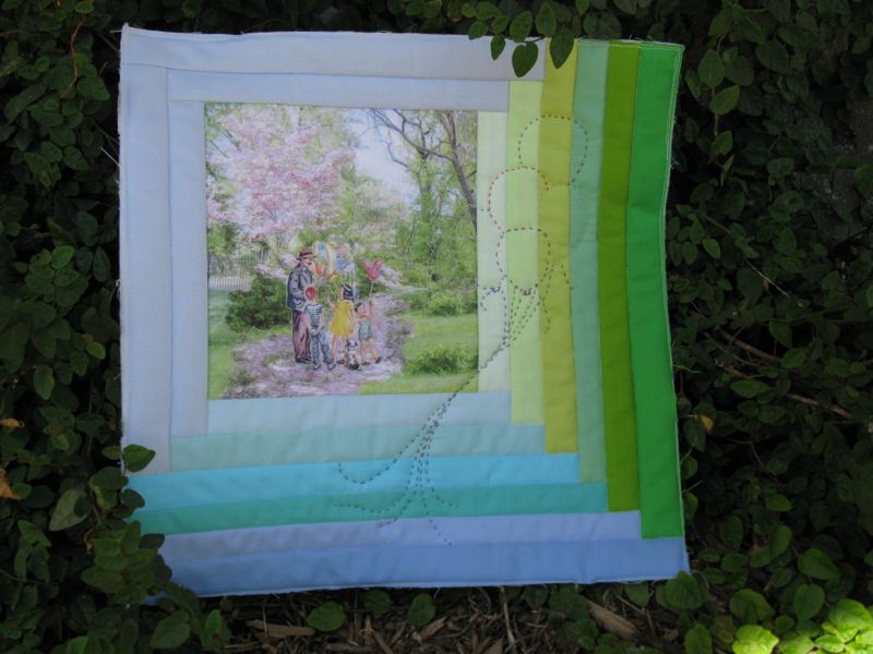
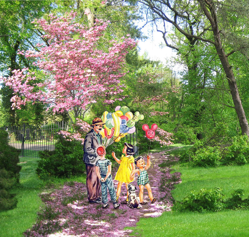
I chose a family group picture from the last time we were all together, almost 2 years ago this December, and cut-and-pasted it into a photo I grabbed from the web of a golden allee (which I think must be in New York’s Central Park). I tweaked it, then printed it on some fabric I’d prepared with Bubble Jet (more info about that on *this* post).
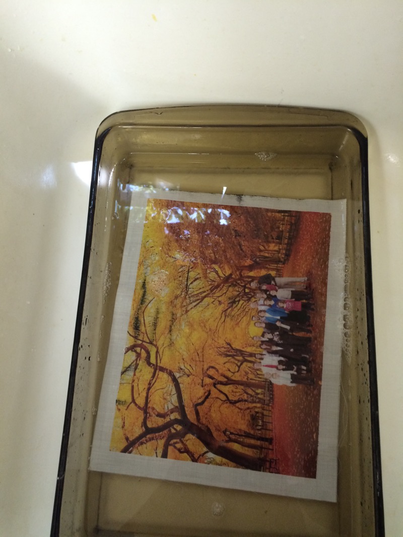
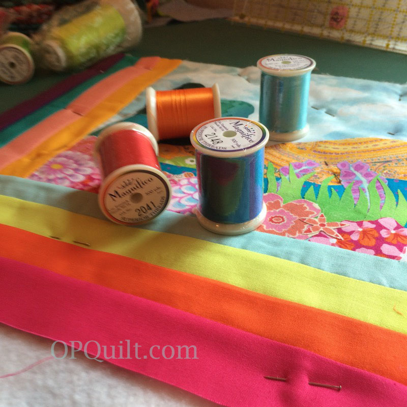
I let it dry from the printing, then set it with Bubble Jet Set, laid it out to catch the excess moisture (below), then hung it to dry.
It needed more leaves. So I cut out scads and scads of leaves from fabric that I’d backed with fusible webbing, and ironed them on. I framed the photo with a partial log cabin arrangement, then quilted it.

In conjunction with the making of this quilt, I read the book by David Orr, The Road Not Taken, which is an analysis of this poem, which apparently most of us get wrong (sorry to be the one to break this to you). We think it’s about rugged individualism, of the choices that we make and how we come out on top. That idea, apparently, is routed firmly in our American way of looking at things, which is to say, that as a country, America comes out on the top in scales ranking us as the most individualistic (only the Czech Republic was tied with us.) And it’s certainly part of the part and parcel of this poem, when we talk about it and think about ourselves as that individual (notice how there are no other people in this poem) striding through a dappled forest, making astute and informed choices. But really, it’s about so many things.
While there are many threads in this book, I was quite intrigued with the idea of being at the crossroads. And in introducing that idea, Orr wonders if it’s not about the final victorious moment, but rather it is about”[t]he moment at the crossroads”. . . “in which all decisions are equally likely. We haven’t moved, we haven’t chosen, we haven’t sinned” (51). Orr quotes the introductory note on Frost in the second edition of The Norton Anthology of Modern Poetry:” ‘The Road Not Taken’ seems to be about the difficulty of decision making but is itself strangely reluctant to resolve. It keeps us in the woods, at the crossroads, unsure whether the speaker is actually even making a choice, and then ends not with the decision itself but with a claim about the future that seems unreliable’ ” (70).
 Even Frost himself, in a note to Leonidas Payne in November of 1927, writes: “My poems—I should suppose everybody’s poems—are all set to trip the reader head foremost into the boundless. Ever since infancy I have had the habit of leaving my blocks carts chairs and such like ordinaries where people would be pretty sure to fall forward over them in the dark. Forward, you understand, and in the dark” (53).
Forward and in the dark is about how I feel about many decisions I make, but the quality of individualism whispers in my ear at all times: I am the one who can see clearly to choose, as if the “I” was unchanging, solid, rooted in bedrock. Yet doesn’t the choosing change us? And then doesn’t every choice become monumental? Orr agrees, saying that “If we can’t persist unchanged through any one choice, then every choice becomes a matter of existential significance—after all, we aren’t merely deciding to go left or right; we’re transforming our very selves” (60-61), which is one aspect of what the poem is about: choice is slippery and transformative, yet a constant in our lives.

However you think about it, I did make a significant choices some twenty-six years ago to marry my husband, to join with him in raising the four children I brought with me out of a period of loss and devastation, and in doing so I not only changed my life, but the lives of the children.
And that has made all the difference.
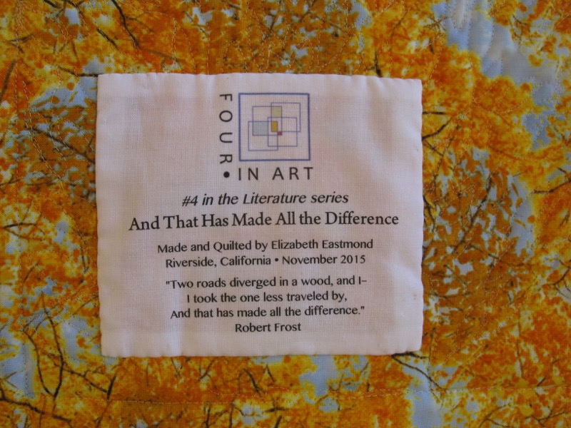
“The Road Not Taken,” by Robert Frost
Two roads diverged in a yellow wood,
And sorry I could not travel both
And be one traveler, long I stood
And looked down one as far as I could
To where it bent in the undergrowth;
Then took the other, as just as fair,
And having perhaps the better claim,
Because it was grassy and wanted wear;
Though as for that the passing there
Had worn them really about the same,
And both that morning equally lay
In leaves no step had trodden black.
Oh, I kept the first for another day!
Yet knowing how way leads on to way,
I doubted if I should ever come back.
I shall be telling this with a sigh
Somewhere ages and ages hence:
Two roads diverged in a wood, and I—
I took the one less traveled by,
And that has made all the difference.

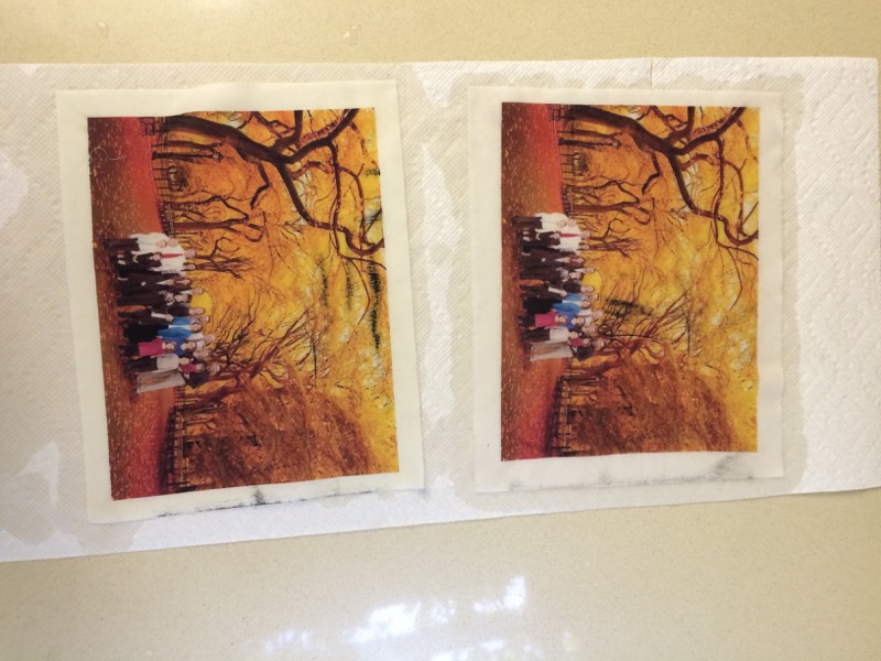
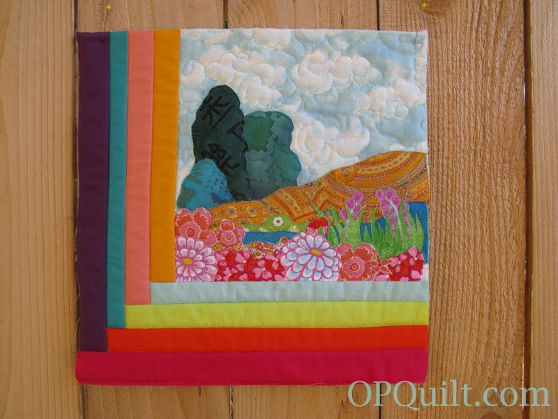
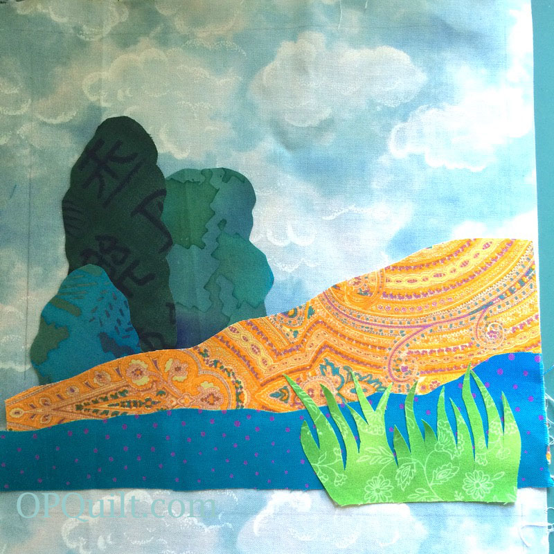
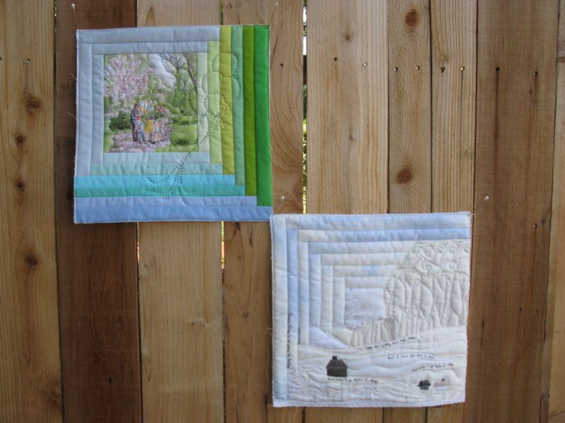
Here they are together. Somehow I need to stitch them together and meld them together into one quilt.
![]()
About Us: We live all over the world, from Scotland and Australia to the continental United States. Our blog is *here.* Please visit the other members of our Four-in-Art Group and see their Literature Art Quilts:


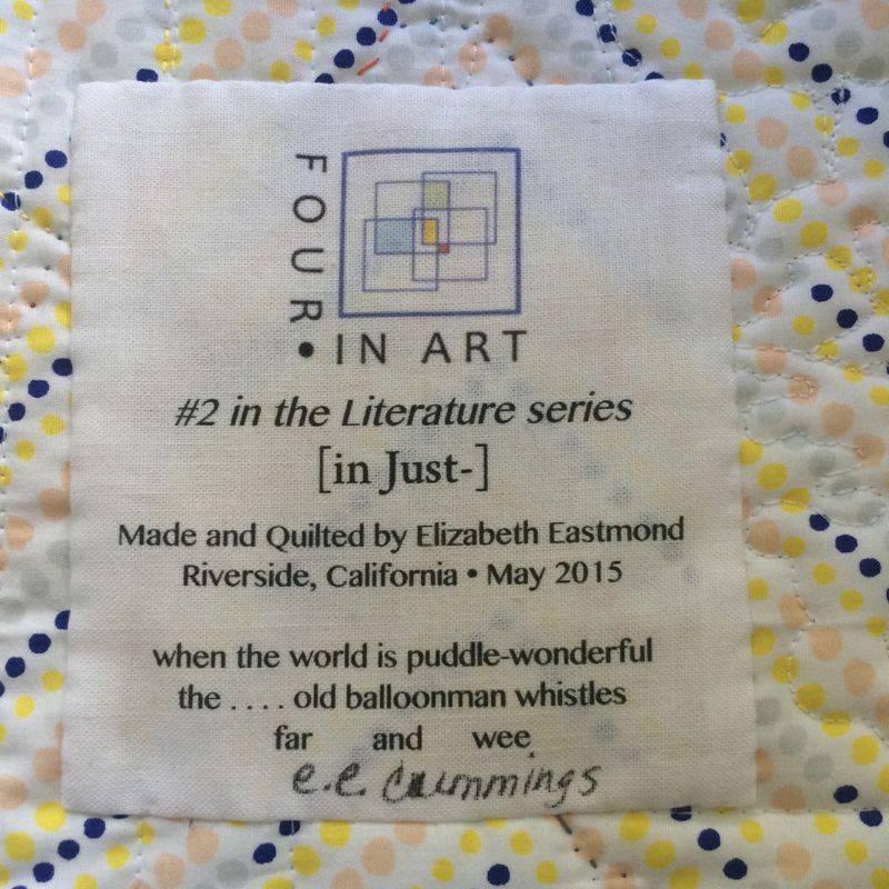
![[in Just-]](https://opquilt.com/wp-content/uploads/2015/04/in-just.png)