Yesterday, I revealed my quarterly art quilt challenge, and as is my usual, this post is about some of the how-to’s.

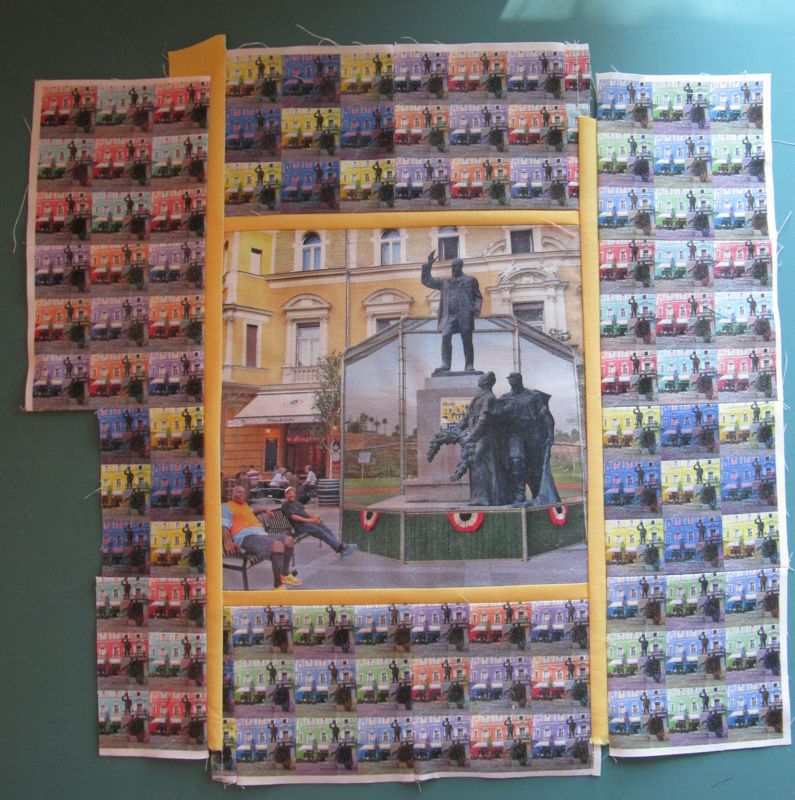
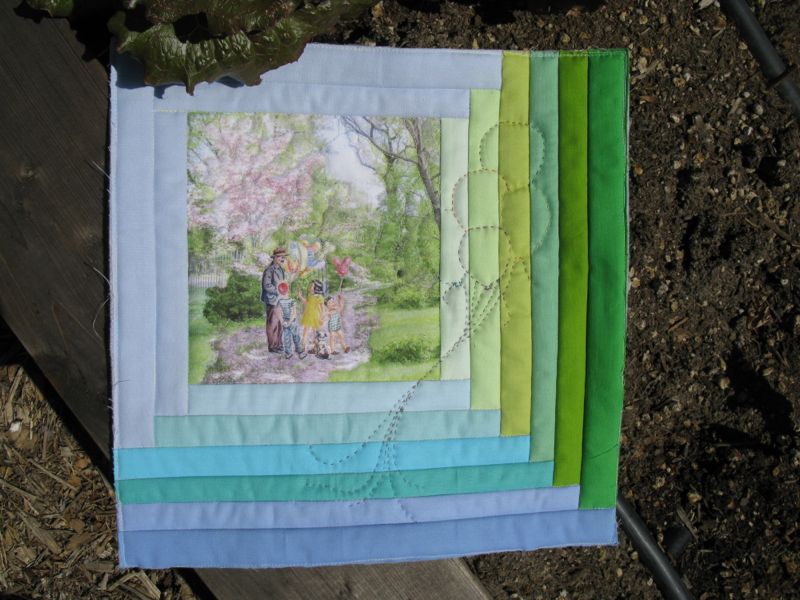
When trying to think about how to illustrate this poem, I kept thinking of all the pictures I’d taken in Washington DC during cherry blossom season and was thinking that they might work for this. I first searched for a picture of a balloon seller, and found an illustration from what looked to be c. 1950s, perfect for I wanted–a nice, clean interpretation.

This is a composite of several photos; I added in the balloon man last. I saved all this (multiple times) and then started to prepare my fabric. I wanted to use the Bubble Jet Set again, like I did for an earlier art quilt (more info *here*), so soaked my Kona white squares and hung them to dry.
I ironed them to freezer paper, then tried to feed them through the printer just as they were.

Fail.
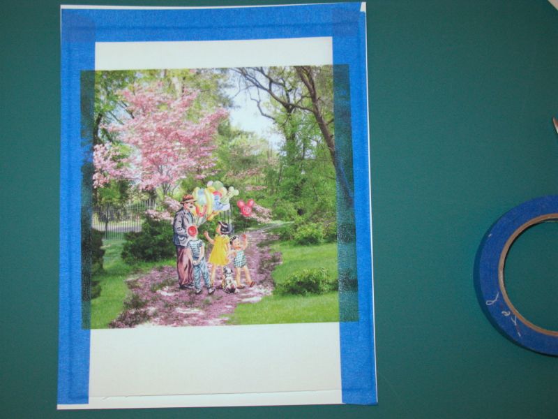
So this time I trimmed down the edges and taped it to a piece of cardstock on three edges and then fed it through the printer (I have a flow-through feed path, but I have done in those printers that do a U-turn). Success. I didn’t care that the image was a bit wider and spilled out onto the tape, as I knew I was going to sew fabric strips around the edges. I let it sit for 30 minutes.

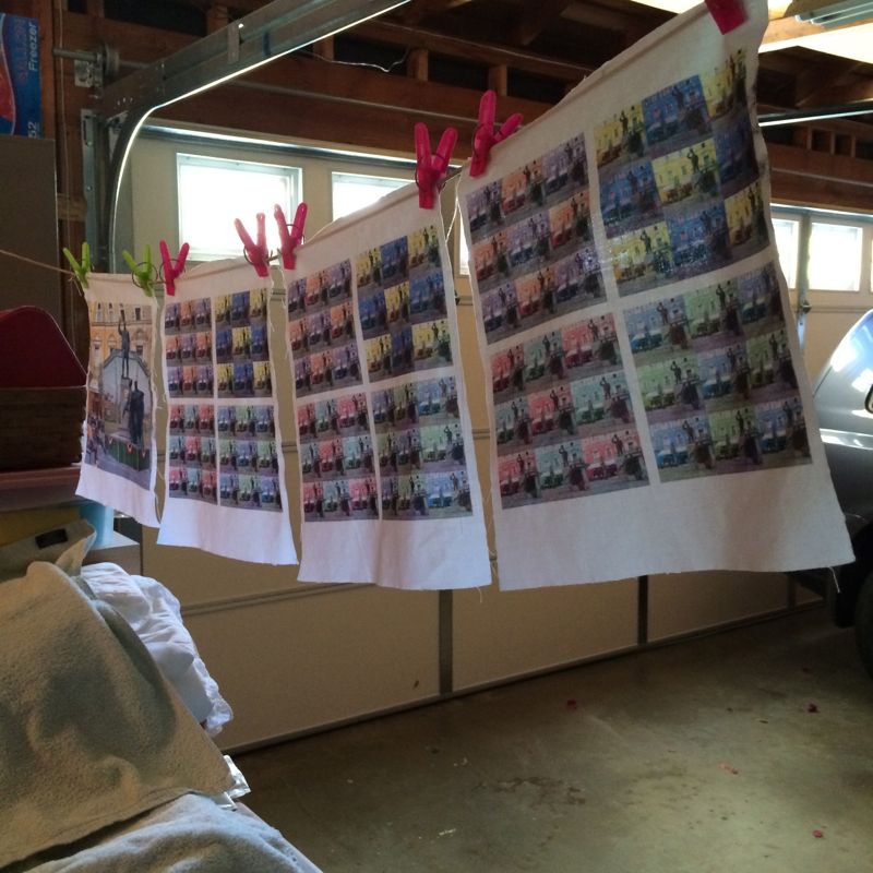
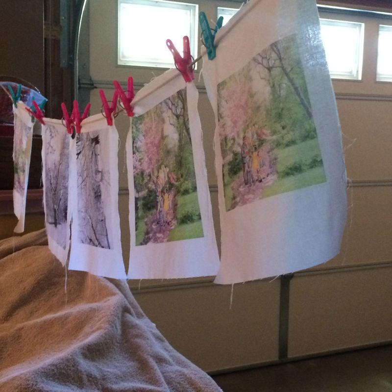
The other part of using Bubble Jet is to rinse the printed fabric in their Bubble Jet Set, so after waiting the allotted amount of time, I rinsed the printed images, and hung them to dry (below).

I’d printed two different versions of the balloon man. One with all full-out color everywhere, and one where I had lightened the background by about 30% to let the man and the children pop out a bit more. That one worked best for fabric.
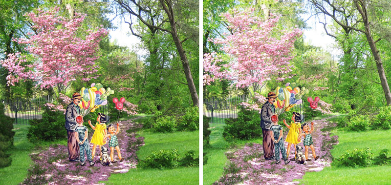
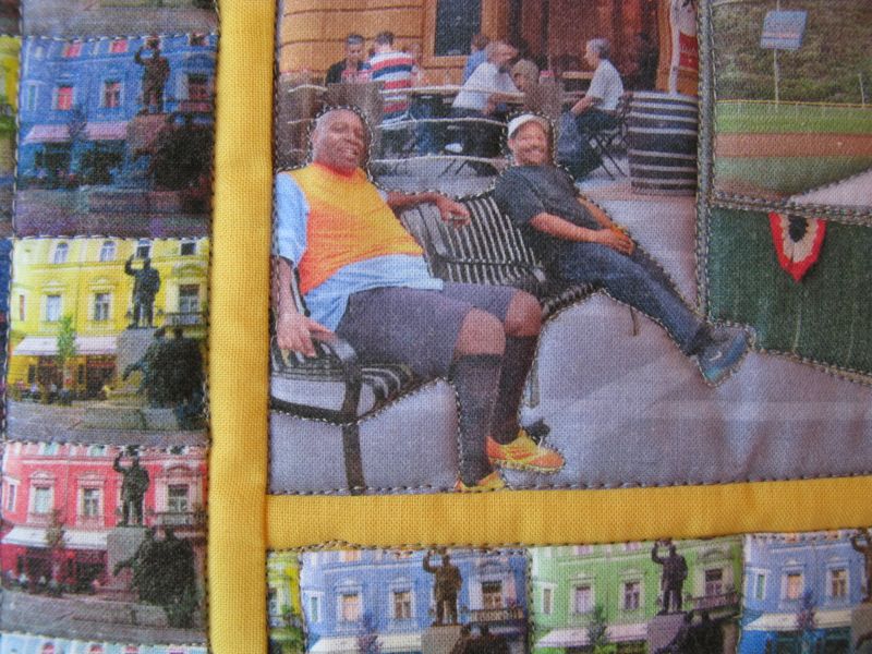
On the screen, they don’t look too different (lighter background is on the right). But my husband said the full-color print was “all a bit much,” language for toning down one part of the picture so that the other could shine. He liked the difference.

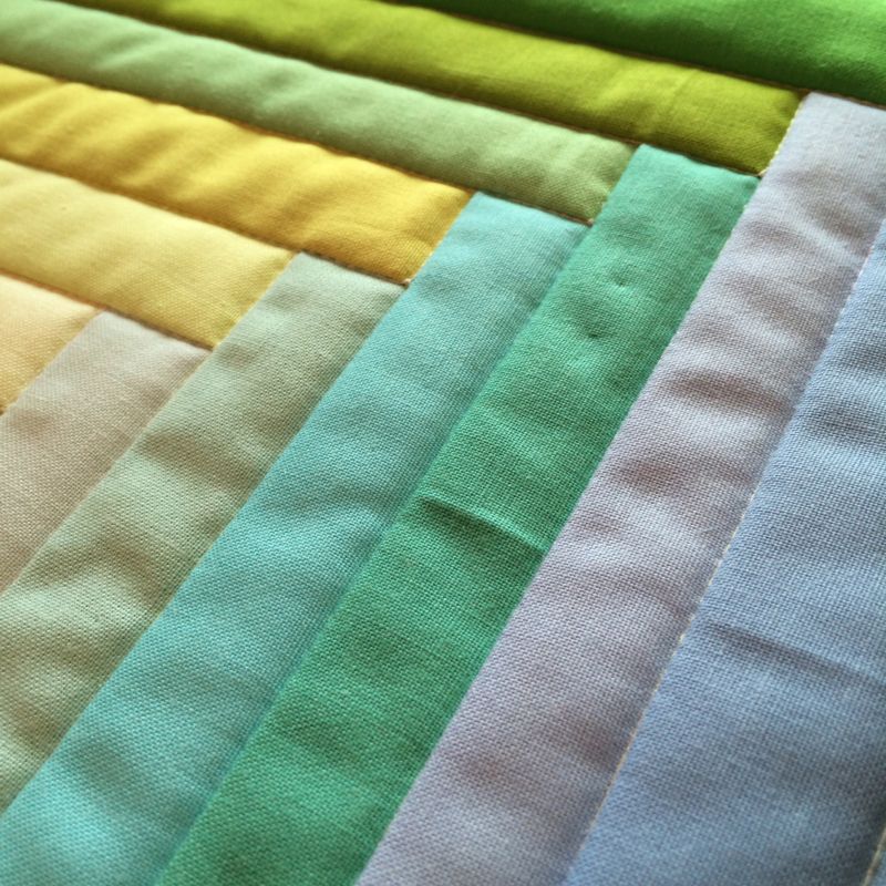
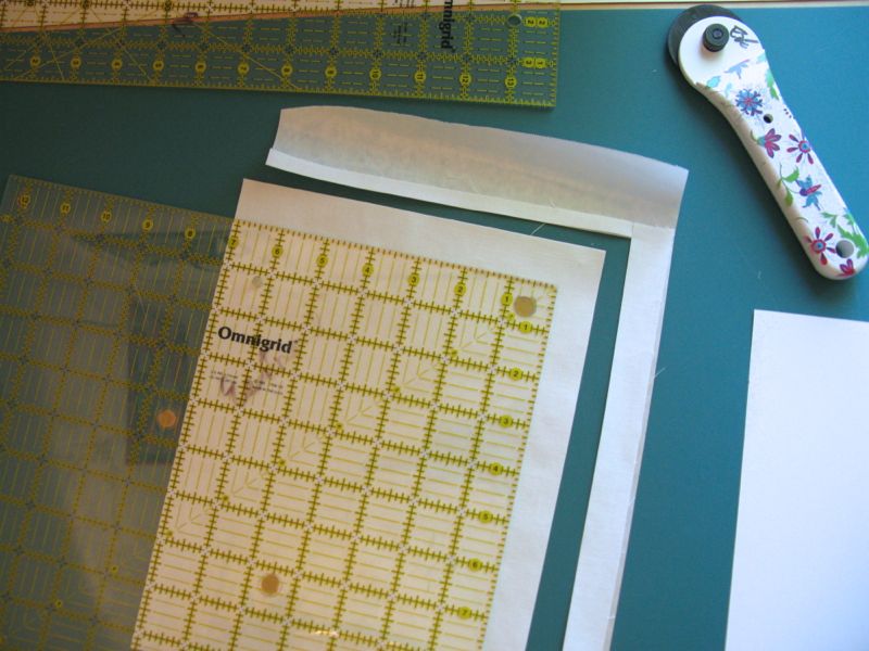
I cut the strips 1 1/4″ wide as I wanted a narrow range of gradated colors.
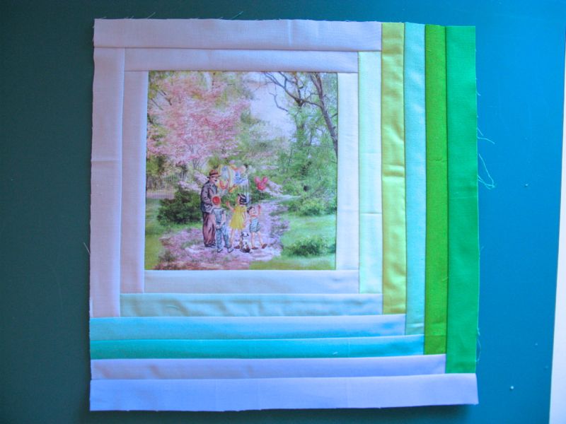
Strips on. I made it a wee bit bigger than our 12″ so when I sew all four of these together at the end, I’ll have room to maneuver.

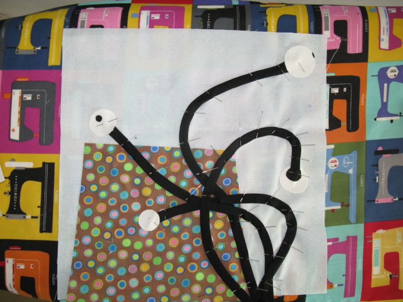
I drew out the balloons on some waxie paper squares that they use in delis. I’d purchased a big box ages ago and I use them to try out quilting ideas.

I tried drawing it on with a white pencil, but it didn’t show very well, so I just pinned on the waxie paper, and kept flipping it back and forth.
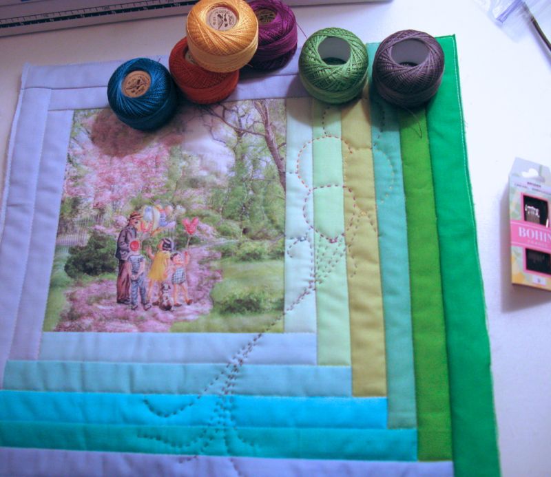
If you read the post about the quilt and the meanings of the motifs, you’ll know why these balloons are here.
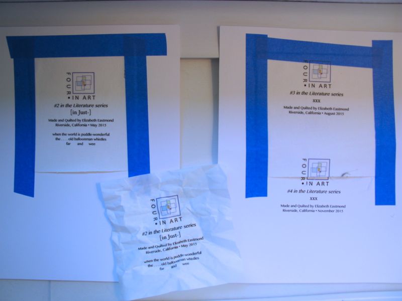
I like to attach the label before the reveal date. On this day, my father was going into surgery for a broken hip. He fell when he was hanging a painting in his art studio. Did I mention that he’ll be 90 in December, and is still a source of inspiration for me–still going down to his studio to paint daily? But today, while I thought about him, I couldn’t make the labels at all–something I usually can do in my sleep. The middle shows the label. . . printed on the freezer paper backing. Next. The righthand side shows the label when I forgot to print only the first page, plus I obviously put the fabric down too low and it printed partially on the masking tape. I finally got it the third time. He had his surgery, and is fine, but to say I was feeling a wee bit distracted and out of sorts would be an understatement.
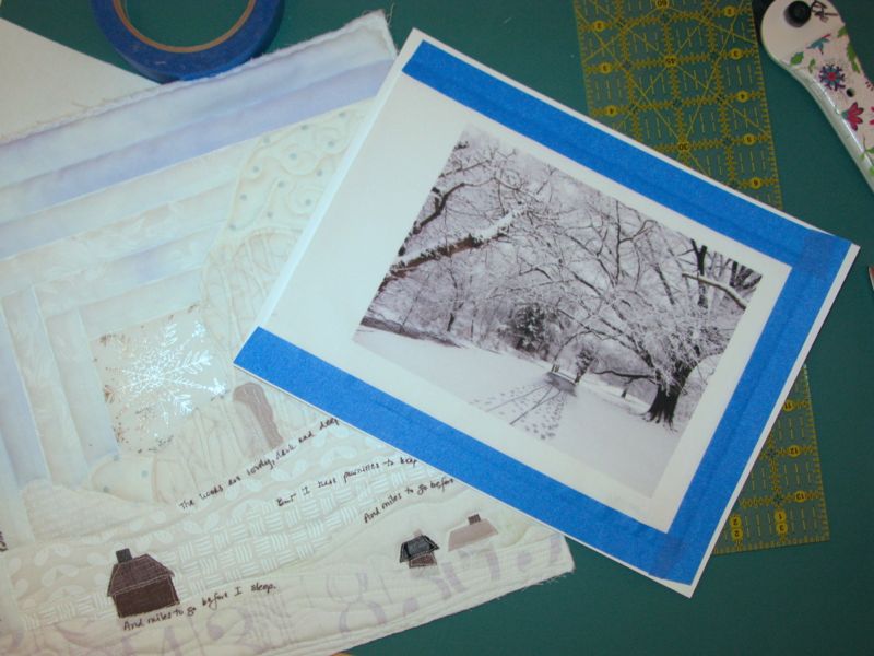
Now I’m thinking that the other quilt needs to be spiffed up with a photo or two. I need to get those woods darker and deeper, but will have to think about how to do this.
 I always enjoy trying to interpret a theme or an idea in these little quilts, but there are some days I approach the task kicking and screaming. It’s always soooo much easier to just pick up a block or two, start whacking away with my rotary cutter and tada! a stack of blocks is sewn and done. It is harder to take the time to think about what I want to say and how to say it. It’s on days like that I’m keenly aware that I’m not an fine arts artist like my sister Christine, or my father.
However, I’m my own kind of quilt artist, and I choose to keep doing these little art quilts because it stretches my brain and pushes me to explore new techniques. Everyone has to find a way to keep growing in their quilting, otherwise we become stagnant and stale and slip out of the conversation. For me, this is one way to remain in the stream of creativity, and I’m always glad to have these art quilt challenges come around again.
Many thanks to the other quilt artists who participate–they inspire me!